IMAGE 0.0
An Image that inspires me
An Image that inspires me
Circe Invidiosa - John William Waterhouse
(http://www.artgallery.sa.gov.au/agsa/home/Collection/european_and_north_american_paintings_and_sculpture.html)

Waterhouse's use of light and colour has always been something I've been inspired by. In this particular painting, the artist utilizes blues and greens to give a sense of texture and movement to the water which spills over the bowl. The artists usage of value and form is also highlighted in this painting, with the careful application of light and shade giving the character of Circe, a sense of dimensionality and weight.
IMAGE 0.1
An Image that inspires me
Waiting - Akino Kondoh
(http://akinokondoh.com/img/works/2008/2008_05.jpg)

Kondoh's combined usage of shape, line and space, give "Waiting" a unique aesethic, and visual sensation. With strong juxtaposition of light and shade, working harmoniously with smooth, natural curves invoke a sensation of weightlessness and stupor.
IMAGE 1
With Time...
Ozymandias - Original Piece
(2H/B on 110gsm)
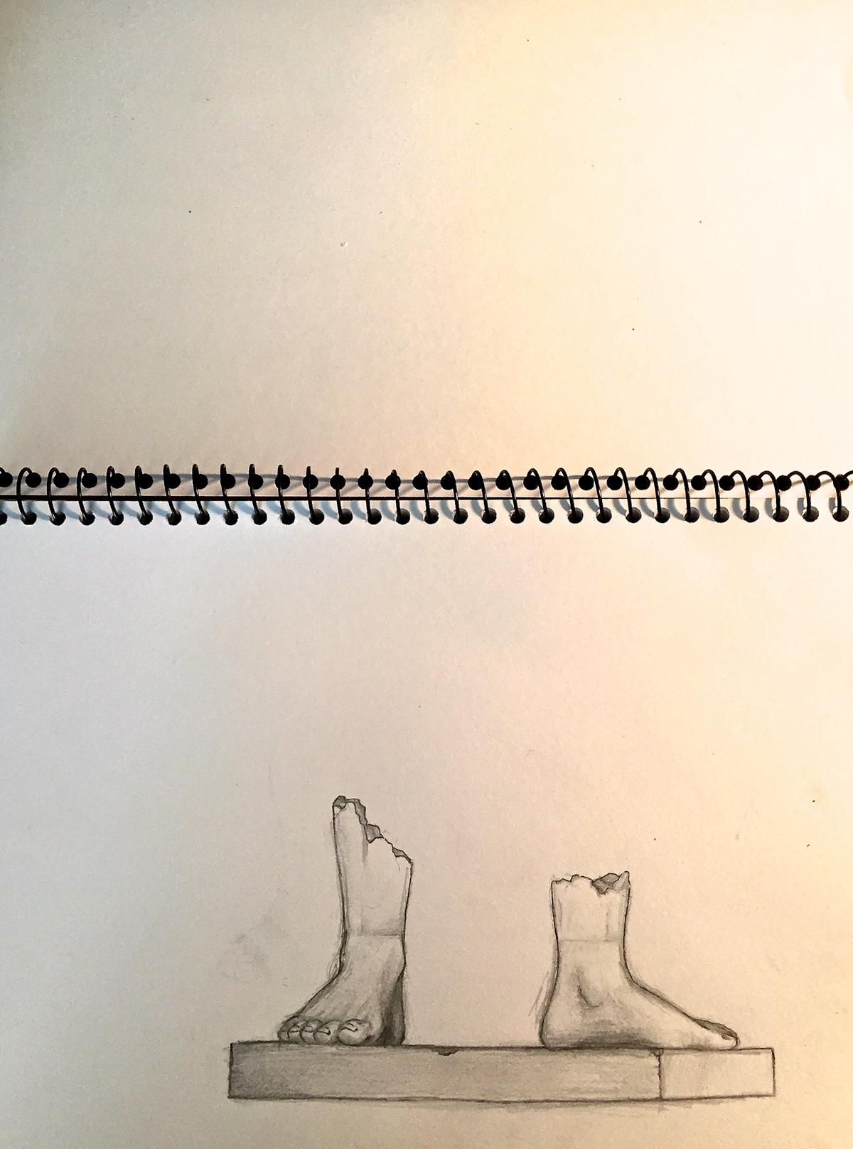
reasoning: For the first image of this body of work, I decided to draw inspiration from the Percy Bysshe Shelley poem Ozymandias. The poem, which tells of the sheer deconstructive power of time; tells of a King of old; Ozymandias, who's entire legacy, was reduced to nothing more than the ruins of a statue; “Two vast and trunkless legs of stone" which "Stand in the desert".
inspiration: The primary inspiration for this piece was the poem Ozymandias, however what really drove me to put pencil to paper was a book I found of daVinci's studies in pen, and the old-timely aesthetic these illustrations had to them- i figured this would best fit in with the theme of "With Time", and best capture the spirit of the poem.
inspiration: The primary inspiration for this piece was the poem Ozymandias, however what really drove me to put pencil to paper was a book I found of daVinci's studies in pen, and the old-timely aesthetic these illustrations had to them- i figured this would best fit in with the theme of "With Time", and best capture the spirit of the poem.
technique: The technique was an attempt to replicate the academic illustration style of artists such as daVinci and Raphael; such technique has always interested, and illuded me, as I felt i've never really been able to successfully employ it.
process: The process was executed with 110 gsm paper, and a mechanical pencil, there is a slight change in the lighting of the image with the light from my desk lamp shining on the paper.
reflection: I think that the image was successful in it's desired effect, and the reflection of the poem, however I feel that it was still too similiar to my usual style. The image was enjoyable to make, and using a B and 2H in place of my usual 4H graphite, allowed me to experiment a bit more with more dramatic lighting.
IMAGE 2
...With Time
Powerline sketch - Original Image
(2H/B/2B/0.4mm Artline on 110gsm)

reasoning: Continuing with the theme of "with time" in the documentation illustration/pencil & ink stylistic requirement, I decided to do a perspective sketch of a power pole. Inspired during my train ride home from university, I drew an old, somewhat buckled power pole, that would've once, during it's life been a tree. I attempted to document the object as realistically as I could, use a single point perspective in order to assist me in doing so from memory. This particular image is relative to time, given the technological conotations associated with the power pole and electricity; contrasting with the birds perched on the cables, who, once upon a time could've rested in branches of the same tree.
inspiration: The inspiration for this piece was primarily the effects of time on the natural and man made environment. The works of brittish artist; Stephen Wiltshire were also inspirational to me for the overall theme/construction of this piece. Wiltshire possesses an eidetic memory, and is able to draw almost perfect recreations of buildings which he was seen before. I attempted to do this, despite my lack of an eidetic memory.
technique: Similiar to Wiltshire's pictures, I utilized a single point perspective in order to try and further my skills in this area, as it's always been sometime i've struggled within. The drawing takes on a somewhat cartoon aesthetic, which I believe is due to my brain attempting to fill in the "gaps" in the mental image; something which Wiltshire's works are void of.
process: The drawing was carried out on 110 gsm art paper, with a 2B/B/2H mechancial pencil, and a .5 mm artline felt tip. This combination of ink/graphite mediums was done for the purpose of experimentation, and shading.
reflection: I feel as if this image was more so of a learning curve than the previous image. I forced myself out of my comfort zone, and into the realm of memory and perspective drawing. The image was enjoyable to create, and I also thought the thought process, theme and subject matter of the image was quite thought provoking.
IMAGE 3
...With Time
Botanicals- Original Image
(0.4mm Artline on 110gsm)
(0.4mm Artline on 110gsm)

reasoning: I was sitting out on the patio after university today, out in the sun. The weather was considerably cold, given the strong gust we had blowing through the backyard- and the majority of dad’s plants had been killed by frost. However, there was one small plant, sheltered from the wind that managed to survive and was now flowering, despite the cold weather, and it got me thinking as to how time is really a destructive process, whilst also being the a fundamental require for creation and the existence of life. I think decided to do my best to try and draw the plant in an anatomical/botanical style, almost in recognition of the plants strength; I felt like Darwin when he was studying the animals in the Galapagos.
inspiration: The primary inspiration for the creation of this image were Charles Darwins botanical sketches, and the scientific/classical aesthetic they carry with them.
technique: The technique was another attempt at scientific/methodical drawing, attempting to accurately capture the details of the plant. The line shading done on this image was an attempt to invoke a sense of traditional, and old worldly objects; Once again, inspired by Charles Darwin’s sketches.
process: The drawing was carried out on 110 gsm art paper, with a 0.4mm ratline pen; the image was drawn from life, with the exception of the roots- the roots were improvised as I wasn’t willing to kill the plant that had survived so much.
reflection:I feel as if the drawing was somewhat unfitting, and unflattering of the plant, given it was the only plant out of a great many that hadn’t been damaged by frost. I feel that such a style does not effectively communicate the effects, neither positive or negative, of time.
IMAGE 4
...With Time
Entropy- Original Image
(0.4mm Artline on 110gsm)
(0.4mm Artline on 110gsm)

reasoning: This image was also created in the aesthetic of scientific illustration/ and was primarily inspired by the thermodynamic principle of entropy. The idea that with time, eventually everything will fall apart just struct me as something entirely tragic- and almost shakespearean in nature. The principle of entropy is of considerable relevance to me at this point of my life, as I am beginning to see friendship groups from school, begin to dissemble as everyone goes their separate ways as time goes on. This highlights again, the very destructive nature of time.
inspiration: The drawing itself was mainly inspired by an old physics textbook I had in my bookshelf, and entropy within itself.
technique: This drawing utilises simplistic shapes and line shading in an attempt to invoke an archaic, traditionalist scientific aesthetic. The aesthetic was employed in order to draw the viewers attention to the subject of time, and have this as an immediate focus for the viewer.
process: The drawing was carried out on 110 gsm art paper, with a 0.4mm artline pen; and was ultimately drawn in several versions; each changing some particular element from the initial textbook image; until the diagram became something unto itself, and was not immediately recognisable as a particle map.
reflection: I believe that the spacing of the scattered particles is successful in the evocation of a sense of panic/worry for the viewer; given the composition uses a contrasting neat, geometrical particle arrangement below to create a sense of juxtaposition. The image was successful in it’s desire intention, however I still feel as if the image does not fully capture the magnitude of the ‘with time' theme.
IMAGE 5
...With Time
Meditations of Old Train Lady - Original Image
(B Pencil on 110gsm)
(B Pencil on 110gsm)

reasoning: I was sitting on the train home from university one day, when I looked up and saw an old lady, glaring out the window- i’m unsure if she was actually glaring, or just staring out under a wrinkled brow. Nonetheless, the book i was reading at the time was Marcus Aurelius’ “Meditations” and there was a quote which read "in an old woman and an old man he will be able to see a certain maturity and comeliness” and it was that I saw. I saw the effects of time, not only as a destructive force, but as something that in time, warranted a certain sense of beauty.
inspiration: The primary inspiration for this image were the sketches of a friend Thien Pham, who typically draws people in lectures, and on the train. I didn’t try to emulate his aesthetic however given I felt this would’ve been too much of a distraction when drawing from life.
technique: The technique was done in a truly native manner; meaning I was not trying to emulate any aesthetic or style, I was simply attempting to capture, as quickly as possible, the essence of the moment, I utilised heavy shading on the front of the face to draw attention to the wrinkles of the lady.
process: The picture was drawn in an augmented Loomis facial drawing technique, which was adapted in order to quickly capture the lady; the picture was drawn from life.
reflection: I feel as if this particular image had ultimately changed my perspective on the theme of time; and is successful in the evocation of a multitude of responses from viewers.
IMAGE 6
...With Time
Vertere (To Turn) - Original Image
(Olympus OMd em-5/M.Zuiko 12-50mm )
(Olympus OMd em-5/M.Zuiko 12-50mm )
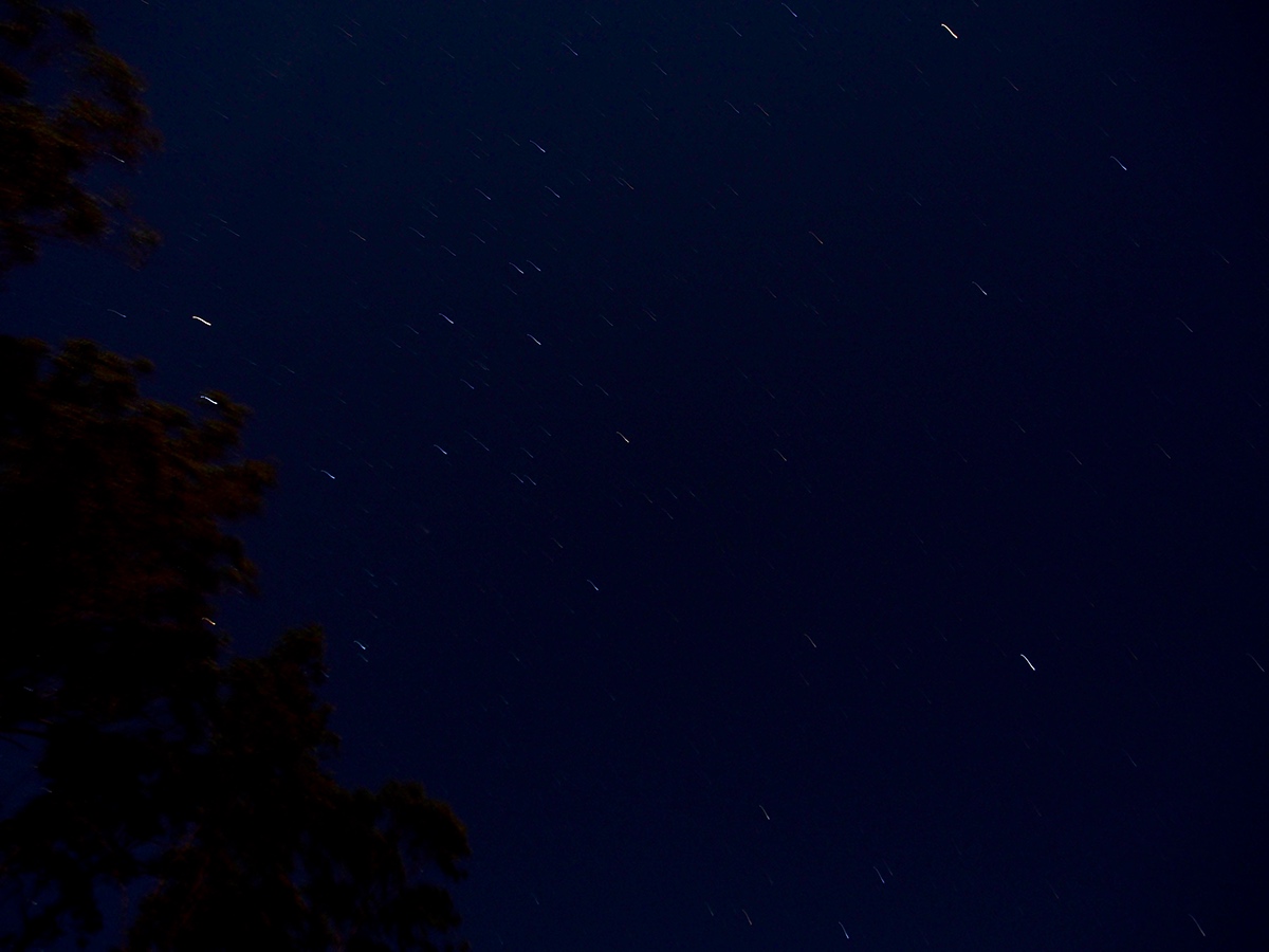
reasoning: After having changed my positioning on the effects of time; I decided to try and capture something which derived it’s beauty from time. I was inspired by several start trail pictures and attempted to recreate such images by experimenting with my father’s camera, which I snuck in to the cold outdoors. The name is derived from the swirling/churning illusion provided by the stars
inspiration: The inspiration for this image was ultimately derived from photographer Richard Gottardo, a person whom I have been attempted to emulate through photography for a great while now.
technique: The technique for this image involved leaving the shutter of the camera open for approximately 30 seconds in order to capture the blaze of light emitted by stars as they move across the sky. Because of the timely nature of these images, I wasn’t able to utilise any image construction principles; this was also due to my lack of equipment, low visibility and no-pre-existing success in such images.
process: The image was done on a 30 second exposure timer, with an ISO of approximately 600. I believe I may have also gotten a cold during the process of this image’s creation.
reflection: In retrospect, the image is somewhat underwhelming, the low ISO results in very little grain, which was a desired effect, however at the cost of lighting, and natural exposure. The image is not aesthetically pleasing because of this; and it’s lack of image construction principles (ie. rule of thirds), however I did feel the content matter was relevant and evoked sensations of wonder in the viewers. Ultimately I wish to revisit such an image later on this body of work.
IMAGE 7
...With Time
...With Time
Arachnasolar - Original Image
(Olympus OMd em-5/M.Zuiko 12-50mm (Macro Setting))

reasoning: After doing further investigation into the scientific attributes of time I stumbled upon a component of string theory which states that time and space are ultimately married in their existence; and one may not existence without the presence of another. This got me thinking about the relevance of time to the planet, and just to mass in general. It was then I found a subject of M theory which ultimately suggests that there are infinitely small universes contained with subatomic particles, and there is potential that we could be one of the universes. It was around this time I was walking in the garden and I saw a small spiders web, with pieces of soil and fertiliser caught in it. I decided that this image was a perfect representation of what I had just discovered, given the pieces of soil actually resembled small planets, the spider in the centre, the solar body, and the rings of the web; the orbital path of the “planets"
inspiration: Ultimately the image was not inspired by any other artists; however was my attempt to try and create a surrealistic photograph, that best captured the concept I was attempting to interpret.
technique: The image was created with a focus on the rule of third, with the horizontal components of the image (the main focus/strong horizontal lines) aligning with the middle vertical third. The image was also cropped in respects to the fibonacci spiral; whilst this compositional technique was less strict in it’s application, the secondary focus of the image, and it’s illusive swirl, roughly coincides with the spiral.
process: The image was shot without a tripod, and utilises a macro setting on a 14-150mm lens to focus and create a tilt shift focus on the web.
reflection: I feel as it the image was successful in the application of image construction principles; and is aesthetically pleasing. I do feel as if the complex subject matter may be lost, however viewers of the image, ultimately found the image enchanting, and somewhat alluring.
IMAGE 8
...With Time
Apollo's Throne - Original Image
(Olympus OMd em-5/M.Zuiko 14-150mm)

reasoning: Apollos throne is an attempt to further my views of time as a creative force. The image captures a sunrise (or what can be viewed as a sunset) over the waters of Nudgee beach. A sunset is impossible without the passage of time and space, and ultimately sees the change of hours as it continues it’s blaze across the sky.
inspiration: The image was primarily inspired by my continued development of my own internal concepts regarding the theme of the image; however the image’s construction, composition and edited colour configuration was inspired by the photographer Chris Kerksieck; as he employs similar elements in several of his photographs.
technique: The image utilises focus as an aesthetic tool; using it to blur the bottom third of the image (as the image employs rule of thirds), immediately drawing the viewers attention to the middle third; where the image’s subject matter ultimately resides.
process: The image was taken using automatic shutter and exposure settings; as the camera which I was utilising had HDR-like qualities in the automatic mode; and utilises composite exposure to ensure the image is balanced. Manual focus was employed for this particular image however, in order to blur the bottom of the image.
reflection: I feel as the if the image successfully utilises the rule of thirds, and colour correction in order to invoke a sense of scale; the utilisation of manual focus to blur the lower parts of the image were also successful in such an effect; and the image ultimately displays the beauty of the continuation of time; whilst not depriving it of it’s sheer force and power.
IMAGE 9
...With Time
...With Time
Fowler's Electrical Engineer's Pocket Book 1955 - Original Image
(Olympus OMd em-5/M.Zuiko 14-150mm (Macro Setting))

reasoning: After the Apollo’s throne image; I decide I wanted to return my focus onto the fickle nature of time; and show how ultimately time’s destructive qualities are also some of it’s most endearing. I decided to return to aforementioned quote from Marcus Aurelius’ meditations, and try to show the beauty of the destruction that time has. I’ve had this book sitting on top of my book shelf for a considerable period of time, and it’s always interested me. The book is obvious derelict, and no longer functions as per it’s original purpose, however it’s decomposition has lead the book to take on a beauty of it’s own. The decomposing material which lines the books outside has split, frayed and curled at the ends, and now bears resemblance to felt; even the dust which lays at the foot of the book takes on an aesthetic quality of sand; and it was for this reason I decided to create this image.
inspiration: The works of Kevin Bauman were ultimately the primary influence in the creation of this image. Bauman’s works showcase the derelict beauty of ruined and abandoned homes and buildings; something which I believe showcases the multi-faceted nature of time; and so I decided to take a similar approach to my subject matter.
technique: I utilised neo-traditional image construction for this image, choosing to orient the key elements around the centre of the page;in order to try and break out of the rule of thirds I had been employing in the majority of my previous works.
process: The process for this image arose purely out of utility, rather than the emulation of a certain style or aesthetic. Given the books small nature, I felt I had to utilise the macro setting on my camera’s lens in order to capture the sheer amount of, otherwise unappreciated, detail that came with the object
reflection: I feel as if the image ultimately is unbalanced due to the off centred image construction. The macro lens I found to be very successful in the capture of the amount of detail I required however. I also think that the colour correction applied to this image, that brings out the image’s warmer colours, assists the construction of the images meaning.
IMAGE 10
...With Time
...With Time
Mists of Time- Original Image
(iPhone 6 Camera (HDR mode)
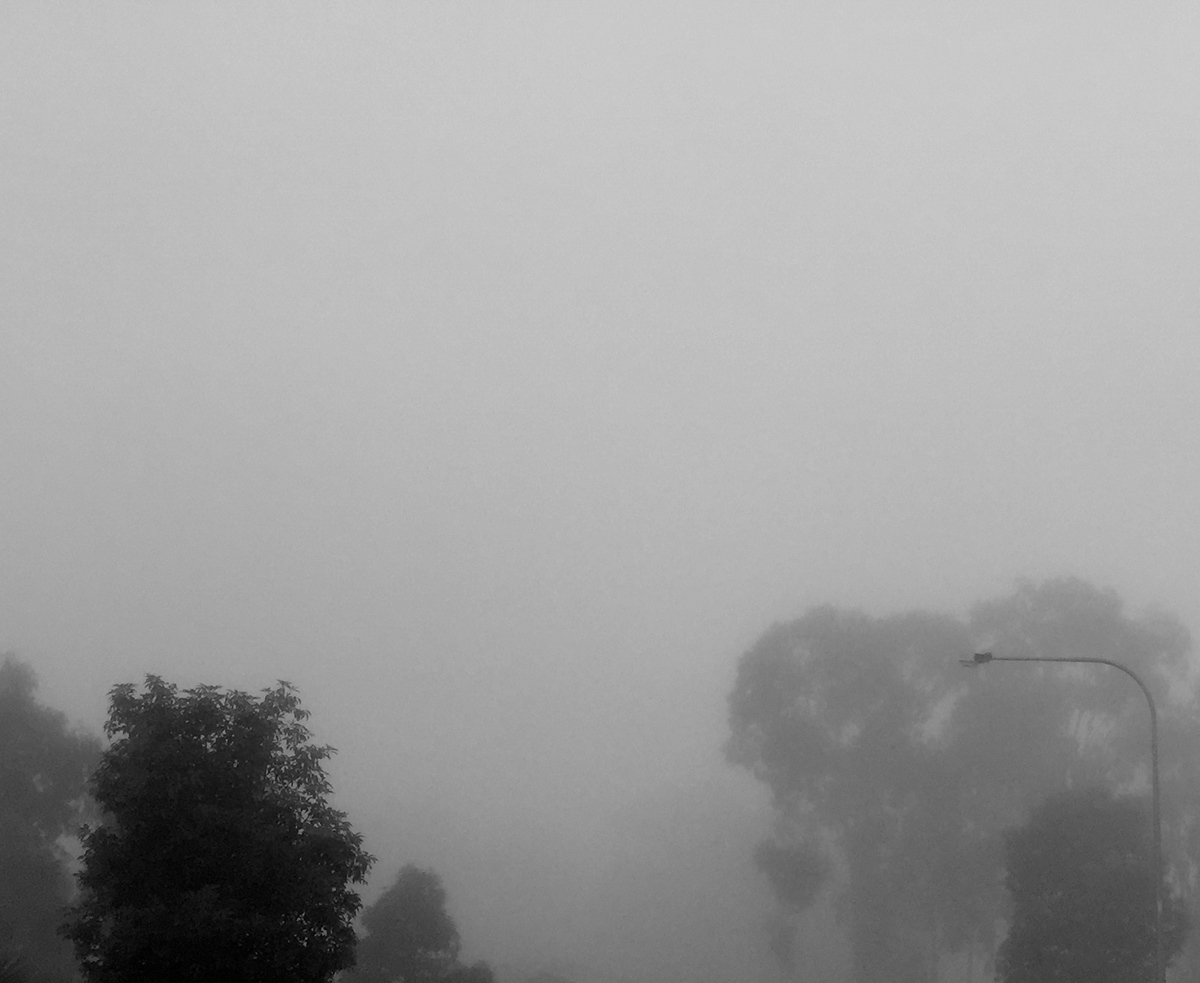
reasoning: This image was ultimately created in order to show the all consuming nature of time. After having finished Marcus Aurelius’ meditations I began to delve further into stoicism and started reading the Enchiridion of Epictetus; which has a passage that basically reads “everything dies/is consumed by time”. It was for this reason, that I decided to get up early one foggy morning to photograph the eery mist that had settled over the corridor of trees that girdle my street. The image is meant to convey the uncertainty of the future, and the irrelevance of the past, and how with time, comes the unknown, and the departure of the known. The image, like so many others in this body of work is a double entendre; as the viewer is uncertain as to whether they’re leaving the fog or going into it; and this is the images intended purpose.
inspiration: The grainy/black and white aesthetic of the image is inspired by some old photo’s my father took when he was growing up on Norfolk Island. I find there to be something quite mysterious and alluring about the photos; and powerfully suggestive of ideas of time; past, present and future. The overall composition and subject matter was also influenced by the works of Chris Kirksieck.
technique: After my previous image, I decide to return to the safer rule of thirds approach, choosing the fill the bottom left and right 9ths of the image with the silhouettes/figures of the tree; creating and ultimately juxtaposing the eery opens of the mist/morning air.
process: The image was taken on my iPhone as the batteries on the camera I normally use were flat; and the mist was lifting fast. I decided to use the High Dynamic Range in order to best capture the natural appearance of the sceptical to the human eye. From there, I then edited the image in photoshop in an attempt to recreate the black and white/grainy effect that my father’s old camera produced.
reflection: I believe the image worked in it’s conveyance of the images created meaning. I believe that the photo was fun to take, but was ultimately quite difficult at the same time; given the reliance of such meteorological occurrences (like mist in Australia) on time and opportunity.
IMAGE 11
...With Time
Story of a Powerpole- Original Image
(0.4mm Artline on 110gsm)

reasoning: The theme for this weeks body of work was based on the comic strips, and the use of images to tell stories; so ultimately i decided to flesh out and further develop the concept and story of an earlier image; the power pole. I feel as if by reverting back to an earlier image; the body of work for this unit develops an overall representation of time. I attempted to reduce the image to it’s most fundamental and basic line and form in order to simplify the interpretation, as the use of small multiples, can sometimes prove to be confusing if viewers are distracted by unnecessary details. The image itself is meant to further the development of the concept of time as a multi-faceted force, one which changes everything; sometimes for the better, and sometimes for the worst. In the case of the image, the story of a power pole tells of how the death of the tree ultimately results in the betterment of life for the birds that reside in it’s final power pole form.
inspiration: Inspiration for this image ultimately comes from previous experiences in information design, and newspaper comics. Working with inspiration design for DXB102 last semester, ultimately taught me how to convey information, and tell a story in the most efficient way, and I thought that the employment of some of these practices would assist with the desired outcome. The simplified, rounded, monochromatic aesthetic of the image was for the most part inspired by comics in the morning paper, such as Dilbert and the far side.
technique: The image was created in respects to Tufte’s theory of information design; specifically small multiples. The use of the gestalt theory of similarity is also used to assist the small multiples in the way of story telling. The ground, which is represented by a simple horizontal line throughout the many frames of the image, assists in distinguishing each frames relevance to each other.
process: The image was completed with 0.4mm artline felt tip marker, on 110gsm paper. The use of these materials were done in an attempt to emulate the aesthetic of the aforementioned Gilbert and The far side comic strips.
reflection: I feel as if, while the image was successful in the telling of a story, using “comic book-y” elements is something I have never enjoyed doing. Being an avant reader of Marvel comics from age 11, I have grown tired and over exposed to traditional/modern modes of story telling as employed in comic books. I always feel the use of small multiples/cells/multiple frames for images that aren’t information design; are insulting to the reader, and ultimately degrade the visual integrity of an artwork/image.
IMAGE 12
...With Time
Bees in Amber - Original Image
(iPhone 6 Camera (HDR mode)

reasoning: Bees in Amber was primarily an attempt to distance myself from the use of cells and/or small multiples in order to tell a story. The image’s subject matter focuses on the endearing qualities of time, and how a person can ultimately defy an otherwise all encompassing and omnipotent power. I found a copy of a poetry anthology called “Bees in Amber” in archives bookstore in the city, and opened the book out of curiosity and found this written on the inside of the cover, and figured this fit in perfectly with the subject matter of the unit.
inspiration: The inspiration behind this image was ultimately my own personal progress, and my attempt to further myself from traditional modes of story telling. The colours used in the image were also inspired by old coloured film photographs.
technique: The image is relatively simple in it’s construction as the text featured in the image carries the majority of the images meaning. The image was cropped in respects to the rule of thirds with the top third of the image out of focus, and featuring heavy, dark colours. This was done to try and balance the whites, and lighter colours of the page. The colours of the image were also edited in order to invoke a sense of nostalgia; with warmer colours and strong yellows and oranges tint the image.
process: The setting, scene and subject matter for the photograph were very spontaneous in their nature- and since I didn’t have enough money to purchase the book for the sake of a single photograph, so I was forced to photograph the image with my phone.
reflection: I feel as if the image was not a successful departure from the information design principles I’d previously employed in the story of a power pole, and therefore did not really assist the the development of images as story telling. The image, whilst of interesting subject matter and context, was ultimately trivial and did not achieve my desired development of skill/image product.
IMAGE 13
...With Time
...With Time
Vertere (To Turn) ii - Original Image
(Olympus OMd em-5/M.Zuiko 12-50mm (Long Exposure Settings)
(Olympus OMd em-5/M.Zuiko 12-50mm (Long Exposure Settings)

reasoning: After having revisited the story of a power line 2 days before, I thought I would revisit another image I deemed to be of great potential for this unit, and for the demonstration of technical ability. MY attempt at astral photography, and star trails earlier in this body of work was ultimately unsuccessful in its desired effect, and did not develop in such a way that I was pleased with- so when looking at story telling/comic book images, I decided that I should reattempt astral photography, in an attempt to further depart from information communication image principles, and move into a raw and abstract depiction, of the story of the stars.
inspiration: My primary inspiration for this image was to reattempt astral photography, in an attempt to successfully capture images similar to Richard Gottardo. However the secondary inspirations for this image were another passage from Marcus Aurelius (which reads “Dwell on the beauty of life, see the stars and see yourself running with them), and the story of Andromeda, and other ancient legends.
technique: Ultimately, the epic and very fiddly nature of star trails made it very difficult to apply any sort of design elements to the work given my lack of a tripod (meaning I had to lay the camera, viewfinder on the ground, and hope for the best). However I decided to rotate, and crop the image in such a way as to appeal to the Gütenberg pattern, so the movement of the image is very natural and appealing to the viewers (from a western audience at least).
process: I returned to the large and desolate clearing near my house last cold and clear night, and after having read up more on star trail photography photographed multiple slow shutter speed/long exposure images (~15 seconds) of the stars. There were approximately 20 photos used for this image, and many more taken either side of the few used. These images were then loaded into photoshop, and stack in chronological order. The blend mode for the 19 top images were set to lighten; which saw only the trails of the stars blended on top of the initial image. A slight fisheye effect was then applied to the already bowed image in order to accentuate the curvature of the star trails, mainly for dramatic effect. Some slight colour modification was then done on this image in order to lighten the sky and colour the stars, to make vibrant an otherwise monochrome image.
reflection: I was happy with how this image developed and turned out. I believe my continued experimentation with long exposure astrophotography was successful in the sense that I have now generated a star trail image, and learnt and developed a new skill in my creative arsenal. I also believe that the image was successful in the demonstration of time, and also successfully told a story. While the image is mostly subjective, I believe most people are able to derive a sense of the continuation of time, and a narrative of sorts from the image.
IMAGE 14
...With Time
...With Time
Impressions of a window - Original Image
(iPhone 6 Camera)

reasoning: Impression of a window was somewhat of a response to Vertere ii, in the sense that I really began to challenge the subject matter, and exactly what a “story” is, and how it can be told through an image. I decided to utilise a window in my house which faces West by South, and as a result can get the most amazing sunsets of an afternoon. The window, being a sliding window has the potential to break up an image when slightly cracked open, and whilst this has previously been a hindrance in the capture of a decent sunset- served as an opportunity in this instance. I decided to open the window slightly in order to give the illusion of a comic book sort of framing. Doing this I believe I was able to represent how the continuation of time is ultimately a story, and how the viewer themselves are positioned in a comic, if they chose to view their life in such a way.
inspiration: The inspiration for the colours of this image ultimately came from Claude Monet’s Antibes in the morning. And while the image may not be of direct resemblance, I decided to accentuate the bright and typically “sunsetty” colours, in an effort to emulate the colour play of impressionist, and post impressionist artists. While this inspiration is of no direct relevance to the idea of time, impressionist colouring has always been something I have loved, and tried to channel in my own painting.
technique: The technique for this image was heavily based on the rule of thirds, with the bright colourful, contrastive strip of colour contrasting the darkened walls that surround the window. The image has also heavily utilised complimentary and connotative colouring in it’s composition.
process: Once more, the process was rather opportunistic, in the sense that the timely natures of sunsets are ultimately quite restrictive, however I had my iPhone on me, and I utilised the HDR composite exposure setting in order to take the best quality and most dynamic photo possible. I then imported this image, and dropped the contrast, boosted exposure and increased saturation, which resulted in a rather foggy looking, yet colourful image, which invoked a colour palette similar to that of a classic impressionist artist.
reflection: I was satisfied with how this image turned out. Whilst there is the possibility for me to’ve taken a better photo I fundamentally believe I was able to adhere to my desires for this image as best I could. I believe I am starting to become more metaphysical with my thought process, and begin thinking of the weekly concept (image as story telling) and the macro-concept (with time) in a more lateral fashion.
IMAGE 15
...With Time
...With Time
Walk of Man & his Dog - Original Image
(Olympus OMd em-5/M.Zuiko 12-50mm (Long Exposure Settings)

reasoning: Having seen the potential in yesterdays photograph, I once again decided to attempt to further develop my own concept of time and story telling. So once more with my father’s olympus omd in hand I walked out into the cold. However this time, with winter allowing for longer sunrises, I decided to drive to Nudgee beach in order to photograph a sunset as I’d heard it’s a popular destination for sightseers and the reflection of the sunrise in the water was something to behold. I decided to construct an image which still told a story, and once again, told of the multifaceted nature of time. The image I constructed showed the impact of man on their natural natural environment. It was entirely dependant on chance that there would be some people walking the beach at this time of day, however I was lucky enough for there to be. The first “cell” of the image shows an earlier time of day, and the raw/untouched beauty of the landscape; the second, larger cell shows the man, walking with dog, and features the manmade port of Brisbane in the background. There is subtle continuations in the image such as the horizon and an inverse of one of the streams in the sand bank, however almost everything else is different, showing the effect that man has had on earth, and how ultimately there is little that remains the same.
inspiration: The inspiration for this image came from my own personal development of the concepts of time and story telling; however, also took influence from some works of Chris Kirksieck, and Trevor Loren Olsen. The image itself was also a response to the anecdote, which tells of the history of earth as a day, and the industrial age only beginning two minutes ago; and since then more than 50% of the trees have been felled.
technique: Ultimately the technique used for the image construction was once again the rule of thirds. Having never really ventured too far from painting, sketching and ink drawing photography is still relatively new to me and I am attempting to learn and construct the best images possible.
process: One photo was taken with the camera on automatic focal and shutter settings, and then another photo was taken a few minutes later, however with increased ISO in order to better capture the otherwise darkened forefront of the image.
The images were then added in photoshop and colours were adjusted in order to produce a contrastive, yet complimentary triadic orange/pink/blue and key colour schema. The image was then divided into thirds, and the first third of the image was pasted from the earlier image, in order to show the extended effects of man.
reflection: I believe that my continued development of photographic skills, and conceptualisation of the themes and task requirements at hand is continue to develop and progress. As before mentioned I am still rather unfamiliar with photography, but have ultimately continued my development of such skills throughout the course of this body of work. The image was a whole lot of fun to make, despite the cold, and help me to continue to understand the nature of time, and exactly what it means to tell a story.
IMAGE 16
...With Time
...With Time
Christ Conscious - Original Image
(0.4mm Artline Marker/ Black Posca Pens)
(0.4mm Artline Marker/ Black Posca Pens)
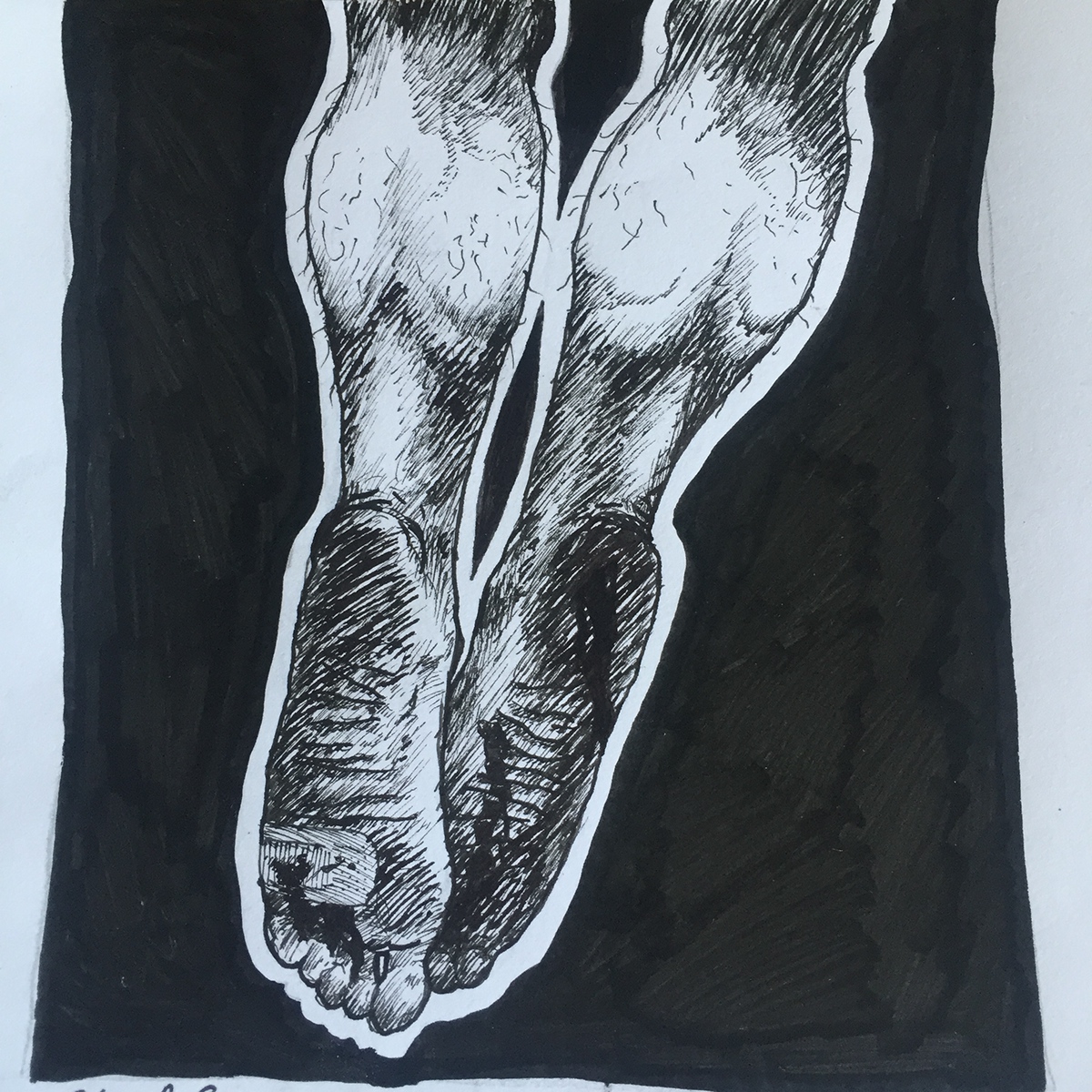
reasoning: Christ Conscious was ultimately something I had wanted to experiment ever since beginning the subject of time, however I only had really developed the concept for the image after finishing up the illustration/document drawing technique part of the unit, so I decided to go back into it after finishing the drawings for week 3. The image was ultimately inspired by a Joey Bada$$ song of the same name, as I started to think what would Jesus actually be like in todays society; if time’s had changed, what would his story be like? And so I drew the two bloodied feet that would’ve otherwise been hanging on the crucifix, and decided to draw a bandaid on his left foot. I then blacked out the area surrounding the feet, in order to focus all the attention on the actual feet themselves, and give them a sort of aura. The main idea behind this image was to utilise well known, powerful, connotative images together in order to tell a composite/new story.
inspiration: The aesthetic of image was inspired by old, grainy, black and white films/comic books, specifically the book Noir: A Collection of Crime Comics. Of the artists who illustrated this book, David Lapham and Jeff Lemire’s illustrations were inarguably my favourite, with their usage of strong, heavy blacks and shadow, to render their illustrations with a truly dramatic feel.
technique: This image utilises contrast, with the heavy black of the background really bringing attention, and asserting the dominance of the feet/legs as the primary feature of the artwork. I tried to use a somewhat off centred composition to, in a way, parody traditional drawings of christ, which are typically very symmetrical/centre based.
process: With this image, I had to study the backs of my own legs/ feet by looking down/into a mirror. This was a very awkward study, but I then went over one of these images (done in pencil) first with 0.2mm artline market, and then bumped up to a 0.4mm, then completed the outline of the legs/feet with a Park frontier fountain pen, and then blacked out the back ground with a posca pen. The pencil which laid underneath the image was then erased.
reflection: I actually feel as if I’ve developed my own story telling ability throughout the past week, as I believe I’ve effectively communicated a story, using a single, very simple image. It was a lot of fun making this image, and I feel my development of the blackout in the background is actual quite effective, and I might try to employ this in future images. I also like the idea of developing a “one frame comic” of sorts.
IMAGE 17
...With Time
...With Time
Walk of Boy and Himself - Original Image
(Oils/Gesso on board)

reasoning: Granted my abundance of time due to my sickness, I decided to pick up the paint brush and start painting in an attempt to pass the time, and lift my own spirits. I planned a painting which continued off of my developments with the Christ Conscious theme and principle. I tried to see, how much I could simplify an artwork before it became void of any sort of meaning. The artwork basically shows the continuation of man through time; it sort of brings together a multitude of elements my previous works throughout this body of work (mainly the man from Walk of Man & his Dog, the tree from Story of a Powerpole and the stars from vertere (to turn)). The image is ultimately so simplistic in order to draw your attention to the two primary elements on the board; the walking person, and the moon. Two things which are ultimately dependant and change with time. The footsteps behind the man are meant to represent the past, and it’s really meant to assert the direction of travel, into the ground before him, and off into the unknown; the image is ultimately another 1 cell comic.
inspiration: The inspiration from this image comes primarily from my own personal development throughout the course of the past 3 weeks.
technique: This painting was constructed utilising complimentary colours, with unarguably the strongest and most notable elements of the painting being the burnt orange ground, and the peacock and cerulean blue sky; these being complimentary colours. The painting also utilises the rule of thirds, with the ground/trees making up one horizontal third, a middle, relatively bland middle horizontal third, and the clouds/moon breaking up to make the top horizontal third. The two most ‘eye-catching’ figures on the page, the moon and the man are also balanced in regards to their relations to their respective corners of the page.
process: The board was primed a few days prior the commencement of this painting, using three layers of Gesso primer. The painting was completed over about 5 hours in a single day. A slow dry medium, consisting of equal parts linseed oil and mineral turpentine was applied to all the base layers of paint to allow for an alla-prima painting effect, or better known as wet-on-wet.
reflection: I thought that this painting was an appropriate crescendo and end to the “with time” theme, as I feel I have ultimately developed an image which covers and deals with the multifaceted nature of time. I have also developed a series of technically and meta-level thinking skills across the past few weeks, all of which have been seen, or who’s influence can be observed in this painting. I was incredibly proud of this image, considering its outside of my traditional painting territory of classical/life like paintings, and delves further into simplification and colourisation than I ever have before.
IMAGE 18
...Home
...Home
Unaware self-portrait - Original Image
(Olympus OMd em-5/M.Zuiko 14-150mm)

reasoning: Given this weeks theme was portraiture, and in relationship to home, I decided that I’d try and take self portrait that shows me in my natural environment, however, but their very nature self portraits are posed and therefore lack the ability to sometimes capture the true essence of a person. In order counter this, what I ended up doing was during my band’s rehearsal at my house, I decided to set up a camera that was focused on me, and continuously capturing me, in my natural environment; my home.
inspiration: The inspiration for this aesthetic of this image once again came from the old grainy black and white photographs that my father took when he was younger. The concept for the photograph actually came from my mother, who was telling me that when we were little kids we were always too shy to pose for photos, and so what she used to do, was, with a telescopic lens, zoom in on us playing from afar in order to capture natural/non-composed photos. The idea to use a silhouetted figure, with a light background was actually inspired by a portrait of Benjamin Disraeli, that showed the politician as a an and some what humbled man. Whilst the portrait in itself is not actually silhouetted in anyway, after considerable thought I realised that silhouetting is probably the most humbling way to show a self portrait- as it avoids any over, or under flattery.
technique: Once more I attempted to crop the photo in such a way as to comply with the rule of thirds; I also set the photo up in order to utilise the strong lighting coming in from the back in order to capture the silhouette- and use the large amount of light as means of creating contrast, and bring a sort of balance to the image.
process: The photograph was taken using the Olympus om-d’s automatic setting in order to allow the camera to best adjust to the lighting, in case of any one else coming into the frame, which would throw off the image. The camera was then set up with a 15 second delay, and the camera button fastened down with a piece of tape, so to capture multiple images, and allow me to forget about the image, and be portrayed natural, in a homely environment.
reflection: I believe that this image was a successful piece of photography; it appears to be lacking in any sort of distinctive or emotive character. I feel as if the image could ultimately be of that of anyone so therefore it fails as a successful portrait. I believe that a portrait should ultimately be about encapsulating the essence of a person and this is something this image has failed to do.
IMAGE 19
...Home
...Home
Shedded Skin - Original Image
(Olympus OMd em-5/M.Zuiko 14-150mm )

reasoning: Shedded skin was an attempt to try and question the fundamental definition of a portrait. In todays society, so much of what we do is based on what we were, what we consume, what brand phone we own, etc. And I then realised, for a lot of people, their clothing ultimately serves as their shell, and in a way, these people are not so dissimilar to hermit crabs, in the sense that many people pin their identity onto their clothing, and what they were is what they see themselves as.
inspiration: Strangely enough I didn’t actually take any sort of inspiration for this artwork, it was just a thought I had on the train one afternoon. The image itself was mainly inspired by installation artworks that i’ve seen at the GOMA in Brisbane.
technique: The technique for this image was quite restricted in the sense that much of the equipment required to photograph, or properly arrange such an image was unavailable. The image is quite simple in it’s intended construction as a result of this; with the main weight and centre of gravity of the figure are situation on the left hand vertical third ruling.
process: I laid the clothing out on the floor, and arranged it in a particular way as to make out as if the clothing we on the body of an invisible person. I then had to stand on top of a chair in order to try to photograph the arrangement.
reflection: Ultimately I feel as the concept for this image had a great deal of potential however the execution was limited by restrictions in equipment. Ultimately if i was to try such an image again I believe I would have to use a white background as the wooden flooring subtracts quite significantly from the image itself, and I believe that I would need to be able to stand further back from the arrangement, so I could zoom in and ‘flatten’ the image out, so it appears as an actual arrangement, not just a mere photograph of clothing on the floor.
IMAGE 20
...Home
A home built from Paper - Original Image
(Olympus OMd em-5/M.Zuiko 14-150mm/ Moleskine A5 journal/Ballpoint Pen)
(Olympus OMd em-5/M.Zuiko 14-150mm/ Moleskine A5 journal/Ballpoint Pen)

reasoning: I decided to kind of take a step back from the Hermit crab ideal and instead start to look at instances where “home” is, or has happened. Ironically enough I wrote about this in my journal, something which I’ve had and constantly updated for over a year now, and was something that I had when I was travelling overseas; and looking back in my writings, this journal was ultimately a place of solace for me when travelling; a home built from ink & paper. I felt that such a thing is ultimately an extension of my being, and could be viewed as a portrait, through the lens of abstract thought.
inspiration: The photograph of my journal was ultimately inspired by the works of another friend and artist; Penelope Comino. Comino creates photographs that utilise quite flattening camera angles, in order to give a somewhat perspective less, birds eye view to her photographs. Neat, geometrical arrangement within these images and the somewhat reduced contrast (used to create the “washed out look”) were all taken as inspiration for this image.
technique: A home built from paper, whilst appearing minimalistic in its construction is considerably arranged and orchestrated as an image. The centrist alignment of the spine of the book was meant to allow for the book to be seen entirely. The selection of this particular passage from the journal, was done as the polaroid photograph on the right hand page is actually aligned with the golden spiral and ultimately assists in the balancing of the pages, given the text is considerably heavier on the left hand page.
process: Having not liked the effect given to the image by the wooden flooring in my house, I decided to place the journal in my bathtub this time, as the smooth, white backdrop would accentuate the colours and visual noise of the journal. The curvature of the bathtub also allowed for my reflection to be scattered, and not interfere with the image. I then stood on top of the bathtub, and zoomed in on the book, in order to give a flattened perspective to the image.
reflection: Ultimately I feel this image was successful, not only as an image (seeing as I employed the techniques I was attempting to in my previous photograph), but also as a portrait, as the unique nature of image, ultimately tells something of the journals owner, and captures the character, and unique attributes of the writer.
IMAGE 21
...Home
Odyssey - Original Image
(Adobe Illustrator)
(Adobe Illustrator)

reasoning: Odyssey was ultimately inspired by the epic poem of the same name. I was reading the homeric story, and reading about how Odysseus was ultimately just trying to make his way home after the trojan war. It was because of this, that I was inspired to try and draw a portrait in the ancient greek/mycenaean embellished style. The face itself was meant to be done in a similar style to the one typically shown on the shield face of Athena, hence the circular nature of the drawing. I honestly believe the image itself is not meant to be indicative of home, but instead remind you of what isn’t. Such faces scare me, and if I was odysseus and saw this monstrous looking portrait on my shield each day, I’d sail home just that little bit faster.
inspiration: As before mentioned this image was ultimately inspired by ancient greek and Mycenaean artworks; specifically the traditional shield faces.
technique: This image is largely classical in it’s construction, with the symmetry being easily the most noticeable and most effective of visual elements. The image however, also employs quite noticeable repetition and rhythm, with the lines around the mouth being of even spacing and the repeat patterning of the curls of the faces hair(allowing the viewer to experience the sensation of rhythm and repetition).
process: The image was carried out on adobe illustrator, as I felt this was the only program/medium that actually offered the means of creating such a stylised, and circular based image. I drew up an initial sketch, and then imported this into illustrator, where one half was then traced over, and this tracing was then flipped in order to create the symmetry these faces are famed for. the brush of the image was then textured for the sake of aesthetic interest; because, even though a line art approach would’ve been more faithful to the traditional faces, the flatness of the 2D illustrator format didn’t really convey the same level of aesthetic beauty as did the antiquated examples.
reflection: I feel as if the image departed the realm of portraiture and ultimately became an image and them unto itself. Whilst this was a bit of a stretch to call this image a self portrait (as the resemblance was lost somewhere between the stuck out tongue, and the exaggerated tusks) I feel that the image, as a design, and as a composition, was ultimately very successful.
IMAGE 22
...Home
The travelling Circus - Original Image
(Olympus OMd em-5/M.Zuiko 14-150mm)
(Olympus OMd em-5/M.Zuiko 14-150mm)

reasoning: As a continuation of sub theme of “instances of home” and times when home has “happened”, I decided to experiment with group portraiture of my group of friends. The companionship and mutual hardships we have embraced as a group have led to the formation of an institution between us, and is ultimately a home to me.
inspiration: Arching back to my mother’s aforementioned photography technique, where she would zoom in on us as kids from afar in order to capture us in our element, and our essential qualities. I decided to do something similar; and told my friends to just go about there business while I photographed them, in their element. And so they did.
technique: The image construction process for this particular image is one again reliant heavily on the rule of thirds, and also some gestalt principles. The man (Angelo) standing to the right hand side is ultimately a marker of the right hand side vertical third marker, and the two sitting on the curb on the left hand side are inline with the left hand third vertical marker. The street light blaring down above head was actually enhanced through editing in order to bring balance to the upper half of the image. The row of street lights to stems to the left of this marker, are also arranged in such a way to balance to lights of the houses to the right hand side. Together, these two bands of lights also form a central horizon marker.
process: The image was taken with the Olympus in multiple settings, and then overlaid and edited together, recreating a HDR effect, through the use of composite exposures through multiple layers. This range was then somewhat flattened, through the application of a black and white filter; and the adjustment of levels to compress the darker mid tones into blacks.
reflection: Ultimately as a portrait I feel that this image within itself is inarguably my most successful, given I have successfully captured the individual traits and characteristics of each member in such a way that doesn’t appear posed or fake (something I have been attempting to avoid since commencement of portraiture). I believe my technical abilities and compositional strengths have really been shown in this image as well.
IMAGE 23
...Home
Mother/Baby on Train - Original Image
(Ballpoint Pen/0.4mm Artline/Chisel tip felt marker)

reasoning: Mother/baby on train is basically a self descriptive artwork. I was sitting on the train home from uni, after having attended for the first time in a few weeks, as a result of being considerably ill, and I saw a woman, playing with her considerably young baby, who was sat in a pram next to her. This really got me thinking, particularly back to the idea that home is not really a place, but it’s more a structure; and in more instances than not is a mental/psychological structure. And in this moment I realised that for that child, it’s home would ultimately be the mother- wherever a baby goes, if it is not accompanied by it’s mother, it will often become distressed, or begin crying. I decided that i’d try to sketch this exact moment, this connection, this babies’ home.
inspiration: The inspiration for this image primarily came from my own work earlier in the unit. I was inspired by the aesthetic and the almost sacred look of “Christ Conscious”. While this drew inspiration from Noir comic books, I feel as if this image has taken on a new dimension when freed from the influence of external images; and is almost softer in it’s appearance.
technique: The image construction for this image was once again inspired by traditionalist, centrist oriented classical artworks. The image was constructed with the blacked out area around the hands in order to draw attention and give emphasis to the hands. However in this instance, instead of creating a geometrical shape with the blackout, i instead decided to try and create something more natural in it’s shape; in order to not have the shape there as a distraction for the viewer, and instead wholly utilise it as means for placing emphasis on the hands.
process: Once again, the spontaneous nature of this particular happening saw me doing a quick primary sketch in my visual journal, and then developing the image once I’d gotten home. I drew the primary sketch with a ballpoint pen; a medium I am beginning to find is more suitable for drawing figures quickly, as any decent ballpoint pen is quite dynamic in it’s application, and can be used to do rather quick and relatively transparent sketches. Once I’d gotten home, I then went around the outlines, and areas of heavy line value with a 0.4mm felt tip, improved the shadows with the ballpoint, and then went around the outline of the hand with the chisel tip felt marker to create the blackout.
reflection: In all honesty, I am more than satisfied with the quality and the progress represented in this image. I feel as if I am slowly starting to create my own unique aesthetic, something which I’ve had great difficulty with in the past. The sub-theme for this week was texture and I feel as if I really effectively employed texture, in conjunction with shadow in order to add the weight, and almost create a sculptural sensation for the hands. I also feel that the use of the blackout, outside of a geometric confinement helped to bring together the image, and add a more natural feel to the picture, and assisted in creating almost a religious feel too.
IMAGE 24
...Home
You'll find your own way home - Original Image
(Mutliple Logarithms mapped on polar setting on Grapher Program)

reasoning: For this week, the micro-theme was textures & patterns. Mathematically generated patterns are always something I’ve been interested in, given my keen interest in science, and my original intentions to study astronomy at university. For this piece I drew inspiration from the icelandic band, Sigur Rôs’ music video for their song Ekki Múkk. The music video is ultimately telling of the stories of life and death; and one of the characters in the video, a maternal snail, tells the protagonist “don’t worry, you’ll find your own way home” before disappearing, and leaving the protagonist’s fox to die. I saw this line as a metaphor for finding one’s own way through life, with death being the final home, and resting place of all life; after all it’s the only thing that unites us as human beings. What I decided to show in this image was the life span of a human being; with the sine waves coming from nothing, spreading out, and then returning to nothing. The colours of the lines were meant to show life’s colourful nature, and the circle placed in the middle of the image was meant to represent a persons scope, as in how much they really have a grasp off; showing that people worry about the future, while still mulling over the past.
inspiration: The inspiration for a mathematically generated image, came ultimately from the album cover for Joy Division’s 1979 LP, Unknown Pleasures. The album showed a graphical representation of a signal from a pulsar; with the design reaching something of an iconic status. I believe that the decision the invert the image, to make the axis white, and background black may’ve been influenced by this design.
technique: The visual construction for this image is wholly based on symmetry and central oriented design. The decision to use a multitude of colours ultimately stems from the graphing program’s line coloration preset, however the colours of the lines were left unchanged as this coloration aided in the communication of the image’s desired meaning. The symmetry and central orientation of the design is ultimately meant to communicate a sense of wholeness, and balance, something which I believe is also inherent to the image’s message.
process: I found the equation for this particular graph in an old science book. An old physics teacher, who knew of my involvement in art, showed me a polar logarithm, not dissimilar to the one shown , and had given me the equation if I wished to recreate it (y=Sinx+{-5…5}). I decided to map out this equation in the program grapher; and then exported the image into photoshop and then inverted the image and then exported into jpeg.
reflection: This image was actually quite exciting to make, I don’t get a chance to do anything with advanced mathematics in my degree, so it was nice to get back into it. In regards to the image itself, I feel that the piece is quite successful, and almost has a ying-yang aesthetic to it; and ultimately feels quite balanced. I do however, believe it’s just a little bit grim for the subject of home, however I believe it shows my continued development of the concept of home, and the abstraction of the concept, and lateral thinking.
IMAGE 25
...Home
Wind in my Sails - Original Image
(2H pencil/Parker Frontier Fountain Pen/Black Felt Tip marker)

easoning: Continuing with the theme of textures, I attempted to experiment a bit with the different textures allowed by shading, and a fountain pen. This image was actually drawn in my personal journal just as I was going to sleep one evening. The image is of the boat I sailed on, and captained while I was in Greece, the Salamis. I update this journal everyday(the one feature in an earlier entry) and was reflecting on how a year has past since I set out to go sailing/travelling. This got me thinking again about the concept of home, because I really did feel at home when I was out there by myself- however this is entirely contradictory to the common concept of home, and largely clashes with the development of my concept of home.
inspiration: The inspiration for this image’s aesthetic actually came from illustrations from the book ‘where the wild things are’. The illustrations of that book have always been of considerable influence to me growing up, with it being one of the first books that I actually remember reading, and the illustrations were absolutely captivating as a child; the textures are almost three dimensional thanks to Maurice Sandak’s usage of ink and shadow. This image was almost a tip of the hat to this book. I think the construction, and positioning of the boat of this boat was also derived from the book’s illustrations.
technique: The image was constructed around the rule of thirds, however because of the nature of the drawing, and the image’s boundaryless framing (see the employment of black out to bring attention to lighter textures), the rule of thirds was only applied in horizontal divisions, with the mast lining up with the left hand vertical third. The usage of line, and form on the boat (particularly the mast, the jib sheet and the main sail) in order to convey movement was also meticulously planned and experimented with.
process: A basic outline of this image was drawn with 2h pencil, very lightly, and then traced over with a parker frontier. This pencil was then erased, and a bared outline was left on the paper. I then cross-hatched as best I could to try and communicate texture of the boat, and the sails, and used a felt-tip market to darken the night sky.
reflection: I believe that the image was actually quite successful as a a texture play, at least in regards to the sales and the hull of the boat. I feel the water could’ve been executed a lot better, however I was quite tired, and really didn’t feel like staying up until midnight. The image construction principles, particularly that of line and form were, to me, quite successful as well, with the boat having a visible and, actually, quite powerful sensation of movement to it.
IMAGE 26
...Home
Atlantis - Original Image
(Olympus OMd em-5/M.Zuiko 14-150mm)
reasoning: Atlantis is a photograph taken once again at Nudgee beach. After seeing my photographs of Apollo’s throne, my friends decided to accompany me early this morning in order to try and get in on the sunrise action. I asked my friend Tyler to stand then, while I photographed him, to which he gladly obliged. Atlantis builds upon the development of theme of home, which was somewhat redefined after my previous image. It’s ultimately meant to represent how a lack of a home can even be a home it’s self- the title refers to the famed sunken city, which implies that the man in the centre is staring out, to what may’ve once been his homeland, showing that the concept of home is ever changing, and home will very rarely be in the same place for a person forever. The image also responds to the idea of texture/pattern in a way that I wanted to try and best represent a smooth, somewhat edgeless sensation/texture/pattern in the image; and did this, mainly through photo editing; in order to reduce noise/ smooth the silhouettes/etc of the images.
inspiration: The inspiration for this image ultimately came from the development of my own ideas, regarding the theme of home. This work draws inspirations from previous works of my own, and is ultimately a development of my own personal style of photography and/or composition.
technique: The composition of the image is based, once more, on the rule of thuds, with the subject being positioned in the central third of the image, with his natural points of attention (head and hands) being situated in the centre 9th. This is primarily to draw you into the image, and focus all your attention on this character. The horizon and different skies (separated by light) are also edited in such a way, that the colour ends/darkens around the mark of the top horizontal third. The colour pallet for this image was based on a split complementary colour configuration, with strong blues, yellows, and oranges immediately grabbing the attention of the viewer. The bright, yet thin band of colour, was an attempt to integrate the Loomis informal subdivision into my work.
process: The image was taken with the omd, and then imported, in RAW format into adobe photoshop. The omd- as a result of being a four thirds camera, often has difficulty with light capture, and so I had to boost the exposure and brightness of the image in photoshop, in order to fully capture the colours on the horizon. This however, resulted in a significant amount of noise and some slight image distortion. To counter this, I utilised the blur tool in areas where the noise was significant, and also applied a denoise setting. This was then carried out on several parts of the image, in order to smooth the images texture, for the desired effect.
reflection: The image itself was incredibly fun to make; although probably not good for my cold, I felt as if the finished product ultimately justifies the means. The image in terms of construction/technique was successful, and is very visually pleasing, and the process also allowed this to be experienced in full. I do however believe it’s somewhat of a far cry of any sort of overt relevance to pattern/texture, and in order to best communicate these concepts I need to head back to a more overt and obvious representation.
IMAGE 27
...Home
Bit Couch - Original Image
(Photoshop Generated Seemless Pattern)

reasoning: In response to the image which came before, Bit Couch was an attempt to rein back in the micro-theme for this week of pattern/texture. I decided to do my best to recreate, from memory. the print which was on an old couch that we had on my home back on Norfolk Island. I changed the colours however, as I can’t remember the colour of the print well enough to attempt to recreate it. I decided to use typically ‘lo-res’ or ‘8-bit’ colouring on this image in an attempt to try and invoke a sense of nostalgia, for my old home on Norfolk Island- when coupled with the the low resolution successfully invokes feelings of 90s/poor early 00’s kid nostalgia. I chose to create a seamless pattern, as I honestly felt that it showed the greatest use of skill, and was of the greatest technical challenge to me.
inspiration: The inspiration for this image actually came from the vapourwave music movement, specifically from the music videos of Jonatan Leandoer Håstad (known as Yung Lean). The aesthetic of pixelated 90s/00s graphics that Leandoer uses in his music videos, for me, invoke a sense of yearning for the past, and kind of made me think about being a child, sitting at home and playing video games. I decided to try and emulate this aesthetic, whilst adhering to the them of pattern.
technique: This patter was, for the most part, void of any sort of intended image construction principles. However, the placement of the image onto the white back ground, was done so in accordance with the Gütenberg model, which maps the movement of the human eye. The reading gravity of the image followed this diagram, with the strong, yet subtle, horizontal line streaking across from the top left to the bottom right of the pattern. Otherwise the use of triadic colour scheme was also employed in this image, with the blues, greens, and pinks in the image working together, and almost clashing, in the most confronting of ways.
process: Originally, I started off in a 100x100 image in adobe photoshop, I drew a basic flower/leaf arrangement, and then off set the pattern, which divided the pattern amongst the 4 corners of the image. The distance between these corners was then filled with the floral pattern; this image was then defined as a pattern, and then tiled over a 200x200 box. Due to this boxes low resolution, the pattern was then stretch, and pixelated using the mosaic filter on photoshop; the pixelation was done in order to add the low-res, pixel texture to assist with the construction of the image’s meaning. This image was then placed on an off-white/eggshell background, which I found assisted with the ‘nostalgic’ and old worldly aesthetic.
reflection: I feel as if this image was a fitting close to the week of pattern/texture, and i feel as if it shows a technical capacity to construct, and build coherent, seamless patterns. I feel as if this piece within itself was a learning curve though; as I had never used a majority of the techniques I employed in this image before, and found myself taking in a considerable amount of new information. The image’s relevance to “home” is somewhat dubious and uncertain upon initial glance, however I still feel the meaning is there.
IMAGE 28
...Home
Home in the Hills - Original Image
(Olympus OMd em-5/M.Zuiko 14-150mm)

reasoning: Having now moved into the final week of the unit, this week looks at the processes involved with macro and micro photography, and the ultimately challenge for me, was how I could associate something, such as this, with home. What I decided to do, was while listening to records, to try and photograph the grooves of the record, and capture the markings that give the disc it’s sound. While the macro lens was restricted by it’s capabilities, and not able to show the actually cuts in the record itself, it did capture the differences in lighting in the grooves. By photographing the grooves I’d hoped to capture the “home”, if you will, of the songs, that the records house, and show what makes the record sound the way it does- hopefully inspiring some self-analysis in the viewer. The image was also edited in such a way as to make the grooves of the vinyl, bear a streaky resemblance to the rings of saturn, playing with the perception of the photo as either micro, or macrophotography.
inspiration: The inspiration for this image was actually derived from looking at the grooves of a vinyl record under a microscope a few years back in science class. The idea to make the image appear similar to the rings of saturn comes from the employment of double entendre in the Irrítalo artwork, made by Sergio Andrés Barba Galván. While my image bears no resemblance to the aforementioned artwork, the employment of double entendre in my image(image can be seen as grooves of a record, and planetary rings) was influenced by this.
technique: An experimental augmented of the Gütenberg patter was used in this image; employed in conjunction with the gestalt principle of repetition and rhythm. I decided to used the direction of repetition of the grooves of the record as the line of movement in this image, as opposed to the actual line of the image, so that the viewer travels down the grooves of the record, following natural reading gravity, in little jumps, sort of like stars.
process: The process was relatively simple for this image, with my desk lamp providing the lighting, and just switching to the macro mode on my camera’s lens. In order to over come the lack of a tripod I simply rested the camera on a stack of books, that allowed for the steady pivot of the device. It was because of this that I was able to reduce the ISO and increase exposure time, in order to avoid grain in the image.
reflection: I believe that this image, whilst appearing relatively simplistic on the surface, is, in regards to design principles, one of my most experimental yet. The image was enjoyable to make, and I’m enjoying photographing in macro, however I want to try photographing actual macro environments, as I feel this would be more so challenging and could potentially fit in better with the overall theme.
IMAGE 29
...Home
Retreat Within Yourself - Original Image
(Olympus OMd em-5/M.Zuiko 14-150mm/Adobe Photoshop)

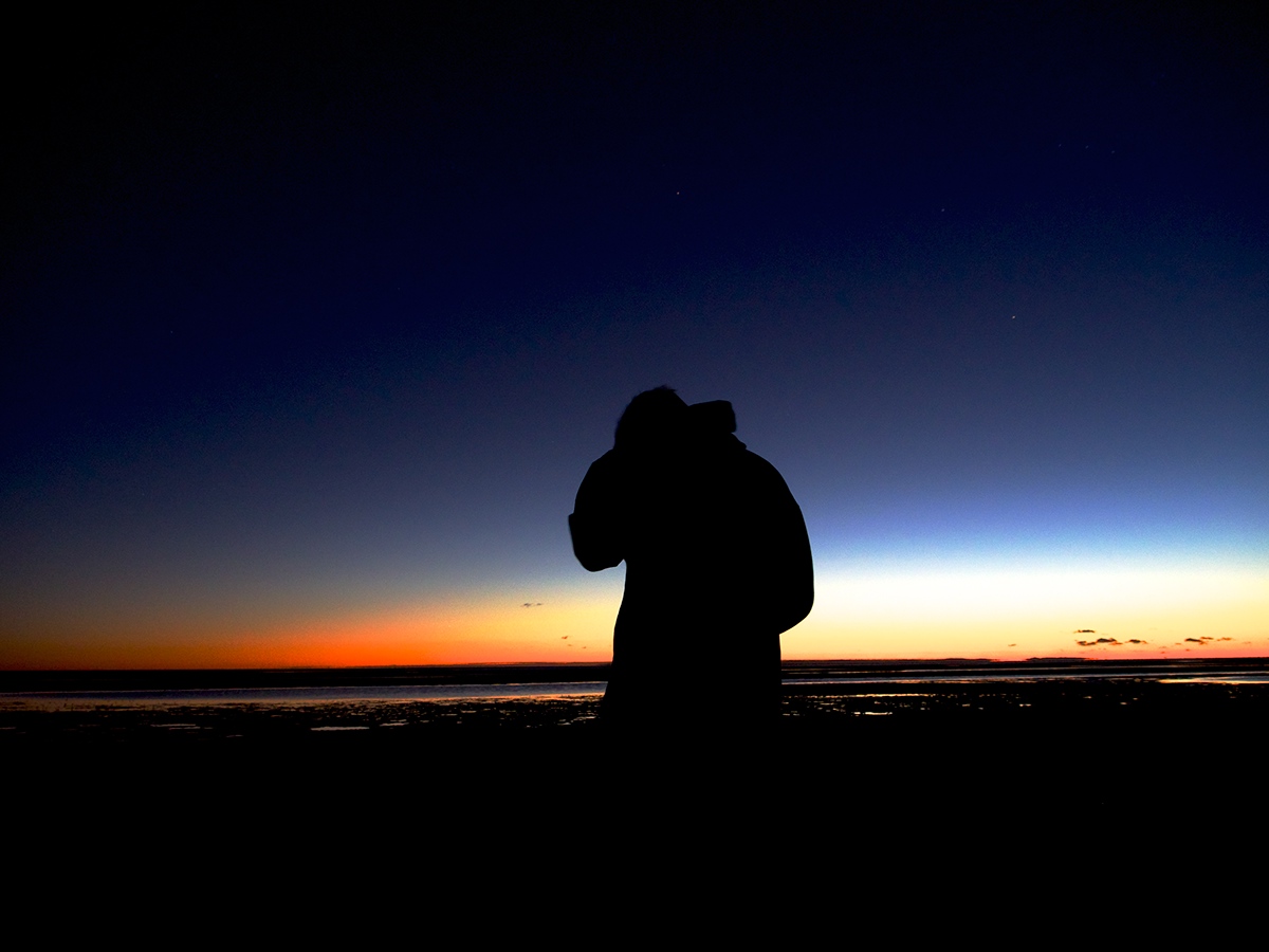
reasoning: Admittedly, upon beginning the creative process for this image I rushed into production without a great deal of consideration for the images of the week. I decided to attempt what I perceived to be micro-photography. Given that macrophotography is defined as to make large a small image (to take a photo that makes something small seem large), I (wrongfully) automatically assumed that microphotography would be to take something large and turn it into something small. Therefore I decided to try and tackle what is inarguably the largest thing known to man, the universe, and try to make it small. I decided to, instead of create star trails as in previous images, attempt to photograph the night sky in such a way as to capture the stars in what could be considered a natural manner. To do this, without trails I decided to increase the ISO, while still maintaining a relatively quick shutter speed. I also decided to changed the focus of the camera, as to blur the image and create a bokeh effect on the stars. I felt like this made the stars look as if they were just a stones throw away from the viewer, as opposed to billions of lightyears. I linked this to the idea of home as, once more, I reading meditations by Marcus Aurelius and there was a passage that said “For nowhere either with more quiet or more freedom from trouble does a man retire than into his own soul, particularly when he has within him such thoughts that by looking into them he is immediately in perfect tranquility”. This quote spoke volumes to me as I have been, personally, dealing with some rather complicated issues recently, and as a result I decided to take this advice on board, and chose to create an image around this idea, of the internal home; the home within one’s own mind. Hence the two silhouettes in the image; the external representing the physical me, and the internal silhouette, which is actually modelled off the silhouette of the man in “Walk of Man & his Dog” I captured earlier, is a representation of the withdrawn self; a person in their internal home.
inspiration: The tonal usage of colour was actually inspired by Claude Monet’s “Impression, soleil levant”. While that painting features a bright orange sun, with a coinciding reflection, I decided that such an element would not benefit the image; and it would also deduct from what I thought to be a microphotograph.
technique: This image was constructed in respects to the Loomis informal sub-division. The image itself is more strict to the suggested lines of the Loomis rulings than previous images. The line of the internal horizon is actually a direct ruling from the subdivision, while the figures are placed in respects to the horizontal and vertical lines. I decided to avoid the usage of the symmetrical subdivision, as it didn’t fit in with the construction of the image’s message, and I felt would subtract from the dynamics/sensation of movement created by the contrasting directions of either silhouettes- as symmetrical composure is typically quite flat, and still in appearance.
process: For the sky in the image’s background, I decided to photograph an image of the night sky with reduced exposure time/quick shutter speed, but with high ISO in order to capture the stars/lightness of the sky. The image was taken out of focus to increase blur of the stars, in order to create a bokeh effect. I then traced the silhouette of the man from Walk of Man & his Dog, in order to get the silhouette of the internal person, I then added an artificial horizon at their feet. After this I then cut out an image of a self portrait I had taken earlier in the body of work, and then created the external silhouette from this image. I then whited out the external silhouette and placed it on a black background, moved the star photo above this image and changed the blend mode to “darken”. This filled out the silhouette with the photograph. To impose the internal silhouette, I then shifted the internal silhouette’s layer to the top of the stack, and changed the layer’s blend mode to darken. In order to create a tonal effect, and not completely black out the internal silhouette, I reduced the layer’s fill. Inner shadow was then added the external silhouette in order to give the illusion of an depth and dimensionality to the image (in order to communicate the constructed meaning of the image), and then drop shadow was added to the internal silhouette in order to further the sense of dimensionality, and create an almost figure-ground relationship between the two images.
reflection: I actually enjoyed making this image, and experimenting with the capacity of photoshops blend modes. I feel that the image was quite unique in it’s aesthetic and sort of represents an area of simplistic photo manipulation/collage not really explored in my work, or in the field of design (that I am aware of).
IMAGE 30
...Home
Pilgrim - Original Image
(Olympus OMd em-5/M.Zuiko 12-50mm)
reasoning: After having been corrected about the definitions of microphotography, I decided to backtrack and attempt to better my macrophotography before rushing off into an area where I have no previous experience. I decided to try and photograph a beetle as I remember learning that beetle’s don’t actually make nests, and so they create a home around themselves, and I imagined that they’d use their hard, exterior shell as means of housing. This coincided with my development of the concept of home, from yesterdays image, and I thought was consistent with both the overall and weekly theme for this unit. I ended up having to travel to my grandmothers house to photograph the beetle, as I was unable to find any around my house, and even then this was the only beetle I was able to find after 2 hours of both Nan and I searching. I decided to call the image Pilgrim, giving the wondering nature of this stray beetle, taking with it it’s home on it’s back, setting out for something beyond my knowledge.
inspiration: I drew inspiration from Sam Droege’s photographs of insects that I saw in a national geographic magazine. Droege’s images utilise a microscope, or ridiculously large telescopic lens that I do not have access too- so I decided, rather than trying to emulate Droege’s technique and fail miserably, that I would try and interpret his image’s the best I could, and construct my own image, in my own personal style, using strong, focus blurs- this was allowed by my camera’s ability to change or virtually emulate the f-number of the lens, even in macro-setting.
technique: This image was constructed in regards the rule of thirds, with the subject appearing in the central third of the image, in the bottom vertical half. The beetle’s strong colour contrast to it’s grey, and blurry background immediately draws the viewer’s attention to it, as the image’s subject, and main construction of meaning.
process: This image was taken with a low shutter speed, and correspondently high ISO setting- I did this initially in fear of the insect taking off in flight, but also to prevent blurring of the image, as I lacked a tripod, and had to take the photograph with my hands as support. I then imported the image into photoshop in order to strengthen the contrast of the image, for communicative purposes, and boost the exposure of the greens/blues to bring some colour to the image.
reflection: This image was actually quite tedious to take, primarily because of the difficulty of finding a beetle. However after having successfully taken the shot, and edited the image, I feel rather successful in my desired outcome. The photography is clear, defined and captures considerable detail given the lack of equipment. Although the image falls short of Droege’s, I feel as if it has taken on a unique quality of it’s own, and resembles more a candid, loving portrayal of a family pet, than it does that of a documentary, microphotograph.
IMAGE 31
...Home
Paintearth - Original Image
(Olympus OMd em-5/M.Zuiko 12-50mm/Adobe Photoshop)

reasoning: I decided to continue my development with macrophotography for this image, as I was actually incredibly happy with how the previous image looked. However for this instance I decided to take it a bit more in the direction of photo manipulation again, as I thought that such a technique was actually quite powerful in the construction of a message. I photographed a series of dried up paint palettes that I had sitting up by easel, and I found that when I reduced the f-stop number as low as I possibly could, the macrophotographs actually rendered a great deal of depth to the images, and they almost looked like mountains. Due to the round indents in the paint palette I decided to compile a series of these photographs in their circular motion to try and creation an abstract representation of earth. The idea being that earth is essentially a home to all human beings, and that painting represents creativity, and creation. Essentially the image is trying to convey the ridiculous potential of the creative process, and how one can build their own world inside their own creativity.
inspiration: The inspiration for this image actually came from the album cover of a song I was listening to at the time; Awake - Tycho. The image features a circle that is horizontally divided into different colours, that I believe are meant to represent the setting/rising sun. I decided to take this circular composition, as I found it to be quite serene, and experiment and manipulate it until I produced the final image.
technique: This image utilises two image construction principles; being bauhaus and the fibonacci sequence. The bauhaus principles in the image are utilised by the circle. While the image itself consists of 3 separate pieces, the gestalt theory states that these objects become one by their association and the eye treats them as such. The use of a circle was meant to be somewhat calming for the viewer and invoke a sense of completeness, softness and almost a sense of maternal security (this specifically is aided by the use of pink, and warmer colours). The fibonacci sequences (1,1,2,3,5…) was also employed in the construction of this image, with 1 larger semi circle then giving way to two smaller, segments, in order to make 3 pieces. Whilst the employment of this technique is not overly overt, I wanted to experiment with fibonacci myself and find new ways to use it in my images.
process: For this image I used my camera on it’s macro setting to photograph a dried up paint palette that I propped up against a wall- I experimented with several different points of focus on each palette, using manual focus. I photographed 3 different pallets, and then used adobe photoshop to compile the images. These images were then adjusted in such a way as to increase the temperature of the image, and remove the background to accentuate the circle.
reflection: I am satisfied with how this image turned out, and I honestly feel that the employment of the fibonacci sequence (even if relatively vague) was still quite successful. Next time, however, I will try and use brighter, more exciting colours for the pallete as I feel that the image is, for the most part flat, with the exception of the bright pink hit in the right centre.
IMAGE 32
...Home
Blue/Orange - Original Image
(Ballpoint pen/ Oil Pastels/Adobe Photoshop)

reasoning: For the final image in this body of work I decided to revisit the coloration of images as it was something that I felt I never really explored over this body of work. I decided to revisit the tree, as I felt it had been a continuous theme over the course of my body of work, and was actually quite a strong representative of the concept of home. The tree houses birds, koalas, possums, ants, spiders, rats, basically everything- the tree is also cut down, and used to build human homes, the tree, as far as organisms go, it’s essentially it’s own home- it houses itself and all that which live inside it. It’s also on the flag of Norfolk Island- my birthplace, and what I consider to be, my home. I decided to revisit the coloration of an earlier painting; “Walk of Boy and Himself”- however decided to invert the coloration of the image as a way of creating a proverbial ying, to the previous paintings yang; coming full circle if you will. I actually find a great deal of beauty in this coloration; the orange and deep blues/purples I feel are a natural pairing, visible in any decent sunset with clouds nearby.
inspiration: The inspiration for this image came on the advice of my tutor, to explore coloration techniques- however the actual image itself and the themes it deals with are purely based on my own development over the course of this body of work. Some aspects of the aesthetic, I believe, were unknowingly inspired by the Calvin & Hobbes comics- as I feel they may rest in the same, nostalgia crippled part of my brain as the ideas I have formed on trees.
technique: The technique for the completed image was based on the relatively simple rule of thirds in conjunction with some Loomis informal subdivision. The image’s placement and horizon adheres to the Loomis subdivision, while the placement of the tree was in regards to the rule of thirds (as the tree itself sits within the central third of the image).
process: The process of construction for this image was actually a long and drawn out one. I initially began with intentions to produce two images, a tree coloured using photoshop, and a tree coloured using analogue mediums (oil pastels). To do this I drew the outline of the tree in very light ballpoint pen, I then photographed the page, imported it into photoshop and tried to colour the image using virtual brushes, as I felt that the airbrush tools in photoshop would be lacking in the depth required to render the image in such a way that I was satisfied with. However upon completion of this, I found that the image really lacked the attention to detail that I try and hold myself to, and this may’ve been due to the lack of control/experience with virtual brushes. I then decided to colour the image myself using oil pastels. Whilst this granted me the degree of detail I was wanting for the tree, when it came to the background I felt as if the pastels really lacked the flare and brazen presence that the long, wide, bleeding strokes that the virtual brushes produced. Unhappy with both images I decided to amalgamate the two, and take the tree from the oil pastel experimentation and position it on top and amongst the virtual painting experimentation, that produced the final image.
reflection: I feel as if this image was a fitting and appropriate finale to this body of work. The image closes and rounds off what is otherwise an exploration of mediums over the course of 6 weeks, and was actually greatly helpful in my continued development of analogue and digital mediums. The image, whilst frustrating, was greatly rewarding upon its completion, and I feel it successfully utilises colour in a dramatic and effective manner.
#ONEPERDAY


