
Image 1
When I thought about the word 'time', I immediately thought about my succulant plants which I had been propagating. When I looked in my pot, some of the leaves I had taken off to propogate had begun sprouting new plants and growing roots. I decided to draw one of my plants as a still life drawing because I felt it truly encapsulated the theme of Time. I used graphite pencils for this illustration, because I am confortable using this medium and I knew I could draw it realistically with shading.
I love drawing, and really enjoyed making this first image. However, I feel that this mage doesn't do my plant justice, as the plnt was a lovely green colour with the tips of the leaves gradually turning a pinkish-purple colour with bright purple roots. I used graphite pencils because I have experience using them, but I feel this image would be a lot more effective if I had used colour instead.
#oneperday

Image 2
After the completion of the first image, I felt that I really needed to draw my plant in colour in order to better capture its beauty. I used coloured pencils and drew from still life.
I have less experience drawing realistically with colour pencils, but I am very pleased with the result. I started with the yellow colour first and layered the other colours until I got to stage where I thought it looked best. I think the coloured pencils worked really well - they aren't as intense as I would have liked, maybe water colour would have been better for that - but I like the natural contrast between the green and purple.
#oneperday

Image 3
I sat down with my art journal to think about what I wanted to draw. I thought about time, and how as time passes, things age. Thinking about aging, I decided to draw a picture of a woman's face, one half young, the other half old.
I used graphite pencil, because I thought it would be best to capture my intention - I can shade, show detail, and can create different textures (such as for the skin and hair). I drew this entirely from imagination, I didn't draw from life or a photo. I think the graphite pencils worked well for this image, though I think I could have created mroe contrast with darker shading and shadows. I found this easy to draw, and enjoyed drawing it. I think I keep drawing images like this because I am comfortable doing them - I need to use other mediums, to expand my experience and experimentation.
#oneperday

Image 4
For this image, I was inspired by my drawing mediums as I was doodling - I noticed that once my pencils got to a certain length, I stoppped using them in favour of longer pencils, which made me notice that their length represent the time that has passed.
I drew this image in pen and used a cross hatch technique. I used a linear crosshatch because it created a smoother texture. I placed the pencils on my book, with daylight from my window casting the shadows, and drew from life. I like this image, because the pen causes the image to pop out more than graphite pencil would, and it contrasts more against the page. Because I was using pen, I was more careful because if i made a mistake I woulnd't have been able to correct it. But the cross hatching was repetitive and I enjoyed that, and I think it is really effective. I'm glad I hatched in the shadows, because they really ground the image.
#oneperday

Image 5
In the front courtyard at my house, there is this plant with large, green leaves. I don't really like the plant myself, it grows so quickly and I have to cut it back often so that it doesn;t block the gate. While leaving the house, I walked past the plant and noticed all the dead leaves that had fallen off, and all the new ones that had grown since I had last trimmed it. This got me thinking about this assignment, and I thought a series of leaves would be a good drawing to capture its life cycle, like a cradle to grave series.
On the left side of the image is the youngest leaf, its edges are curled up because the leaves grow out of the stem curled around itself. It was a pale green colour and had a rubbery texture. The second on the left was the mature leaf, dark green in colour, full and almost flat. The third leaf was starting to die, the edges were crispy and turning a yellow-brown colour. The last leaf on the right was completely brown and crumbly, and the leaf appeared to have folded itself in half.
I drew this image in pen on textured pastel paper, because I want to come back to it and paint over it with water colour. This image was harder to draw, because it was very detailed. I took photos of the leaves and drew from them. It took more time, as I wanted to draw as accurately as possible, but I am very happy with the results. I think once I put the watercolour over it, the image will be more effective as the colour will be a better indicator as to how old the leaves are, while the drawing on its own is a little ambiguous.
#oneperday

Image 6
This is the coloured version of my previous image, inspired by the plant in my front courtyard. The colour makes the image much more effective, as it clearly illustrates the age of hte plants, representing the amount of time they have lived.
I used watercolour for this image, as I feel it lends itself really well to natural and organic subjects. However, the colour is not very intense, and in real life the greens were very bright. I also used watercolour because I am not very familiar with it and I wanted to try a new medium. I think my technique as ok, maybe if I had layered more colour it would have been brighter, but I am happy with my blending. If I were to repeat this image, I would try to make the colours brighter.
#oneperday

Image 7
According to physics, time = speed / distance. As I was on a train the other day, I noticed how everything out the window blurred together, and thought about how fast we were travelling. This made me think about how the trains speed represented the time that was passing, and I wanted to be able to capture that movement in an image.
While on the train, I drew the carriage in pencil, then again in pen. I used textas for the colours. I usedd these materials because I was kind of going for a simple, almost comic-like image, with select yet vibrant colours. However, because of that approach, my image doesn't have any depth or shadows in it, making it quite flat. Even the blurred green out the windows looks a bit flat. If I were to recreate this image, I would add shading, but other than that I am happy with the colours, particularly how I was able to create the blurred look by combining different shaddes of greens, browns and blues to show the movement of the train.
#oneperday

Image 8
This is the first photograph I have taken for this project. As I walked into my bedroom, I was inspired by the afternoon light that filtered through my blinds and hit my wall. I wanted to capture it, as the sun has always been used as a way of telling time, and I thought that would make it an ideal representation of time passing.
I did not use any special technique for this image, as I have not yet learnt how to adjust aperture and shutterspeed, and was not edited on photoshop. I used a simple digital camera, and only daylighting. I like this image because the light that shines on my desk organiser adds more shadows, and the warmth of the wood is a god contrast against the white wall. However, this does make the image more busy, and the shadows cast less intense.
#oneperday

Image 9
My roomate had an avocado for lunch one day, and I noticed it was over-ripe. I thought this would make a good subject for one of my images, as it's ripeness was a good indicator as to how time had effected it.
I used a digital camera for this image, and natural light that came through the window to the right. I then altered the photo slightly, using the curves tool on photoshop. My roomate is the one holding the avocado against the white wall; I thought this would make the image more playful. The light was not very intense (it was an overcast day) and this gives the image a softer look. I think if the light was against the avocado it might have given it more emphasis, but overall I am happy with the composition and lighting. I also like the texture of the knife cuts on teh avocado against the relatively smooth wall and arm, and the greeness contrasts nicely against the wall.
#oneperday

Image 10
The inspiration for this image came when I was at the Marriag Equality Rally in Brisbane the other week. I noticed as we walked through the streets, that on the corners were police officers; they were most likely just there to control the traffic. However, this got me thinking about how times have changed and how thirty years ago people were still being prosecuted for being gay.
This image was taken with an iPhone 4s, and altered with the curves tool on photoshop. I really like it because in the frame you can see the gay pride flag with a police car behind it, and how the colours of the flag really stand out. I think the composition is quite good, considering I was just taking it as I walked by. If I were to take it again, I would have stopped and got a better angle, maybe to see what it would have looked like with the police car in the foreground and the marchers in the background. I don't like the light at the top of the image on the buildings, it distracts a bit from the rest of the image, but I couldnt help it because that was the natural light.
#oneperday

Image 11
I was inspired to take this photo when I was watching Dad around the house after he left his job; he started doing lots of little projects like fixing the paint trims and cleaning things to keep himself busy. I thought this shot would be a good image as the viewer would want to put it into context, and would assume what task he was doing; for example, washing up, cleaning, cooking, looking for something in the drawer.
I used my digital camera and did not set the image up. The lighting for this shot came from the ceiling light and there was indirect light from the window. I think the composition is pretty good, with the window in the centre and dad moving around it. I also like how the ceiling light cast a deep shadow below the open draw. On photoshop I used the curves tool to slightly brighten it, as I had the aperture on the camera set a bit too dark, but I think it didn't turn out too bad with the darker shadows. While this image is not one of my favourites, I like it ambiguity and that the viewer must image the back story to the photo.

Image 12
I took this photo when I was at the Sunshine Coast filming for another assignment. I noticed the card on the ground, old, dirty and torn from time. Because the subject is a playing card, this has connotations of gambling, and would lead the viewer to imaging a story about an unlucky gambler who left this card behind, and because of its bad state, that the gambler most likely lost a lot of money.
I used a digital camera only had daylighting. I then photoshopped it, using the curves and colour selection tools. By enhancing the shadows and making the colours deeper, this gives the image a darker feel, and enhances its dirtiness. What I don't like about the photo is the composition, it's not quite in thirds, but it's not so bad. I like that it has the gambling connotations, and I like the textures of the cement and bricks as they add to the negative connotations the viewer will draw.
#oneperday

Image 13
The boots themselves were the inspiration for this image; they are worn from use, old and dirty. I took this image because from just these workboots the viewer wonders who their owner is, what he or she does, why are they not being worn.
I used a digital camera with daylighting. I then edited the photo with the curves tool and made it black and white. I like this photo because the boots have heaps of character, and the black and white effect really enhances the creases and wear and tear on the boots. I think that set up could have been better, with less stuff in the background and surrounding the boots, or perhaps if the boots were not sitting next to each other but looked as if they had just been tossed together. I do though feel that these boots could have been used more effectively to tell their 'story'; for example, if I had combined image 11 with my dad unfocused in the background and the unworn boots in the foregound, it would have led the viewers to draw more specific conclusions about why the boots are not being worn.
#oneperday

Image 15
This image was a class activity, where we had draw what we did today. We were asked to draw it as a continuous drawing, rather than separate it; on the left is the bus I took to uni, then H block where the leture is with people leaving it, then I met up with two of my friends, and we had Nando's for lunch.
Because I quickly drew it in class, there is not a lot of detail and I didn't colour it. I don't particularly like this image, but I can see how setting up a drawing like this would be good for making context and creating a story of sorts. If I were to redo this image, I would draw it again with more detail and colour it with texta. But I do like how i set it up, with the three of us towards the foreground, as if we are about to go to Nando's.
#oneperday

Image 16
The inspiration for this image came when I looked at my watch today, and I wanted to draw a scene where the person looks at their watch to check the time. I then contructed this short story about a man going to the bus stop only to find that the bus had got there early and left without him.
I drew this image in black and grey textas. I used black for the most important parts of the image, and the different shades of grey for the less important stuff so it wouldn't distract the viewer and make the image too busy. Despite being quite simple and very short, I quite like the image. I think using different shades of grey worked well, and I really like the first scene where the guy looks at his watch.
#oneperday

Image 17
The other night I had to a kill a cockroach for my room mate, so that was the inspiration for this image. I thought three little scenes would be a quick way to tell the story of finding the cockroach and killing it.
I drew this image in pen and coloured it with texta. What I don't like about the image is that you can see the marks from the textas; instead of colouring with them I could have used photoshop and it would have had a cleaner look.
#oneperday

Image 18
I was inspired to make this image as I was googling comic books, and really noticed how all the female characters were wearing hardly any clothes and the male characters had suits that covered most of their body. So I decided to compare what they look like now, to what it would look like of the female characters wore proper suits with a more realistic body, and what the male characters would look like if they wore skimpy outfits. I also wanted to make it a little fun, so I drew superman looking embarrased by his almost-naked-ness. I wanted this image to show our progression over time, where now we won't accept female characters to be sexualised.
For Wonderwoman and Superman on the left, I copied what they actually looked like in some of the comic books, and on the right I drew them how I thought they should look. I used textas for this image. I really like this image, particularly how I changed wonderwoman's face in the second part, as her head is tilted back more and it looks like she has more power, and I love how Superman is really embarrased and trying to cover himself up. This would also be a good image as a commentary on how the comic book industry has sexualised the female characters. Even though they are also very muscley, they wear skimpy clothing and has very large breasts. I wanted to show that they can still look powerful (like a superhero should look) and wear exactly the same as what the men wear. If I were to redo this drwing, I would use photoshop so the colouring is smoother and neater, and I would draw it better.
#oneperday

Image 19
My inspiration for this image were the little political comics in the newspapers. They make fun of current political issues and I wanted to make one that would relate to our current time.
I drew this image in pen and water colour. I used these mediums because that it what is commonly used in the newspaper ones. I wanted to make fun of the quota that everyone was talking about for women in politics, which is anothre good representation of our current time, that we are actively trying to get more women into politics, when once we could not even vote. I like this image because it is light and little funny, but the colours didn't turn out very well from scanning, even after editing it on photoshop. But overall I think it is a nice image that fulfills its purpose to make light of current politics in a comic strip theme.
#oneperday

Image 20
For the portraits, I photographed my room mates. My inspiraiton really just came from epxerimenting and trying different angles and different light sources.
For this photo, my I got my room mate to stand in front of the glass sliding door so that her front would be lit. It was also an overcast day, so the light was diffused, which I thought turned out well, as very intense direct light would not have had the same effect. I used the curves tool on photoshop to darken the background to draw more attention to the foreground. Because my room mate has pink undertones in her skin, when I brightened the foreground it made her look very pink, so I used the colour selection tool to change her undertone to a more yellow colour. I was very proud of my photoshopping, as I don't have much experience with it.
I really like this image. I think it captures my room mate's character, as she is a really sweet, quiet person, but when you know her better she is also a really funny and mischevous person. What I don't like this photo, however, is how bright her chest is; I tried to darken it but that effected the rest of the shadows in the image as well.

Image 21
This is the black and white experimentation for my previous image. In this one, the bright patch on her chest is much more obvious, which I don't like, but I do like that her freckles are much more noticeable. I really like the composition of this image (and the previous one), as it places the subject as the only focus in the image, and I think being black and white is very effective, as her face seems to have more character to it.
#oneperday
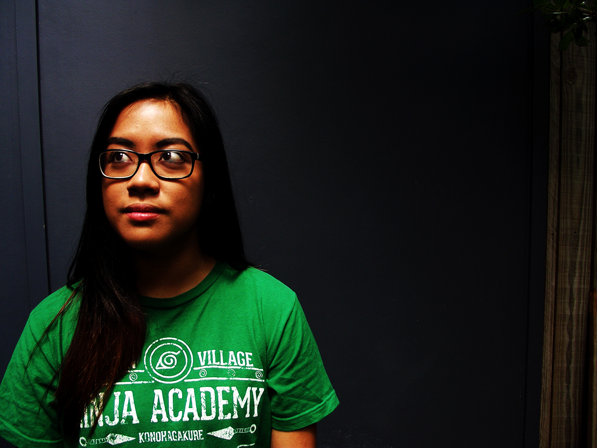
Image 22
My inspiration for this image also came from experimentation. This image relates to the new theme of home, because it shows my room mate in our courtyard, which is dark, but she is highlighted and looking out to the side, showing her ambition for the future and getting away and finding a new, better home for the future.
I used a digital camera for this image and natural daylight only. The light on my room mate filtered through the tree in our courtyard, which covereed the left side of the image. I really like this image because of the lighting; the natural came through in a really great way, and I think I exploited it well in this image. What I don't like about the image is my room mate's shirt, it would have looked better if it were a plain, dark t-shirt so it woulnd't distract the viewer.

Image 23
For this image, I wanted to play around with how light could fall on my room mate's face, and I wanted to take advantage of the pattern that the fly screen created from the sliding door in our unit. Because half of her face is in shadow and the other half hasa crossing patter from the screen on it, it appears as though she feels trapped or constrained. This image is about homesickness, and these connotations of confinement give the image a sense of longing for somewhere else: home.
I used a digital camera and natural daylight only. I then used teh curves tool on photoshop to darken the shadows and constrast the light and dark more, then made the image black and white. I really like this image, I think the contrast works really well, and I love how the shadows that are cast across her face give the image heaps of meaning.
#oneperday

Image 24
This is a portrait of my sister, and my inspiration for this image came from experimenting with different angles of natural light. It was taken at my parent's house in Toowoomba, and in the background you can see Dad's collection of stuff hanging from the fences, including a sign that says 'The Peppers'.
I used my digital camera and edited the photo on photoshop using the colour selection tool to maker her hair colour and the green leaves more vibrant. This is one of my favourite photos. I love the angle of it, as my sister looks powerful and confident, and I love the light coming from behind her. The colours are really good as well, as her hair contrasts the greenery nicely. What I have been finding difficult is relating the portraits to the theme of 'home', as I really just want to experiment with different light, angles and ways of taking a portrait.
#oneperday
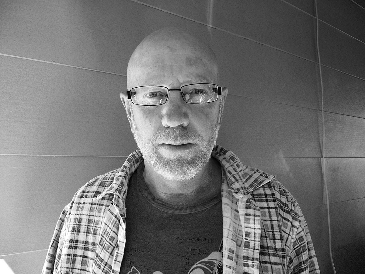
Image 25
This is a portrait of my dad. I've always been inspired by black and white portraits as they capture detail really well (like in Image 21 above) so I wanted to make a black and white portrait of my dad.
I used a digital camera and placed my dad under the shade of the garage roof with the natural light source coming from behind the camera. I think the composition of this image is good, but it has very little emotion or meaning in it. I didn't plan the image well, because I feel that it needs more context, such as a different background, and more contrast between th shadows in the background and the lighting in the foreground. I also feel that if the lightsource had been more direct to Dad's face, then the background would have been darker, and I would have been able to get more detail from the lines on his face, which ideally was what I wanted to achieve.
#oneperday

Image 26
For this portrait I photographed my mum. I didn’t really have any inspiration, I just experimented with different angles.
I used a digital camera and diffused natural light that came through some of the transparent, plastic sheeting on the ceiling; I edited it on photoshop with the curves and colour selection tools. This image is not one of my favourites, because it’s quite plain and has no meaning behind it. I’ve found that the images where I’ve experimented more and were more original have turned out to be much better.
#oneperday

Image 27
I was inspired by Vivian Meyer for this image after I saw a documentary about her on the ABC. I really liked her experimental and unique angles and ways she had of photographing things, so I wanted to try something more original and fun.
I took this photo on my digital camera from inside one of the rooms of my parent’s house and had my sister stand outside and cover her face with her hands on the window. I then altered it in photoshop with the curves tool. I made it black and white because I felt that it would give the image a crisper look and give the shadows more definition on the blinds.
I really like this image; I like that you have to look through the blinds to see the main subject, and I like the shadows that are cast on them and their slight refection in the window. I also like how my sister is posed; it adds to the sense of ambiguity, as you deliberately can’t see her face. For me, this is a fun portrait as we were mucking around as I took it, but it could also be interpreted as a darker image, as the blinds and her deliberately obstructed face give it connotations of limitations and confinement.
#oneperday

Image 28
For this portrait I wanted to take advantage of the light that filtered through the vine growing on the fence and roof and show how it cast shadows against my mum’s face.
I used a digital camera and altered it on photoshop with the curves tool and made it black and white to enhance the contrast between shadows and light. I think the angle is very flattering, but it is also not very experimental. I think the background could have been darker and more out of focus, but I do like the light that is cast on the side of her face.
#oneperday

Image 29
For this image I wanted to create a type of portrait that reflected who I was without actually showing my face. So I decided to take a photo of my hands with paint and pastels smudged all over them to reflect my creativity.
I used a digital camera (with my sister’s help to get the right angle) and used natural light that was diffused through a skylight. I quite like this image because it’s different to what you would expect a self-portrait to be. I also like the horizontal lines of the table underneath my hands, the blue paint splatters on the table contrasting the red and orange ones on my hand, and I like that my hands are at the bottom of the page. I think the lighting could be brighter on my hands, to make more of a difference between the foreground and background.
#oneperday

Image 30
This is my self-portrait; my inspiration for this image came from experimenting with the other portraits, and I decided I wanted to use the shading that the fly screen created to cast over me.
I set up my digital camera on a tripod and I positioned myself in the light patch that came through the sliding doors. On photoshop I used the curves tool to darken the shadows, particularly the ones in the background. By using the shadows from the fly screen and covering my face, this image has a dark feeling to it, as if the subject is oppressed.
#oneperday
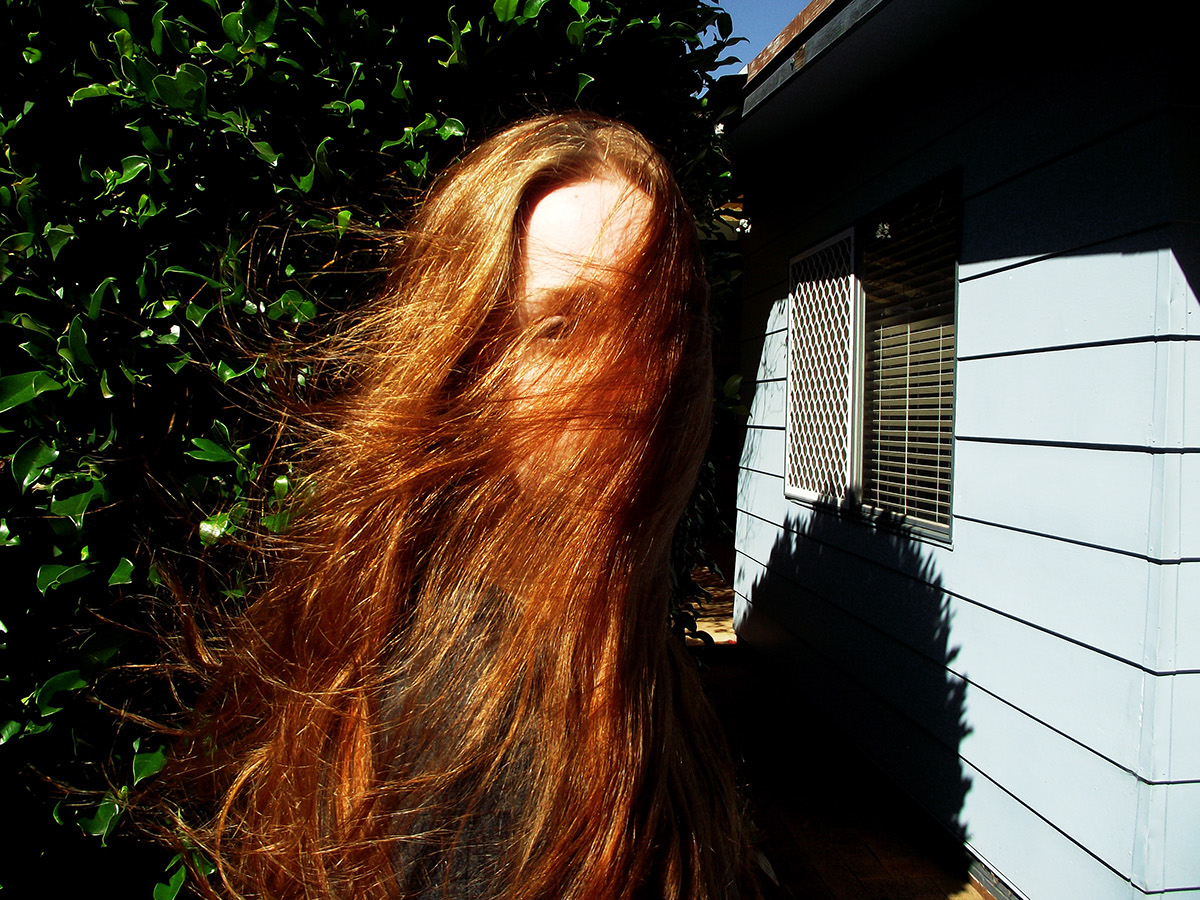
Image 31
When I was photographing my sister, it was a very windy day and I wanted to take advantage of that and took this photo with her hair covering her face in the wind.
I used my digital camera with daylighting and used the curves and colour selection tools on photoshop. I really like this photo; I like the composition with her in the centre, and that you can see one of her eyes looking at you but her body is facing the other way. I also like the shadow of the tree and cladding on the wall, and that her red hair contrasts the greenery well. I think I also like it a lot because it was very experimental and I like that it is very different to traditional portraits.
#oneperday

Image 32
For my illustrated self-portrait, I was inspired by the way portraits are illustrated in Frankie magazine with pencil and watercolour; I wanted to make something similar to that, but I wanted to use pen because I like its crispness.
I drew this from a photo I took and used pen and water colour. I think I could have hatched more and implemented more shading, but I still quite like this image. I like the hair because of the detailed lines, but I don’t think this illustration looks like me at all. I should have used less hatching for the eyes as mine are a much lighter colour, and the lips are also too dark. But I really like that I painted my shirt in black, because the image needed a dark block of colour.
#oneperday

Image 33
Nature photography was my inspiration for this image. I wanted to capture the natural patterns that occur in leaves and other vegetation, as their patterns are very beautiful.
I took this image with a digital camere outside with natural light against the leaf. The light patch on the left side of the leaf distracts away from the pattern, but other than that the image is very good; I do like that the pattern leads back to a centre point, as the eye is drawn there. I edited it slighly on photoshop with the curves and colour selection tools, to make the colours more intense and the pattern more pronounced. If I were to take this image again, I would proboably use a back drop so that the background is just a plan dark colour that won't distract from the pattern.
#oneperday

Image 34
There was no inspiration for this image, I was just looking around my flat for patterns and experimenting with the camera. This is a photo of the texture on my joggers, which is a good representation of a man-made pattern.
I used an SLR camera that I borrowed for uni for this image. I had fun experimenting with it, but the image definitely needed more light and I should have changed the aperture to a different setting. I'm really happy with my focusing, i like that the lines draw the eye over towards the left hand side where I've focused the pattern into view.
#oneperday

Image 35
My inspiration for this image came from the diamond tile pattern I've come across on floors on Pinterest. I wanted to recreate this pattern on illustrator after looking at the tutorials on black board.
I made this on illustrator by drawing a three dimensional box with three different coloured sides, then copying and pasting the box to create a repetitive pattern. I really like this image, particularly the use of the three diffferent shades as they give the pattern a sense of depth. I also found it very easy to create on illustrator and it will be a simple pattern that I could easily change the colours for many situations and applications. I've found it a bit hard to relate this pattern back to the theme of home, but I feel this pattern could easily be used for many homely applications, such as pillows or teatowels.
#oneperday

Image 36
I've repeated the pattern again to experiment with different colour schemes. I don't really like these colours as much, because there is a higher contrast between the colours and I think it looks best when the colours are all different shades of the one colour.
#oneperday

Image 37
Another experimentation, I wanted to see how the pattern would look as a flat image, with no colour to give it depth and dimension. I think the image still looks very good, and without the colour it has a more professional look to it; I can image it on a business card or as wallpaper on a statement wall in a flash motel foyer. Because of the lack of colour and depth, this black and white pattern is less homely than the coloured ones.
#oneperday

Image 39
For this image, my inspiration came from the pattern tutorial on blaack board from the Design Sponge website. I was really interested in being able to create my own repeat pattern, so I gave it a go. I used a flower pattern, because flower arrangements and bouquets are often a way of making spaces more welcoming and homely when having guests at your house.
I drew this with pen, then cut and taped as instructed, then scanned and put it together in illustrator. As you can see, I didn't cut and tape very neatly, which is why the pattern doesn;t quite meet up and you can tell it looks a bit like tiles. Also, I had this image scanned at Office Works because mine stopped working, and I found the quality wasn't as good. But other than that, I like the pattern a lot with the different flowers, and I am really glad I learnt how to make the pattern by hand because it is definitely a skill I will continue to use.
#oneperday

Image 40
For the macro photos in our tutorial we were asked to go outside and take photos of nature. This was one I took while I was at home after class, it is a stump from the bush in the court yeard that has started growing out again. I thought the little root like things would make the image very interesting.
I took this with a digital camera and day light only. While I like it because the subject is really interesting, the colours are very blandand it's a bit too dark. I do though like that the focus is on the root things far side of the stump that have more light on them. It would have looked better with a back drop, because the background is a bit distracting. The image could also be clearer, so using a tripod would have helped.
#oneperday

Image 41
This image also didn't have any inspiration, I just went searching for items around the house to take macro photos of. I thought the plastic bag would be a good macro photo, because of its unique texture and the way it cathes the light.
I used an SLR camera for this photo with artificial light from above, and edited it with the curves tool on photoshop. I don't like that this photo is so dark, I think that is because I was still getting used to the settings on the camera and because it was night time the light wasn't very good. I do though like the texture of the plastic bag, and I like that the focus is further way, with the foreground unfocused.
#oneperday

Image 42
Nature photography was my inspiration for this image. My succulents that I had been propagating (and had used for my week 1 images) were growing lots of roots, so I thought they would make great subjects for macro photography, and potted plants are things that always remind me of home, as I have been trying to grow some here in Brisbane, and my dad grows plants in Toowoomba and my grandparents have lots of potten plants at their place in Charleville.
I used my digital camera for this photo and edited it on photoshop. The photo is not that good; if I still had the SLR camera it would have turned out much better, but it's ok considering my camera is not that good. I had difficulty focusing on the roots as well, adn the best I could get it was to focus on the roots at the back and on some of the soil. I didn't notice until later that I had also got a little worm-like bug in the photo as well, which I like because it adds context and gives the viewer an indication as to what the size really is. The image though is fairly boring, if I could have zoomed more and focues better, I would like to have created a more abstract photo of the roots.
#oneperday

Image 43
I was still using nature photography as my inspiration, and I noticed a spider building a web in my courtyard so I decided to shoot it because it was making its own home in the web.
I used my digital camera and had more success with this photo, most likely because there was better light and I was able to get up close without having to zoom in too much. I think this photo worked out well, because the natural light on the spider and web really focuses the viewer on them, and because the background was so dark it doesn't distract from the photo. It would have been good to get a shot while the spider wasn't so curled up, but I think it got a fright as I was taking its photo. If I had used an SLR camera I think I could have got a better focus and much more detailed on the spider, but I am very happy with this image otherwise.
#oneperday

Image 44
This is our fantasic world, macro photography in-class activity. I had taken play-dough to uni that day so our group made little people from it and a monster, and came up with a story line around that. It is a story about a little guy who gets excluded from his friends, and finds a monster who comes and kills his friends for him.
We shot this with an SLR camera in the gardens at QUT near Z6 block. We put the friends in with the flowers, but when the little guy is sad he was in a cemented area that was dark and that's where he meets the monster. When he sees the monster, we used light from a mobile phone to highlight it and make it seem special. When I edited it on photoshop, I wanted to make the colours really vibrant when he is happy, but dull and dark when he is sad. And when the monster kills the friends, I wanted to give everything a warm saturation and a red tint, so its very surreal. And in the final shot when we zoom in on the little guy with the monster, I saturated it again to make it eerie. This activity was fun to do, and quite easy. However, I think the images need to be cropped so that they look better and have no unecessary stuff in them distracting from the story.
#oneperday


