
JESUS saith unto him, I am the way, the truth, and the life: no man cometh unto the Father, but by me. -- John 14:6
An attempt to develop an Identity for my Church, Laymen's Evangelical Fellowship International (LEFI)

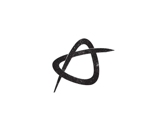
Jay Reef & Aquariums, specializing in saltwater reef aquariums. Idea was to explore a caligraphic "J"
which also forms an outline/ suggestive fish.
Professional Clinic providing treatment for psychological/ emotional conditions. Tagline: Unwinding Lives, Transforming Futures. The Identity depicts untying of a knot which symbolizes Freedom.

AOI Playschool for Kids. Handwriiten illustration/ typography has been used to convey a joyful mood.

Proposed Symbol for the Indian Rupee.
Basically an abstraction of the Devanagari letter " रू " and English alphabet " R "

Personal Identity. A Composite of the Christian Cross (Triumph & Salvation) and the letter " J " (Jenskin)

Microgenix: Speciality Chemicals for the Garment Industry. The letters M&X coming together to form
an Infinite symbol, suggesting range of product/ services. Chemical affordance is depicted
by means of an improvised Benzene Capsule.
an Infinite symbol, suggesting range of product/ services. Chemical affordance is depicted
by means of an improvised Benzene Capsule.

Connect Front: Software firm Dealing with Integrating a Backend/ Database to a FrontEnd/ User Interface.
The Identity uses/ fuses the letters C & F to depict a Connection

O2: HR Recruiting Firm. The Idea was to communicate the reactive mix of poeple working within the Organization.
The reoccuring shape is also a Top View/ Shot of a Human Being/ Resource.

Mountian Music Institute is a premier institute with a highly experienced & qualified faculty in Western Classical.
The Identity is a composite of a mountain and musical note.

Studio 27 is a design studio specializing in motion graphics.
A dynamic shape has been used to communicate the idea of motion.

OriPro - A Company involved with manufacturing mechanincal joints for heavy machinery.


