

Logo Design
Shadow Gallery
A beacon of refuge faintly glimmers among the smoggy dystopia of Heilongjiang's frozen plains. Shadow Gallery was a source of warmth, fellowship, and strong ale throughout my lengthy stay in Daqing, China. Our favorite bar was the epicenter of many legendary moments in ex-pat history after “just one more pint”. I was deeply honored to help out with their rebrand.


A laowai walks into a Chinese bar…
Every expat in Daqing knows Shadow Gallery. For some time, it was the only place in the city to get a decent IPA. The name was taken from the shifting shadows of the patrons visible to a passerby through the tinted windows of the bar. I began with a simple prism design, illustrating the light hitting it and producing shadows instead of color, which mirrors the same effect as the light from the bar hitting the windows and casting the shadows into the street outside.
This logo is something that we workshopped for a while. The logic and meaning may not be readily apparent to the average passerby, but we wanted it that way. We wanted something enigmatic and mysterious that embodied the spirit of the bar rather than branding that announced itself as a bar. The prism IS the bar, the people are the light that shines through it, the colors are good times, and the namesake shadows framed by the windows and cast outward are the gallery exhibits.

A tale of two logos
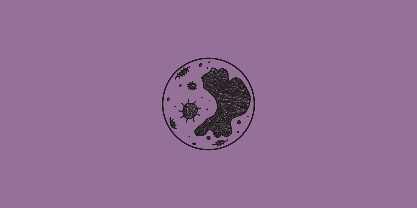
The second logo, which became the more dominant one, still captures those mysterious nighttime vibes with a hand-drawn full moon as the centerpiece. Shadow Gallery is well known as a venue with a great selection of craft beer, whisky, and cocktails, so the aim was to class this version of the logo up a bit. By hand-drawing the features on the moon, I added a “hand-crafted” element to the design to tie in with the craft beer and specialist cocktails they serve.


Fly me to the moon
There are still bold, hard lines and the same high contrast Arial Black typeface from the prism logo to maintain a tidy composition. Rather than just slapping the type across the front of the moon, I cut that part of the design out for clarity and balance. The Good Karma typeface by Roland Hüse is the perfect complement to both the hand-drawn moon and the boldness of the type used for “Shadow”. The result feels classier compared to the prism design while emanating the same vibes, especially when it’s lit up in neon!


I like big hunks of metal.
T-shirts are nice and all, but it doesn’t get much better than seeing one of your designs laser-etched into a large, heavy piece of metal. There was no shortage of memorabilia to apply Shadow Gallery’s new logos to, from ashtrays and bottle openers to napkins and stainless steel membership cards. The ashtray, in particular, is one of my favorite branded objects in this set. In addition to printing and engraving, Shadow Gallery applied the moon design to the bar’s fridge by punching out the design and installing LEDs behind it.


My place in Daqing’s neon pantheon
My absolute favorite application of the moon design is the large neon sign above the entrance. The owner didn't want to make it immediately clear that the business is a bar and instead display an intriguing design radiating pale moonlight at night without too much context. One should know that “secret bars” are becoming quite a trend in China. Word of mouth and WeChat are the most commonly used marketing tools, and the signage is often in English instead of Chinese. Finding the symbol of these speakeasies is an adventure for the patrons. In this case, Shadow Gallery will tell thirsty Daqingers to “look for the moon," which holds many different meanings in Chinese folklore.


