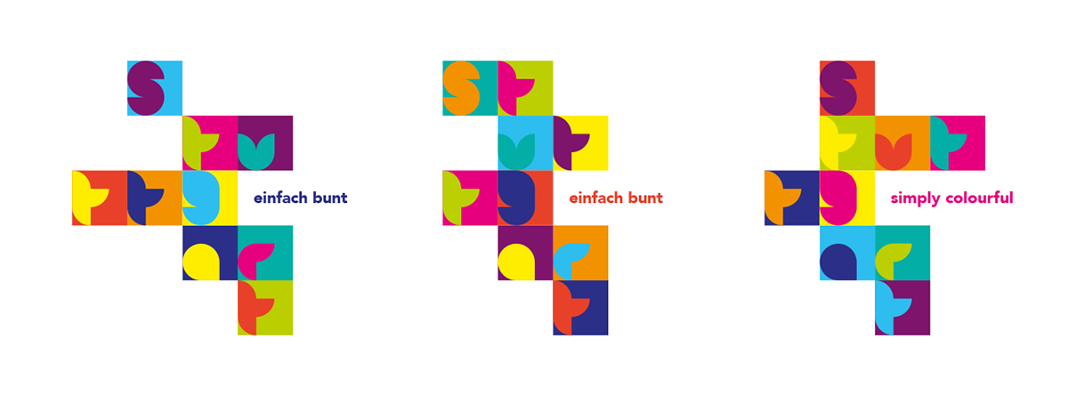
Our aim is to encourage integration and communication between people of different cultures and nationalities in our home town of Stuttgart. We developed a graphic language based on form and colour placed within a simple grid.
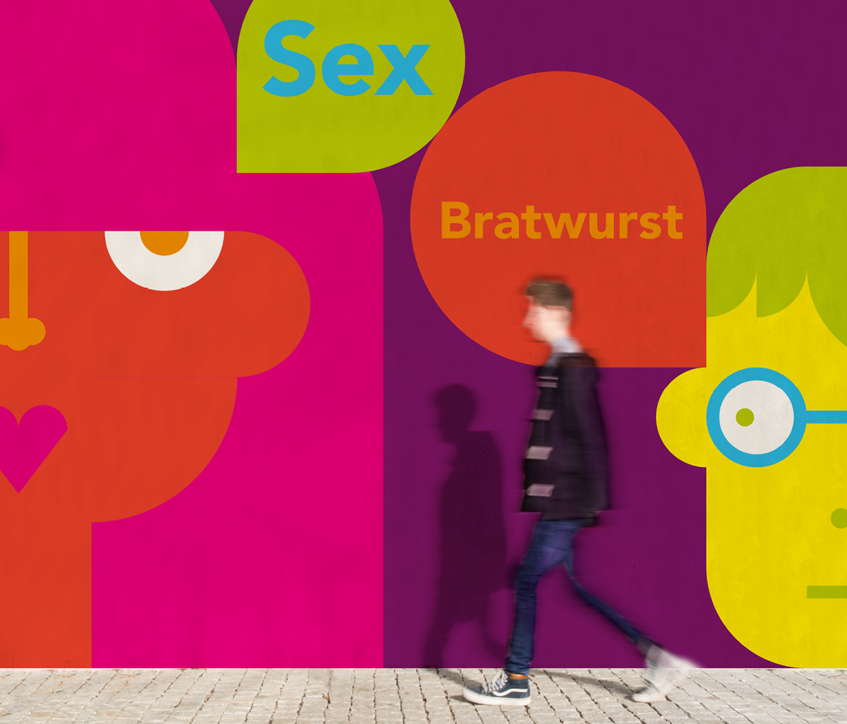
We want everyone to be part of Stuttgart’s identity, irrespective of origin, sexuality, gender and age. It’s this colourful mix that makes our city.
People are being encouraged to patrticipate in creating this colourful cityscape made of their own portraits. Skin colour does not matter, the images are made from a randomly selected colour pallet to keep it fresh and alive.

The logo itself is based on this simple graphic language. Colour and arrangement are variable, creating new words with the existing letters turns it into a playful communication device.
Custom made photo boxes will be placed on Stuttgart’s main sites. Through an interactive screen you will be asked a question about Stuttgart or about yourself. After answering the question, the photo box will take a photo and generate an abstract graphic image of you. The picture you get is a postcard, you can send around the world.
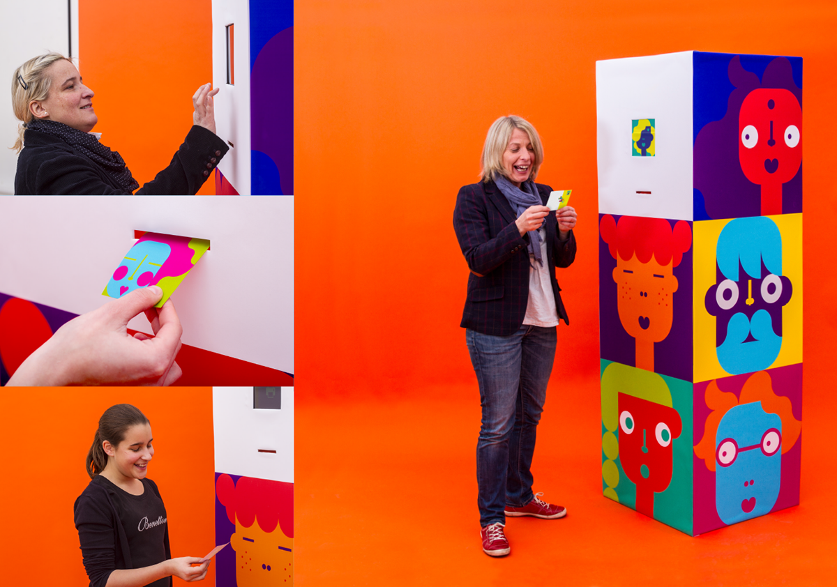

Image and answer will become a part of Stuttgart’s cityscape. Big glass fronts in the city display everchanging digital portraits.
This identity can be ever growing, changing and be used for promoting Stuttgart as a colourful, vibrant and fun place to be.


Throughout the city colourfully shaped seating are positioned, to encourage a playful interaction, that is fun and makes people laugh. And Stuttgart’s parks become a playground.


A concept by Vera Oberlader, Annika Heß, Romana Wieser and Fabian Karrer.
The project won a „Wood Pencil“ at the D&AD New Blood Award 2015 and is nominated for the German Design Award 2016. At the Red Dot Communication Design Award it won the title „Best of the best“.
Thanks for watching.