I started working with Driftwood while they were still a small and rad Portland fledgling. I developed a brand, voice, logo system and layout guide to express their strong vision.
Photography by Holly Feral & Margot Bigg.

We developed several marks that could flex for different needs and environments. The driftwood illustration which anchors the primary lockup was modeled after a real piece of driftwood found by the publication's founder when she decided to make the magazine a reality. She woodburned the name Driftwood onto the piece, and a photo of it served as a logo in the earliest days of the brand.

The cascading hierarchy of the primary mark from large to small informed a simplified wordmark version of the logo housed in a triangle. This triangle shape creates a framing device for Driftwood content in its various forms. It is never used as a stand-alone element.

Through repetition, the triangular Driftwood frame lockup has become iconic. Its association with the magazine has become strong enough even to allow for abstraction of the lockup; a simple triangle positioned at the top of a frame evokes the brand.


Artful and photo-driven layouts are an important part of Driftwood's brand.


During the startup days, Driftwood relied on ad sales to get off the ground. A solid media kit was an important resource to send to prospective advertisers to make a clear case for the benefits of partnering with a unique, emerging cultural niche publication like Driftwood.

For secondary elements of the brand, a hand-made DIY approach evokes the artful and people-oriented spirit of Driftwood. It also pays homage to the spirit of Driftwood's earliest logo— a photo of the real piece of driftwood with the magazine's name woodburned onto it by hand.
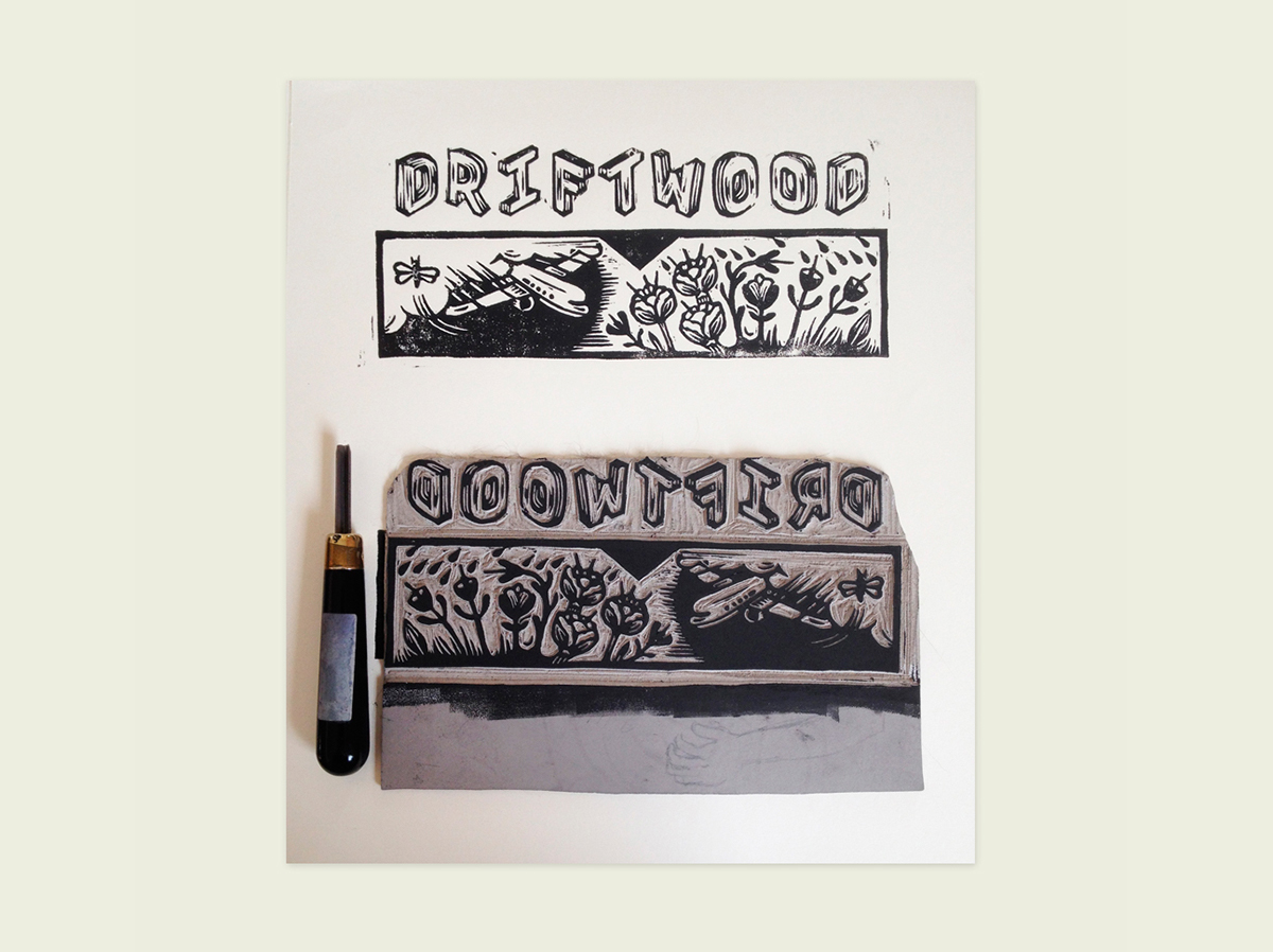
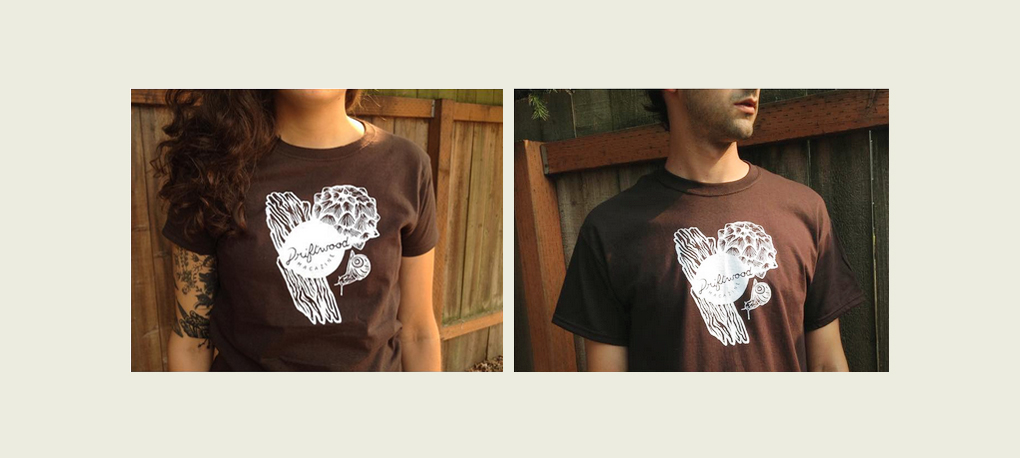
When Driftwood asked me to design shirts, I designed and carved a small series of linocuts.