项目背景
YANG DESIGN 是一家前瞻产品、服务设计咨询公司,在过去两年经历了飞速发展,因此旧品牌形象已经无法承载公司快速增长的媒体公关需求,公司需求识别度更高、更清晰规范以及更有品质的形象体系。
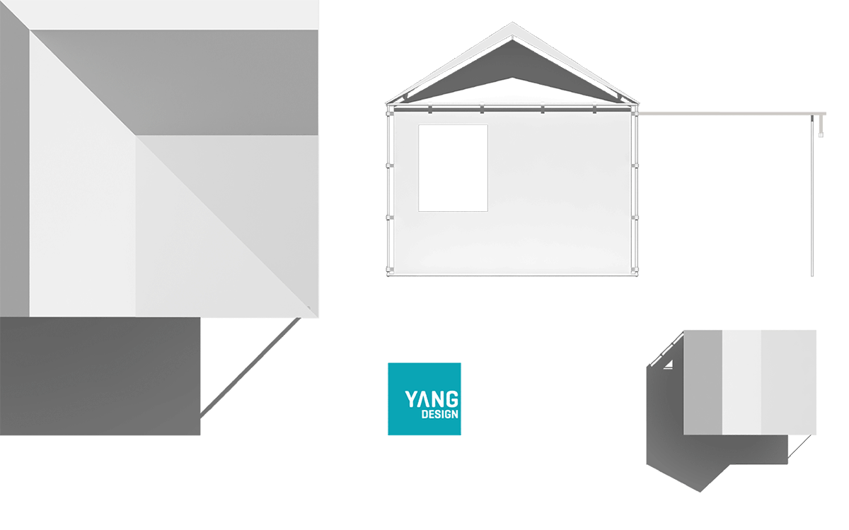
解决方式
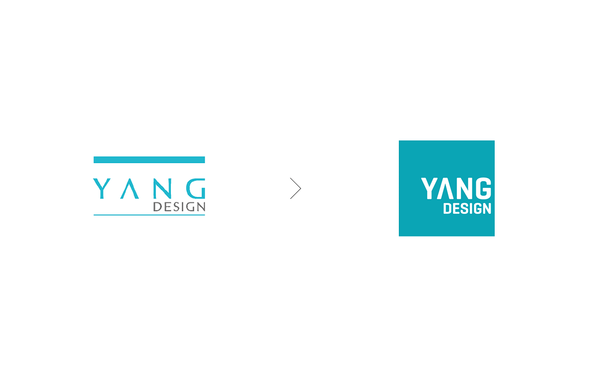
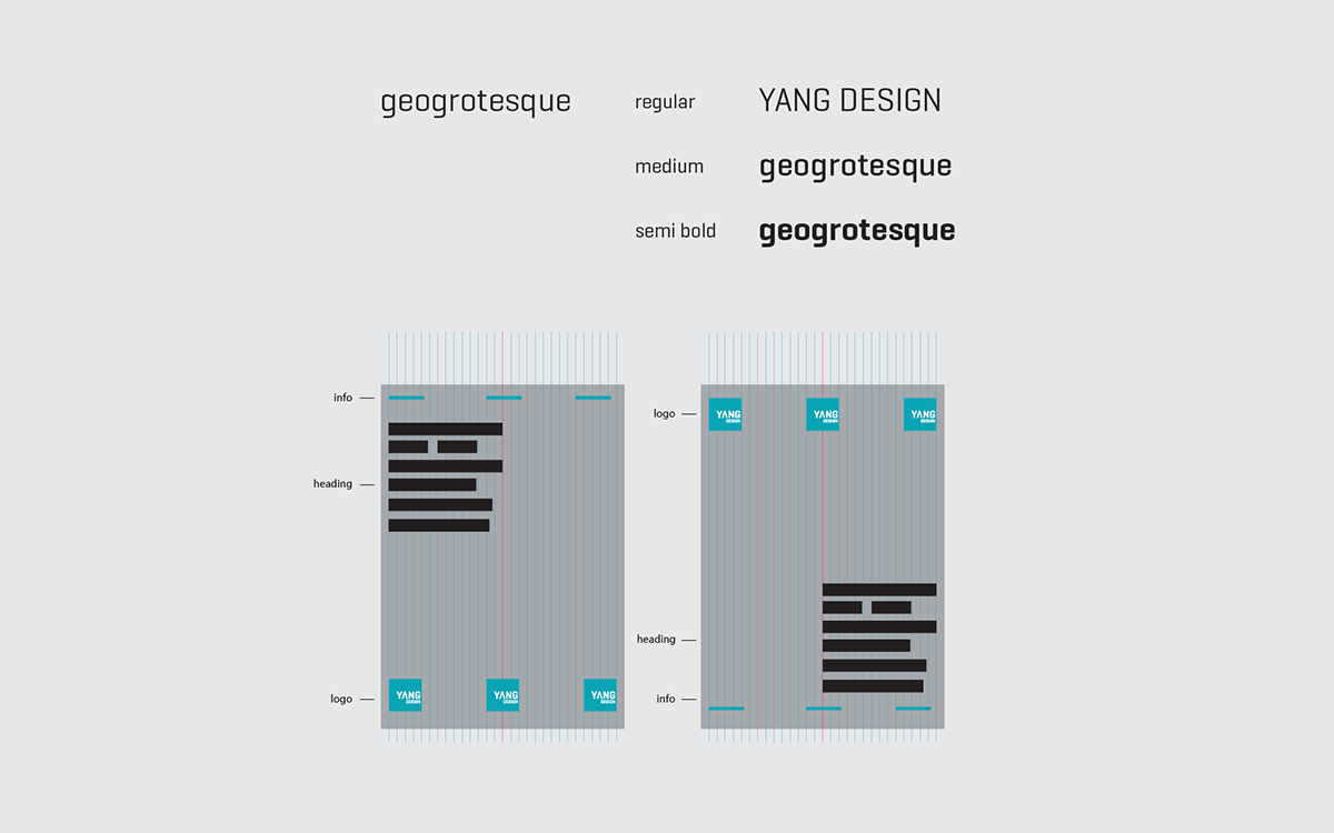
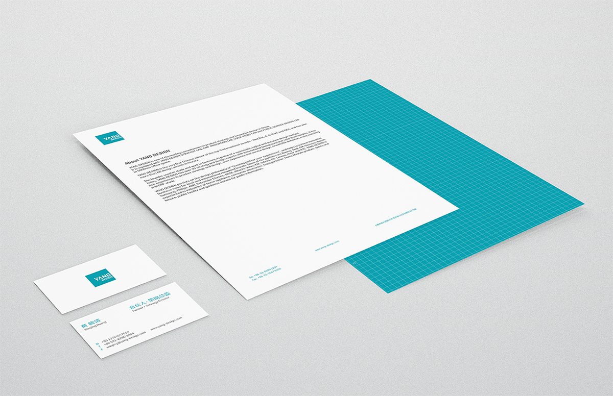
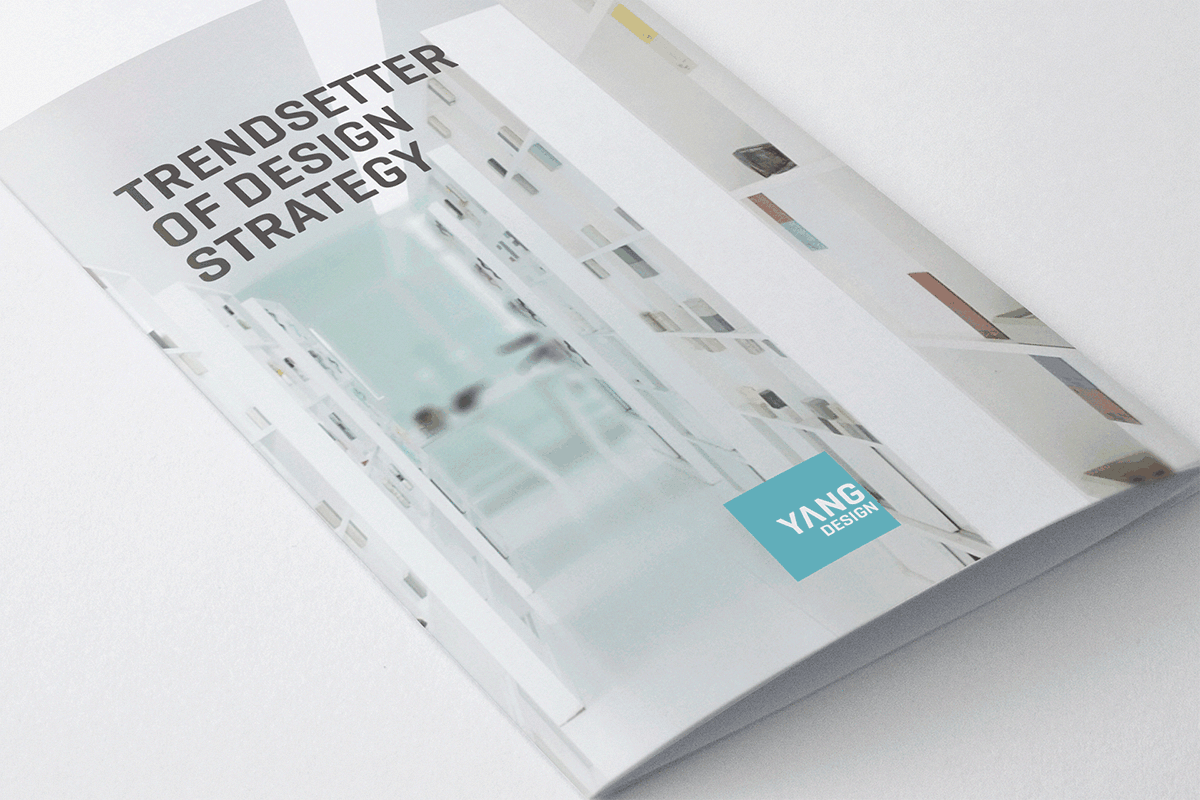
作为YANG DESIGN的首席品牌平面设计师,我负责对公司的品牌形象进行全面升级。此次品牌升级从“传承”与“超越”两方面着手,新的LOGO保留了原LOGO的基础视觉特征,并且将字体处理的更为现代,LOGO颜色更加明晰,形式更加模块化。从而以追求最大化的视觉沟通以及子品牌的可扩展性。更重要的升级来自于对整个识别系统的规范:独特的文字排版网格系统、LOGO的应用方式、清晰简洁加上以留白为主的图像处理规范等。
CHALLENGE
YANG DESIGN is an award wining industrial and service design consultancy which growing fast within past 2 years. In order to meet the new standard of brand communication with client, media and public relation, the logo and identity system needed to update.
SOLUTION
As lead graphic designer in YANG DESIGN, I developed a new identity system with refined logo design. The logo refinement focused on inheriting and evolving. I kept some fundamental visual aspect of the old one. The new typeface is bolder yet more modern, plus the refined color and square shape made it more legible, iconic and adaptable. In addition, the new identity system made the brand more distinctive. A unique grid system along with typography has been set. The imagery has been designed to be more clear and professional.