Here are my work samples for design rennovation and brand identity. As mentioned in the creative brief on the sidenote, I took the ownership of creating a new design paradigm for overall customer experience on flagship products.
New--
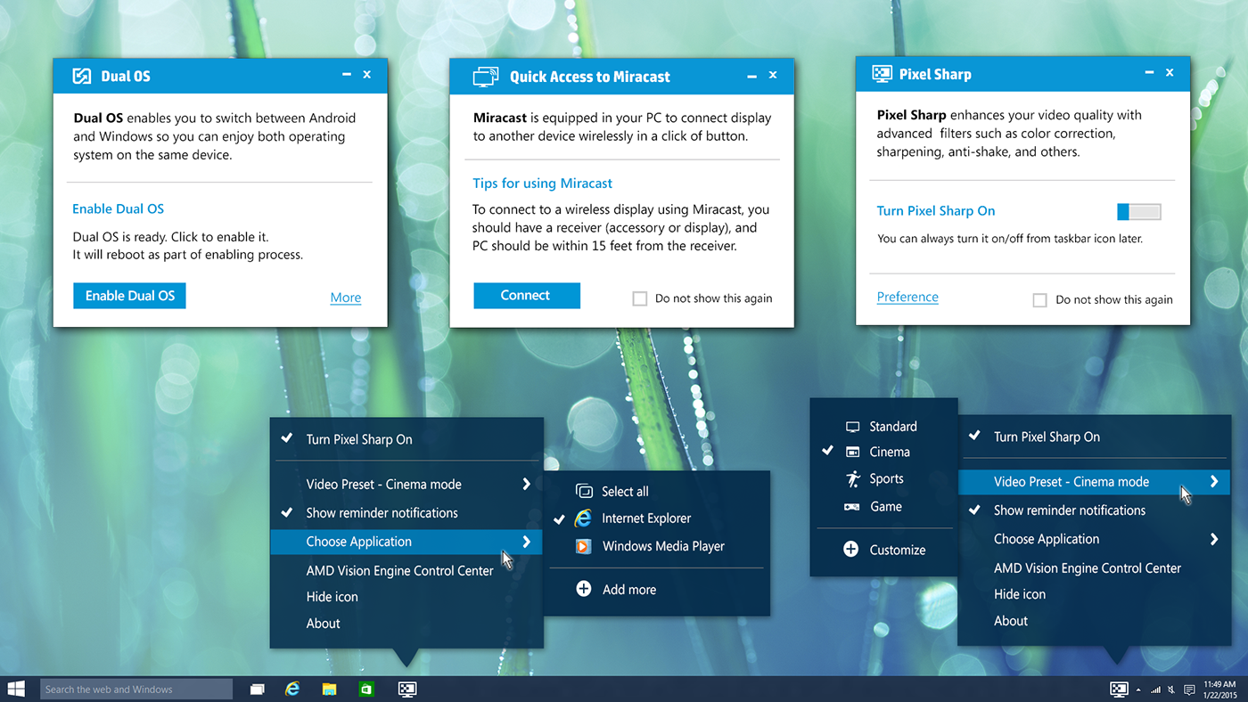
This is a collage of UI design samples I did for utility apps that were pre-installed in consumer PC we shipped. In comparison to the old version below, we have established solid branding with more attractive style and consistent UI design pattern.

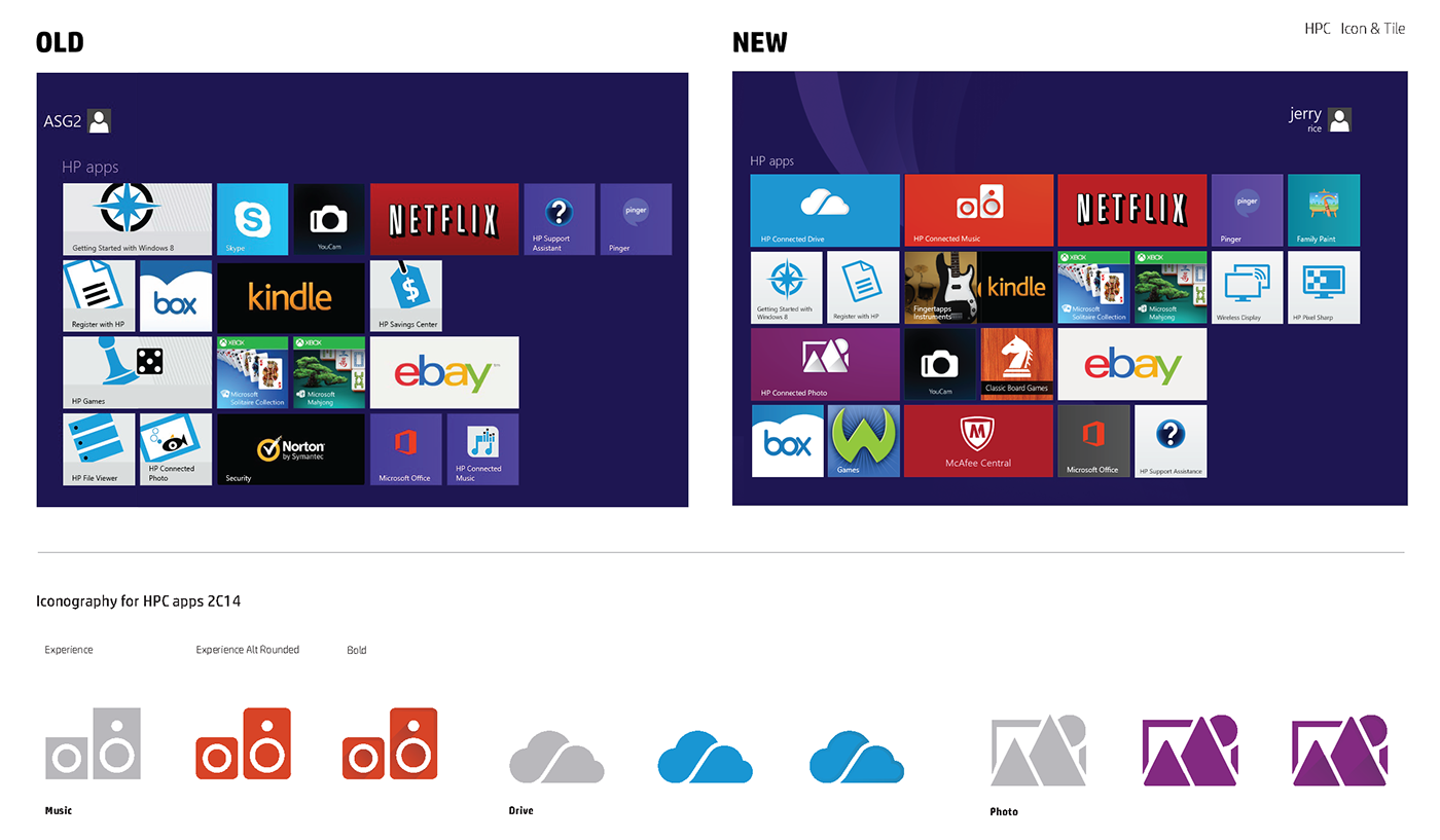
Old--
Samples of pre-installed utility apps for the same PC unit as above. Poor UX design, bad branding resulted in no customer engagement.

Bad.
I initiated a consistency inspection in the current HW build (at that time) to identify potential areas to improve for better user experience in overall.
Point 1: Usage of corporate logo in various color theme for multiple utility apps is bad.
Point 2: Inconsistent visual language for app icons is bad.
Point 3: No branding impact from wallpaper to app design is bad.
The value of app icons can be very different than those system/control icons. I focused more on compelling visual and clear message to make our hero app icons stand out with unique identity. With UI framework, iconography, I recreated touch point layout to sell HP’s 1st party default apps with new branding.

Samples of design exploration from rough sketch through concept phase.
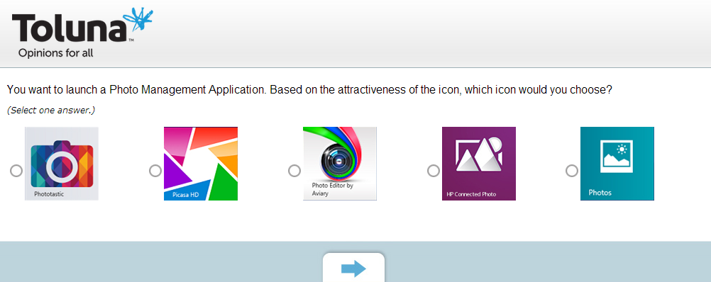
I was involved in series of testing and survey to validate design concept. This is an example of testing user preference of our new hero app icons in comparison with the competitors.

I created this color palettes for hero apps in collaboraiton with our corporate branding team.

Along with color theory and typography, iconography was one of the core aspects of creating branding guideline for consistent design pattern. COmplying with web icons that were created by corporate branding team, I led the design workflow to create icons for application and application controls.


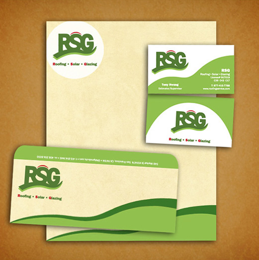
RSG is an eco-freindly construction company located in East Bay area, CA. I created the brand identity with corporate logo and print collateral.


I was a lead product designer for Shonen Jump graphic novel, the world's best selling manga brand. I did overall design from logo design (both brand and productlines) to layout template.

Slam dunk was one of the best selling products for Shonen Jump brand. I designed these front covers in the similar style for branding while creating some unique identity for it.


