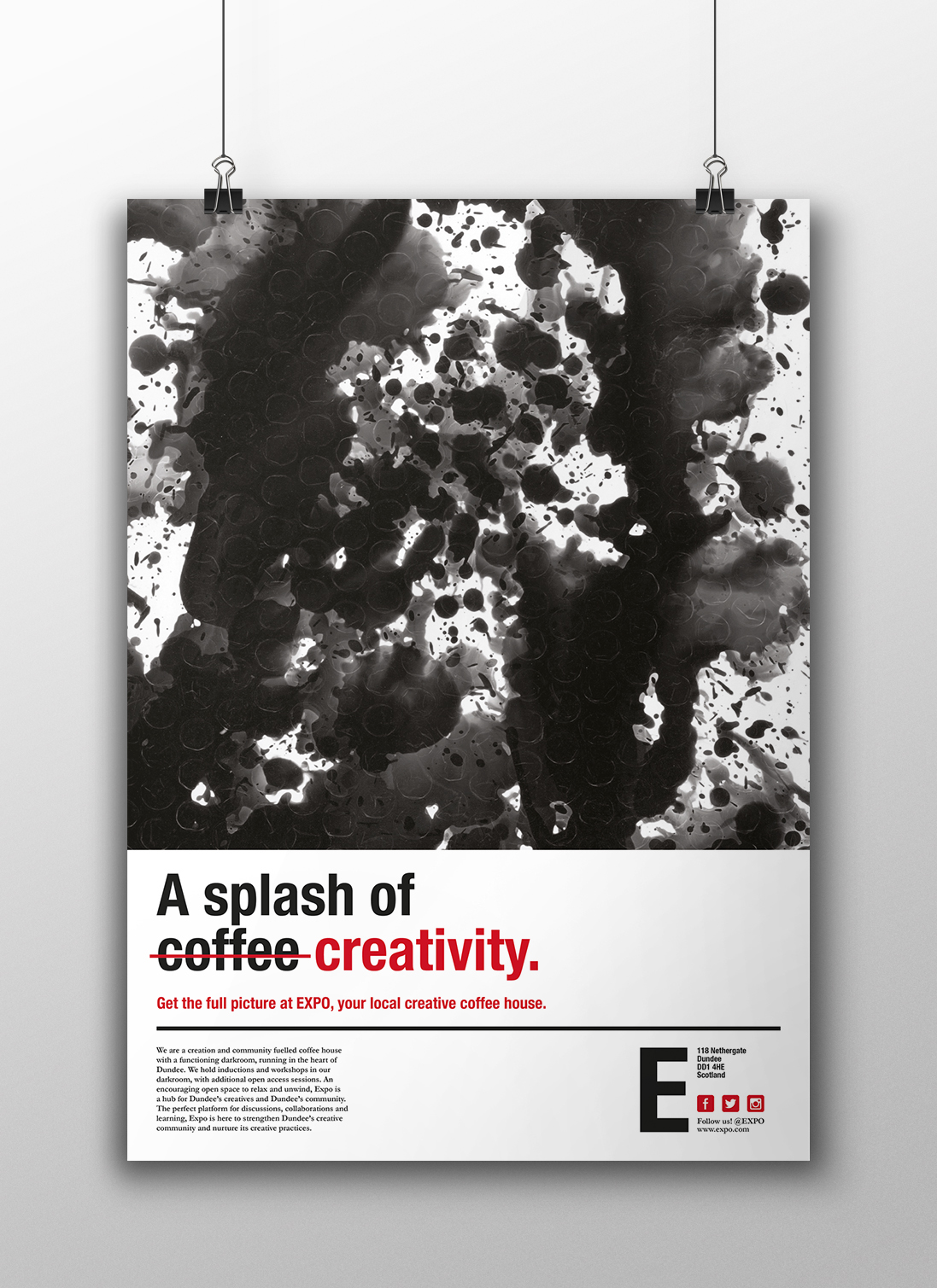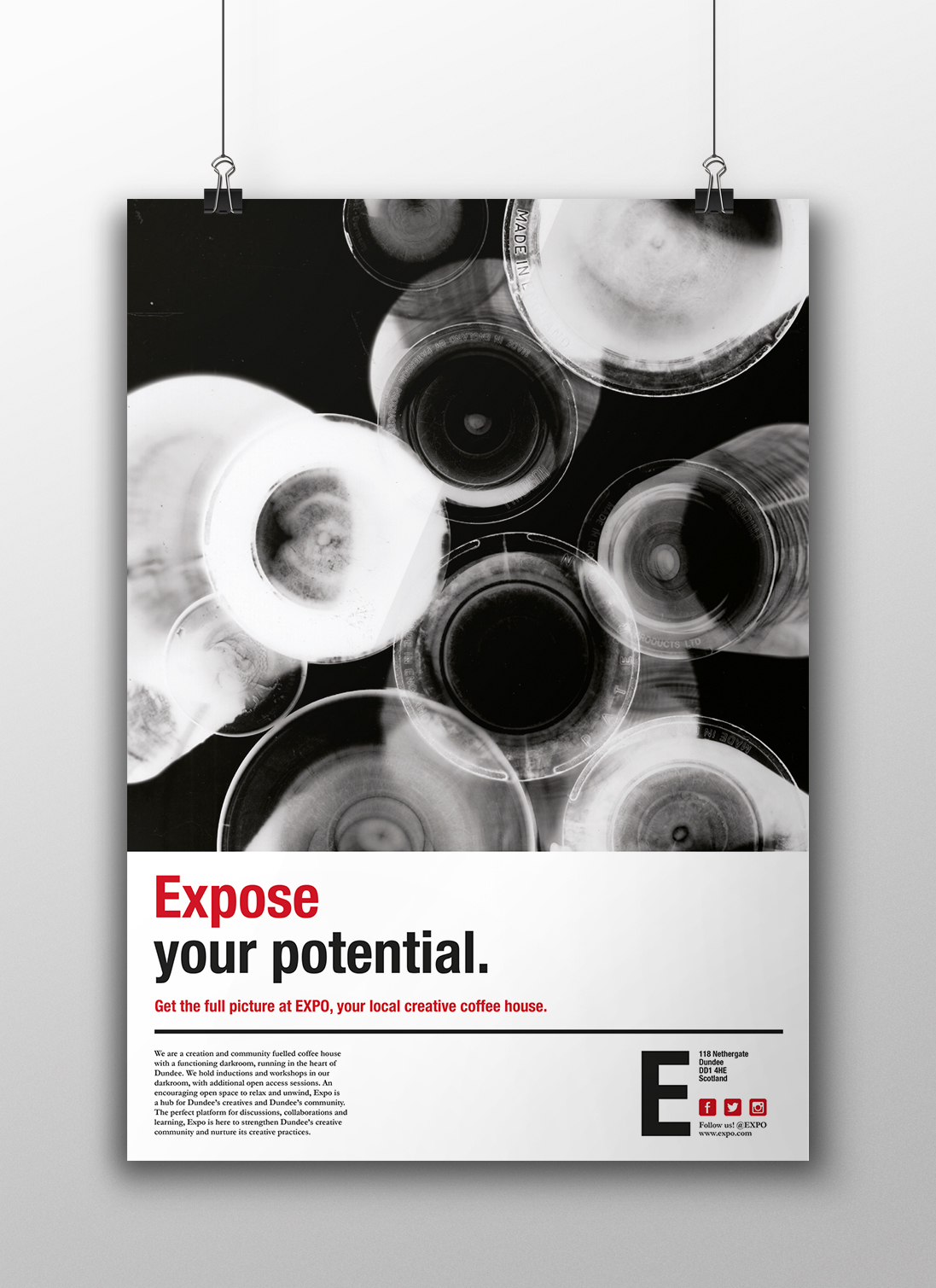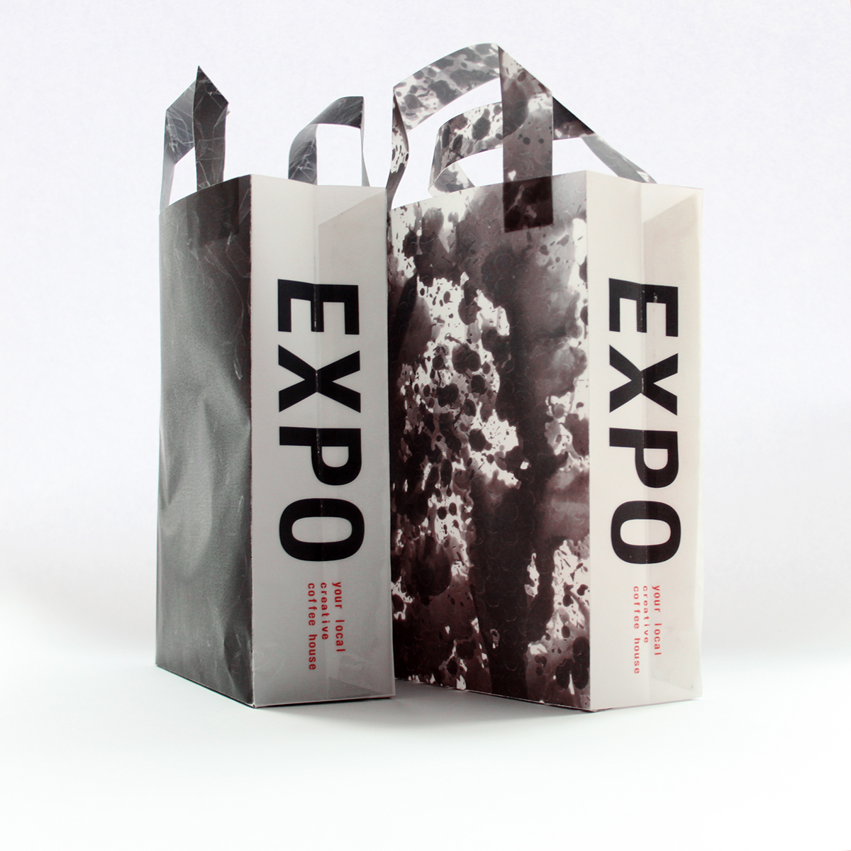
Expo (short for both ‘Exposition’ and ‘Exposure’) is a new creative space in Dundee combining an open access darkroom facility (running inductions and workshops) with a coffee house. This is a creation and community fuelled space encouraging unbiased learning of an old technique which will be new to many, whilst providing the comforting atmosphere that a coffee shop might encapsulate.
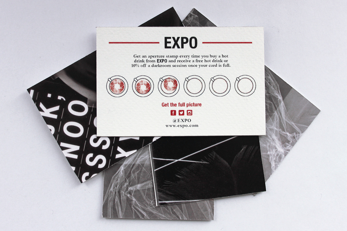
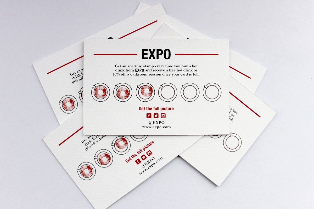
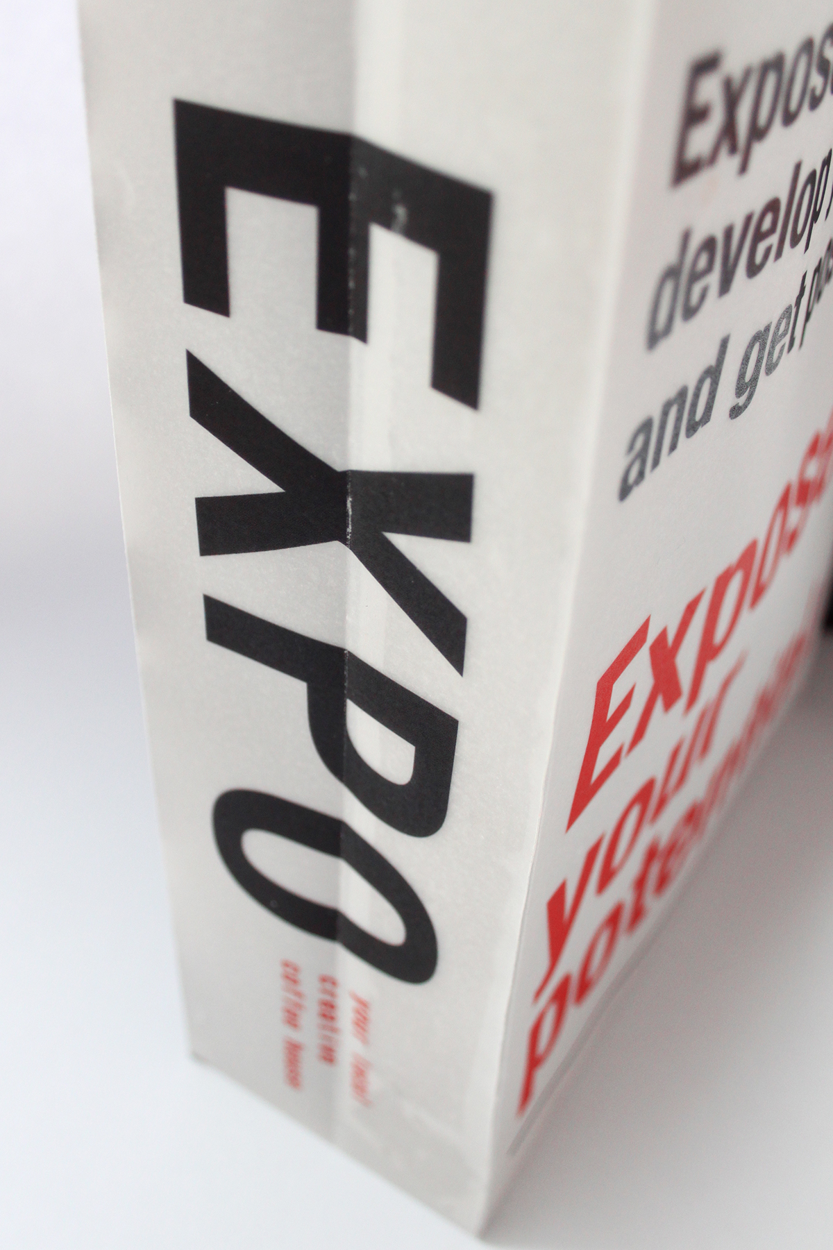
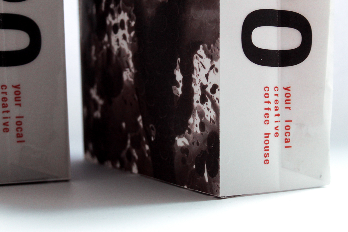
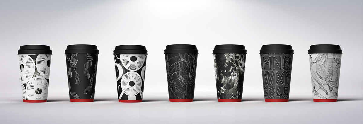
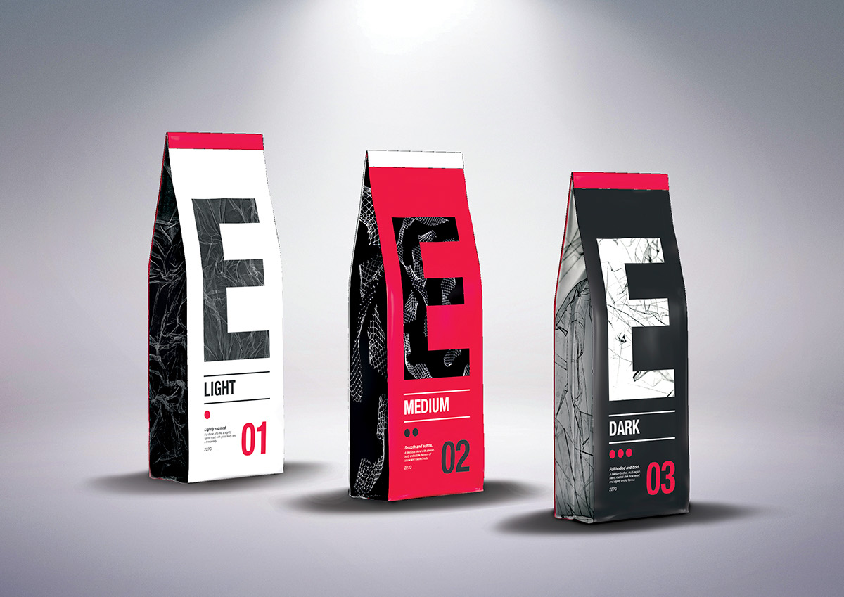
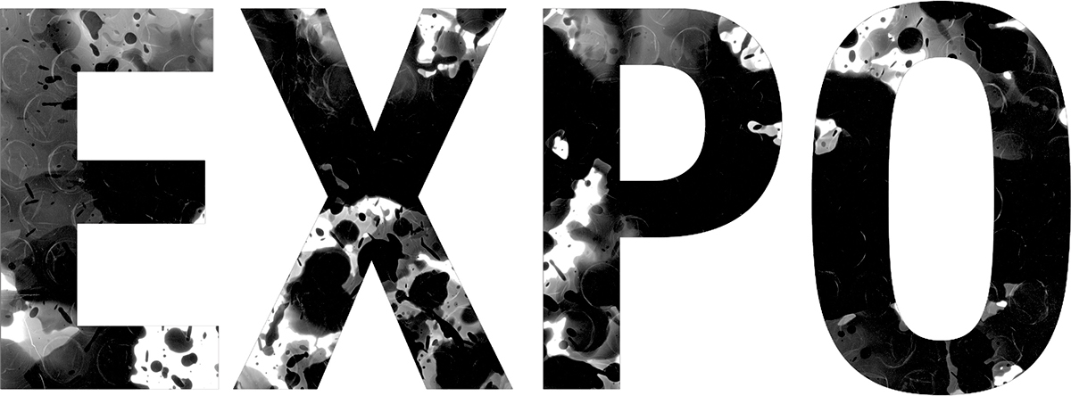
The resulting brand/identity created utilises classical elements from both design and photography. From the use of Helvetica Neue and Garamond in a typographic hierarchy, the colour scheme of red, white and black to the use of photograms as a key element in the design strategy.
Photograms are used consistently throughout the brand. They are used in the logo, in packaging, marketing materials and more, to establish continuity across all design elements. Photograms are arguably one of the simplest articles to produce in the darkroom, a camera is not even needed to create them. However, they can yield impressive results due to their unique nature (for example, Man Ray’s ‘Rayographs’). This is key in Expo’s strategy as it illustrates to consumers the ease in creating effective pieces in the darkroom, without needing any previous experience. Photograms seen in the branding were made using a variety of materials including bubble wrap, cling film, tape and more.
The logo, when used in full, can be done using the typeface alone, or with photograms masked behind to create a textured logo. In doing this, the logo will stay uniformly the same, but always alter slightly to be reflective of the creative and always moving nature of the brand.