Fairphone - Logo Design
Fairphone is a social enterprise that is building a movement for fairer electronics. By making a phone, they’re opening up the supply chain and make a positive impact in mining, design, manufacturing and life cycle. Along the way expanding the market for products that put ethical values first.
Fairphone is the most sustainable smartphone on the market. It is made from fair-trade gold and recycled materials and is easy to open up for DIY repairs and upgrades.
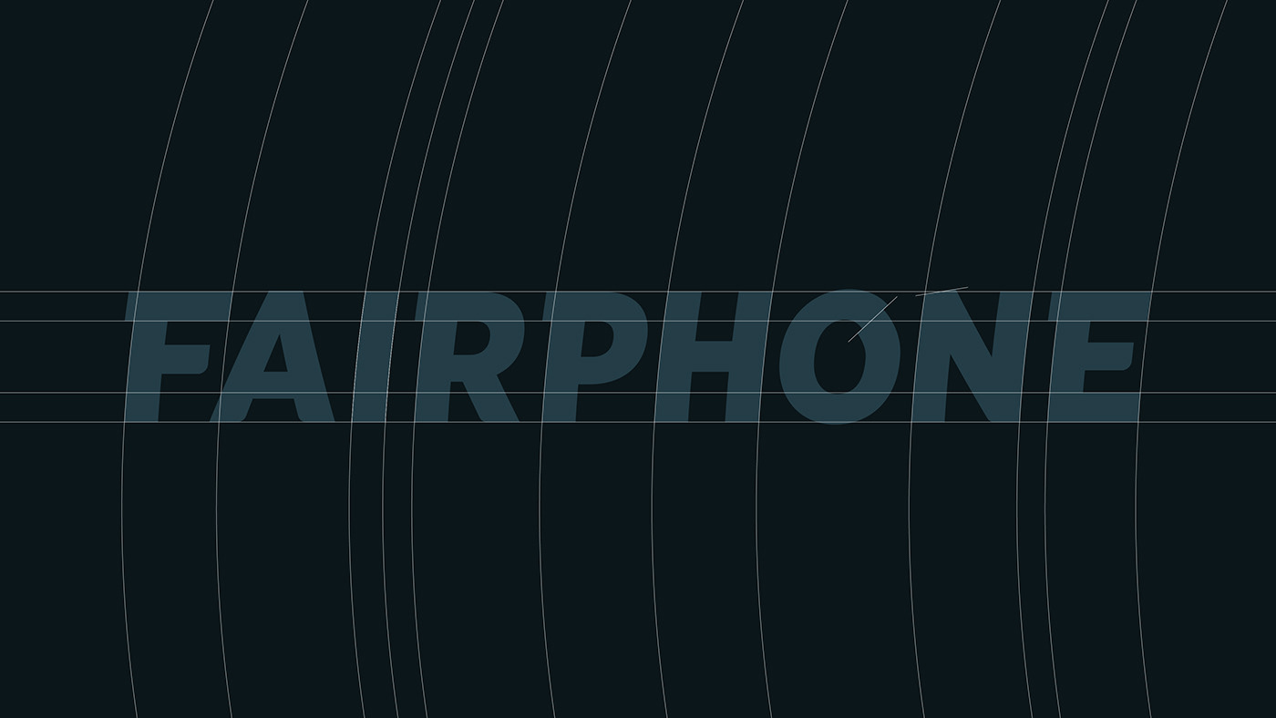
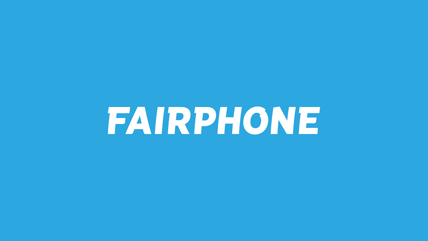
Calango was commissioned to design a word-mark for this disruptive brand. The goal was to stand out from the majority of electronics logos, while still being able to compete with the big names in the smartphone industry.
The curved type leaning forward tells a story of vigor and determination, while the disconnected O symbolizes the never ending mission towards a fairer electronics industry. There is always an unfair aspect somewhere that could be improved.
Get yours
Explore Fairphone at fairphone.com
Credits
Jeroen Krielaars / Calango - Logo design