The Egyptian food group Sakr asked me to redesign the logo of one of their product: Golden Chef, a brand of ghee (clarified butter used for cooking in some Arab countries). The challenge was to redesign both the Latin version and Arabic one ensuring harmonization between two scripts respecting their own features. I also redesign entierly the packaging.
/
Le groupe d'agro-alimentaire égyptien Sakr m'a demandé de refaire le logo d'un de leur produits : Golden Chef, une marque de ghi (beure clarifié utilisé en cuisine dans certains pays arabes). L'enjeu a été de redessiner à la fois la version latine et arabe en veillant à l'harmonisation de deux sytèmes d'écritures tout en respectant leurs caractéristiques propres. J'ai aussi refait entièrement le packaging.
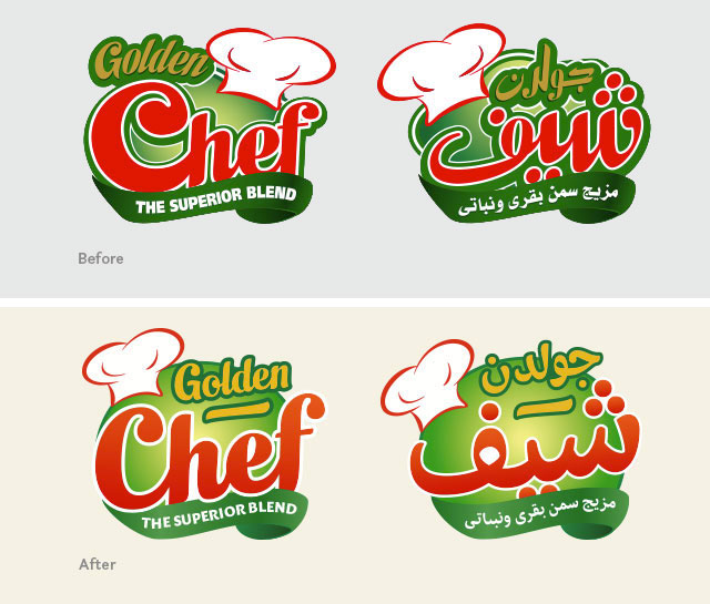

All the colors changed to be less aggressive and more "foody", some elements of the logotype switched to create a more unified logo than an addition of disparate elements.
—
Les couleurs ont changé de manière à être moins agressives et plus "gourmandes". Certains éléments ont changé de place afin de créer un logo plus uni plutôt qu'une somme d'éléments disparates.

All the letter shapes were redesigned in particular the C and the ascenders of h and f both for a better legibility and integration with the other part of the logo.
—
Toutes les formes de lettres ont été redessinées, en particulier le C et les jambages supérieurs des h et f à la fois pour plus de lisibilité ainsi qu'une meilleure intégration avec le reste du logo.

The typeface of the baseline changed for a more "foody" aspect and better readability.
—
La typographie du slogan a été changée pour un aspect plus "gourmand" ainsi qu'une meilleure lisibilité.

Like for the latin logo, the number of contours is reduced, the shapes are simplifed and clearer, less confusing.
—
Comme pour le logo latin, le nombre de contours est réduit, les formes sont simplifiées et plus claires, moins confuses.

The shapes of the old logo wanted to match the Latin logo by copying its contrast and its shapes. But because arabic has its own features, I redesigned it to be more faithful to arabic writing taking care of the matchmaking with the latin.
—
Les formes de l'ancien logo voulaient correspondre au latin en copiant son contraste et ses formes. Mais parce que l'arabe a ses propre caractéristiques, je l'ai redessiné afin d'être plus fidèle à l'écriture arabe tout en veillant à la correspondance avec le latin.


