North Face Visual Identity
I was set the task of creating a visual identity for the active wear brand, North Face. The identity is designed to embrace the idea of exploration, navigation and adventure.
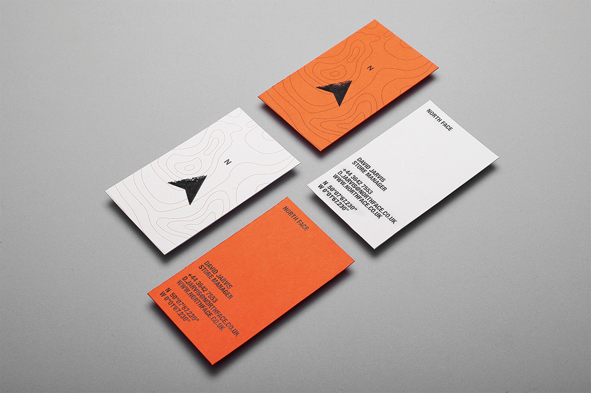
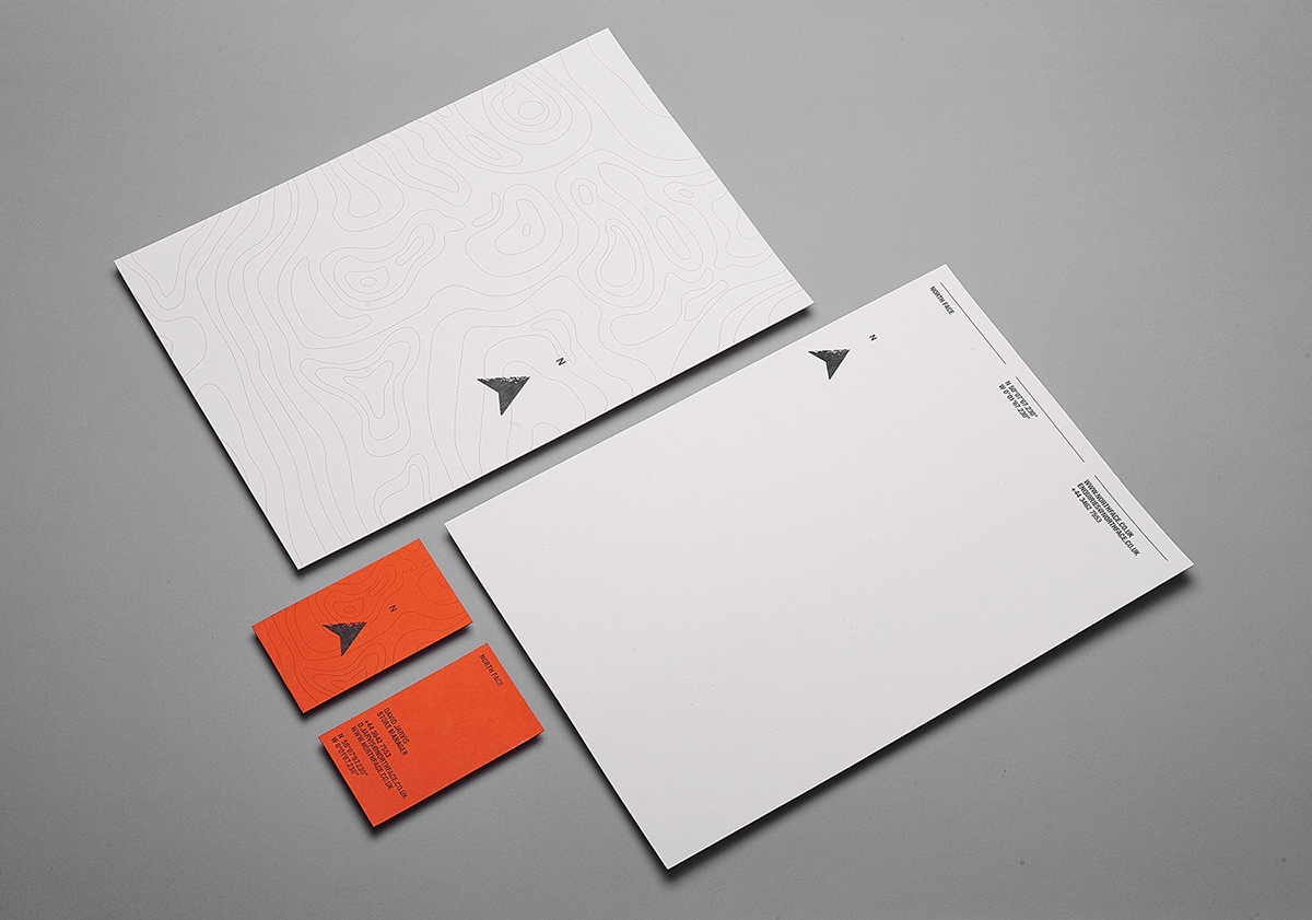
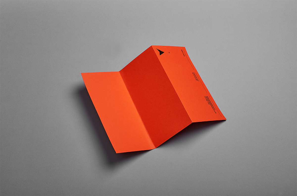
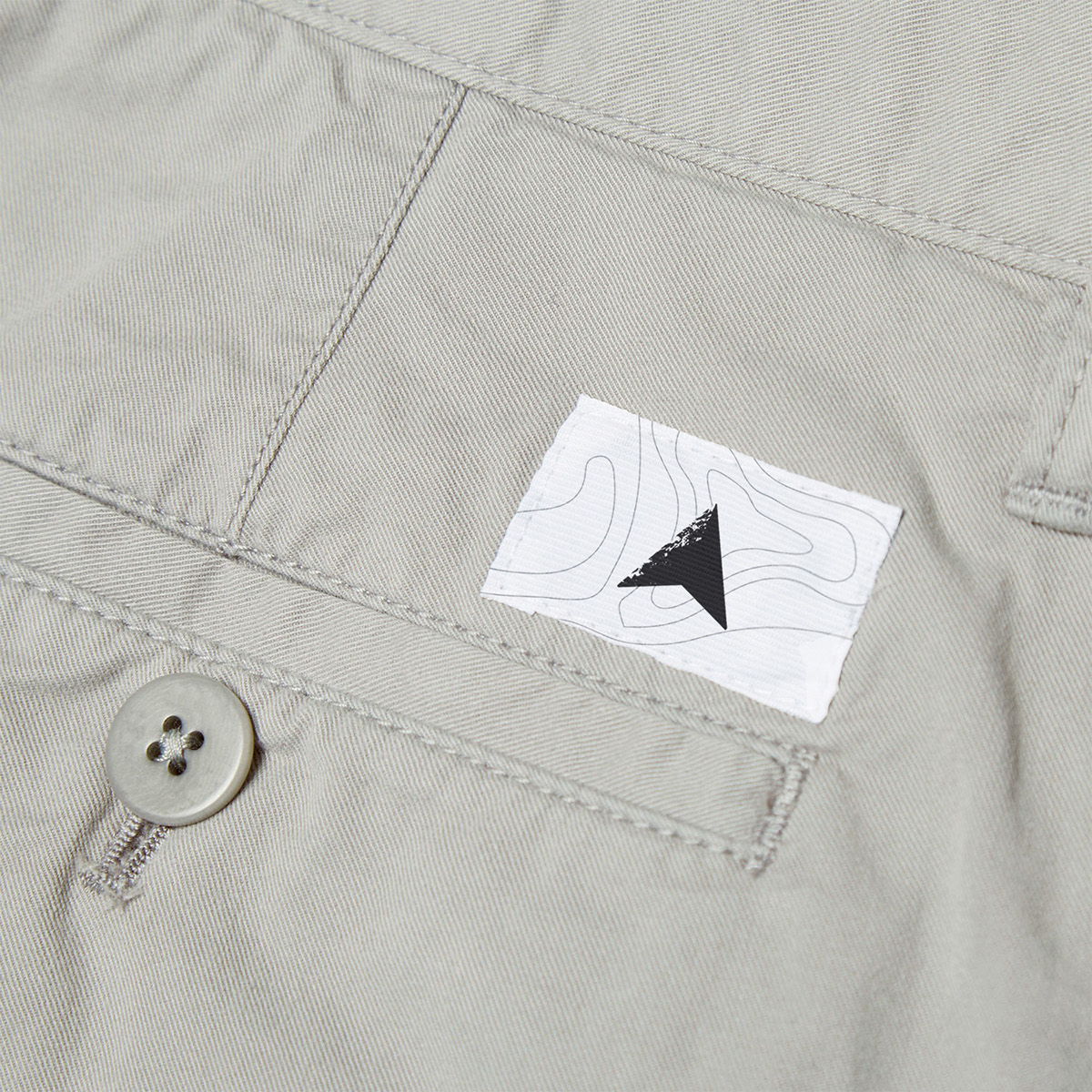
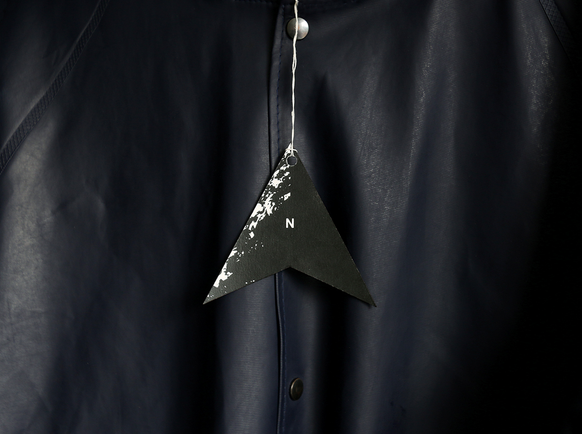
The marque is designed to represent a north compass point and a mountain. The rocky texture only covers half of the marque. The reason for this is because the North Face gets it's name from the fact that the north face of a mountain is the most difficult to climb; It receives no direct sun light, therefore it is always in the dark. To represent this, one side of the marque is blacked out.
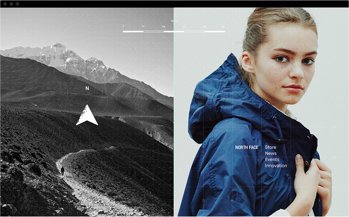
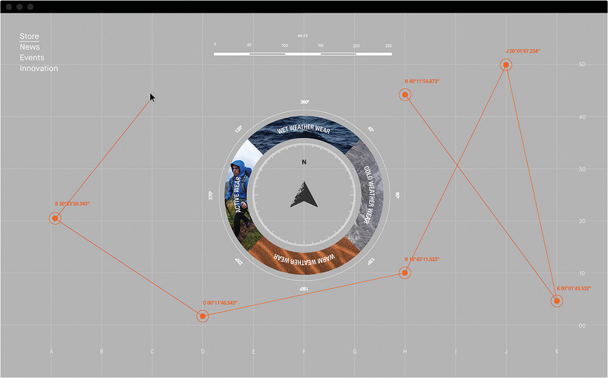
The rest of the identity makes reference to exploration by utilising map markings - gradient lines from topographical maps, co-ordinates, and distance scales are used throughout.
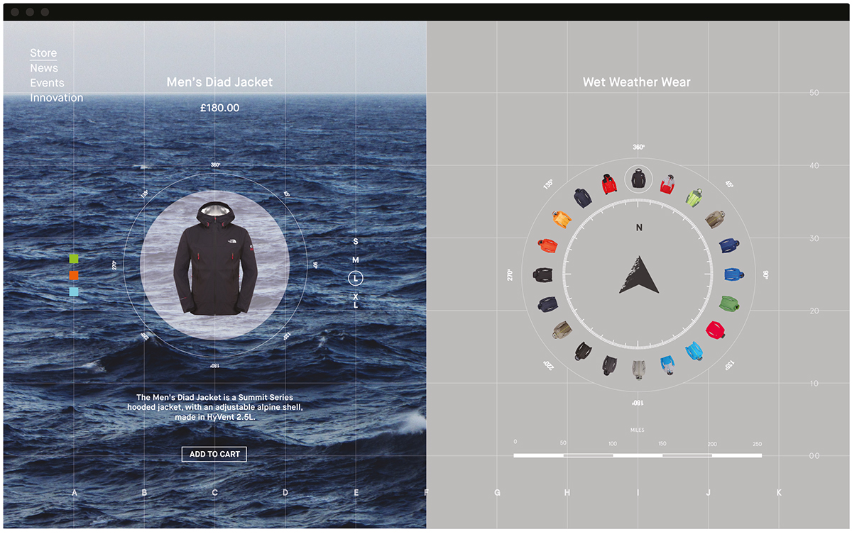
The identity comes to life through digital applications. While navigating the website, the user's cursor 'journey' is tracked, plotting their digital journey with co-ordinate points. The site is navigated by using a compass device, which the marque becomes part of, selecting items which are positioned north.
The concept store app enables customers to explore stores using compasses on their smartphones. Customers are able to use in-store navigation to locate items they have viewed on their digital devices.
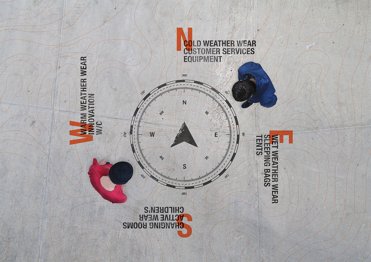
Compasses printed on the floor are used as in-store way finding, showing that different departments are either, north, east, south, or west, enabling customers to use a compass to navigate their way around the store.