The goal of this project was a small company rebranding. We were asked to select a company in Kent, Ohio to research and follow through with a design system we felt fit the needs of the company. I started the project by exploring a wide range of ideas. I eventually narrowed it down to handwritten type combined with some kind of fork/gardening tool element and/or sun.
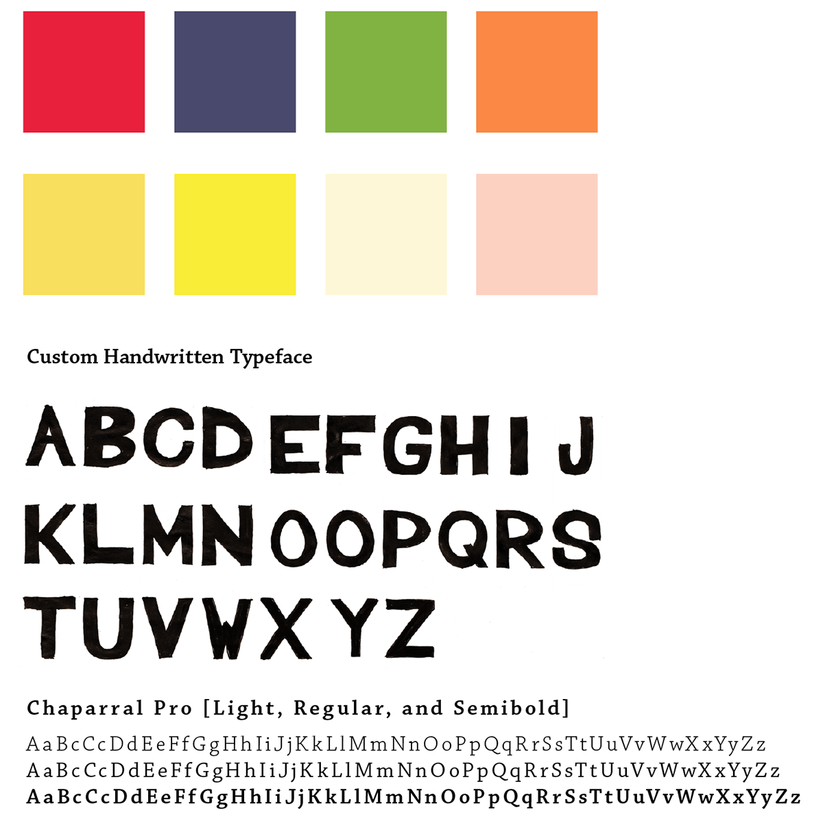
We had to develop a branding system of some type in order to present a final logo, type system, advertising series, and website. The system I developed included handwritten type combined with Chaparral Pro.

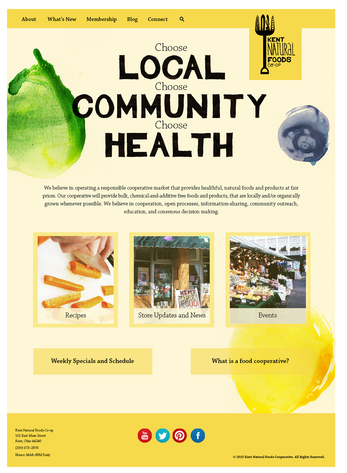
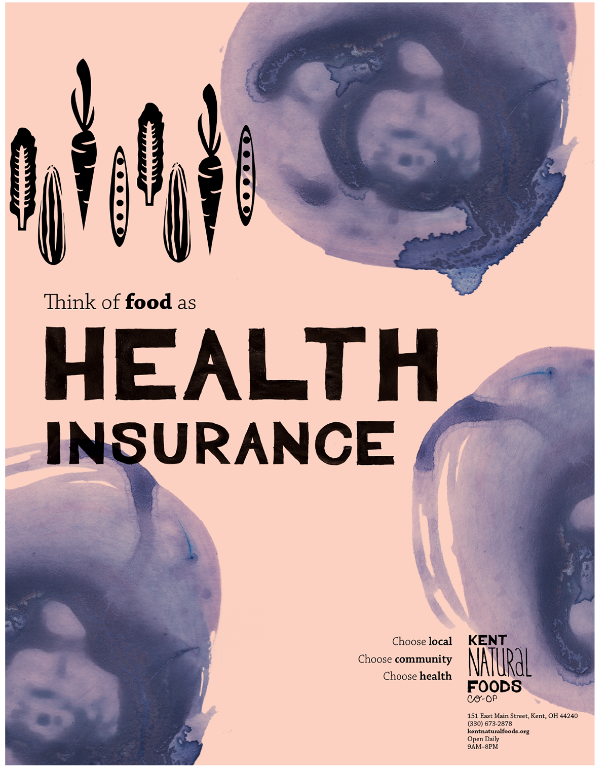
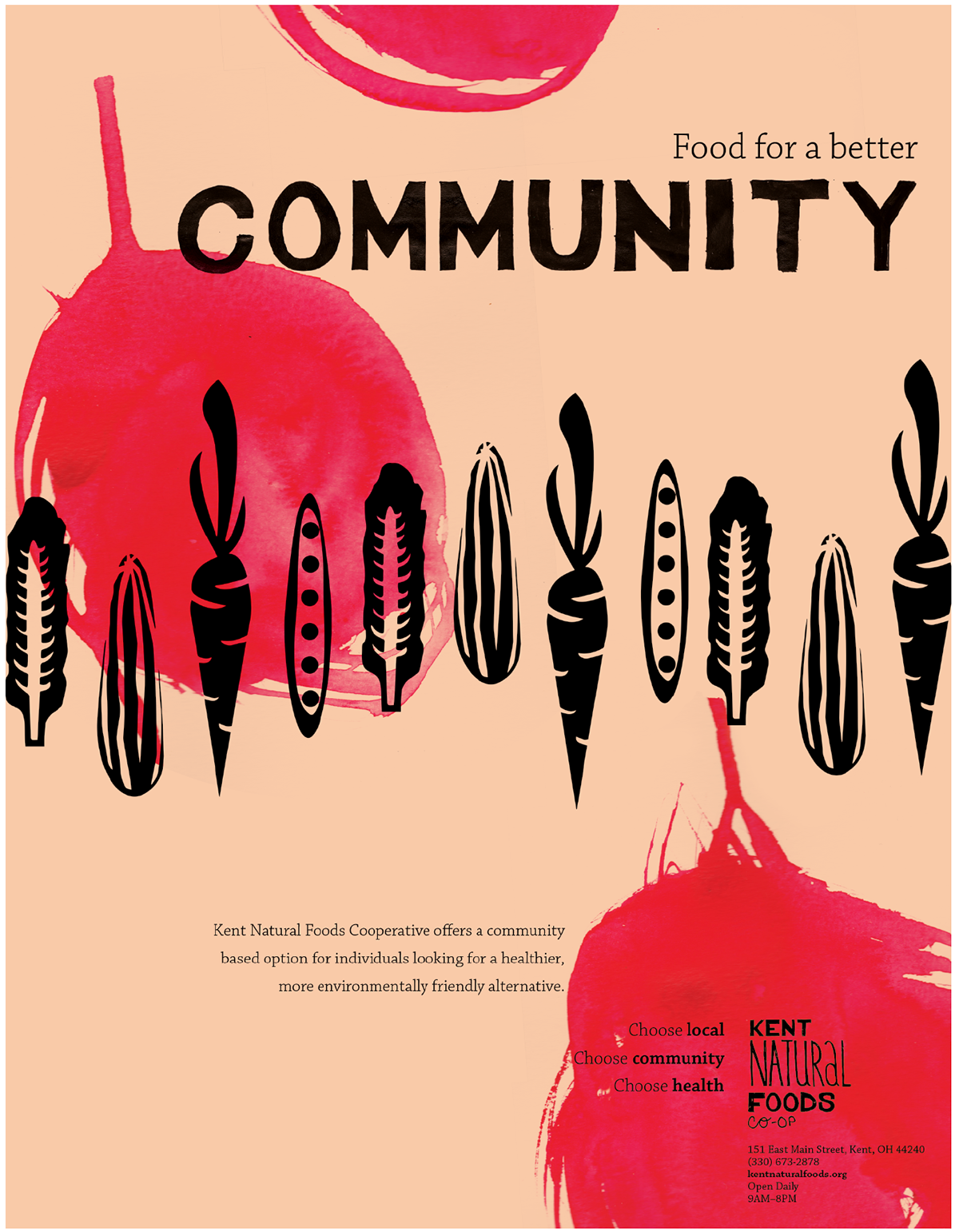
I developed a family of abstract fruit and vegetables to bring a feeling of organic freedom that aligns with the core beliefs of the co-op. These elements were created using watercolors.

The other vegetables found throughout the branding include the set developed for the logo. These images can be used in a variety of ways, in place of the fork/farming tool element. This offers a level of flexibility in the branding.
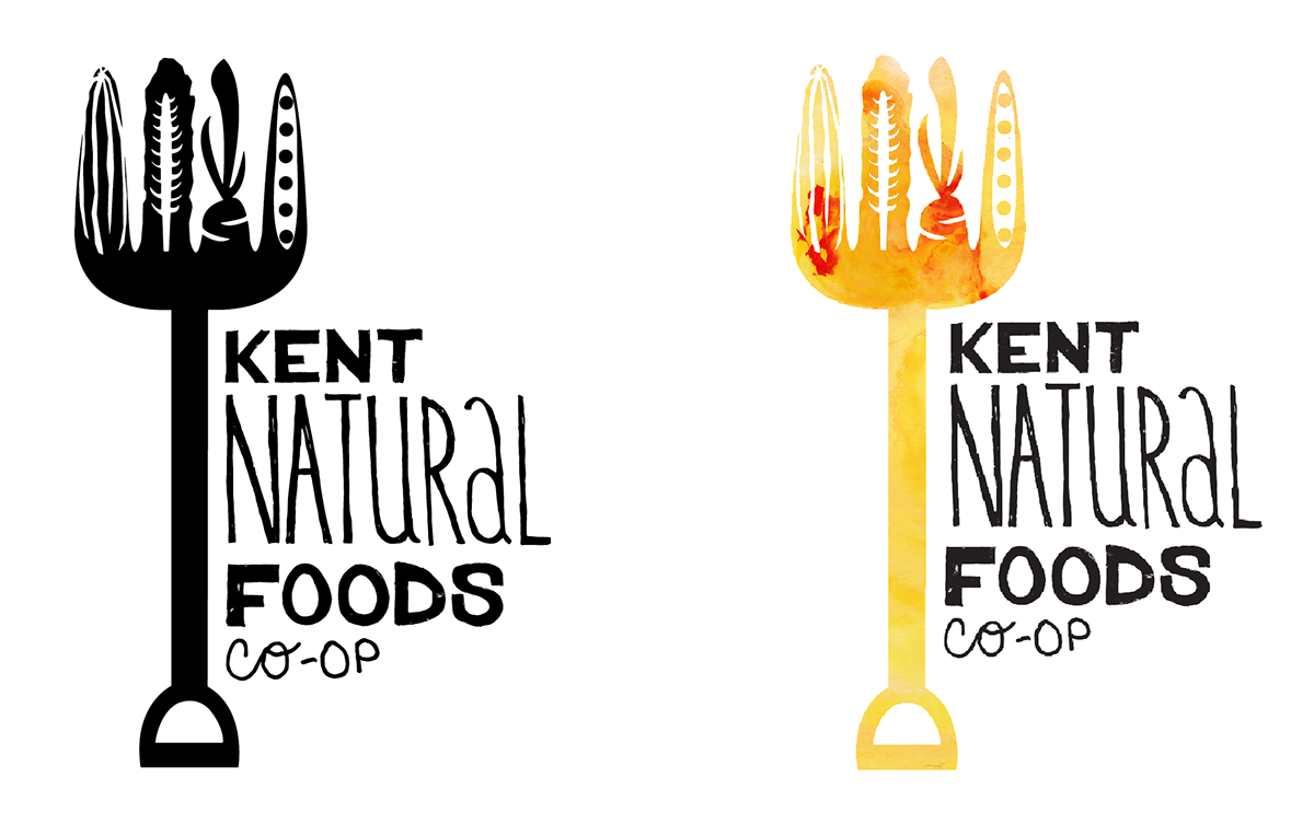
The final logo combines all of the elements together. It can be deconstructed and used in a wide range of ways to best suit a variety of applications, both digital and print.
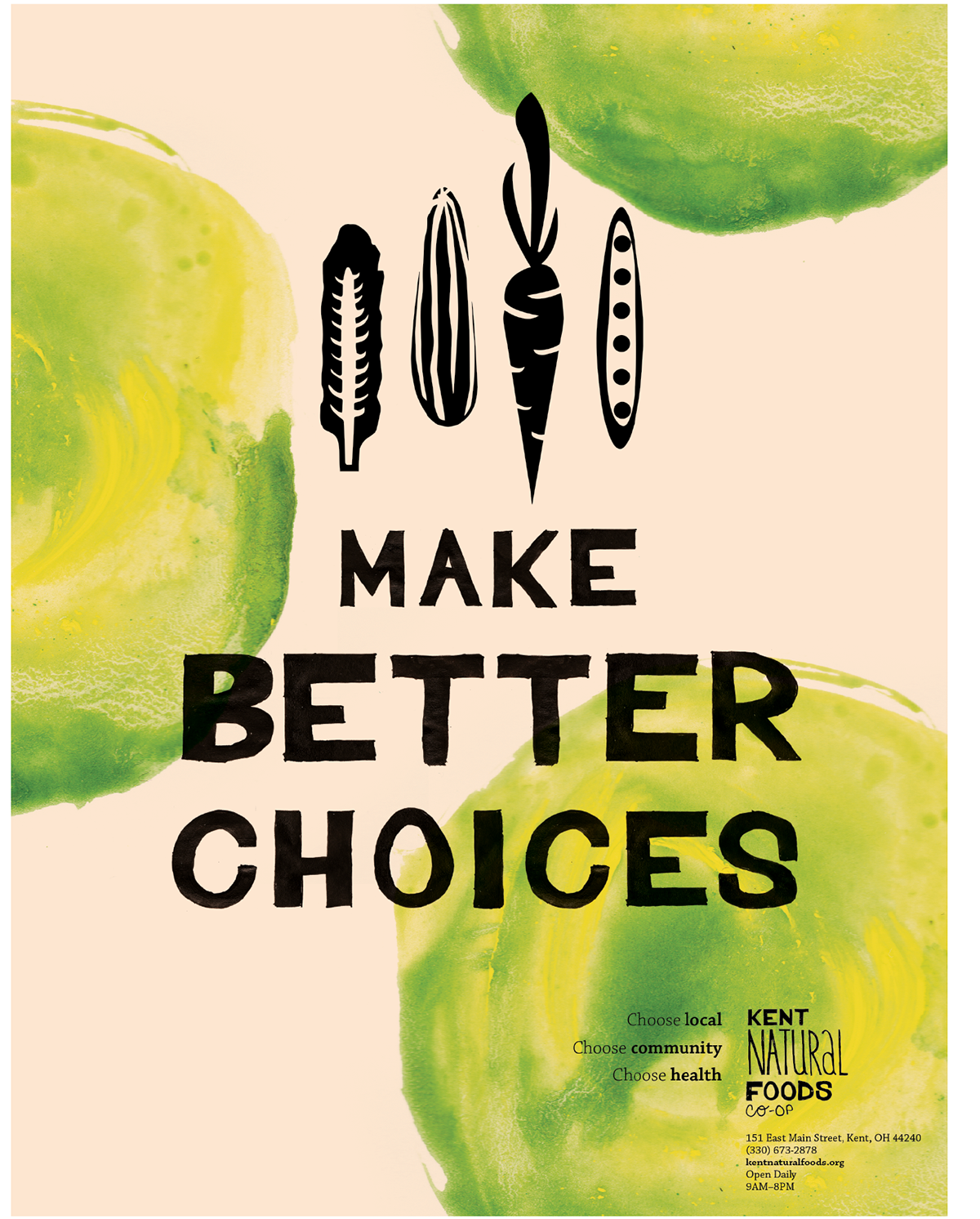
The advertising series attempts to grab the attention of a wide variety of people in the community, including students, families, and Kent's older population. Each ad tries to project the ideals of the co-op in a very straight forward way.
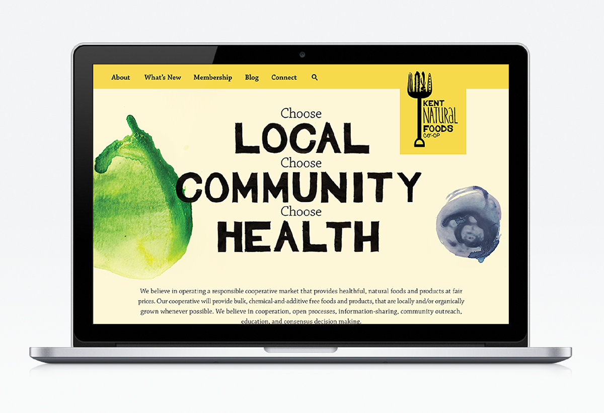
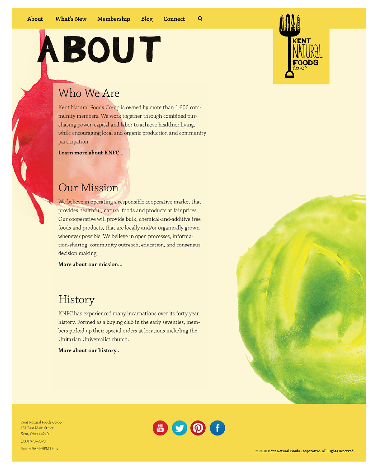
The website reflects the playful, organic feel of the rest of the rebranding.