

Original logo. Owner was very attached to having some recognizable aspect of her signature in the final logo, and strongly liked the dark blue.
Alternative color palette proposed. The original red and blue were very close in terms of value, so for other accent colors I proposed I tried to create a contrast of value between the primary and accent colors. The client requested to see the logo with the original red, but ended up preferring the accent colors that provided more of a value contrast.

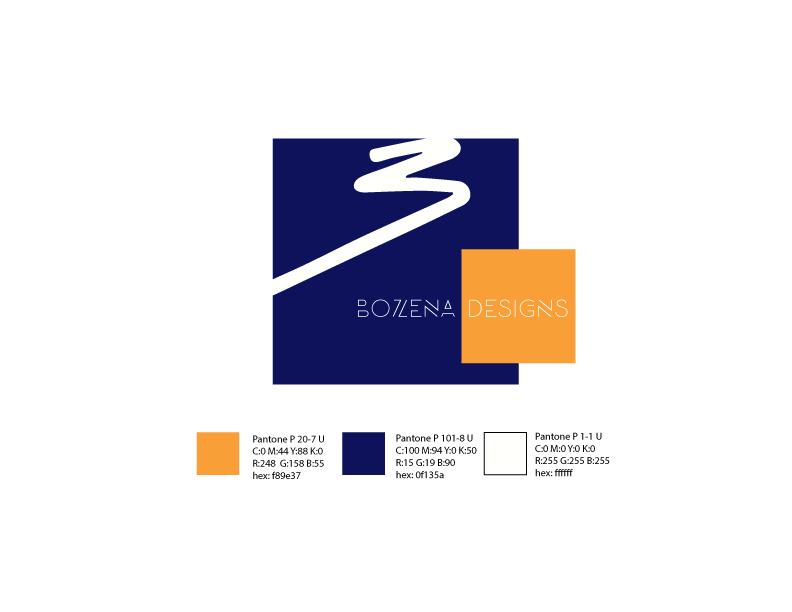
Additional color alternative

Alternative with no accent color. Could either be a primary logo, or used for something such as a one color print job.


