Architetica Logotypes
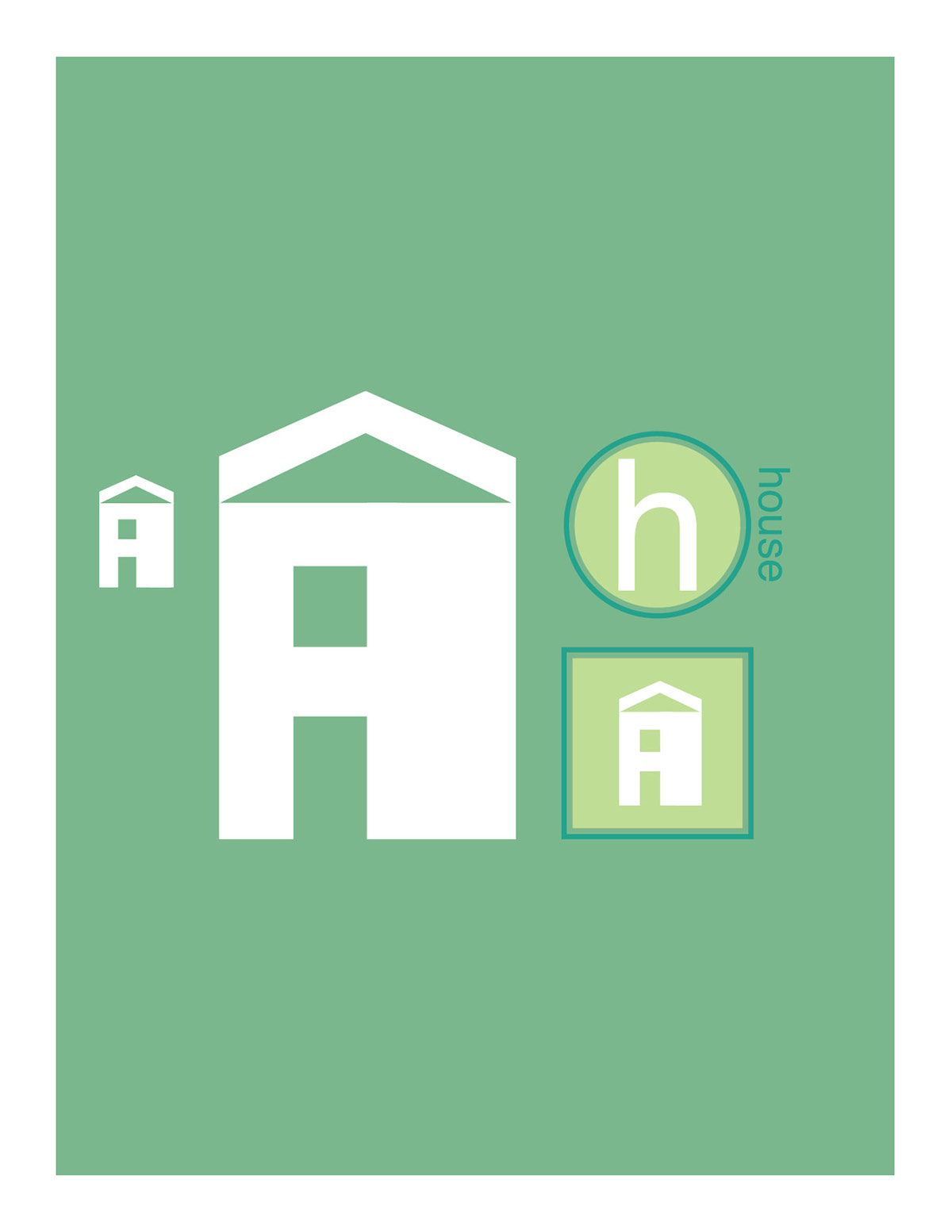
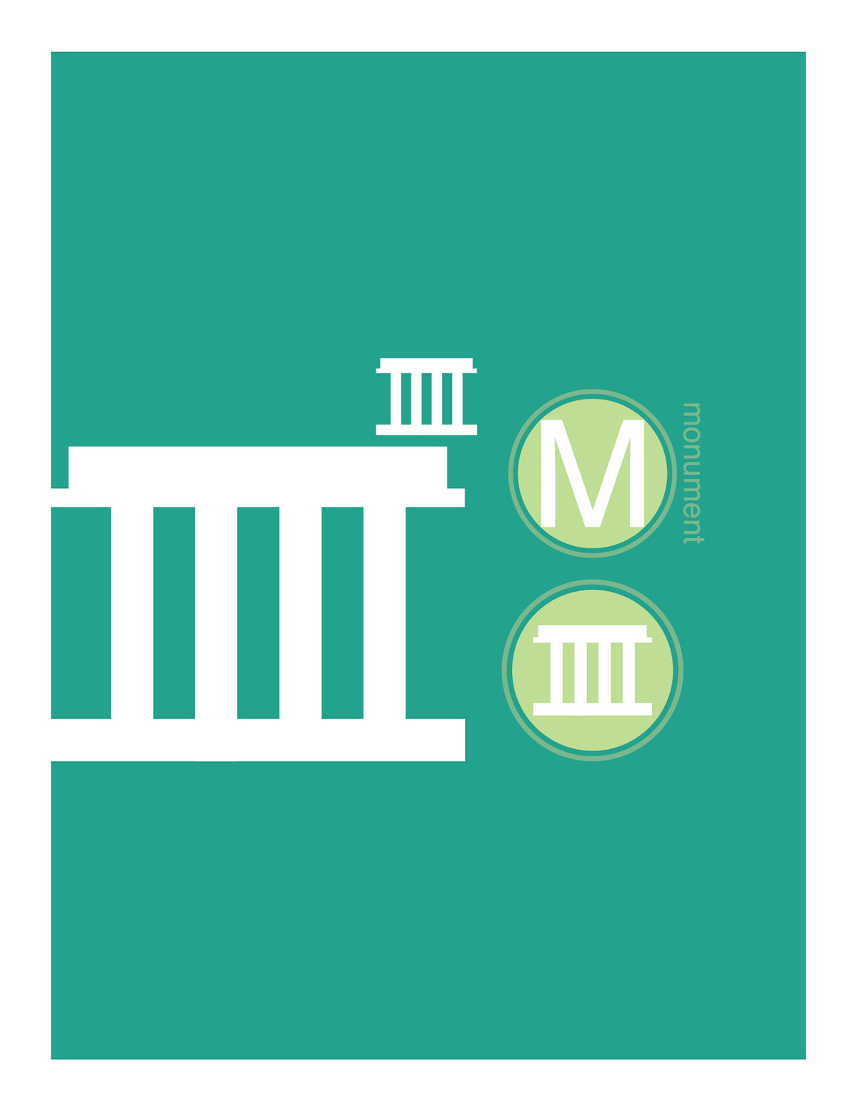
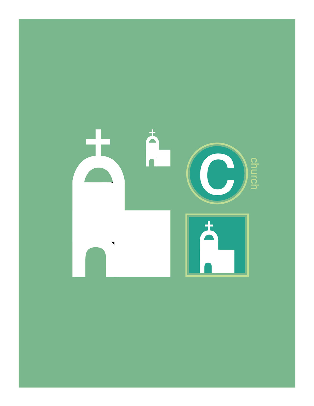
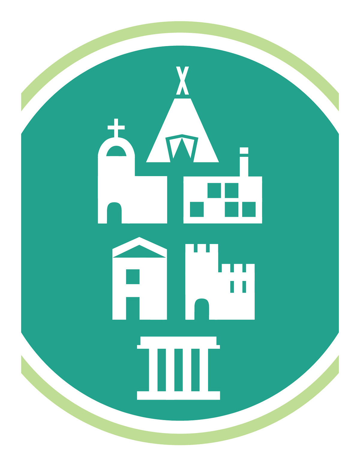
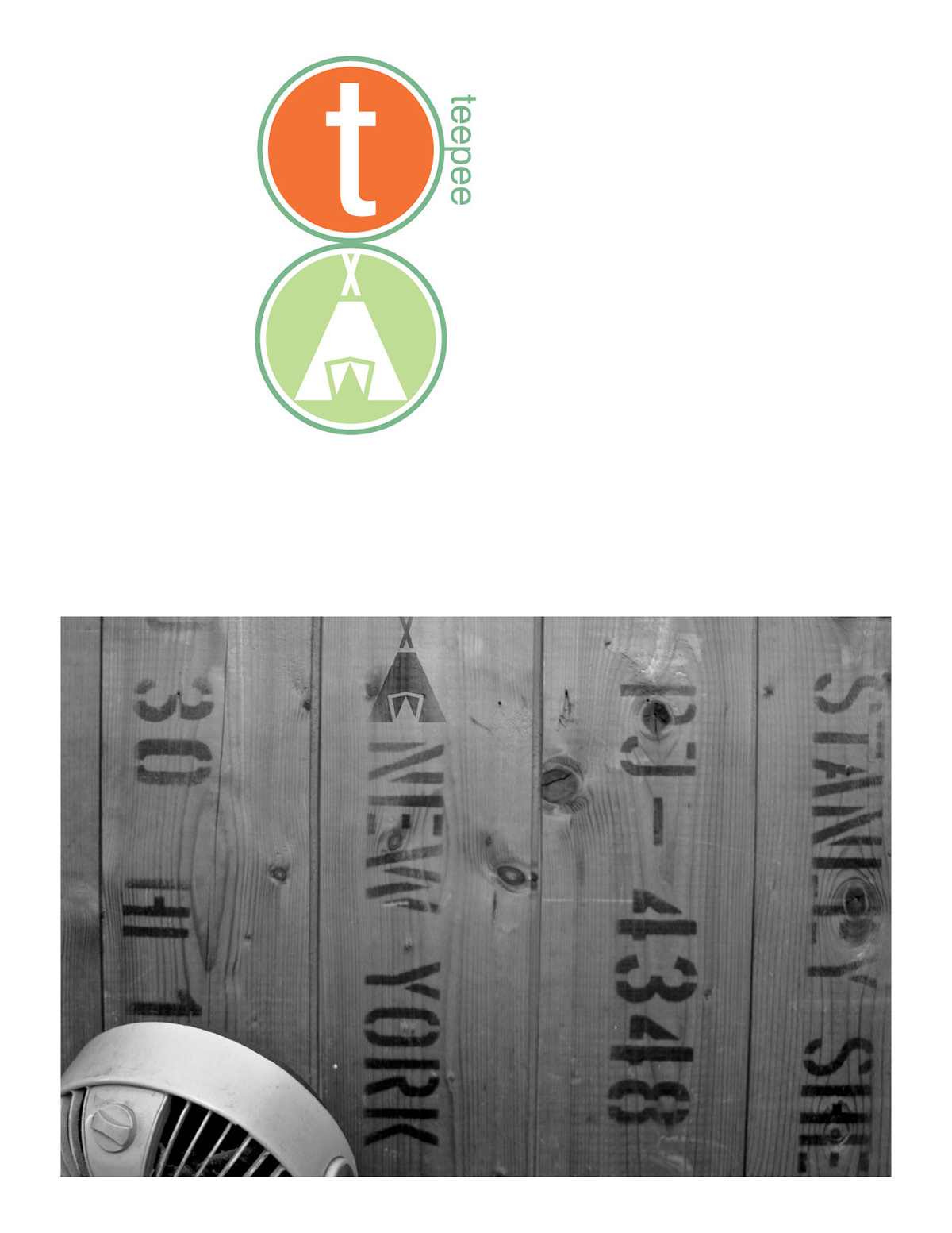
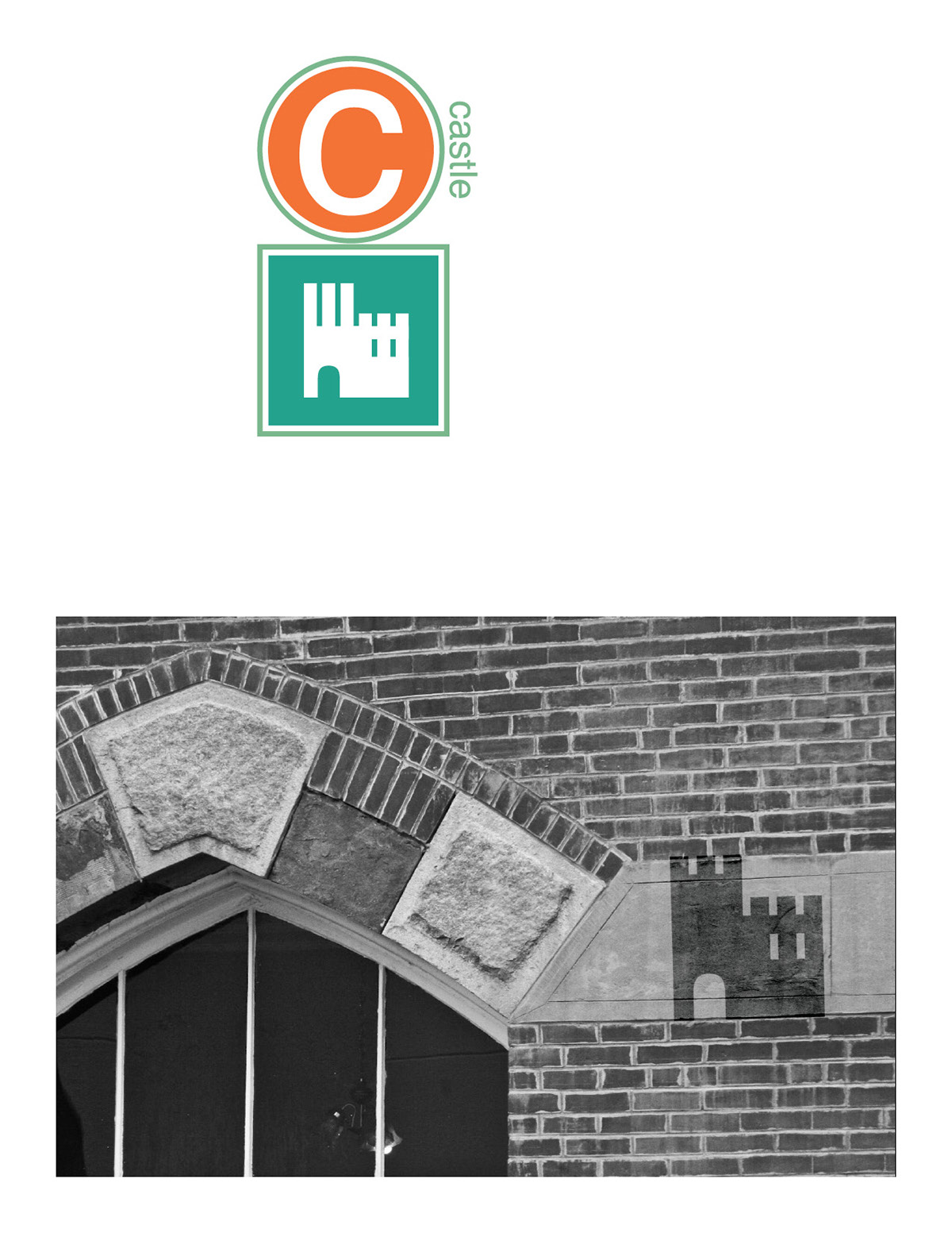
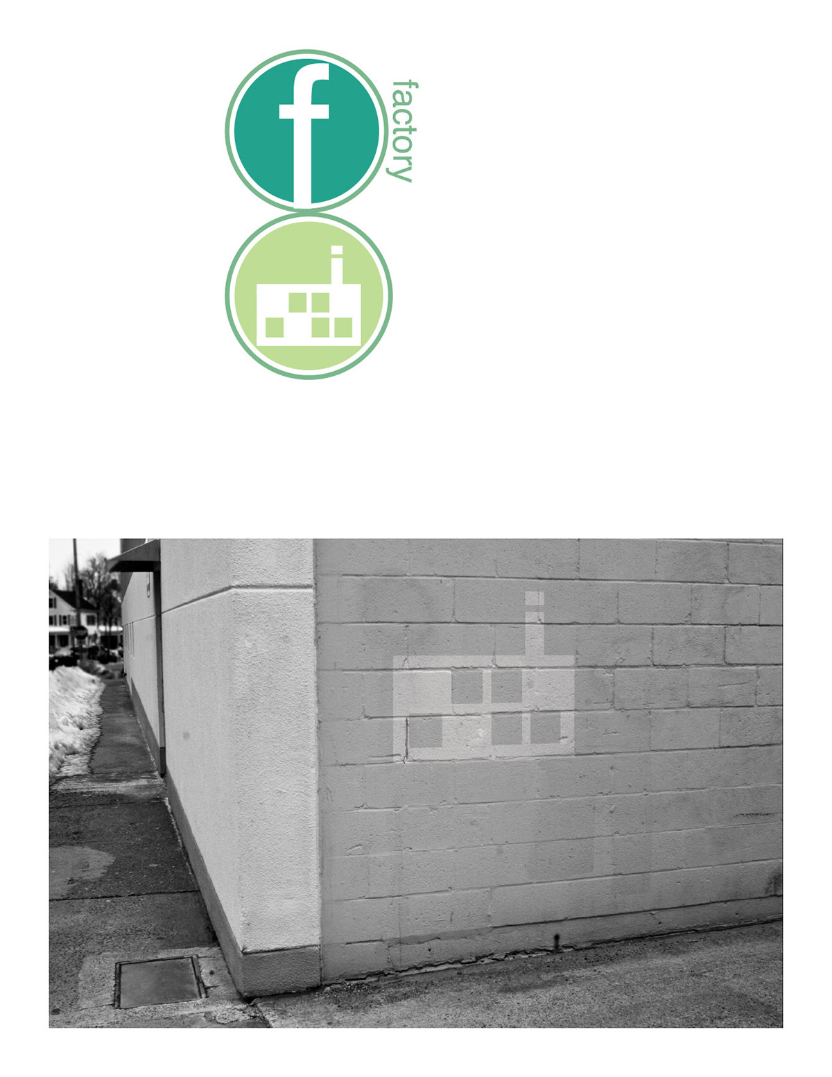
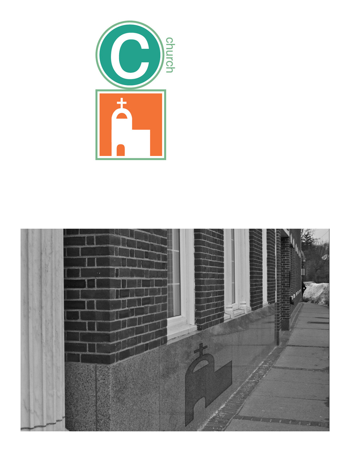
This family of icons is both a study of common architecture and of the typeface Helvetica. Each of the six icons consists only of pieces of Helvetica letterforms, cut at 90° angles. The family aims to illustrate distinct types of buildings in the clearest, simplest possible way. Each icon began as a sketch, which was then translated into shapes created by the letterforms. I hoped to show the icons in a real-world environment, so I created sign-like visuals to accompany them. Last, I applied them to photographs of real-world architecture.