Background
Red-Green colorblindness results when the cones in our eyes that perceive red and green colors overlap too heavily regarding the wavelengths of light that stimulate them. In the case of protan deficiency, red cones perceive lower wavelengths, or are "blue shifted." The more common form, deutan deficiency, occurs when green cones are red shifted.
A few years ago, a Berkeley based optics company called Enchroma developed sunglasses designed to help patients with difficulty distinguishing between red and green to regain more normal vision. Their method involves filtering out the wavelengths of light that most heavily overlap between the two colors, only allowing more discrete regions of color to pass through. The figure below shows the transmittance values allowed by Enchroma glasses at varied wavelengths - note that wavelengths between 550 and 575 are largely blocked.

Experimentation
In order to simulate the effect, I took microscopic images of a color wheel. Because notch filters (which remove small wavelength bands) are hundreds of dollars, I mimicked the effect using ImageJ. I took an unfiltered image, an image with only green wavelengths allowed through (using a 520/40 bandpass filter), and then subtracted the two images to produce the red-shifted color wheel shown on the right. This final image is somewhat similar to what a deutanomalic patient should see when looking at the image on the left.

Results
To understand the biological impact of color blindness, we run into a bit of a roadblock. How do you define color contrast? The most common method used online is to take the absolute value of the differences between two points' individual Red, Green, and Blue values, and then sum. However, this metric does not take into account that human eyes are much more sensitive to green than they are to other colors.
Every digital color can be defined by its RGB values, which each range from 0 to 255. The color splotches shown below are created by setting all RGB values to 127 (to create intermediate hues, which are easier to distinguish) and then taking the color identified and setting it at either its maximum or minimum.
Although all three pairs of colors are heavily different, the degree of contrast is maximized in the second row. This is a result of our eyes' sensitivity to green wavelengths, which means that green wavelength visualization should maybe be weighed more heavily in color contrast methods, although there is no metric which is universally agreed upon, and the industry standard continues to weigh each color equally.

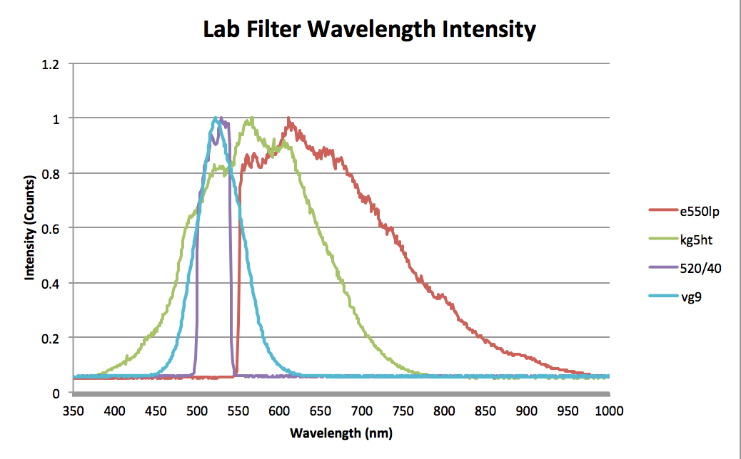
Using a spectrometer, I checked the relative transmittance of various lab filters throughout the visible spectrum. It became apparent that I wouldn't be able to accurately replicate the effect of Enchroma glasses. The bandpass filters are designed to optimize color contrast while minimizing the number of wavelengths they allow to pass through, which is why many filters and lasers are green. However, by blocking out green light, I'm not going to improve color contrast. I just block green light. I would need a filter centered around 560-570 nanometers if I wanted to better characterize the effect of Enchroma glasses on users with normal vision.
That said, this was a fun project and it gave me a much more thorough understanding of visual perception for color-weak and color-blind patients! Perhaps with more time or with more financial resources, I could have gotten my hands on an actual pair of Enchroma glasses in order to better characterize their effect!