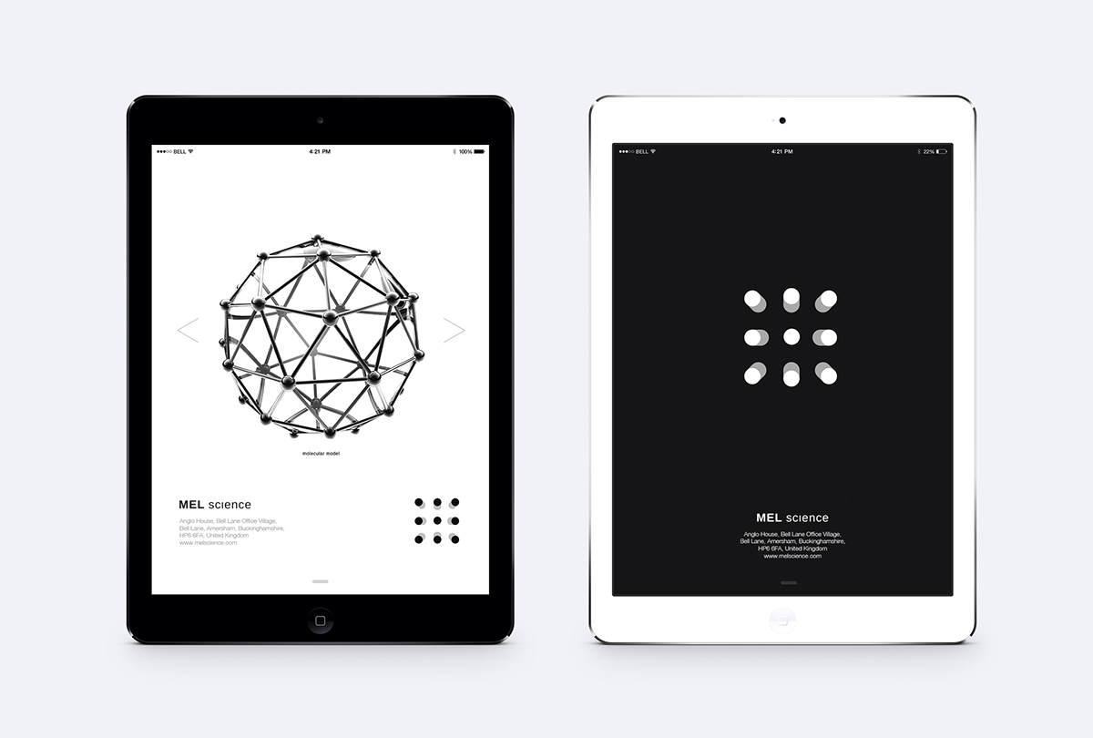


We used the basic concept – recognizable pattern made of points matrix – as the base for renewed logotype. It symbolizes the idea, that everything around us consists of atoms. This idea illustrates MEL Science values: giving science knowledge, disclosing and explaining the essence of natural processes. Extra range of atoms gave dynamics and volume to the points matrix. With help of range of particles of extra color the points began to move and rush to the viewer, the atomic lattice became more obvious and volumetric.
Also we chose light variant of the company’s name font. In the letter “i” in the word “science” we removed the point to make accent on the volume matrix.
Components of the corporate block – graphical sign and logotype – can be used independently for different carriers, including blogs and social networks, where the company communicates with audience, publishes interesting scientific facts and articles.
Creative team:
Project manager: Ekaterina Saburova
Art Director: Oleg Schegel
Designer: Artem Lukichev
Designer: Artem Lukichev

