
loyal to his team
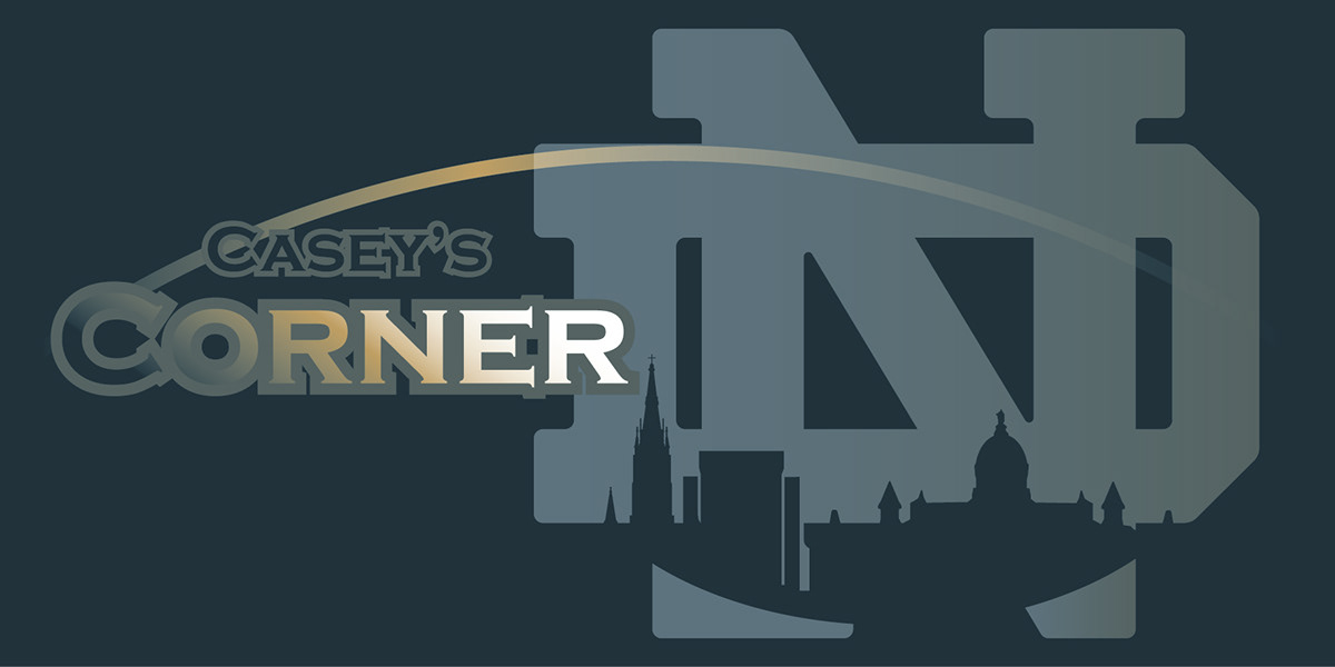
While I worked as an intern for a sign company called SIGN-A-RAMA I was handed a client's need. He requested a 3'x6' banner be created for his neighborhood Notre Dame football parties. His specifications were quite vague so I had a lot of room to play. He needed the Notre Dame University logo, and the phrase "Casey's Corner" to be displayed somewhere on the banner. Easy enough.
I began with retracing the Notre Dame logo and smoothing out the edges. I wanted to do something that hadn't been done with this logo before so I took pictures of popular campus structures, uploaded them and using the pen tool traced out their general characteristics. I wanted that logo to hold a lot of weight in the design almost becoming the secondary color so I made that thing huge, but not to the point where it became a back drop. I was stuck in that position for a while and felt my decision about the logo was so far so good. The architecture seemed to best fit inside the logo now, something I feel a Notre Dame fan would look at and appreciate. At this point it was no longer a distraction but a compliment. I just couldn't have handled having the architecture draw too much attention, that's not the main focus here. Casey's Corner. Notre Dame. Football.
I needed something to say "football" without seeing an actual football shoved in your face every time you look at this. I didn't want a player, a helmet, cleats; just the generic indicators. I came up with the idea to incorporate this golden arc complimented by the structures' bottom arc to subtly resemble a football's oval shape. The arc seemed fitting because, Notre Dame is all about golden opportunity and high standards; from the Golden Dome to a football player's gold painted helmet.
Lastly, the text. My right side was knee breaking heavy at this point and I planned to balance the final design by having the type stay left sided. After all, English readers view text top to bottom, left to right. I chose to use Copperplate Gothic Bold font. Yes, it is overused sometimes, but I had to! There's a respect and high standard quality to it that I was depending on my type to give. I wasn't satisfied with flat text. It needed to carry more weight to balance this design out and look like it belongs where I put it. I gave it a back tracing filled with the same color the logo has on the right most side of its gradient to compact the farthest right element to the farthest left. Already it was unifying itself. Still it wasn't holding its ground completely and that golden arc across the top was alone up there and causing problems. That's where the solution to create a gradient within the type came about. The text now became the initial point of contact with the viewer's eyes, was the focal point, quieted the golden arc, and helped circulate the viewer's gaze.
With some transparency, color, and placement tuneups it was finished. I learned a fair amount about transparency and the placement of a design's elements creating a unified and balanced result.

