


Concept:
Bisplease is a web app where users can vote for the products they want to be back or to stay on the market.
It shifts the "brand to consumer" top-down logic, disrupts marketing mainly unilateral process.
In other words: the ability to press the Pause button in the ever-forward-going-motion of new collections.
UX:
On the site, search if the product you want is already listed, if it is: add your vote. If not, just create the item. Then share, see who talks about this item on the net and tell them to come vote up.
The higher the vote count, the more interested a brand can be in bringing the item back.
You can follow users and items, add comments, and get notifications.
RESEARCH
Concepts:
If the UX described above is pretty straightforward, the underlying concepts of Bisplease are very abstract: time, marketing, design, logic, user-centric, etc.
The name Bisplease itself, is composed of two abstract concepts: repetition (bis) and etiquette (please).
I extracted 3 main values:
Time
- past and present (also a sort of time paradox, Bisplease being a new and modern tool, but based on the past)
- past and present (also a sort of time paradox, Bisplease being a new and modern tool, but based on the past)
- repetition (pause, back, again, and forward)
Humanity
- excitement (engagement is very high when wanting a product back)
- human scale / user-centric (the whole point is to give the user/brand relationship more balance)
- excitement (engagement is very high when wanting a product back)
- human scale / user-centric (the whole point is to give the user/brand relationship more balance)
- fluidity / kindness (the word "please" and also the logical approach of users simply telling what they want)
Natural selection
- selection / natural selection / winner / chosen one (users elect staples and hits)
- design (it's about which design "wins")
- selection / natural selection / winner / chosen one (users elect staples and hits)
- design (it's about which design "wins")
Target market:
At this point, Bisplease is open to any kind of products ruled by collections rotations. Food, perfumes, cars, fashion, etc. That said, intuition and numbers tell us fashion will probably be the most active category, and it should be kept in mind in the design process.
As for demographics, it's also very broad, potentially ranging from teens wanting their favorite jeans to stay on the market, to elders wanting a rather old item back. Still, Bisplease being an innovative concept, we can expect the first and most implicated users to all have a rather "modern" way of thinking.
Competitors:
Many businesses claim to be "new" but Bisplease truely is and therefore has no real direct competitor, or at least close lookalike. Most approaching competition would be petition websites a la change.org, facebook groups, and Pinterest to a limited extent.
REFLEXION
It would be easy to fall for an all vintage identity but would miss an important part: first Bisplease is a new and modern tool, secondly, it isn't only for old products, it's also for the items of the current collection that you want to stay on shelves next year.
As for visual representations, Bisplease being a social network and its logo going to be seen almost only on screens, I'll think icon/symbol/monogram first, then wordmark.
INSPIRATION
1 = Time / Back / Again / redo
1 = Time / Back / Again / redo
2 = Hey! / Touch / Select
3 = Like / Fave
4 = Pick / Select / Winner

Hands appear to be a recurring element, let's push further in this direction.

SKETCHING
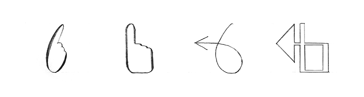
I already very much liked the hand idea, conceptually, and liked it even more visually once drawn.
First sketch looks winner to me because of its calligraphic aspect: humanity and classic approach, if not vintage. Furthermore, it conveys movement, and the notion of "please, hey".
Interesting thing is it can be read as an uppercase calligraphic B but also a cursive lowercase b.
Still, I always quickly explore the concepts I like less first, to be sure about their potential (or lack thereof):

Pushing that first draft typography could enhance things, but as I guessed, the idea of past/time and humanity are lacking.
The first option leans too much towards the mouse pointer, and the second one reminds of speed/transportation.
Selected direction:

I used calligraphic rules (thick on down strokes, thin on upstroke) and a slight slant to evoke a manuscript feel and by extension, the human aspect, and also the idea of classicism and past tense. Sill, I tried to remain modern with recurring shapes and the cuts in ligatures, which also allow to make the lettering breath more at small sizes.
ICONS SET
1/ eco + logical
2/ arrows + addition = crowd gathering
3/ heart + question mark
4/ pause button + smiley
5/ magnifier + ship's wheel
6/ speech bubbles + target + propagation

COLOR SCHEME
Gold and yellow seemed the most relevant to convey iconism and classicism.

FONT
We simply choose Lato, an open source Google font. It's minimal, classical, well designed and highly versatile, coming in numerous weights.
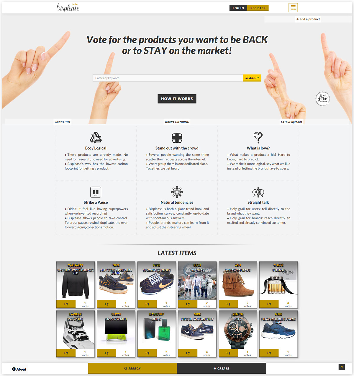
UI
Since its a web app needing to be responsive and a first version, we used Bootstrap as a foundation and heavily customised its CSS.
Index screen cap and mockups on various devices:

EXPLAINER VIDEO
The general aesthetics are inspired by last's century black and white mute films. It allows for a minimal style and displays didactical wireframes very coherently.
The main added value of the design is found in the seamless and creative transitions between sequences.
Soundtrack is "They Can't Take That Away From Me" by Billie Holiday, a 1937 cult song that is now in the public domain. While the jazzy music is a perfect fit to evoke both the past and the mannerism of the word "please", the lyrics themselves were just too relevant to Bisplease's purpose to not use this song.
Take a quick tour at www.bisplease.com and if you have any beloved product you'd like back, go create an item, it's all free :)


