
Mosaik Architects | Branding
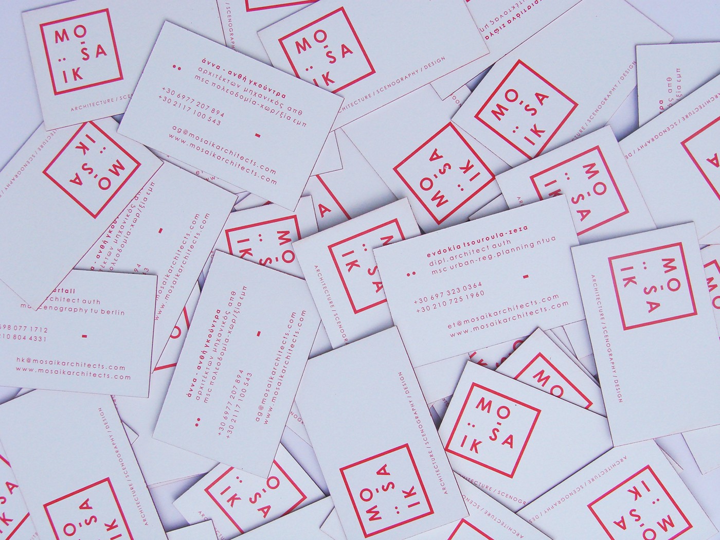
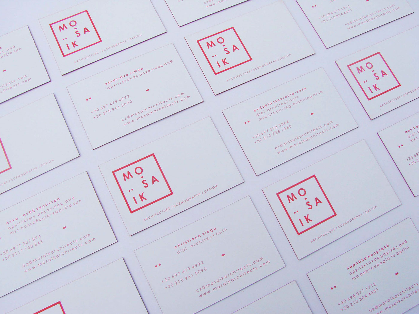
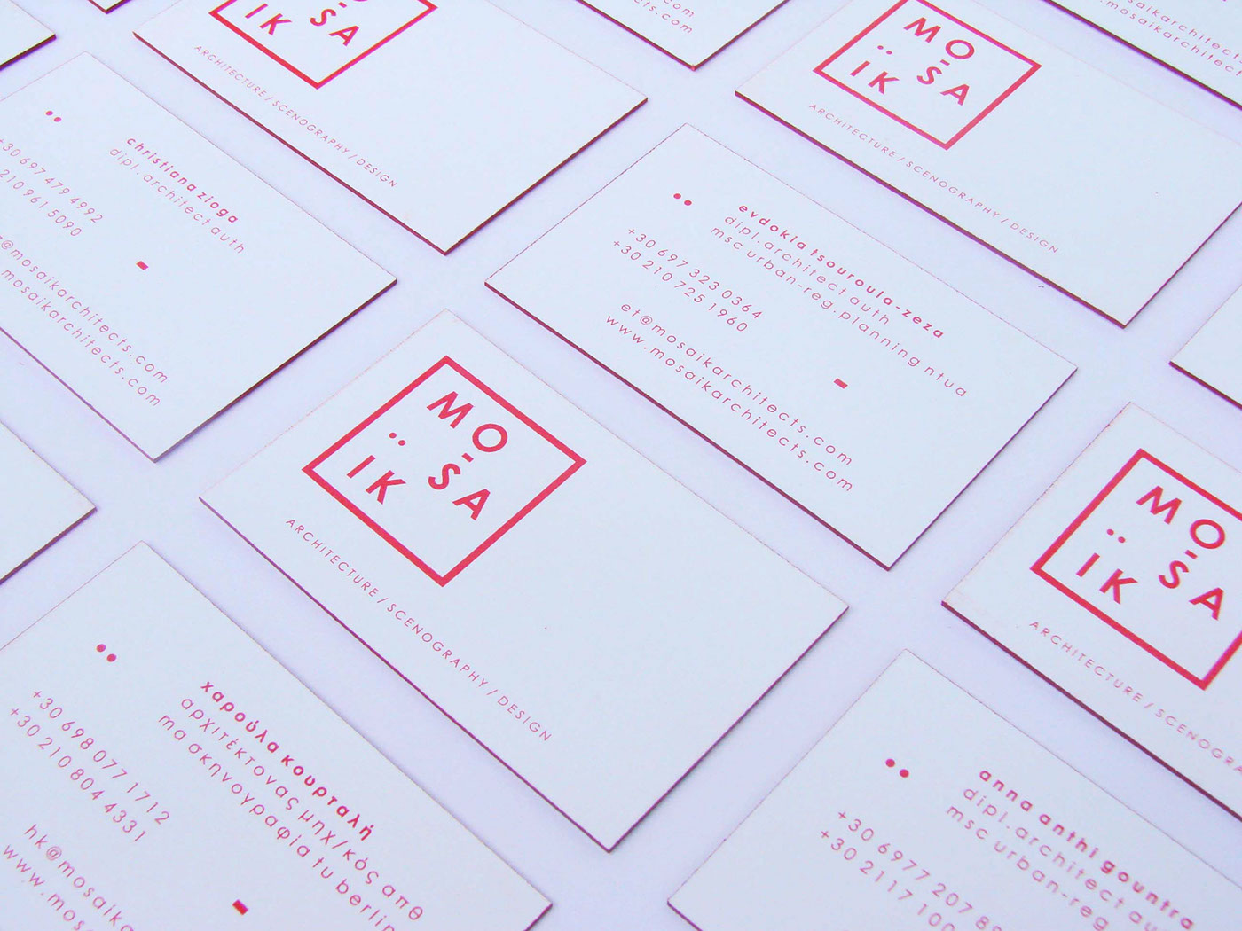
MOSAIK is a group of four female architects based in Athens that share a common interest in exploring design through space and objects. Each architect has a different specialty in the architectural field.
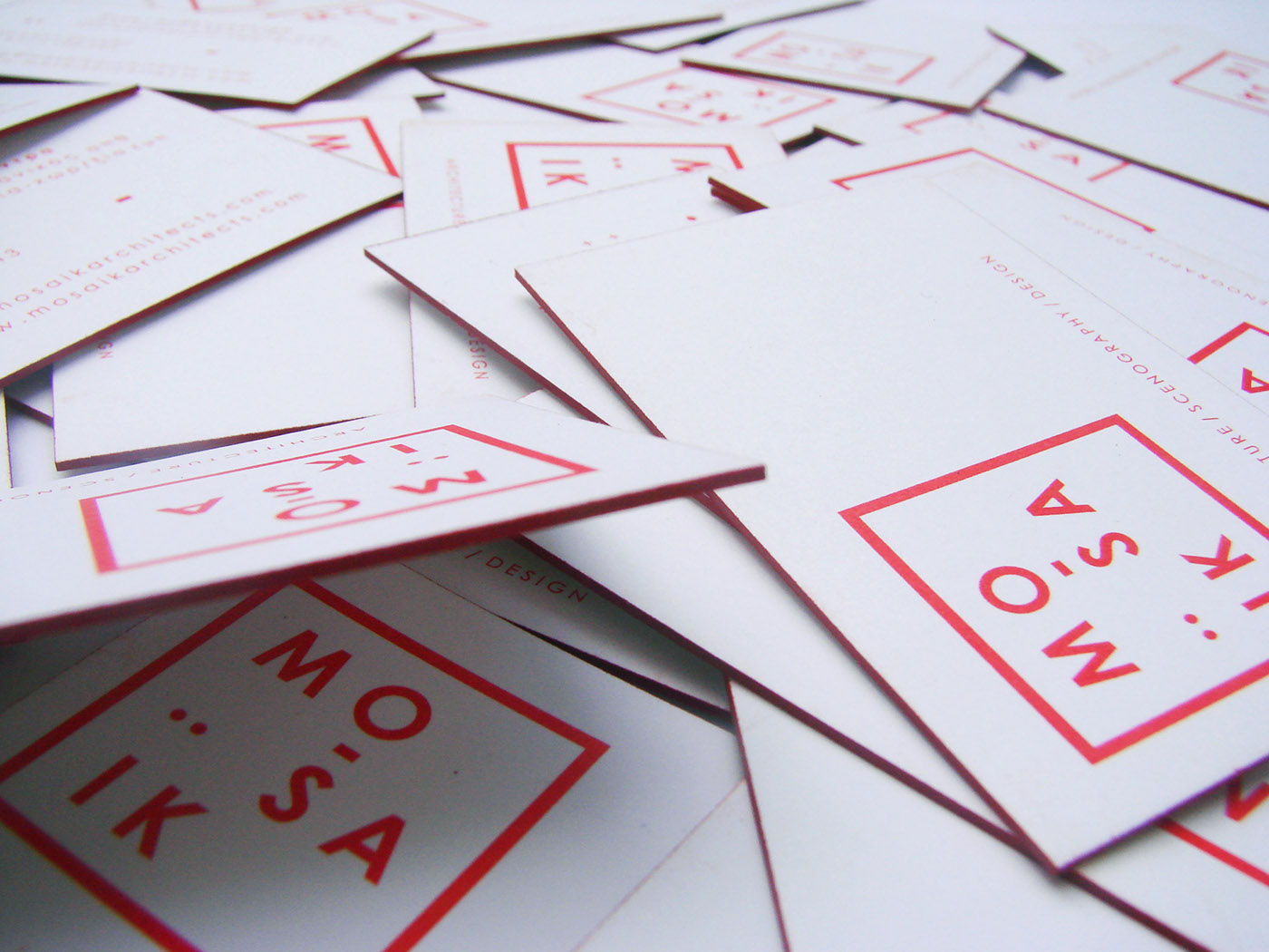
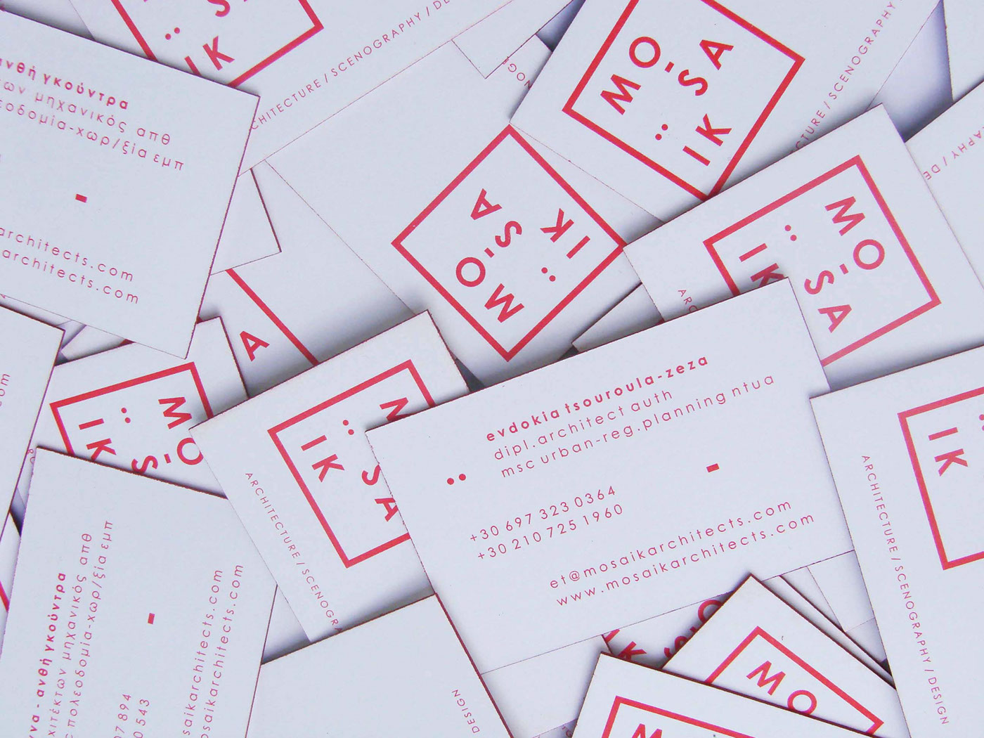
I was asked to design a logo and business cards for them. The design of the logo was influenced by its metaphoric meaning, which describes a group of disordered pieces.
Based on the combination of varying elements I created a group of letters that are disordered but at the same time remain in a group. Therefore the word MO-SA-IK is "broken" in pieces but surrounded by a square which is used to represent teamwork and stability. In the word MOSAIK I have also used a part of the letter omega which is like an "underscore" under the letter ‘O’ and the 2 dots (diacritic) which are placed over the letter ‘I’, as in the Greek language and which are used as decorative elements in the logo.


