


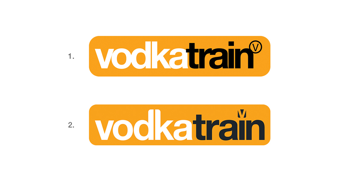
The project began with an update of the Vodkatrain logo. The letterspacing was increased as was the spacing within the lozenge, a new colour replaced the 100% black, the ascenders were slightly rounded to give a softer feel and the 'V' was given a purpose which could be utilised across the brand
1. = Old logo 2.= New logo


The 'V' taken from the logo can be utilised to represent social media
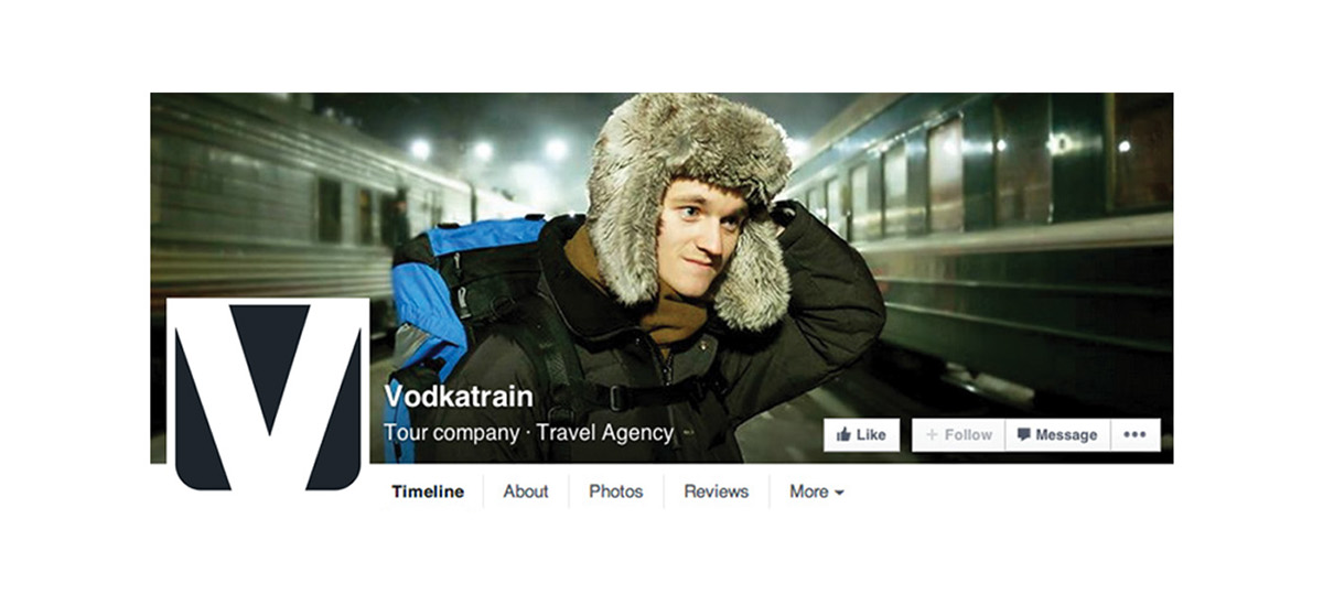
Facebook page

And also becomes a new identifier
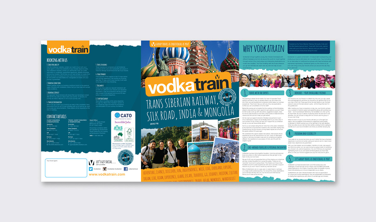
Front & back cover with internal 'throw out' which makes up the three page cover of the brochure 2015/16
Inside 'throw out'
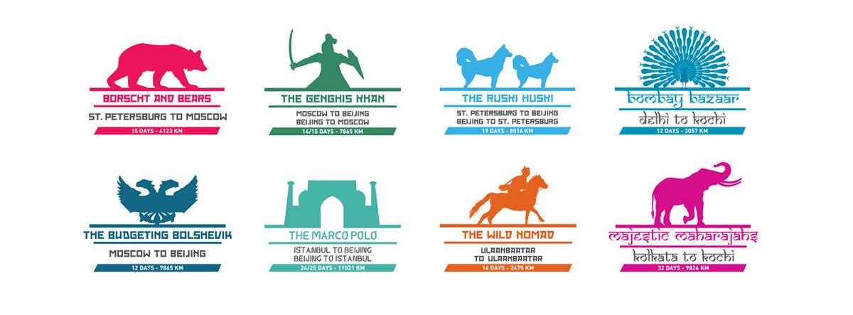
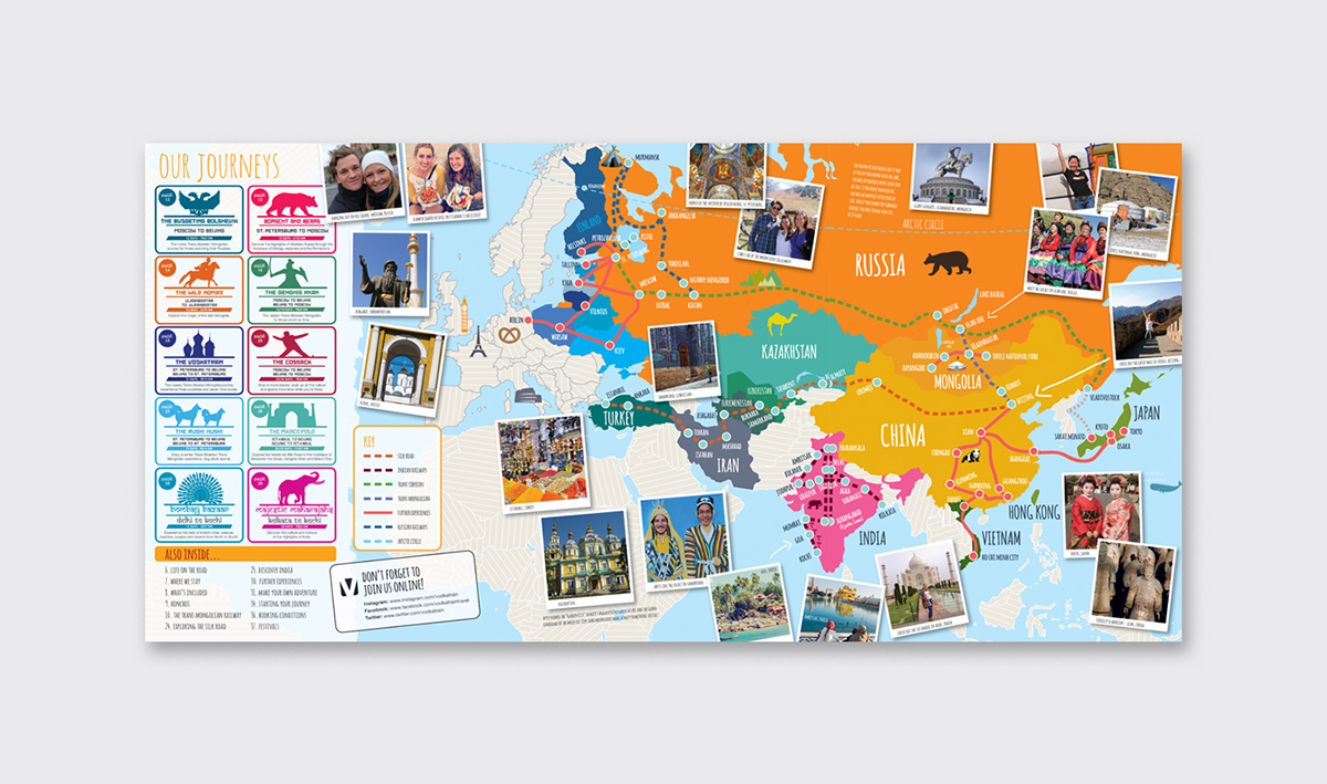
Newly designed icons to represent the different journey styles throughout the brochure and a bright colour palette
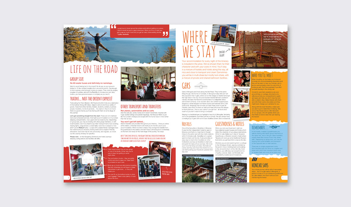
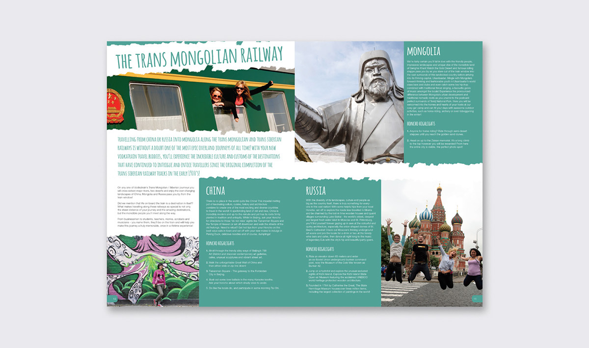
Brochure spreads


The second point of contact with the customer were detailed journey information sheets

Flyers designed for an expo event


