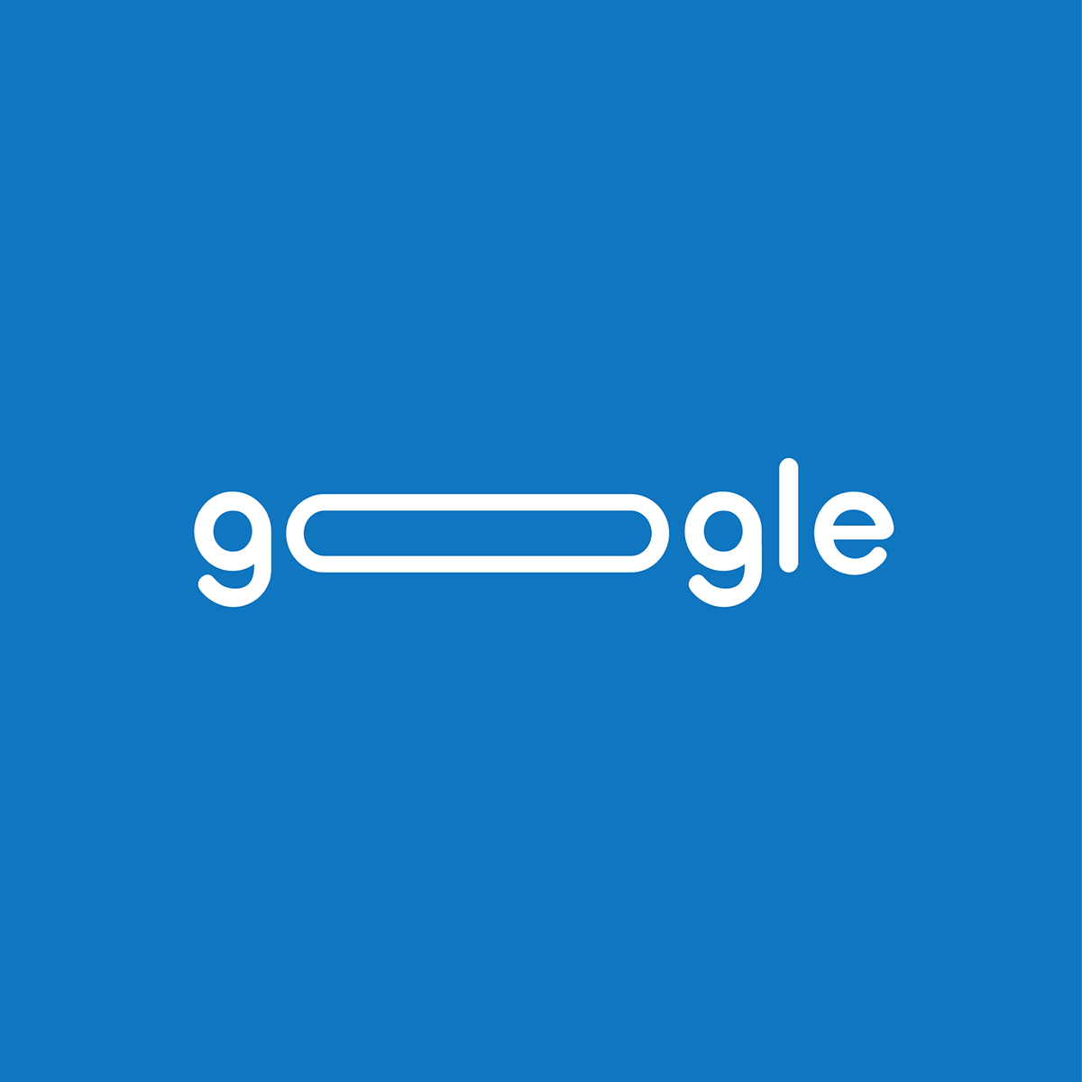
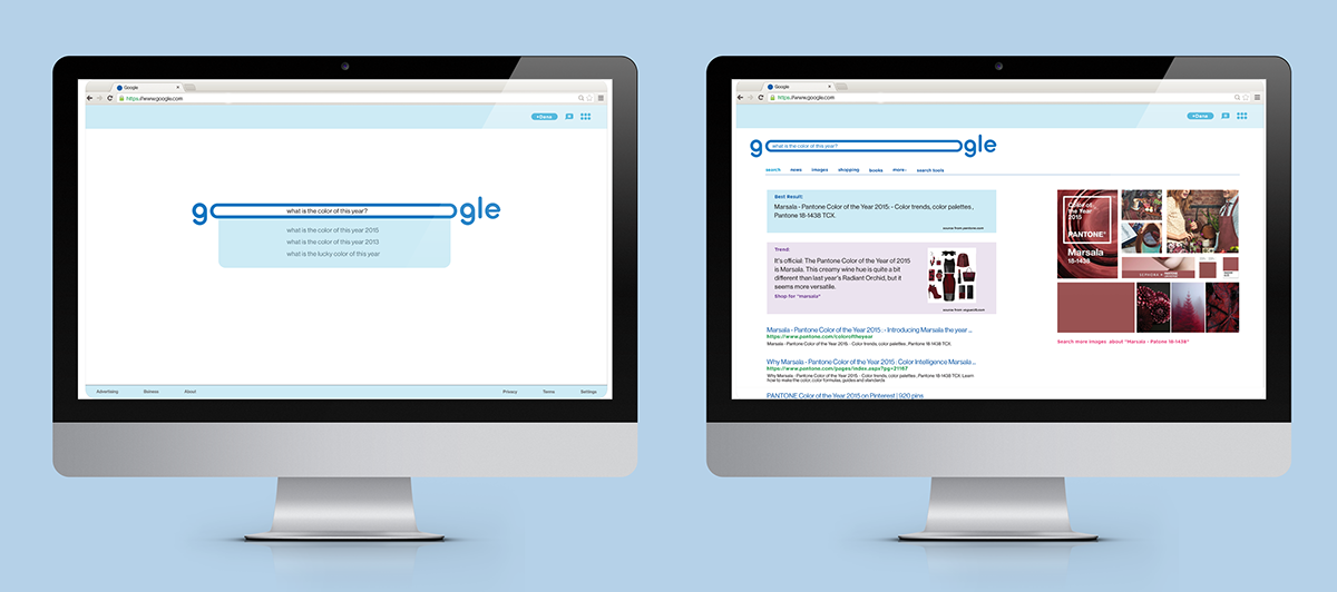
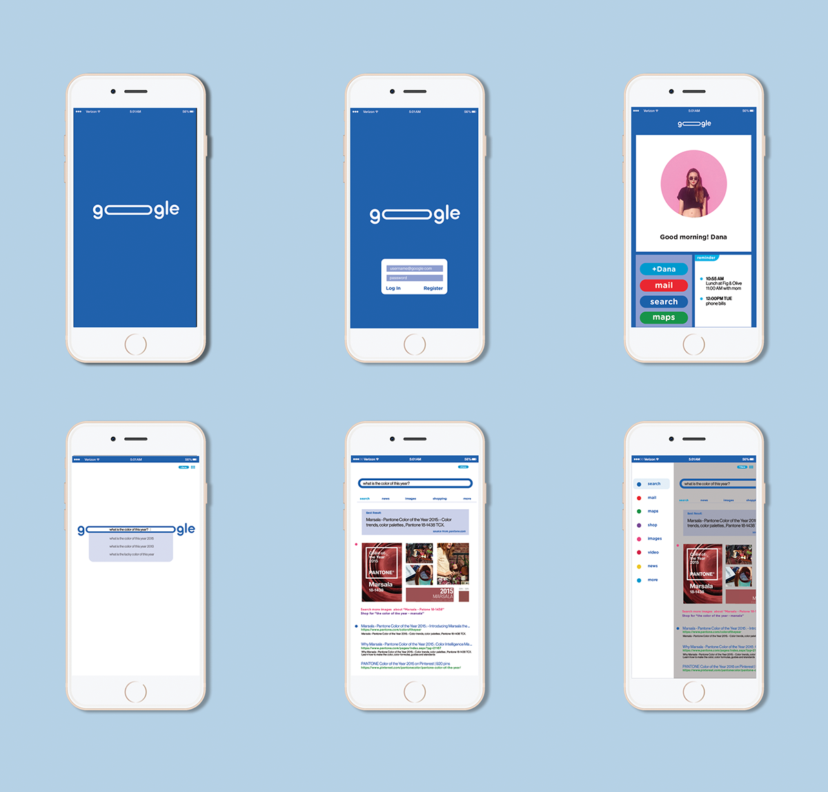
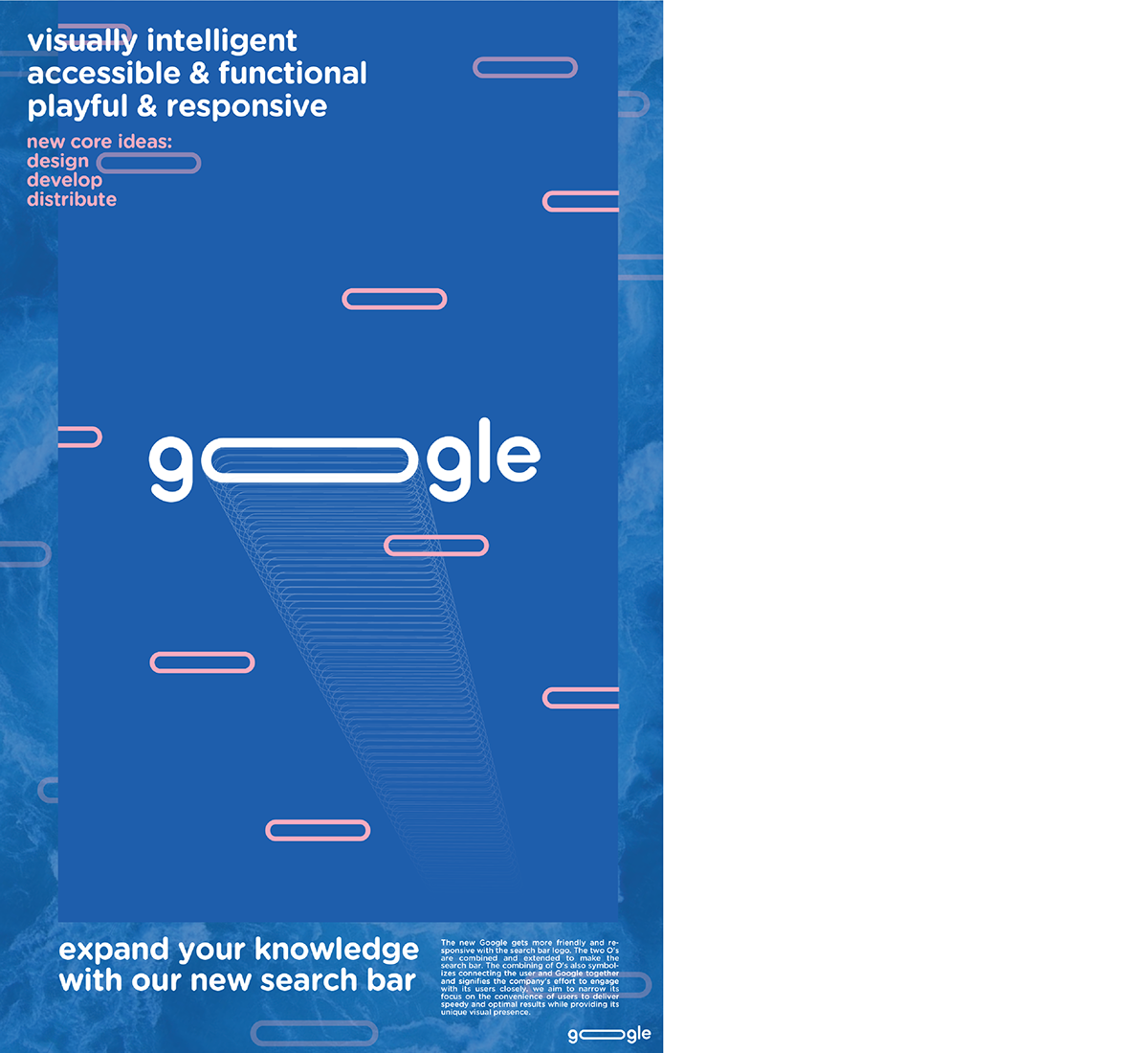
The new Google gets more friendly and responsive with the search bar logo. The two O's are combined and extended to make the search bar. The combining of O's also symbolizes connecting the user and Google together and signifies the company's effort to engage with its users closely. I aimed to narrow its focus on the convenience of users to deliver speedy and optimal results while providing its unique visual presence. The search bar is expandable with the amount of characters you enter in the search bar.
LOGO
BRAND IDENTITY
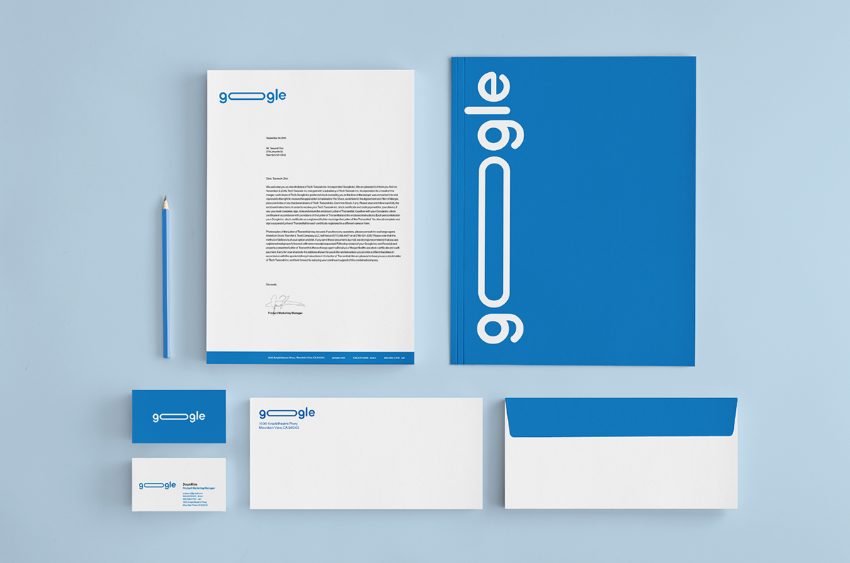
STATIONERY
WEB & APP
NEW GOOGLE ANNOUNCEMENT POSTER
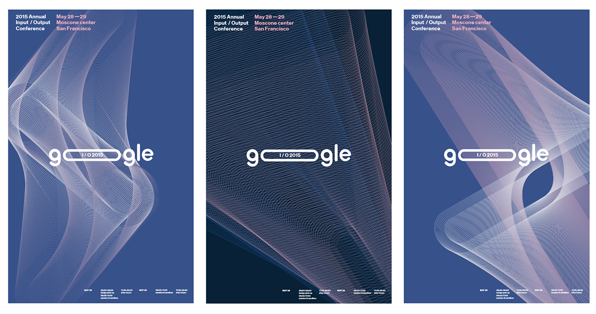
GOOGLE I/O POSTER SERIES
I wanted to make my poster series to show very efficiency and usefulness the design has in many ways. I focused on one of google's events that they provide yearly, which aren't widely known to people yet. These are the I/O (input/output) Conference posters. This conference is annually held in San Francisco for software developers and features new tech, web, mobile and enterprise applications with google. I was inspired by one of their original key words "crystaline" which means to "building up of atoms to create a full crystline structure". So I used the outline of my new logo (search bar) and created new forms. The idea of creating a whole new structure, form or picture with one atom is empowering this kind of conference because this technology conference is always developing and introducing new inventions to the world.
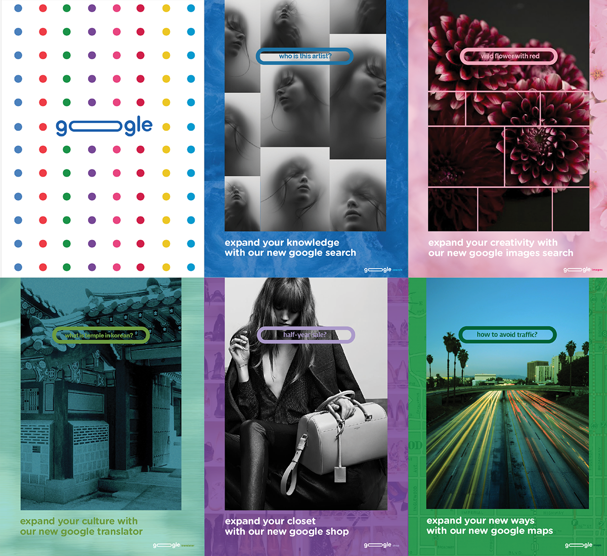
ADVERTISING BROCHURES
I wanted to approach the audience differently for this brochures part. Google is always fun, easy accessible, and playful, but I wanted to show the other side of Google that can be visually attracting while promoting the new google logo at the same time. Still keeping the original google color pallette for the other departments' (such as gmail, map, images, translator...etc) indication and add more colors for others departments too.
LOGO ANIMATIONS