16 weights in 3 optical sizes.

Typefounding in the 19th century was full of experimentation. Looking through specimen books from various foundries, it seems as though no idea was too crazy for a world which was constantly expanding and an industry that was rapidly growing. It was in this ecosystem that a type founder in Paris made a a typeface full of character, exploration, and resourcefulness which became the catalyst for Essonnes. A typeface which sought to redefine establish paradigms (who says a a lowercase g can’t have serifs?) and solve a myriad of problems which plagued earlier designers. Born of a union between Didot experimentation, late Victorian extravagance, and contemporary pragmatism, Essonnes is a type system which brings both the familiarity and creativity of a Didone together with the situational requirements of the 21st century.
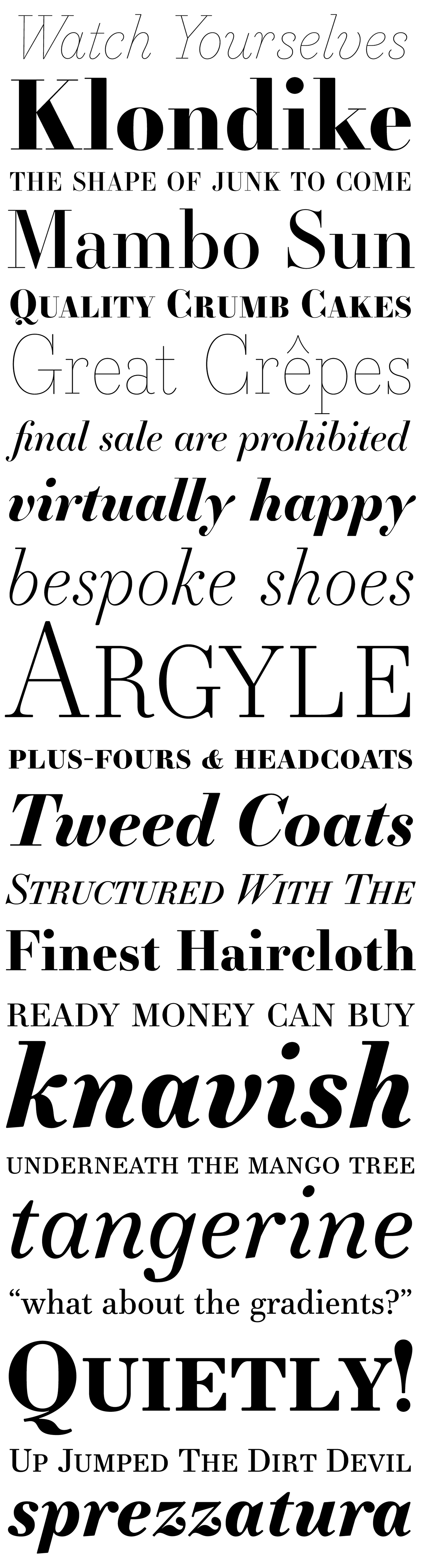
Some of the alternates based on the original Didot design.
*Headline Bold*
*Headline Bold*


See more at
Also available (at an itroductory 35% off) at
☞ http://myfonts.com/fonts/james-todd/essonnes ☜
☞ http://myfonts.com/fonts/james-todd/essonnes ☜


