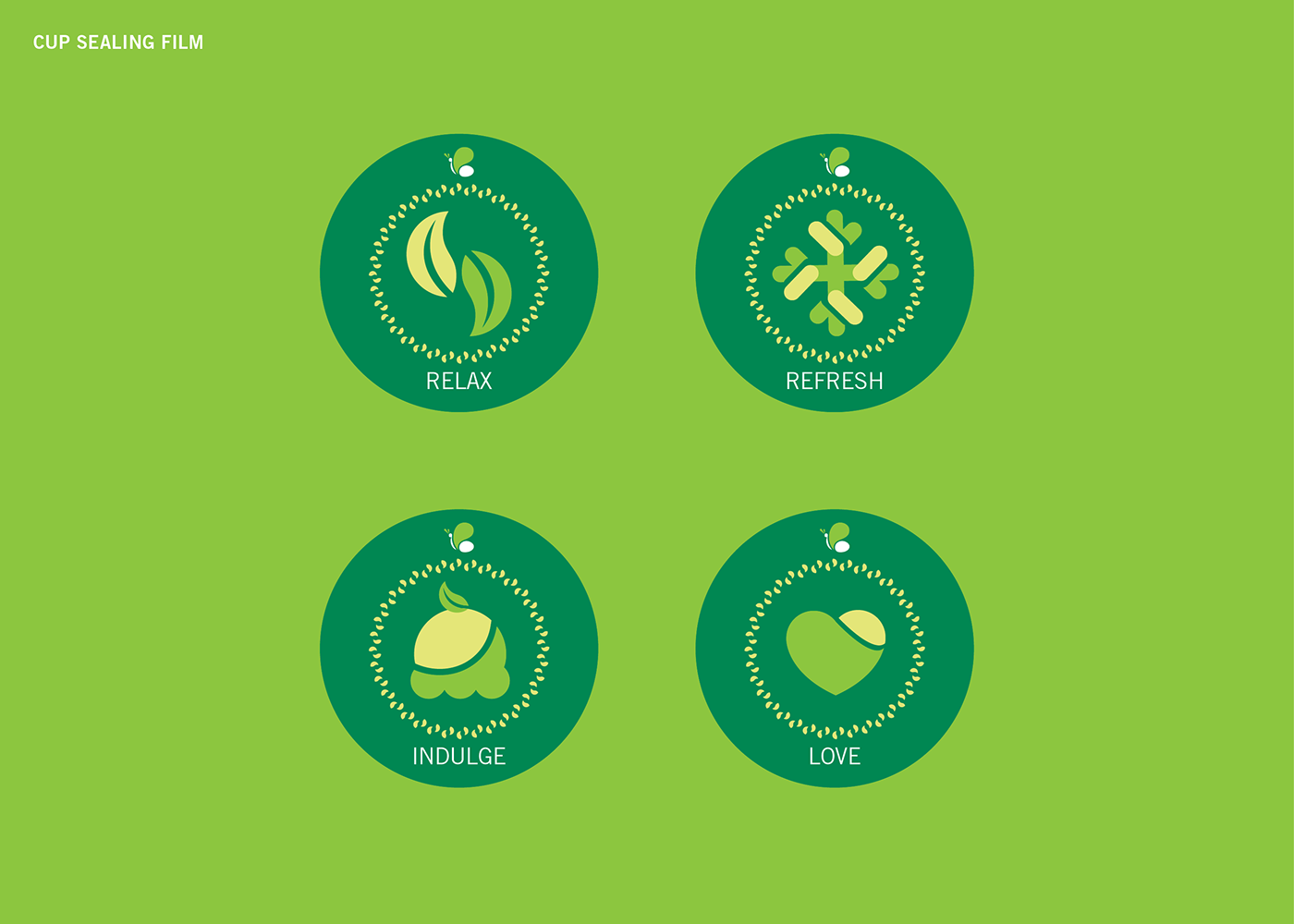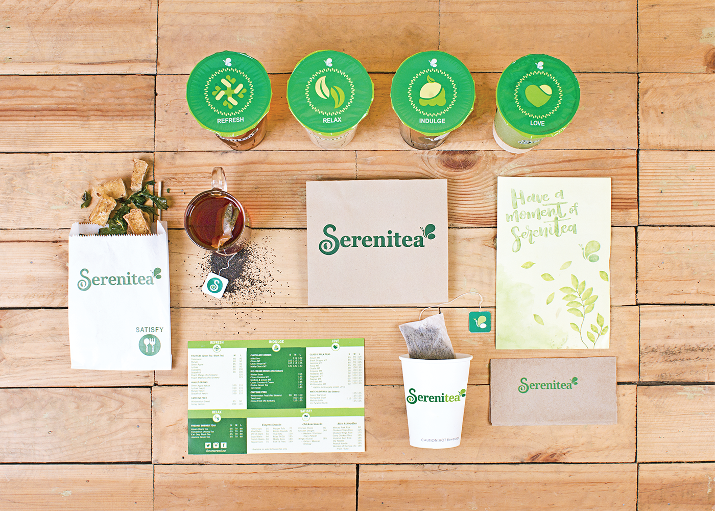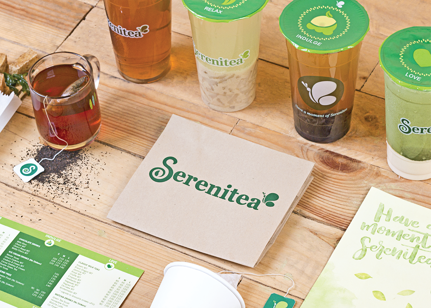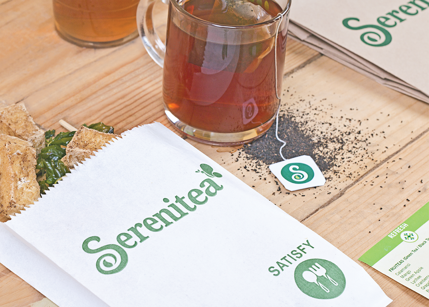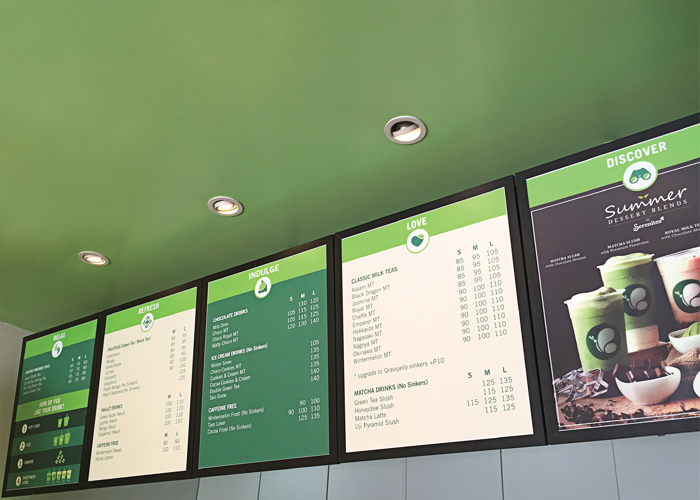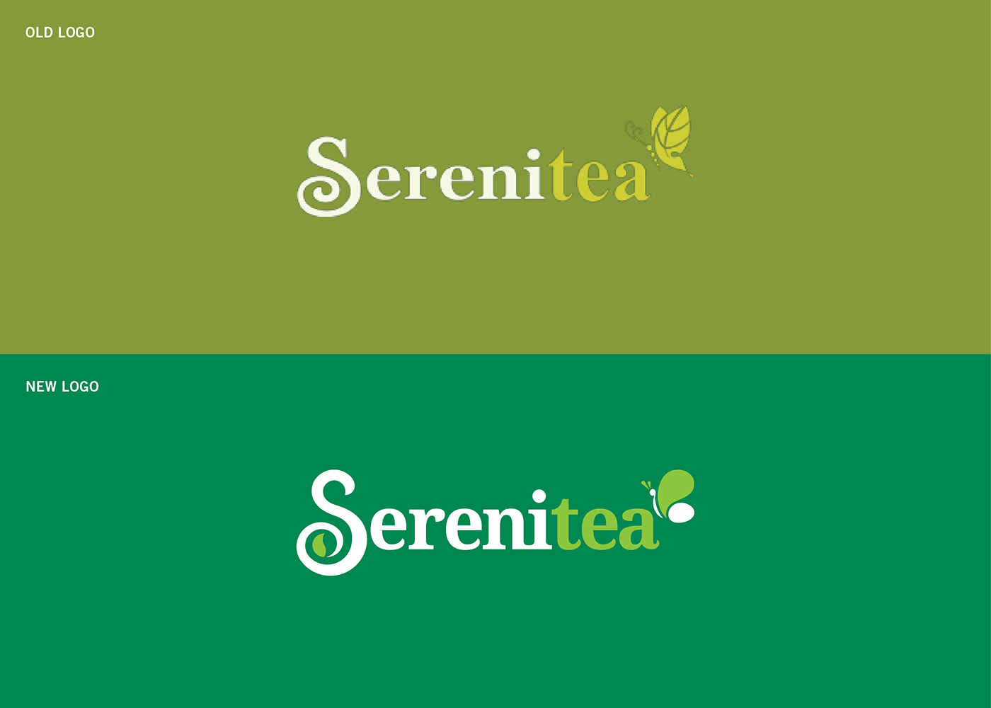
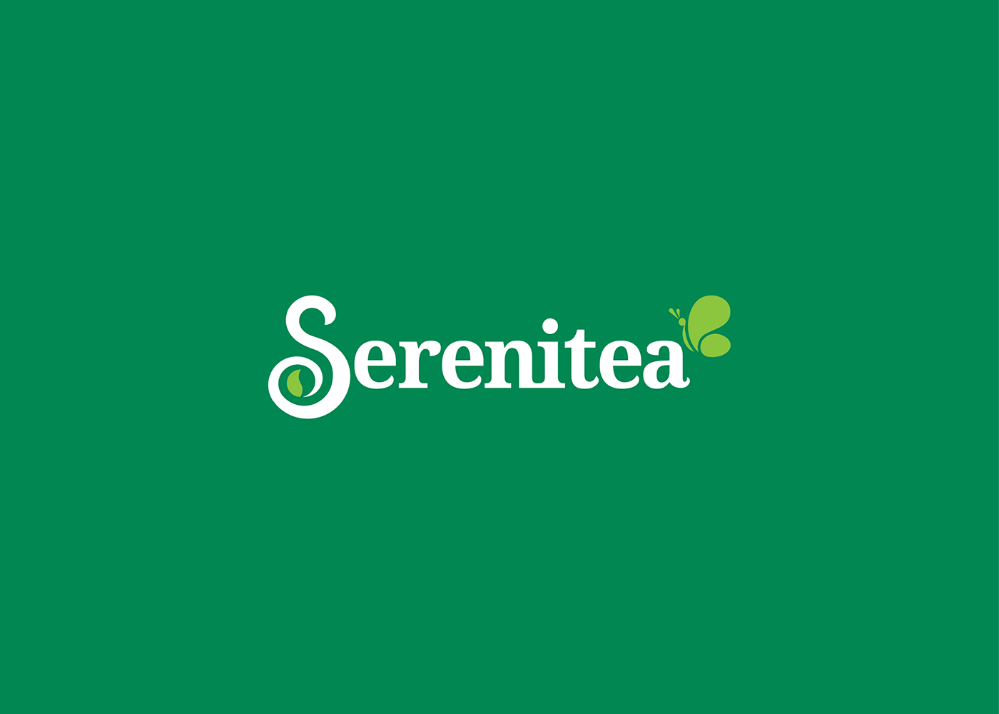
Serenitea, one of the Philippines' leading teashops, tapped TeamManila to redesign the company's logo and rebrand their over-all identity. The old logo which used less vibrant colors was given a refreshing boost not only in its color palette but also in the use of typography and icons. Seen above are the changes and improvements applied.

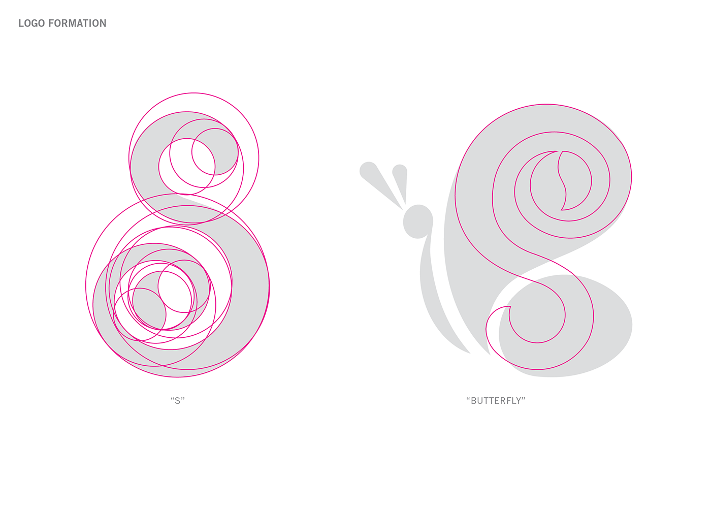
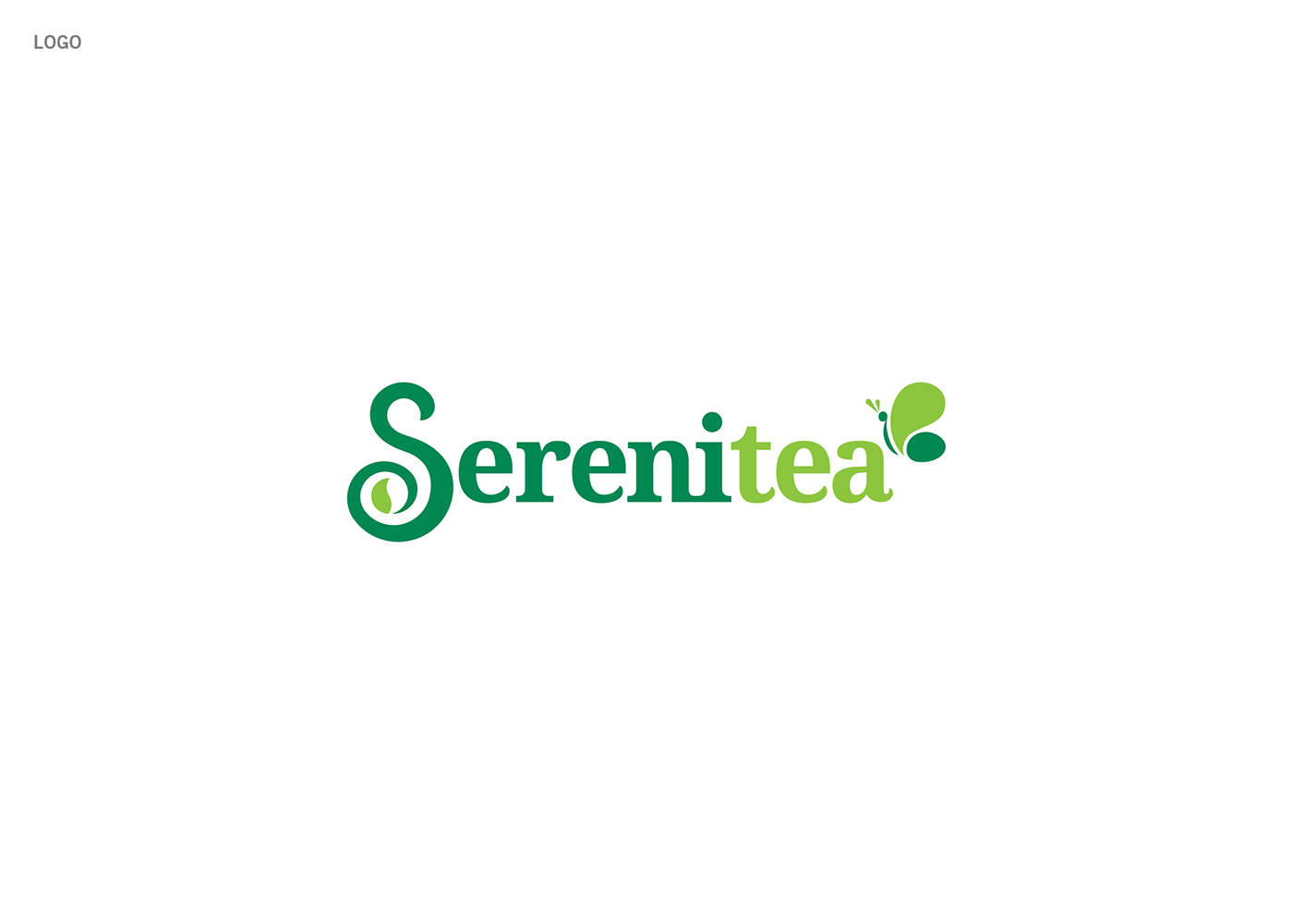
Cleaner and definitely livelier – Serenitea’s new logo show the brand’s elements in a design that’s pleasing to the eyes. The letter S, formed out of overlapping circles, features a leaf on its tail that subtly represents a yin and yang. Serene and relaxing at first glance, the Serenitea butterfly is also present as it symbolizes a child-like explorer, discovering new curves and opportunities. Done in a customized font, the Serenitea logo easily represents the brand’s fresh products.
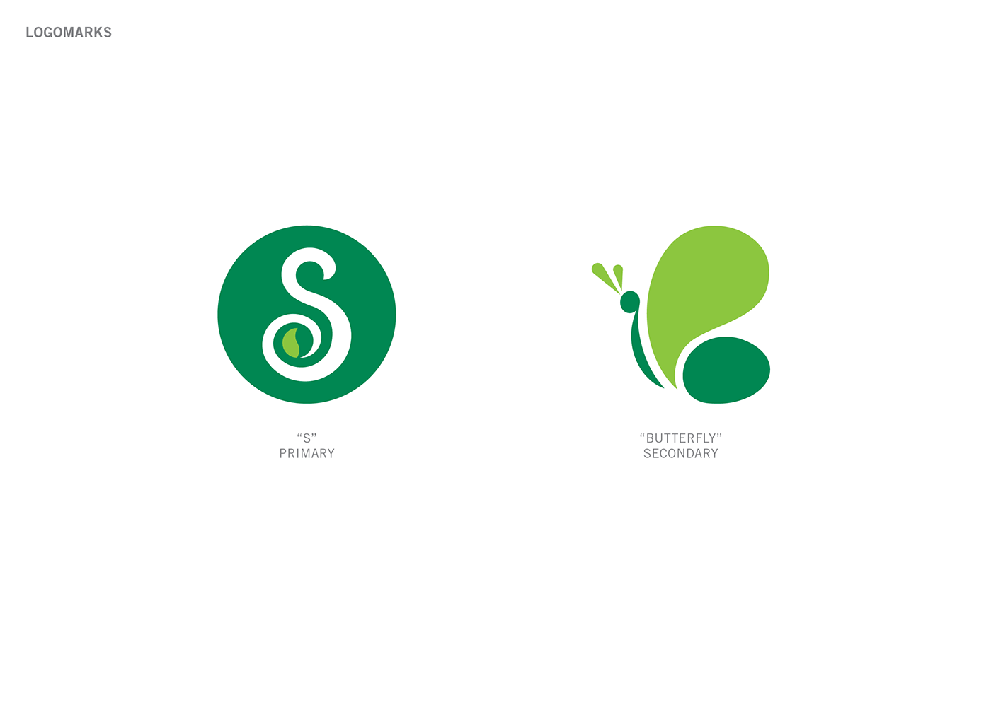
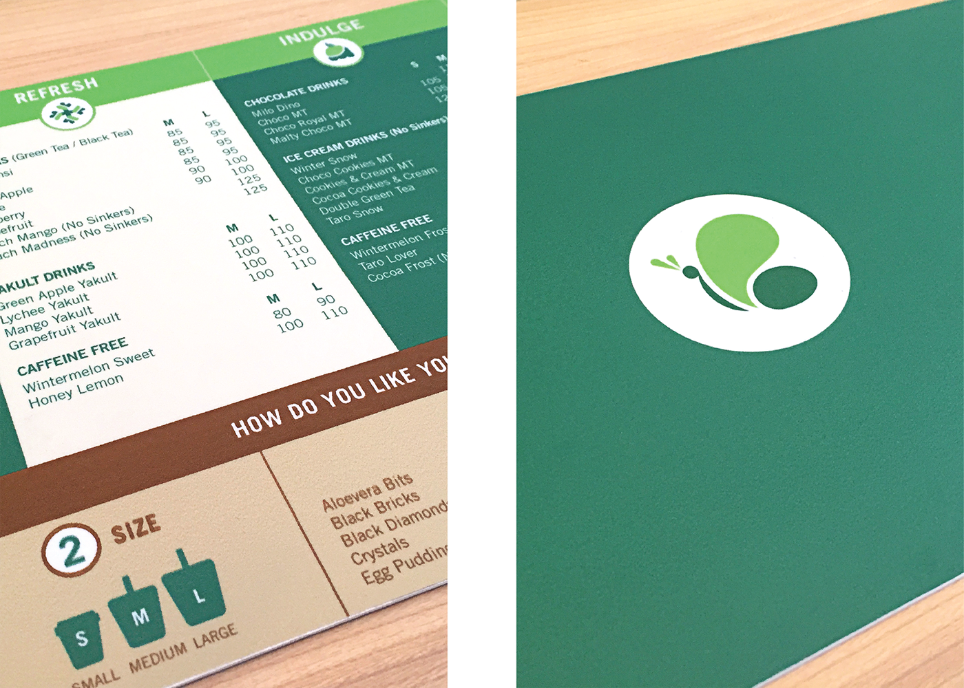
Inspired by overlapping circles, the S in Serenitea’s brand logo can be used independently whenever needed.
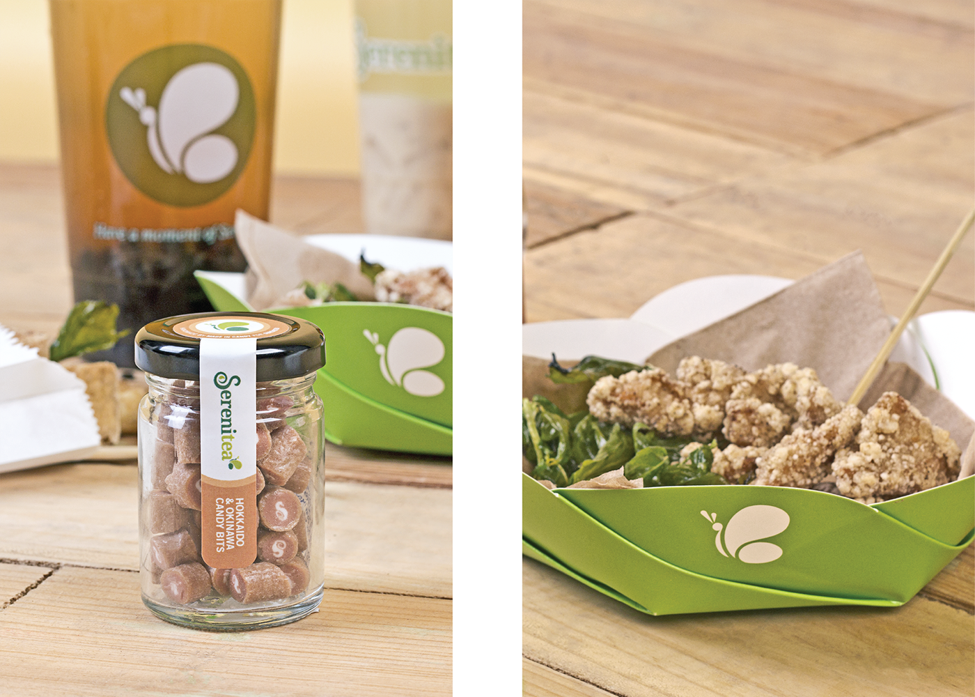
Aside from the letter “S”, the butterfly icon from Serenitea’s logo can also be used separately.
A trademark of the company, the butterfly represents life and freshness to the brand.
A trademark of the company, the butterfly represents life and freshness to the brand.