


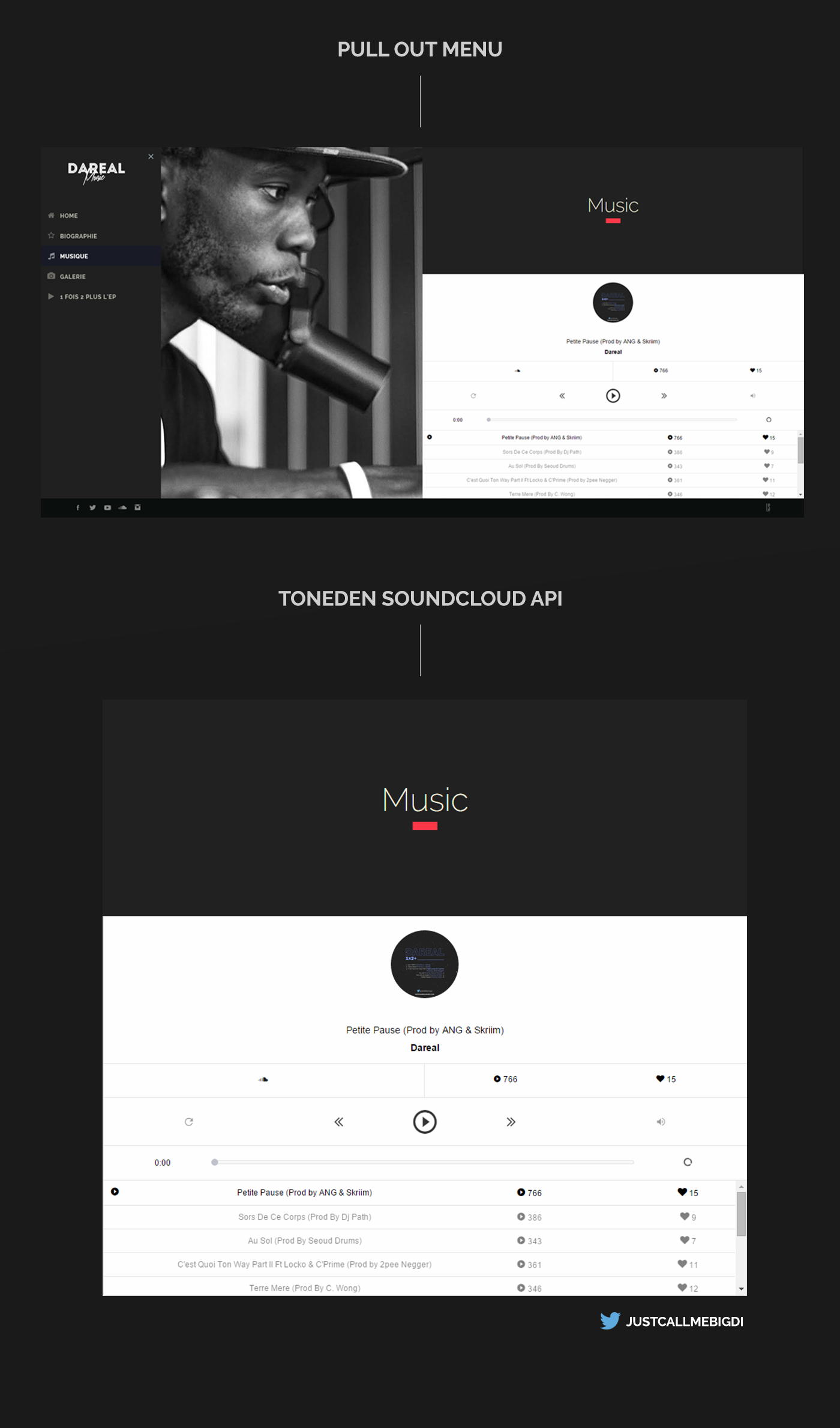
The website has a pull out menu, for both Desktops and mobile devices. Therefore, the website on mobile devices is scalable free since their width is not controlled by any media queries, which you will only see operate on desktops when "shrinking" and "extending" your browser.


