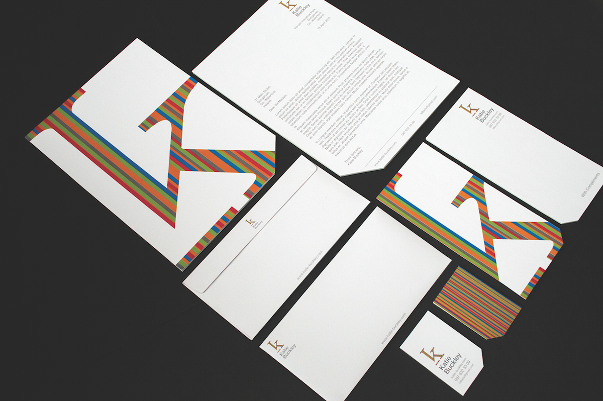

Before starting this project, I had an existing logo, which I created while doing work experience at a design studio. The basic Idea of the logo was to take the ‘k’ shape without the descender, this shape came to my attention when in my first year of college, one of my lecturers wrote my name this way and the way she wrote the ‘k’ intrigued me. When it came time to designing my logo I took inspiration from this and added the fun element of colour.
I began looking at the ‘k’ through a calligraphy and serif typeface. I decided on the addition of the serif foot to prevent the appearance of the letter about to tumble over. I choose the century typeface for the logo because of the shape and size of the serifs and the thickness of the lines. I then paired this with the Helvetica Neue typeface for my name to provide a clean, uncluttered and non-distracting type pairing to accompany the logo.
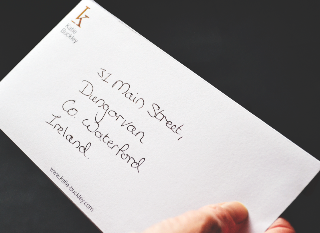
The idea of the ‘k’ was that any colour or pattern can be applied to the shape. The colours choices for the original logo were taken from the old logo to bring a fun element to the design as the plain logo can look quite corporate.
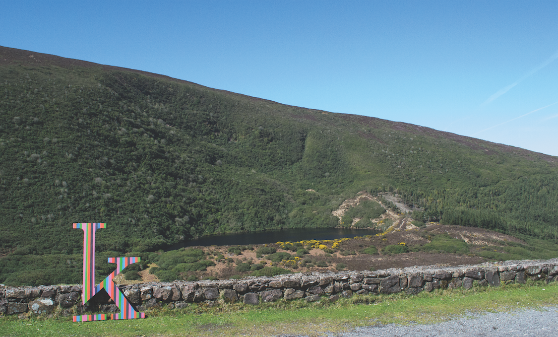
The final photos were an experiment, created by building a giant version of the logo from MDF and bringing it to places and photographing it as if it were travelling.