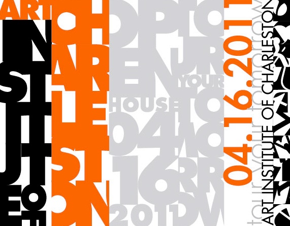
Type Sequence
This work required a ten-letter word that related to art and design. After brainstorming for several words, I decided to use “scrutinize.” But I wanted to incorporate the meaning of the word into the design itself. The type sequence does spell out “scrutinize,” but the viewer must examine the piece thoroughly in order to read it. I worked the sequence into a banner to market the upcoming open house at the Art Institute of Charleston. Word stacks match the type sequence design, paying attention to the flow of the letters and their negative spaces, while remaining readable and thus preserving the funtion of the banner. I then designed a postcard invitation to pair with the banner. The invitation mimics the type sequence with all vital information incorporated into stacks of letters formed into columns to reflect the vertical orientation of the banner.