
This is my first mind map of all of the ideas, of what I could do for my final piece, I looked throught the words shown in the brief, they are as follows:
- Culture
- Ambition
- Consumerism
- Consumerism
- Illumination
- Sequence
- Controversy
- Sequence
- Controversy
After looking through these words I chose four, in which I was interested in and started to think of different ways to be able to make one of them into a final piece.
After thinking long and hard about the different words, I decided to make 'illumination' my chosen word. Once it was decided I started to look at different artists and their work that I found interesting and inspirational towards mine.

This piece was created by the photographer, 'Alan Jaras'.The reason that i chose this image is because of the amazing, bright colours and the light looking like icicles, to create what looks like in my option, an illuminated cityscape.

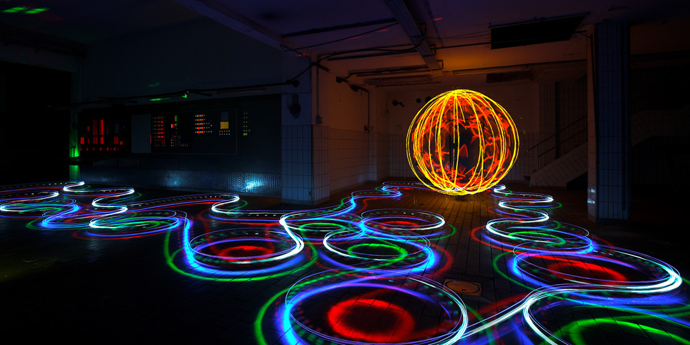
This image was created by Cenci Goepel and Jens Warnecke, they are two very talented photographers. I find this image inparticularly very well executed, the colours within the image are very vibrant and satnd out making it very eye catching. There are two different types of illumination going on, there is the light drawing in the foreground and the star trails in the background.

This is an image of the london at night all lit up, this was taken by Darren Pearson, this image has been thought out very well as the light of the london eye and the buildings around it are reflected in the water that ius in the background, with the word 'London' written with a torch containing three lights.

Lichtfaktor
LAPP-PRO

Sola

Susan Derges, the photographer that took this elegant imag of a trees and a bridge, I chose this image as I felt that the light above that is casting the shadows of the trees and bridge into the water, in my opinion i feel that this photgraph is similar to an optical illusion, where the water and sky merge together.

Christiane Zschommler

Andrew Tallon is one of the photgraphers that I chose for the wonderful and colourful star trails and cityscape within the image taken. I really like this image as there is lots of colour and lots of things going, I can tell this from the single frozen shot.
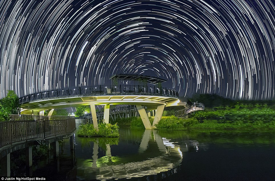
Justin Ng

Lincoln Harrison
This was a plan of all of the different light sources that I could use for creating the illumination, with different colours and effects. Also the variation between the different lights would give off different brightnesses, therefore some of the light would be more dominant over the ones that weren't as strong.

These are all of my brainstorms and ideas of what I wanted to create with the different light and light sources, as the ideas progressed they became more tricky and intricate to do, the reason for this is that I wanted to push myself, and improve my photography and computer editing skills.


These are my trail pieces, they were created through the use of an array of different torches, and altered shutter speed set on the camera, to change the length of the light drawings. the torches used came in all different colours and sizes therefore allowing me to be able to create a variety of differnt size lights.

This is my first ight drawing that I tried out, it was set on 10 seconds long shutter speed, the torch that I used had three lights, that is how i got the three lights that all inline with each other.

I gradually got use to the settings on the camera nad the lights i was using, i managed to change the coour of the light through using colourful plastics to change and alter the colour of the torch.


When i was able to do more that one coloured light, i increased the shutter speed from 10 seconds up to 15 to 30 seconds, i did this because i need to experiment with using different torches, colours and shutter speeds.

I brought a torch that was able to strobe, that is how I got the effect of dots and dashes and changed the filter, so I was able to have more than one colour.

I started to use laser torches to create text on the wall, i set the shutter speed to 30 seconds and maaged to use trwo different laser pens to add a variety of colour.

For this light torch I had to up the ISO and apeture to get the colour of the torch bright enough to be able to see it, with this imge i decided to repeat the pattern over and over again to see what sort of effect would get from it.

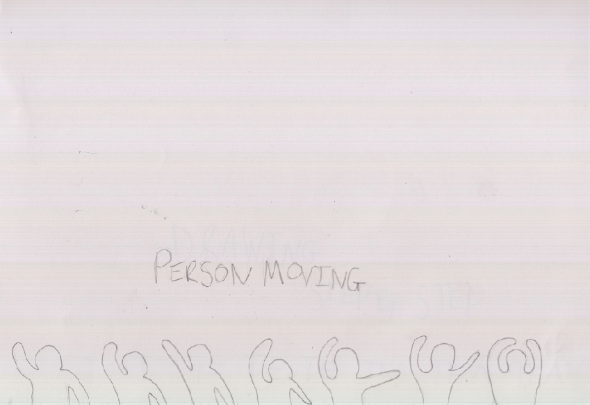
Finally i decided to experiment even more and try to draw the outline of a perosn with a torch, to see what it would look like.This is what it came out like.
After thinking of my ideas for the word 'illumination'. I found it difficult to progress one of my ideas that I had thought of, then took it forward and turn into a final piece. My ideas I had for the project I couldn't think of a concept for any of them, so that is why I decided to change my word and ideas completely, and I went on to choose 'consumerism' as my word.

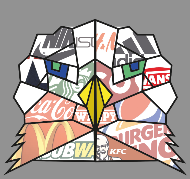
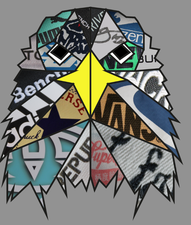
For my final pieces I am using inspiration from Rukkit's of which he makes animals and/or birds out of thick black lines that create geometric shapes, this led to the shapes that had been made, being filled with words and patterns. But for my final piece I wanted to use the thick black lines designed by myself and make my own animals based around my photographs of the birds of prey that I took, for this reason I decided to fill in the gaps with photographs taken by myself of logos and brands of companies that are very well known all around the globe.

This image inparticular by 'Rukkit' is very similar to what I want my final piece to look like, I really like the simplistic shapes and colours usede to create this piece of amazing work.

One of the main artist that recieved inspiration from for my idea was 'Rukkit'. The reason why is because of the thick black lines, with the inside of the shape filled with a pattern, single colour and text.


Tom Maunder is the artist that influeneced into creating mt final pieceof putting compainies and logos into designated shapes, to create one image.

Britto is another artist that is linked with the layout and shapes used to create my final piece, the reason I chose this artist is the use of the thick black lines, it too is filled with single colour and patterns to fill in the shapes created by th black lines.

Britto
Craig and Karl are a pair of artists that created these very oldy coloured pieces of work, this one inparticular

Craig and Karl

Craig and Karl
These are my final pieces that I created for my last project, they are linked with this project because the birds are covered with geometric shapes.


My concept for the word 'consumerism' is that I am using two birds an eagle and a hawk, they have very good eye sight. So therefore, I am classing us humans in this day and age, as being like birds of prey that home in on shops, resturants and companies as if it was their prey. These are brands that are known across the globe. With todays hectic lifestyle people are more drawn to the label rather that taste or wear of the product.


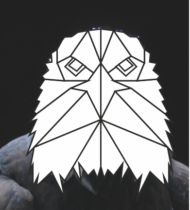
This is an image of an eagle that was taken by me, it has benn used in


For this project I had to take into consideration the health and safety aspects that were present whilst working on my project. These involved, making sure that all drinkable liquids had lids on and were done up or pushed on tight to ensure of no spillages which would ruin the computers. Making sure all possessions and leads are under the tables and away from people tripping over them. Making sure to take plenty of short breaks from the computers as this can lead to eyes being damaged. Ensure that you go out to eat and drink, as you can become dehydrated and hungry. Remember to take care when using an iron to put on the design on to a t-shirt.
My project began with we me wanted to make my final piece out of different light for one of the chosen words which as “illumination”, I had a brainstorm of the different light sources in which I could use to create the my final piece. Firstly I thought of the idea of capturing star trails that would have been taken by me and have create a quote out of different lights, and then edit them to together. But unfortunately that idea was not good because the weather conditions were bad and the stars were not visible at night so I was unable to complete that idea. That is why I went on to another brainstorm of the different light sources that I could use and what I could do with those lights create something that had meaning, or would have been able to explain why I was doing this idea.
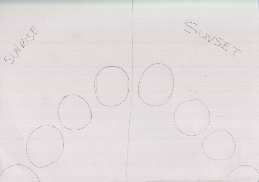
This lead me to some more idea, one of then was to create a sunset and sunrise by drawing then and then putting the images to gather to make a time-lapse, but there was no reasoning behind why I was doing the idea, therefore I went on to the idea of having a person drawn with light and have then move, to give the same effect of a flip book, but that too was no good because I also didn't have explanation as to why I wanted to do it. So I kept going and thinking of more ideas.
After thinking long and hard I managed to think of some more ideas that would have some reasoning behind making it, the ideas was to create person out of light and then have an eighteen drawn above their head and have all of things possible when you turn eighteen. the artists that I looked at that inspired me for the word illumination were Cenci Goepel and Jens Warnecke, Darren Pearson these artists I found very inspirational because of the way their work was created. They used a mixture of natural light as well as different torches to give of different coloured and sized lights.
This project has changed from illumination to consumerism, the reason behind this is that when I was thinking of ideas for illumination I unable to think about why I was doing illumination and why I was using the variety of lights to created all the different colours and sized lights. Throughout this project my skills have developed and improved massively, at the beginning of this project was only able to use the basics of illustrator and photoshop, whereas now I know a lot of the shortcut of photoshop, which meant I was able to create my work quicker, consequently I was able to achieve better results and ensure that it looked a higher quality rather than just a piece that was created with the very basics skills.
If I was to do this project again I would ensure that I chose the word that I wanted to use at the start of the project, this is so that would give myself a better change of making my work look good without the rush of quickly choosing at idea that could work. The materials that I used for this project was the computer, iron and ironing paper, these worked well but if I had more time or re-done the project would have got it printed professionally.
The message that I wanted to portray for this project is that, us humans are like birds of prey, we both home in on the things we want, and we go for sight and rather than taste, I feel that this could have been conveyed in my final pieces. I’m quite happy with my final pieces because of the way they came out, in particular I like the main black frame of the birds at makes the piece look like a bird.
If there was anything to change about this project I would be the appearance of my final piece and the timing, the reason for timing is that would have liked to have done more to this project but unfortunately I was unable to do that because I wasted my time on the word illumination for too long which shortened the amount time I had when I came to me changing me mind and wanting to do consumerism because for that word I was able to think of an idea as well as a concept for my final piece.


