


This project was awarded a merit in ISTD 2015.
It was one of five merits awarded in Ireland that year along with membership to the International Society of Typographic Designers.
It was one of five merits awarded in Ireland that year along with membership to the International Society of Typographic Designers.
This is project was designed in response to the Rhetoric Of Ekphrasis brief for the ISTD 2015 student competition. The brief required that students typographically interpret a critical piece of writing which is based upon a famous work of art.
For my submission I decided to base my design upon the Julian Spalding novel entitled, Why You Should Sell your Hirst's While You Can. The design references the famous spot paintings designed by Damien Hirst.
For my submission I decided to base my design upon the Julian Spalding novel entitled, Why You Should Sell your Hirst's While You Can. The design references the famous spot paintings designed by Damien Hirst.


My book is entitled Spotted, Con Art and is 236 pages long with 101 typographic interpretations of 101 different spot paintings. The content of this book is presented in two different type faces, Akzidenz Grotesk and Adobe Caslon Pro in order to reflect the two voices presented in the book.
Adobe Caslon Pro is used to present content from Julians Spaldings Novel, reflecting the voice of the art critic. Akzidenz Grotesk is used to reflect the more neutral voice of the author. The geometric features of the typeface are similar to "the spot" in the spot paintings, acting as a tool which has few distinguishable or quirky characteristics.


Julian Spaldings Novel critises modern art as it exists today. He coins the term "con art" suggesting that modern art is a sham. I took five key concepts explored in Spaldings novel and used these for the topics explored in this book. The book is essentially broken into five chapters: Con Art, The Myth of the Label, Vacuous, The Colour of Money and an Unoriginal Idea. These chapters are repeated under reworded titles and content. This was a strategy to further the concept that the spot paintings are repetitious, devoid of content and meaning and could be used to create an endless series.


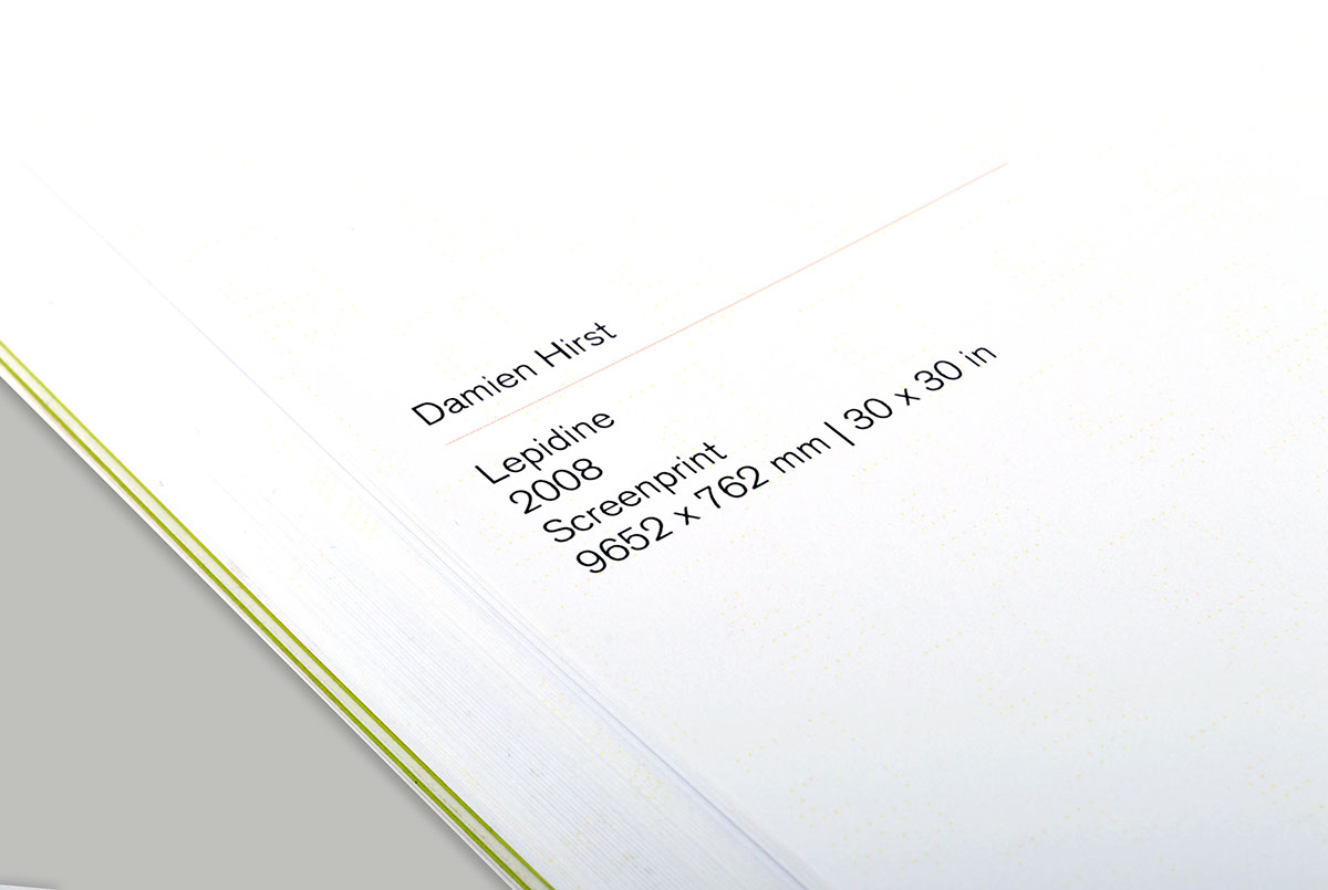


Catalogue of 101 images of the selected spot paintings. Each indivually interpreted in this book.

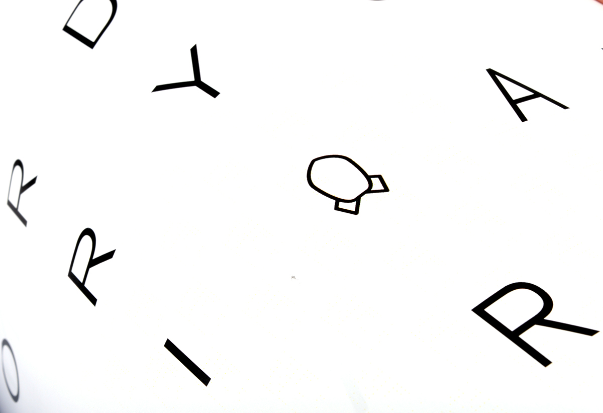
Each chapter contains different ten typographic interpretations of ten different spot paintings. The words they spell are synonyms the name of the chapter. A catalogue of images at the back of the book details what spot painting each illustration is drawn from in chronological order.
The aim of the book is to appear ambiguous, illusive, sparse, to look beautiful and to suggest that it could be furthered to create an endless series of books. This is a reflection of all the characteristics of the spot paintings. The type illustrations are presented in a manner similar to the way they would be presented in a museum, on gloss paper next to a small paragraph of information.
The aim of the book is to appear ambiguous, illusive, sparse, to look beautiful and to suggest that it could be furthered to create an endless series of books. This is a reflection of all the characteristics of the spot paintings. The type illustrations are presented in a manner similar to the way they would be presented in a museum, on gloss paper next to a small paragraph of information.


