The world of type brought to life.
Animated logo for TYPOMANIA, an event showcasing the best of typography related works around the world.
From classic type design to photography or animation, the logo represents not only the excellence in the use or representation of typography, but also the many different approaches designers and artist around the world take when it comes to this world of letters.
I wanted to represent this universe of creative playfulness taking a different approach for the animation of each letter of the logo, giving each one a unique concept taken from the field and history of typography:
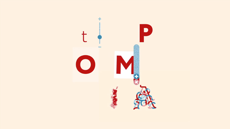
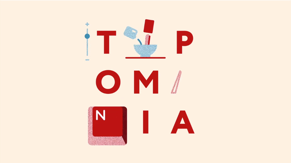
T is for "Transformation" – infinite variations and possibilities.
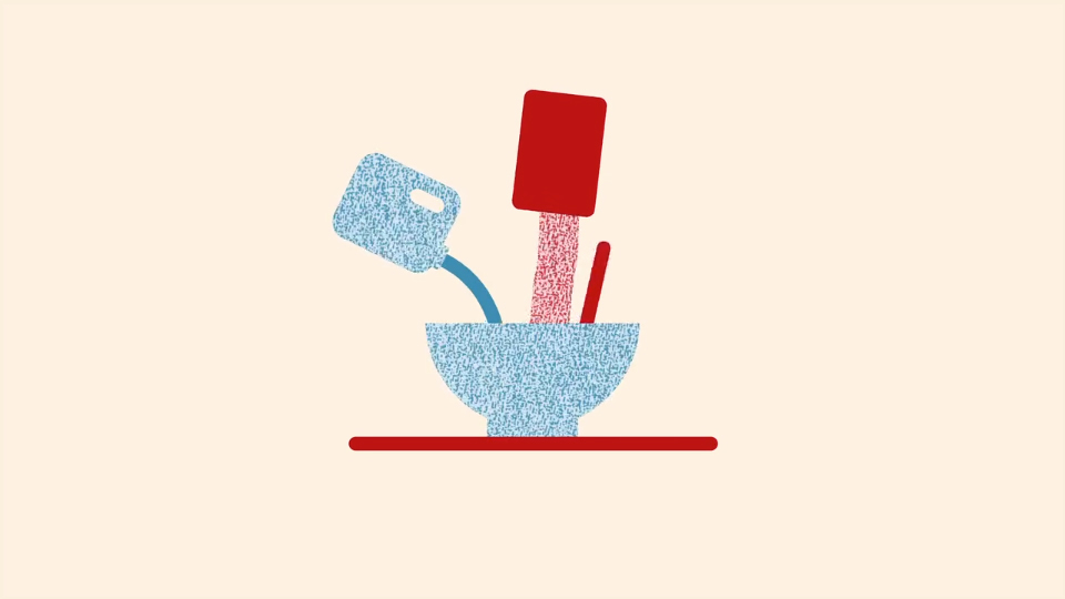
Y is for "Yummy!" – the inherent deliciousness of a well-cooked (designed) typeface.
P is for "Print" – the craftsmanship, the care for the process.
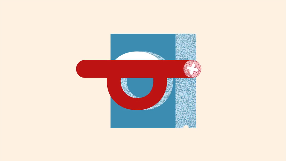
O is for "Oblivion" – rescuing old methods of creation that were about to disappear.
M is for "Multiplication" – the advantages of technology.
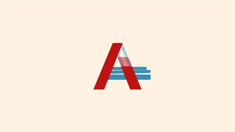
A is for "Architecture" – the technical and precise aspects of type.
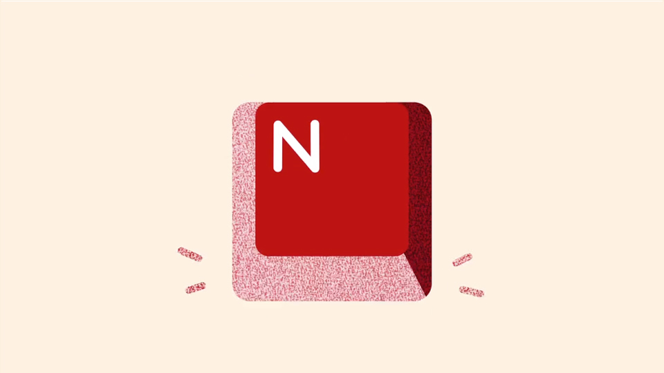
N is for "Nostalgia" – appreciation and knowledge of the history behind what we see and use today.
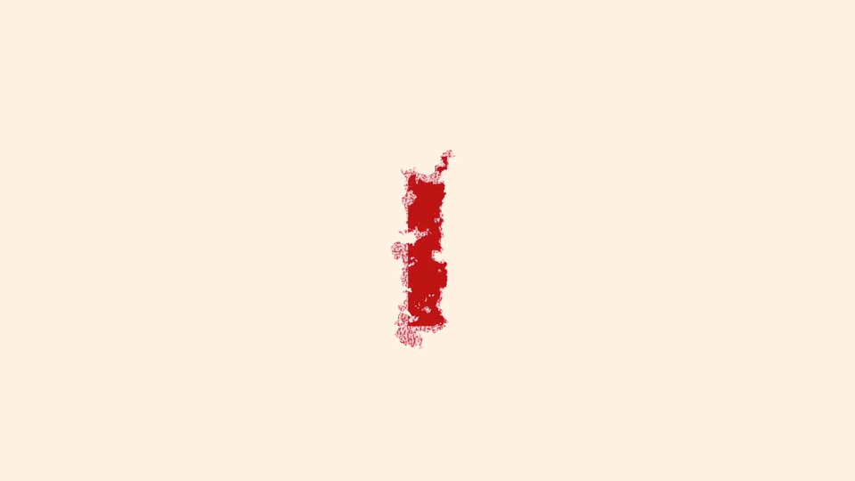
I is for "Ink" – where it all started.
A is for "Art" – playfulness and emotion.
These concepts were then used as the starting point to develop the final animations.