Brief: I was tasked to create an original booklet for Swatch, the Swiss watch company. The booklet was not to be commercial, but focus more on a interesting way of portraying time while linking with the content. It was also to be treated like an exclusive collector’s item as the target market was for a typical member of the Swatch Club.
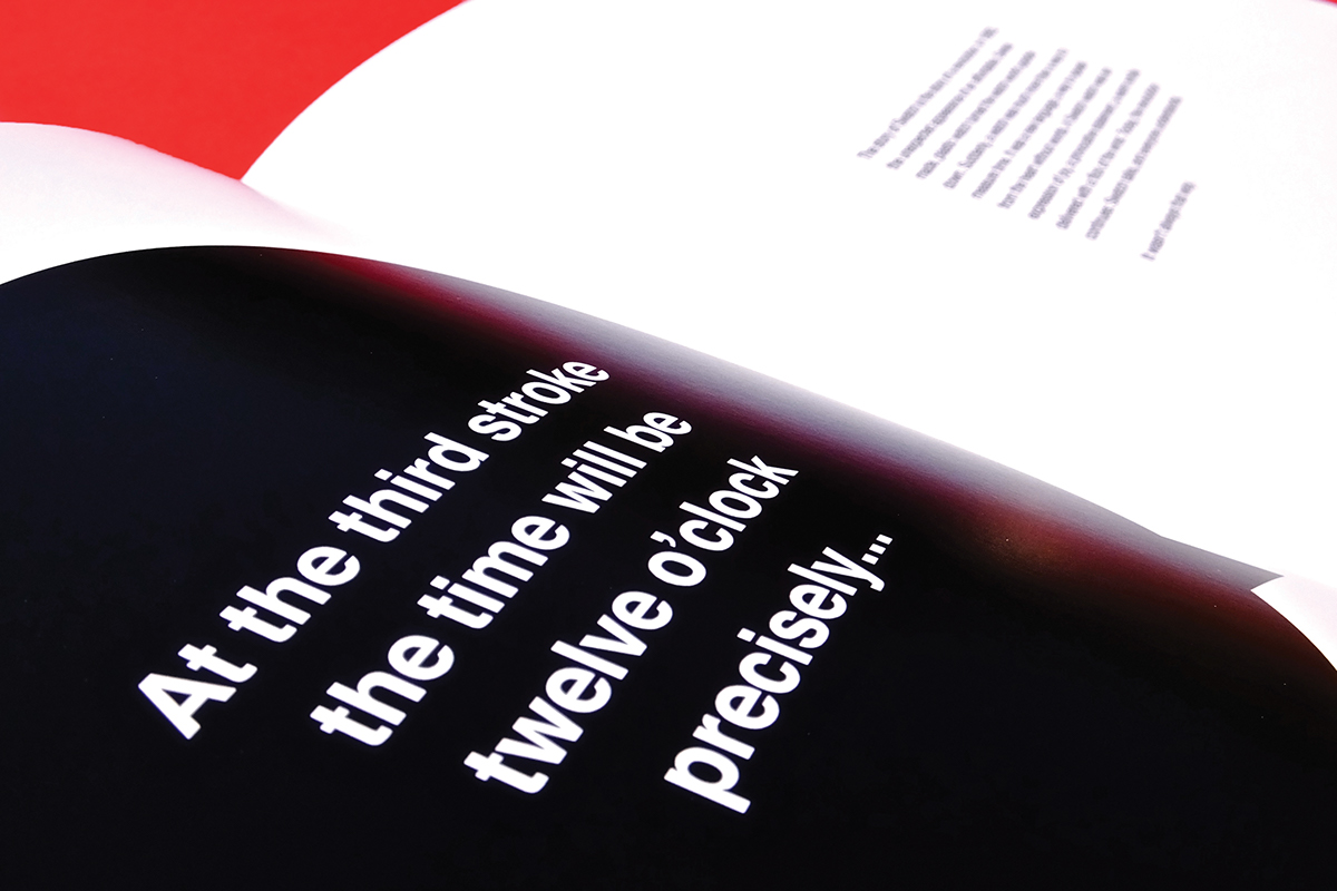
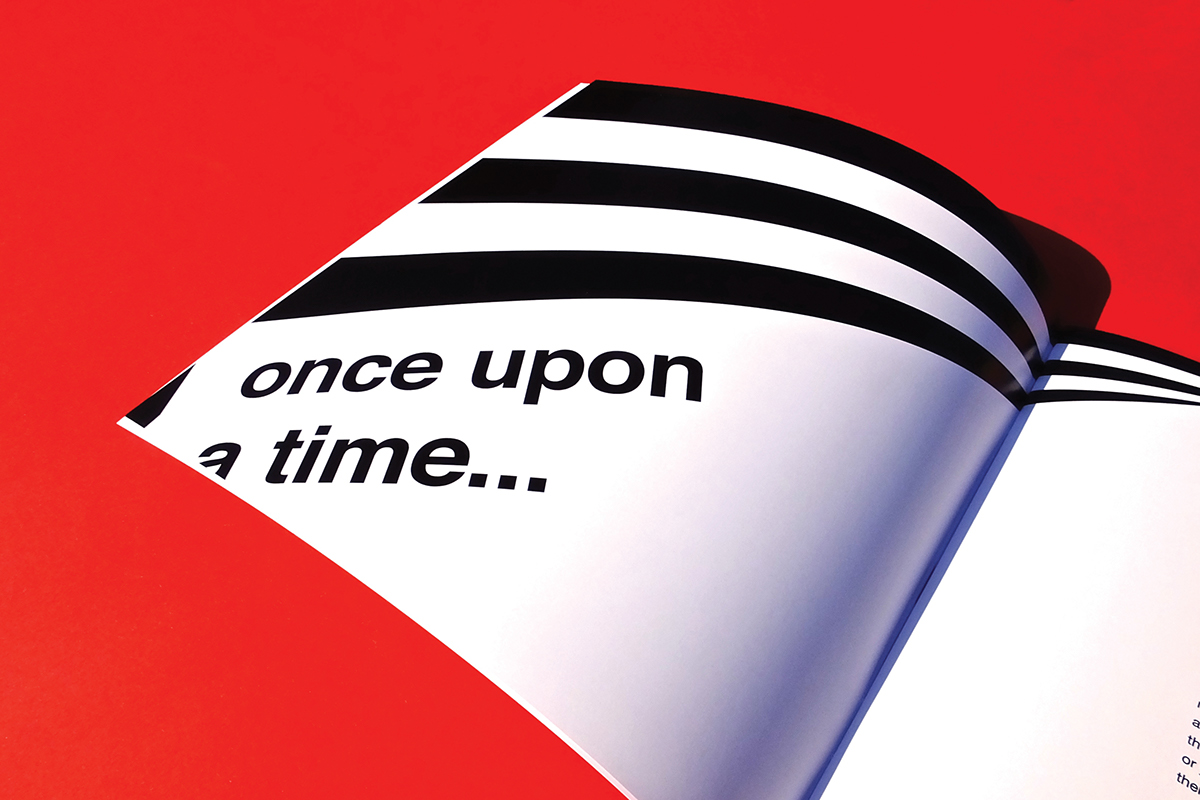
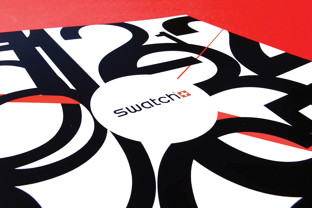
My original idea for this project was to use Swiss Style for its striking look and to link with the origins of Swatch. And a lot of the characteristics of the style are still incorporated like the use of Helvetica with all typography and using black, white and red together. But a lot of my main inspiration came from the book, “Popular Lies About Graphic Design” by Chris Ward for it’s prominent and simplistic look in black and white, it’s effective use of typography, and compelling pictures and illustrations. So for the final designs I used a more minimalist style using black & white, but I still used a small amount of red on the front cover with the clock hands and the logo.
My illustrations relate to many things like the numbers/shapes to do with clocks, the themes of the pages’ text, famous expressions to do with time. This is a 28 page booklet and each spread in booklet signify the hours of a clock, so some of the illustrations can relate to them for example, “A stitch in time” illustration relates to 9 o’clock, or the middle symmetrical spread relates to 6 o’clock (half way). My final solutions are underneath. Thank you for taking the time to look at my work; feel free to comment you thoughts below.
To see the full booklet and designs, you can see it on the my website at:
andrew-hankinson.co.uk/project/swatch
andrew-hankinson.co.uk/project/swatch