14.04.15
- Concepts
- Ideas
- Aesthetics
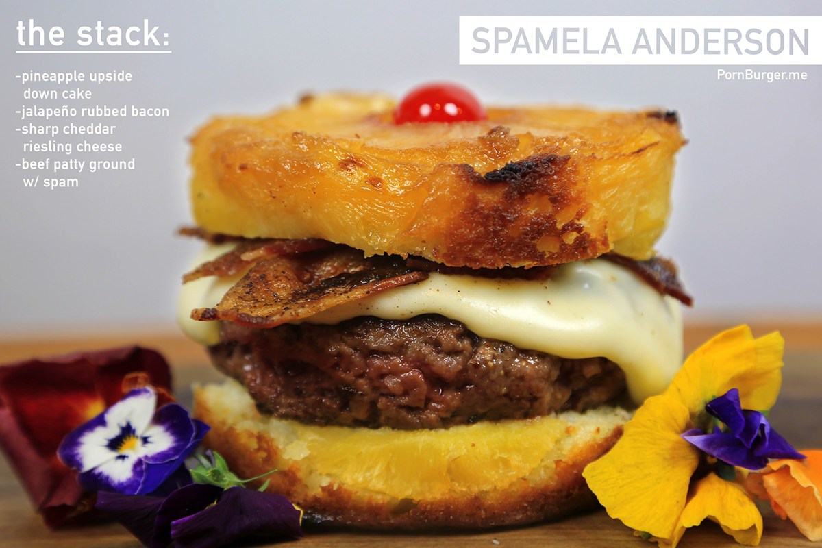
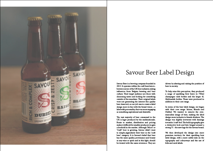
In week 7 we got into groups and began to brainstorm concepts, ideas and aesthetics for our magazine. There were many concepts that we’re being thrown around but the three that we all loved were Festivals, Burgers and Beers and Travel. After narrowing it down we chose to focus on the Burgers and Beers concept as we thought it would be an original niche market to tap into. When deciding on an aesthetic we discussed achieving a simplistic and minimalistic design as well as being very hand crafted.
21.04.15
- Typography Hierarchy
- Colour Scheme
- Slight Content Change
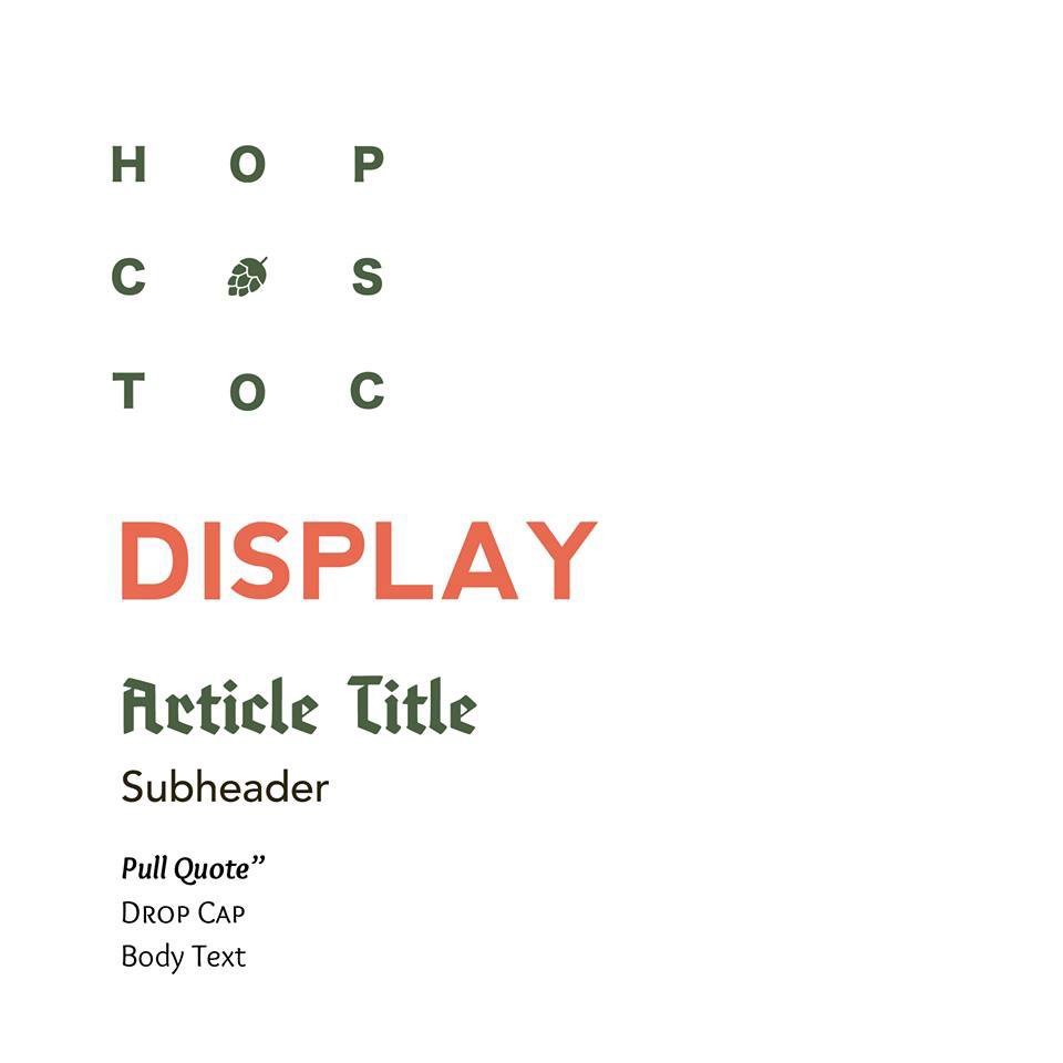
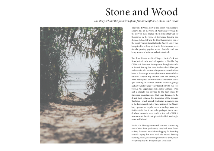
When week 8 hit us we began to work on a typography hierarchy. As a group we struggled to fall in love with the hierarchy that we had chosen and think this is purely because we were pulling different typefaces from different font families and trying to come up with a coherent design whereas our overall aesthetic is about being simplistic. For an aesthetic we narrowed it down to a minimalistic theme with large images and multitudes of white space which everyone was please with.
28.04.15
- Continuing with Typeface Hierarchy
- Colour Scheme
- Narrowing Content
In week 9 we continued to explore typefaces as none of us were completely happy with a display font as well as sharing fonts over social media throughout the week. We chose an orange, white and olive colour scheme as we felt it was a little different to what anyone else would have chosen and had seen these colours together on another book and thought they worked well together. This week we also decided to narrow the content of the magazine to the design behind craft beers.
05.05.15
- Playing with Layouts
- Shared Possible Content
- Chose a Typeography Heirarchy
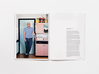
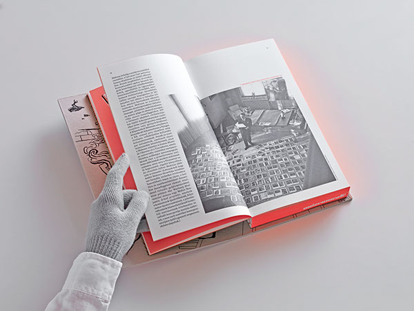
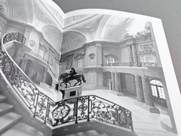
In week 10 we began to put together some layouts. We did this to show each other to see if we were all on the same page with the chosen aesthetic and weather or not the aesthetic chosen work well together. We also shared some possible content to each other over Social Media and continued to work and change the typeface hierarchy. The new typeface hierarchy consisted of the Minion Pro font family as it stuck with our simplistic and minimalistic theme, was clean and easy to read and did not take away from the large high resolution images we had included in layouts.
12.05.15
- Meet ups
- Constructive Feedback
This week we continued to meet up and exchange advice on different layouts to help each other stay within the chosen aesthetic and so the magazine kept a consistent design. Some of the feed back that I received was that my design layouts were too compact and needed to be spread whilst still achieving the desired amount of white space. By the end of this week I had just about completed all of my magazine layouts.


19.05.15
- Final Pages
-Touch Ups Completed
Week 12 I completed any touch ups that my part of the magazine needed whilst continually getting feedback from my fellow group members. Below I have attached the pages that were changed before the finalisation of the whole document.


