Pilgreen es un restaurante de comida saludable y tienda naturista. El nombre Pilgreen nace de un juego de palabras entre la palabra Pilgrim y la palabra green. “Pilgrim”, significa peregrino, viajero cuyo destino es un lugar sagrado en donde encontrará la felicidad, por lo tanto Pilgreen se refiere a aquellas personas que busquen la armonía, balance y paz en un lugar donde puedan disfrutar de alimentos naturales y saludables.
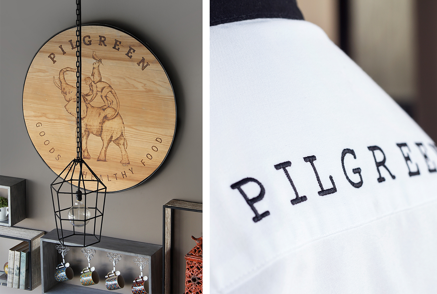
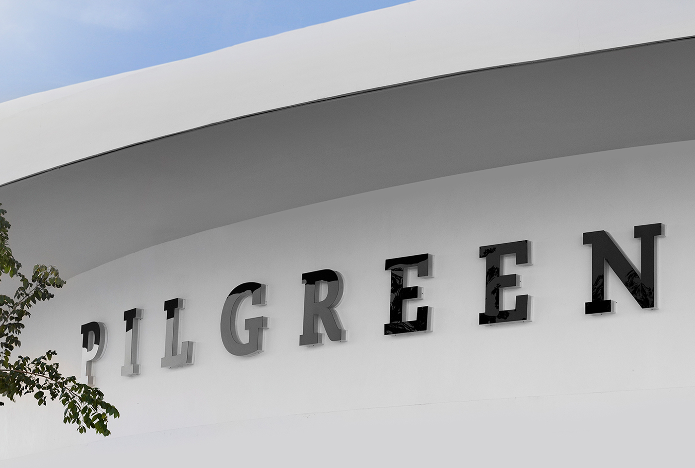
Se colaboró con TNGNT Arquitectos para realizar un trabajo integral en donde el branding y la arquitectura convivan en un ambiente acogedor y amigable.
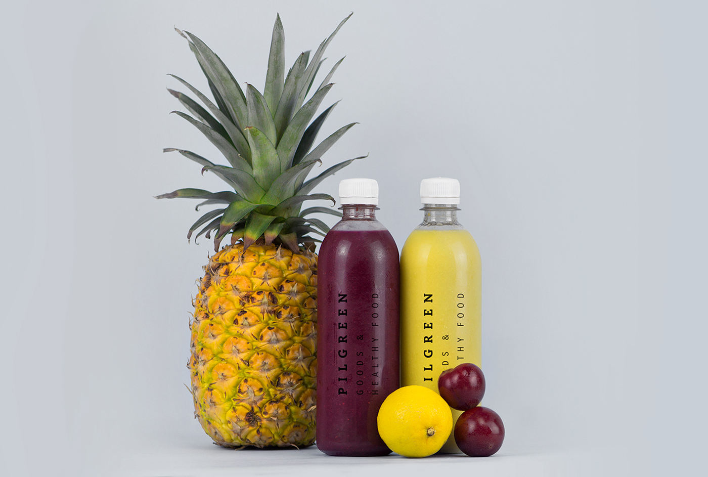
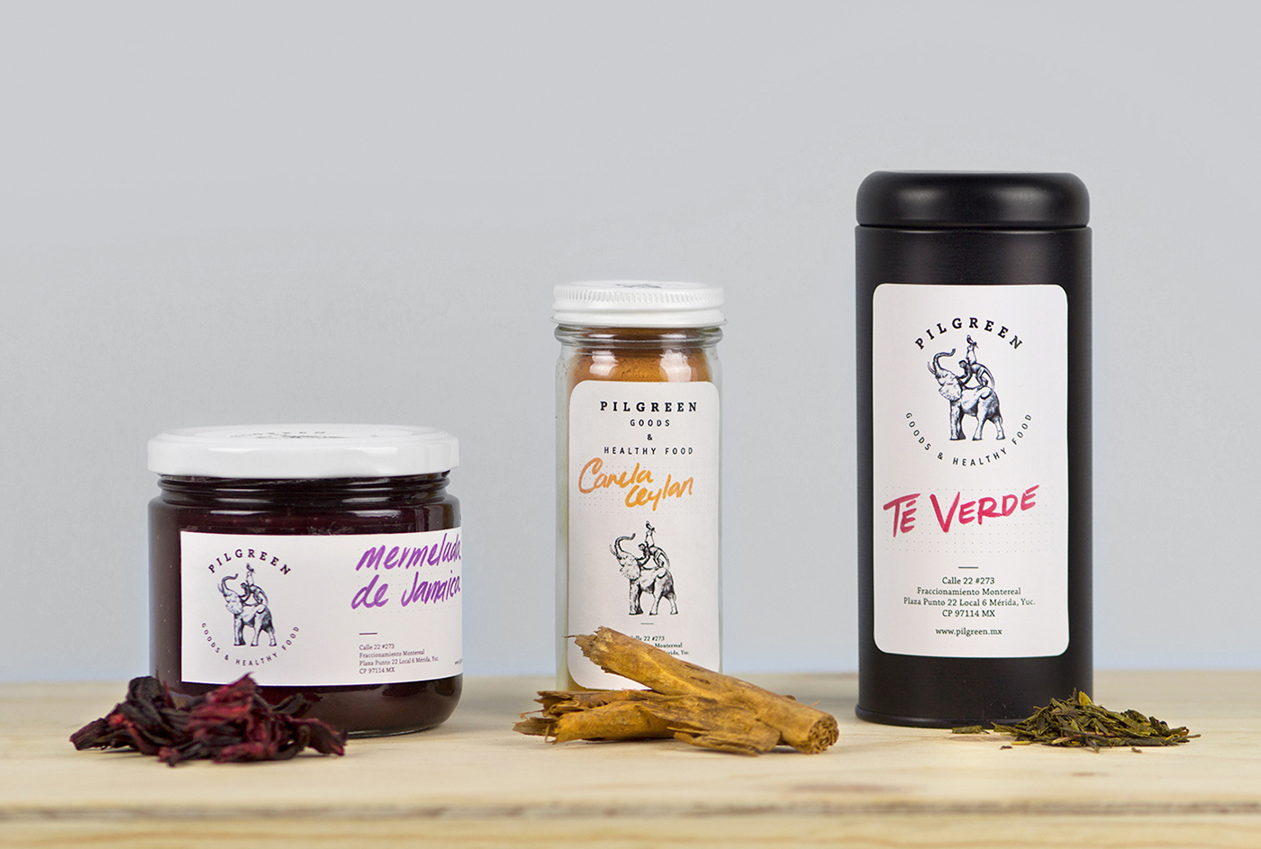
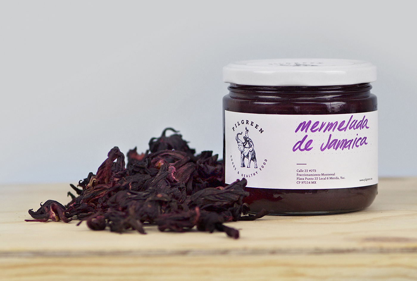
“Comida saludable” es un concepto muy utilizado en el mercado actual, por lo que se crea una imagen con un valor agregado que hace de Pilgreen una marca única con un sentido de comunidad.
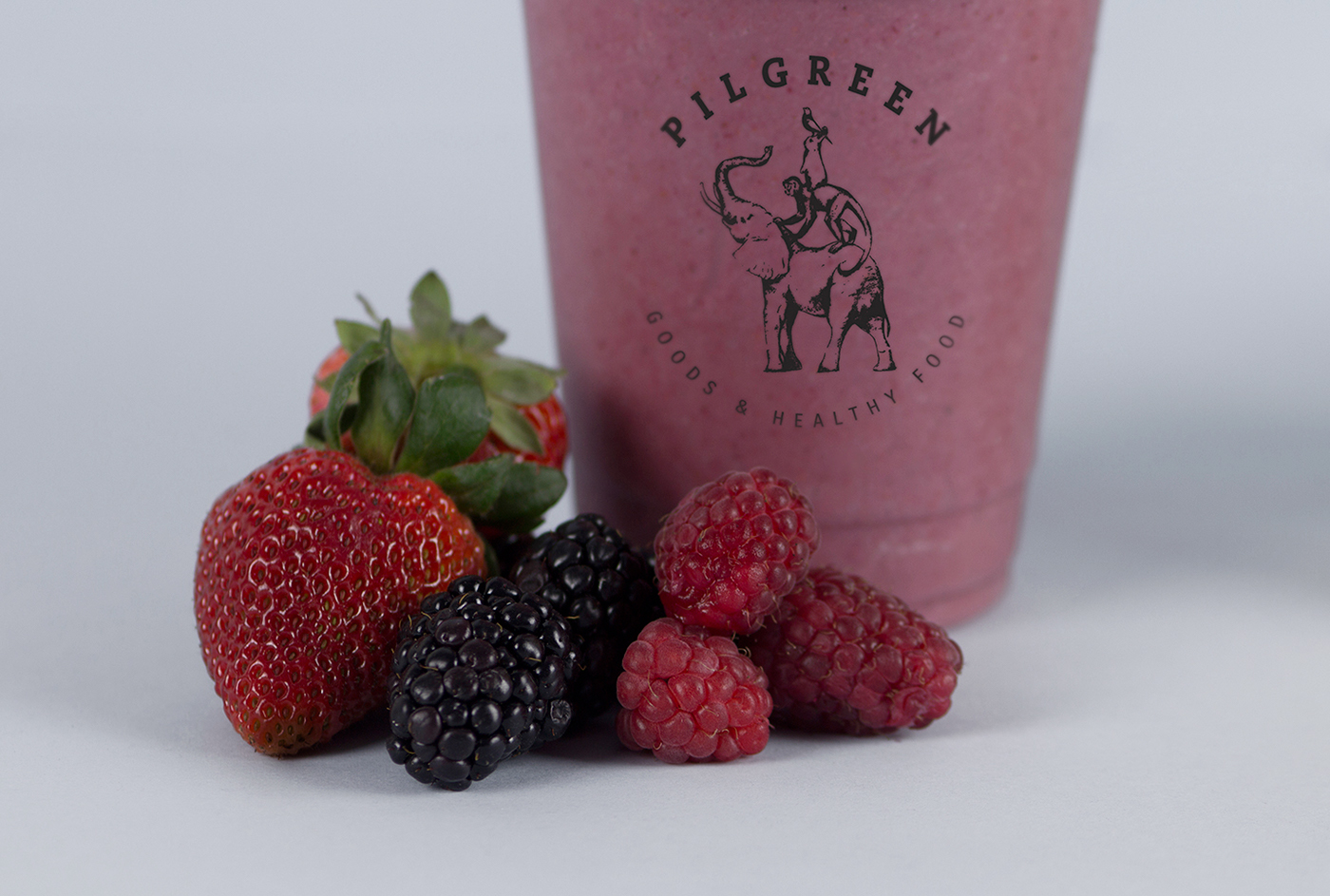
Bajo la filosofía “All different but all help each other get the fruit from the tree” creamos el isotipo de Pilgreen que reúne cuatro animales de diferentes características para lograr un objetivo en común. Estas criaturas fueron seleccionadas por los distintos valores que proporcionan a la marca; comenzando por el elefante, símbolo de fortaleza y sustento, que comparte la alegría e inteligencia del mono, quien a su vez proporciona soporte al conejo que refleja la prudencia y vida, y finalmente el ave que nos da sentido de amistad y libertad.
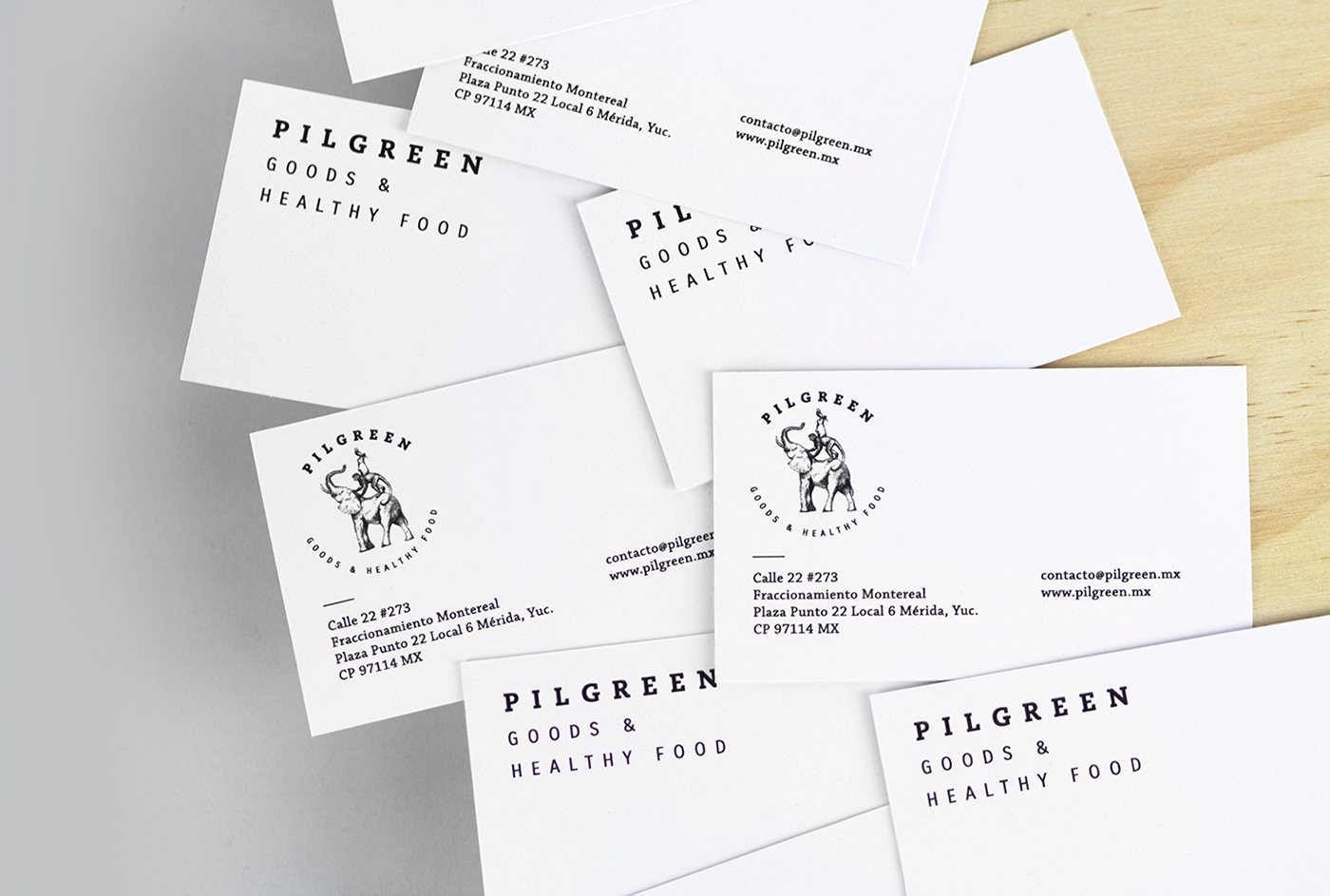
Los animales, la selección tipográfica y el formato circular, inspirado en la filosofía zen, dan como resultado una marca que refleja el estilo de vida sano, de comunidad y armonía.
Se colaboró con TNGNT Arquitectos para realizar un trabajo integral en donde el branding y la arquitectura convivan en un ambiente acogedor y amigable.
“Comida saludable” es un concepto muy utilizado en el mercado actual, por lo que se crea una imagen con un valor agregado que hace de Pilgreen una marca única con un sentido de comunidad.
Bajo la filosofía “All different but all help each other get the fruit from the tree” creamos el isotipo de Pilgreen que reúne cuatro animales de diferentes características para lograr un objetivo en común. Estas criaturas fueron seleccionadas por los distintos valores que proporcionan a la marca; comenzando por el elefante, símbolo de fortaleza y sustento, que comparte la alegría e inteligencia del mono, quien a su vez proporciona soporte al conejo que refleja la prudencia y vida, y finalmente el ave que nos da sentido de amistad y libertad.
Los animales, la selección tipográfica y el formato circular, inspirado en la filosofía zen, dan como resultado una marca que refleja el estilo de vida sano, de comunidad y armonía.


Pilgreen is a healthy food restaurant where you can find unique merchandise and all kinds of goodies. The name of the place is a wordplay, it comes from the word Pilgrim and green. A Pilgrim is a traveler who is on a journey to a holy place, a place where happiness is found. Pilgreen is all about the search of harmony, balance and peace while eating a healthy meal.
This project is the result of a collaboration whith TNGNT Architects in order to create a complete and consistent work, a place where the brand and the environment bonds in a cozy and friendly space.
Nowadays "Healthy food” is a concept that’s already been used, the idea was to create a brand with extra value, the community feeling is what makes Pilgreen unique.
“All different but all help each other get the fruit from the tree” was the philosophy that inspired us to create the logo’s illustration, four different animals gathered to get the same thing. Each animal was selected because of the social value they represent. The elephant, a symbol of strenght and support that shares the happiness and intelligence of the monkey, that at the same time, gives support to the rabbit. The rabbit reflects life and prudence, and at last, the bird that gives us a sense of friendship and freedom.
The animals, the selection of typography and the circular shape of the logotype, inspired by the zen philosophy gives us as a result a brand that reflects a healthy lifestyle, harmony and a sense of community.


