

New Masthead, Logo Trace and Styling
Some examples of the mastheads I have designed
Some examples of the mastheads I have designed
Here are some Examples of the masthead designs I have used in recent weeks past. The most difficult part of designing this format was getting enough of a focal point with the extra wide photo format. The next most difficult thing was getting the right amount of contrast with a picture behind the entire masthead as requested. The Logo was retraced in Illustrator and beveled & styled various ways until finally deciding on the one you see below. I feel the final result gives a much cleaner look with a lot more depth and fresh look on stands. Glad to see the nickel is nowhere to be seen or associated any longer. The change of the masthead inspired a lot of other changes within the paper including headings, the remaining elements of the cover, and design consistency of the ads within the paper.
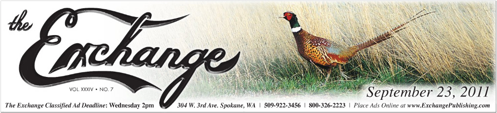
One of the first masthead designs. This particular one was for the Annual Hunting Issue.
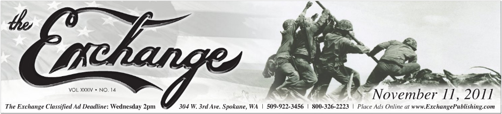
New Masthead Design for the Veteran's Day Issue
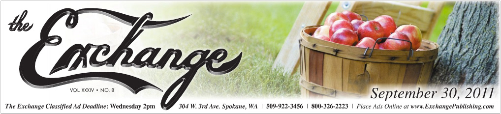
Masthead Design for the Home Idea Show Sponsored by The Green Bluff Growers Association and their Apple Festival.

New Masthead Design for the Annual Fall Home Improvement Issue
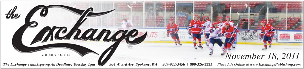
New Masthead Design Incorporating the Spokane Chiefs
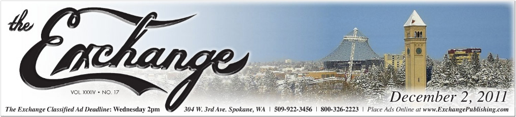
New Masthead Design for the First Issue of December

The old masthead and logo. The logo in the old masthead was degraded and the masthead was just old.


