
Initial idea of creating a brand that makes learning creative technology easy and accessible.


Initial sketches of the brand.

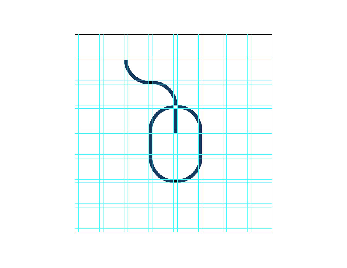
Initial designs for the ProKno logo.

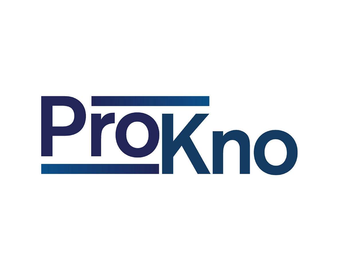
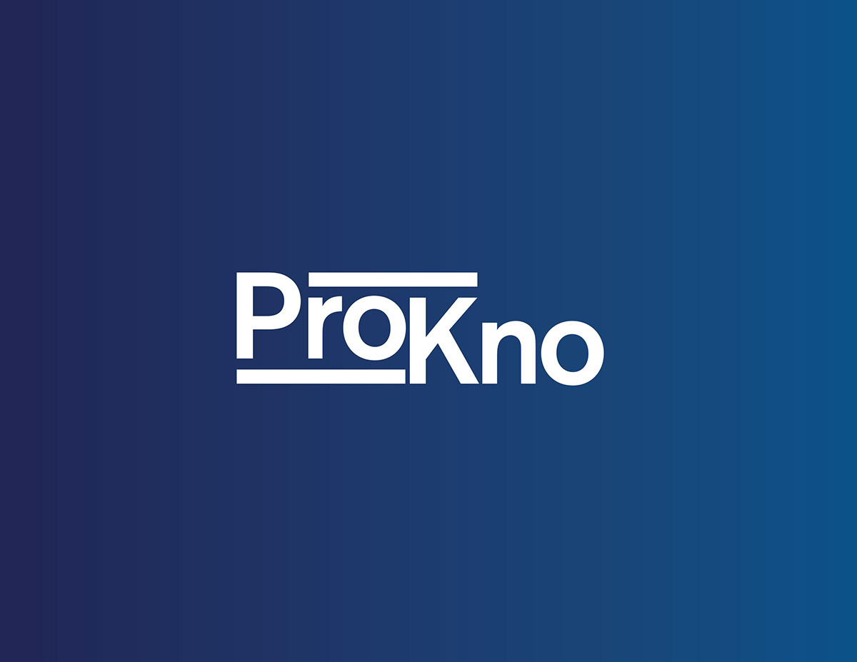
Final design of the ProKno logo. The mark represent "steps" to symbolize the learning process while also providing emphasis on the pronunciation of it's unique name.
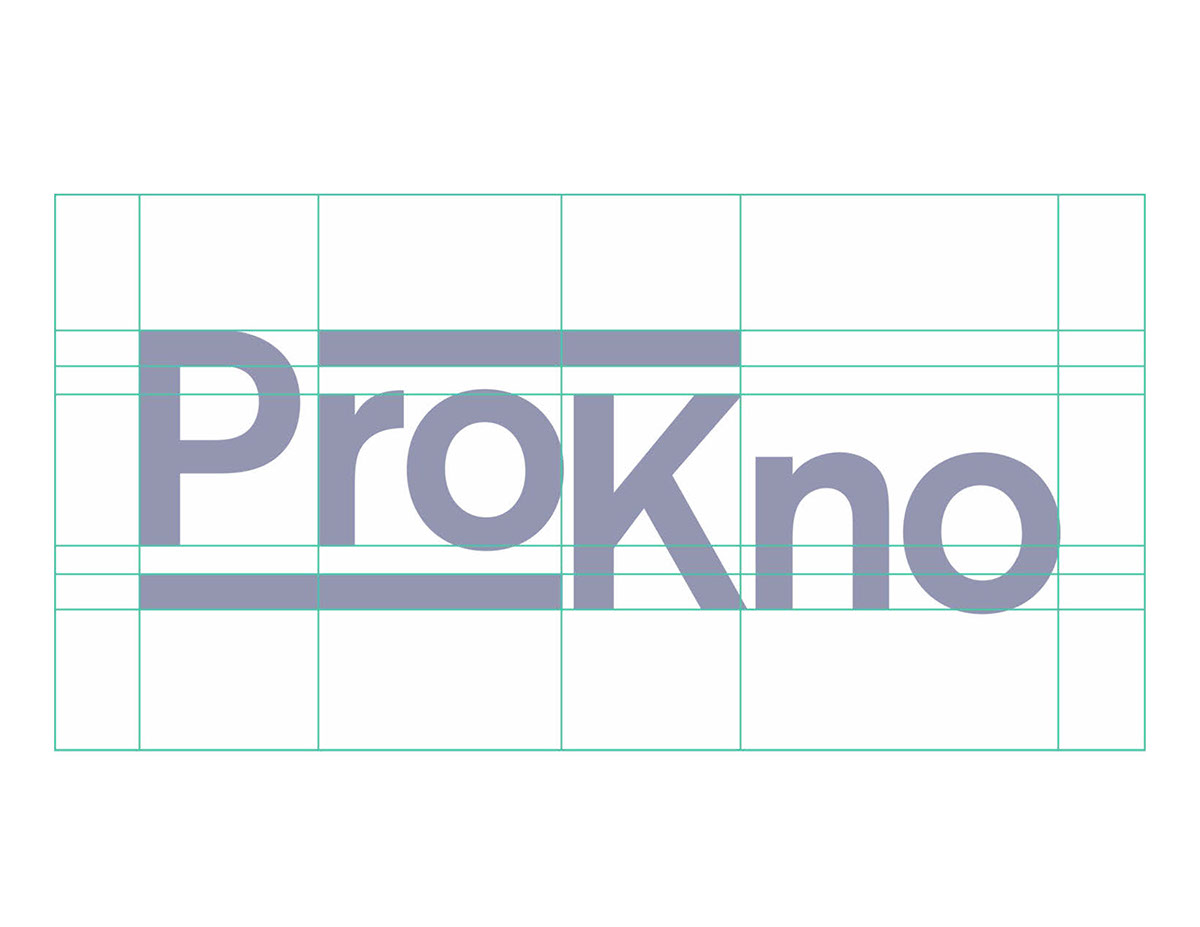
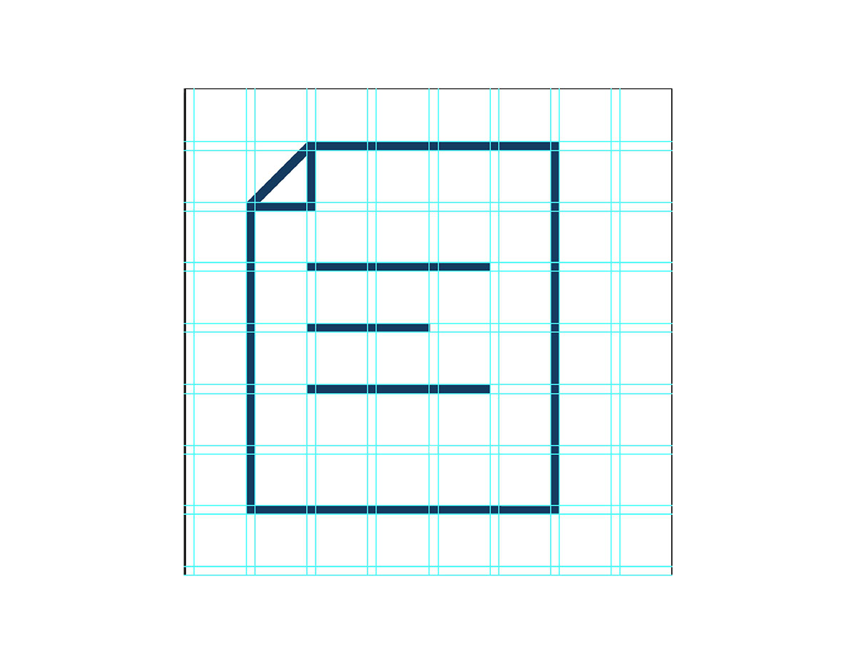
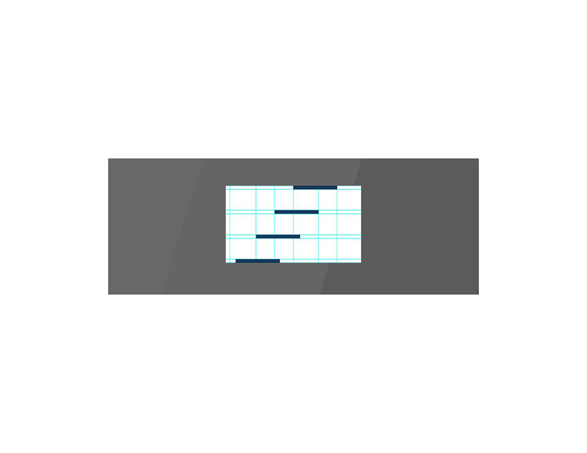
Final logo on grid. Below is a brief animation of the logo in motion. Both the logo and the logo animation were created by Michael Ponton.
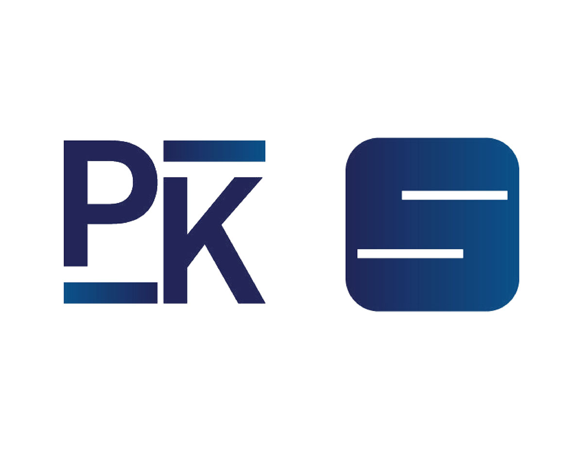
Logos for mobile apps such as the iphone and android devices. Designed by Michael Ponton.
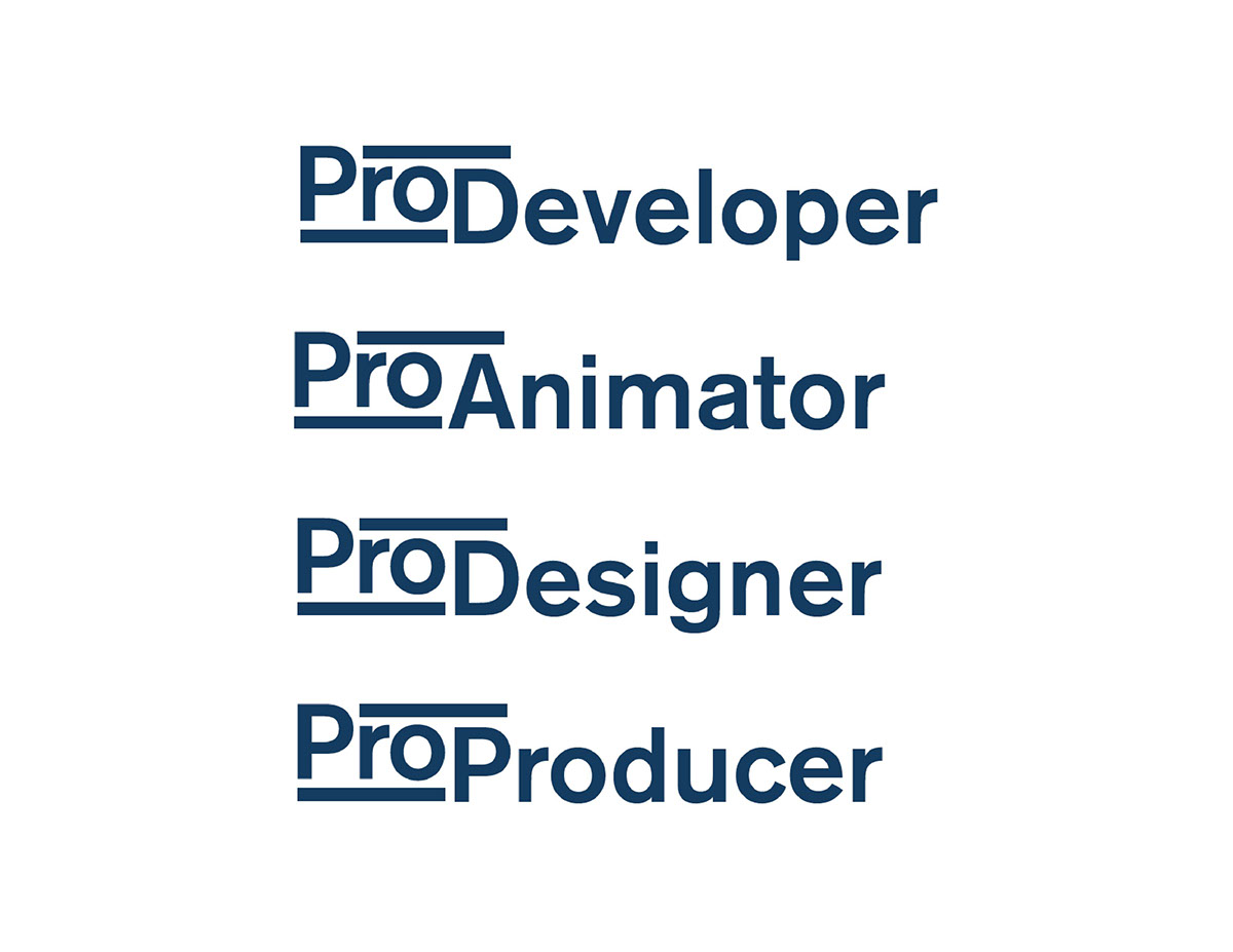
As a user would get good enough in their field of study, they would get titles such as ProAnimator. Designed by Michael Ponton.
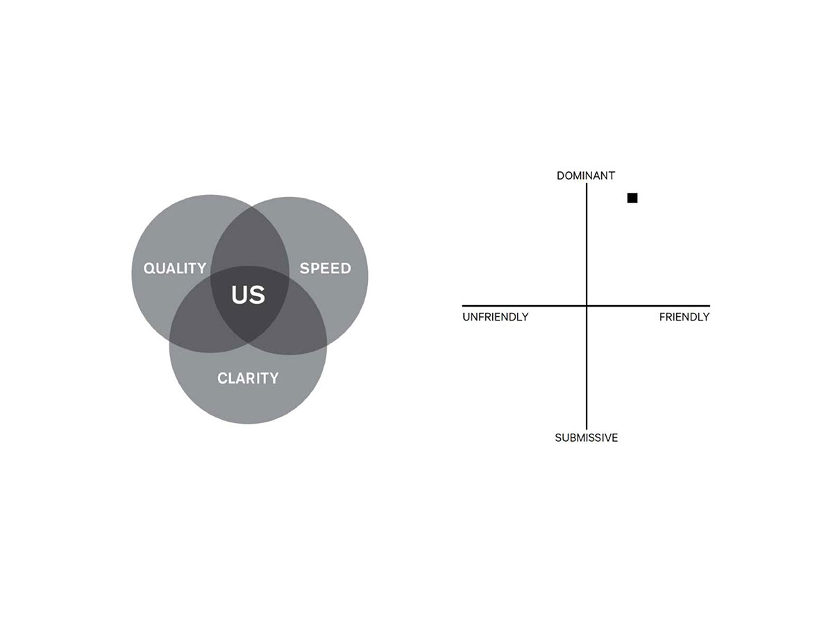
Chart of our brand's qualities and personality.
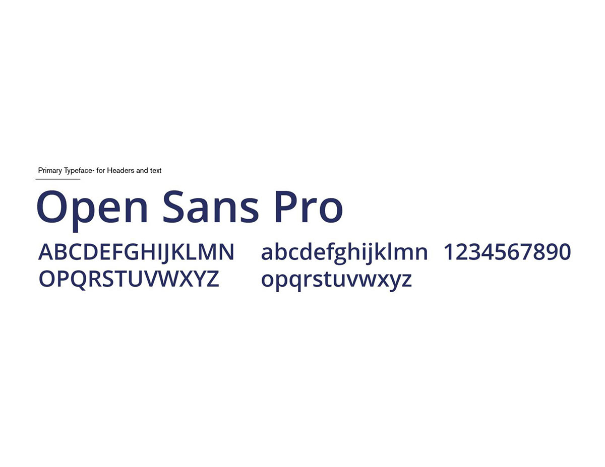
We chose Open Sans to be the main typeface due to its clean aesthetic and it is open source.
Here are some icons and them on the grid.


This is the animation icon for ProKno.
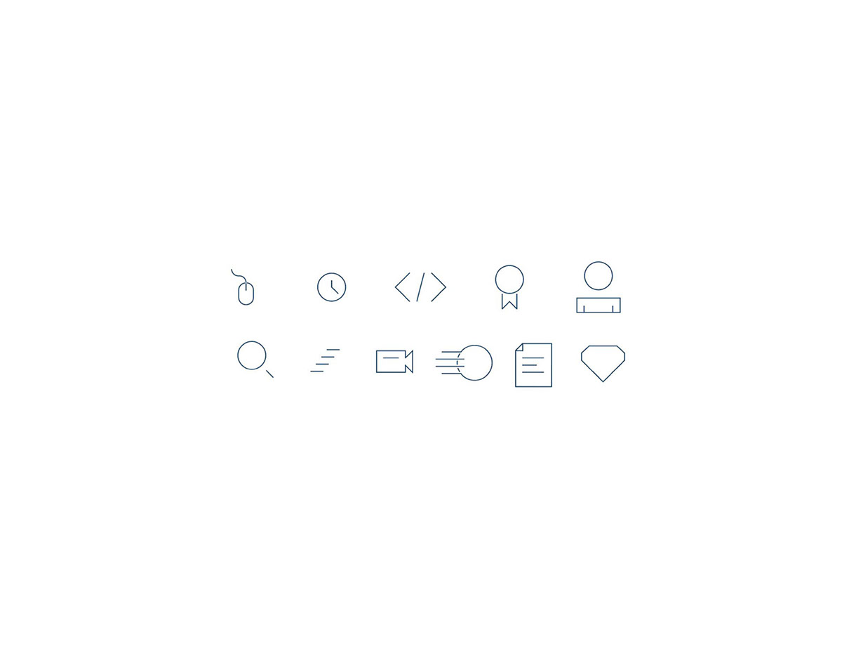
All of the icons off-grid. All of the icons were designed by Brendan McCann.
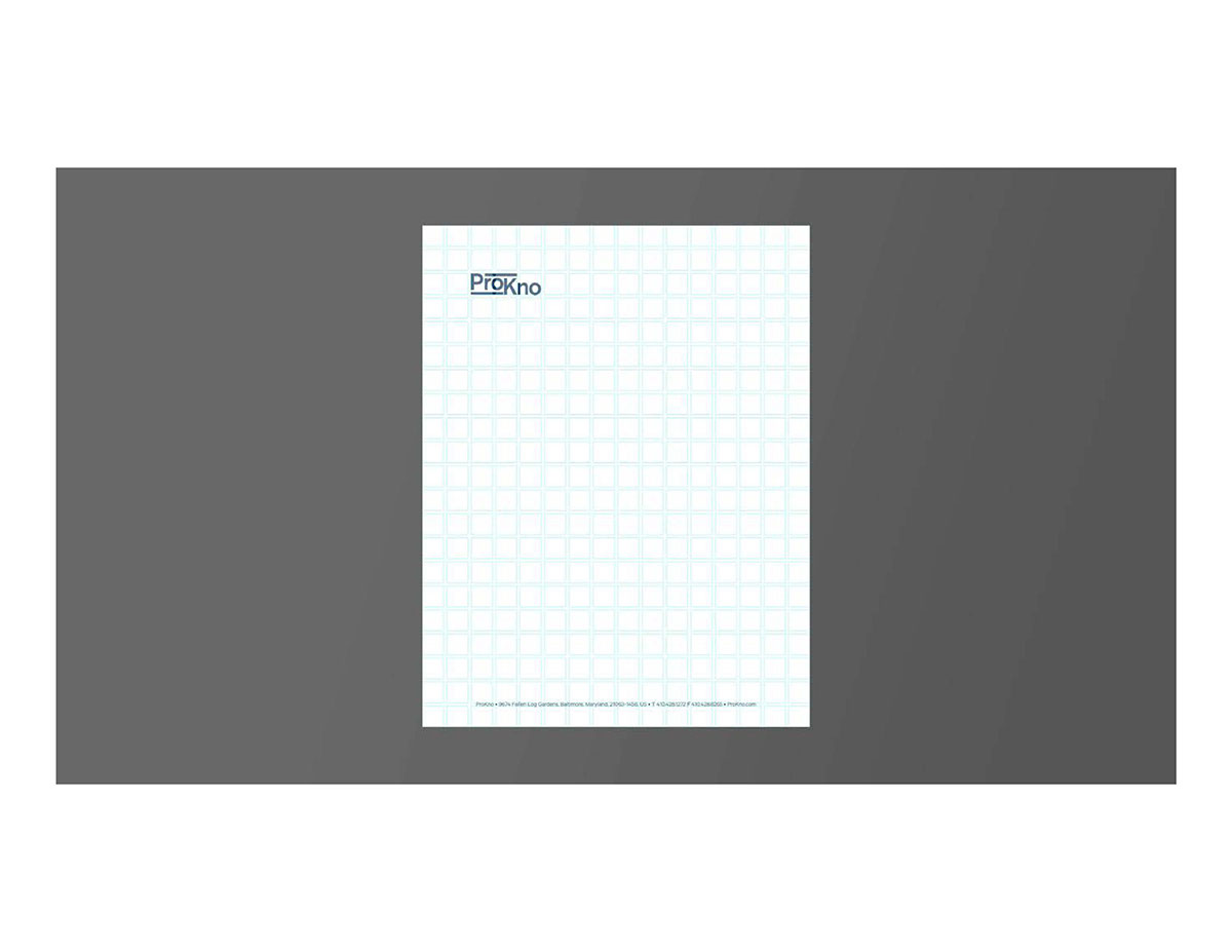
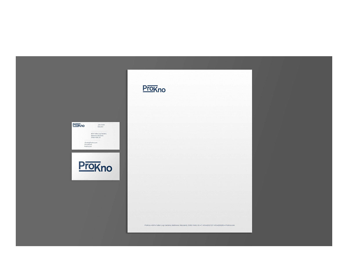
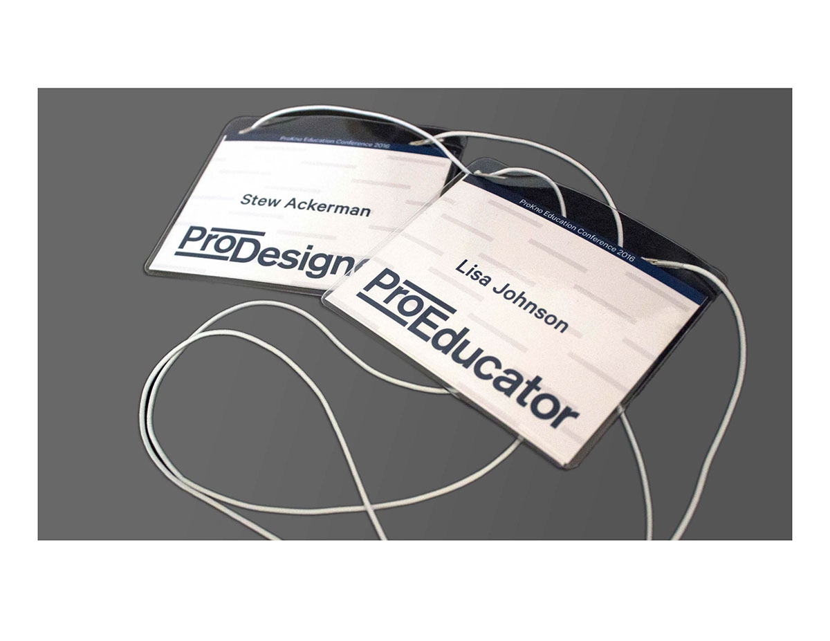
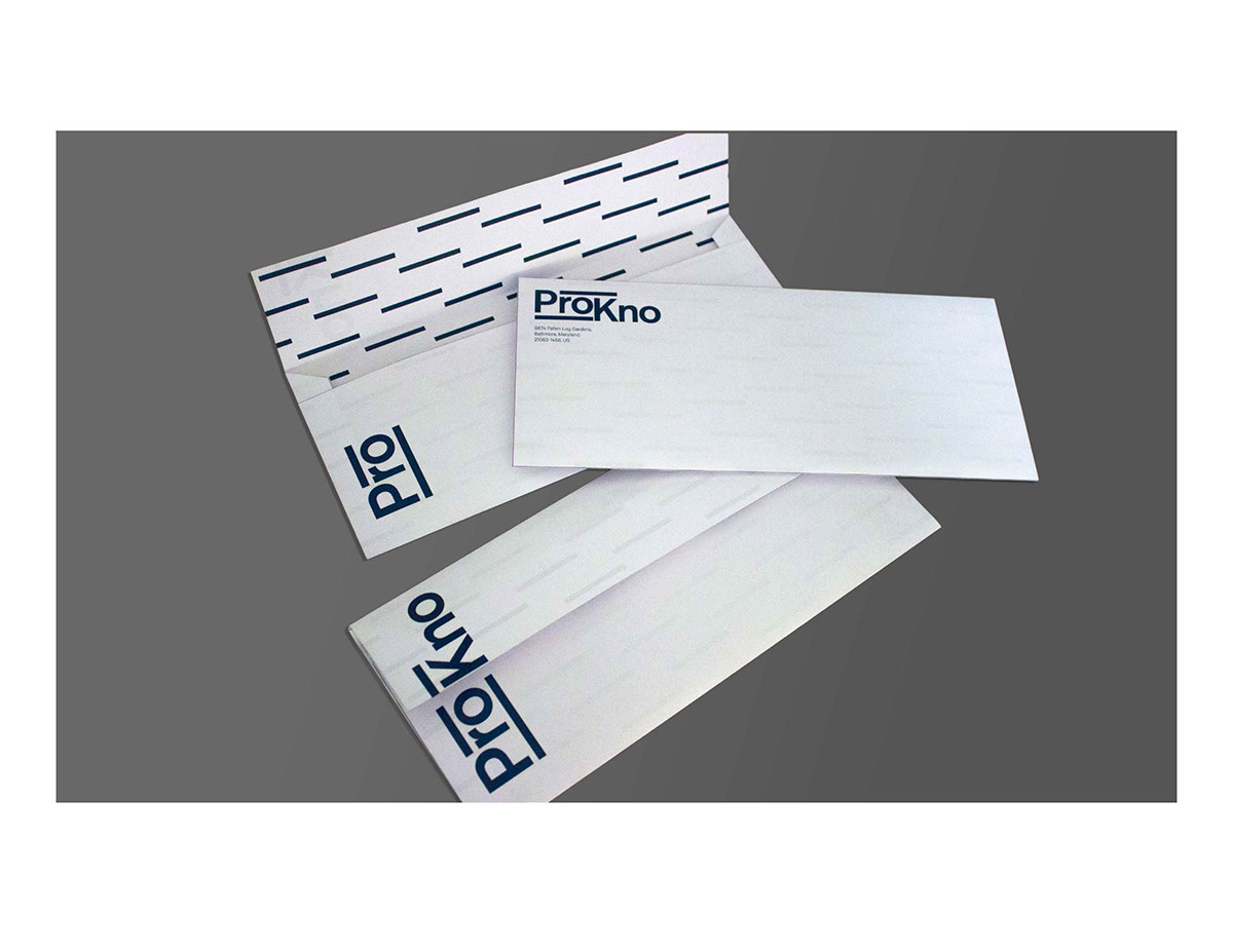
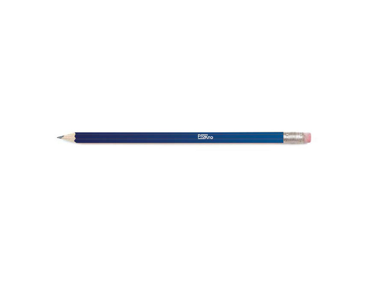
Here is ProKno used in many different products. Created by Lauren Burleigh, Brendan McCann and Michael Ponton.


Advertisement for ProKno. Created by Michael Finneran.
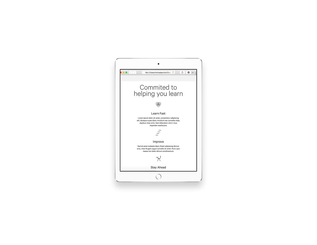
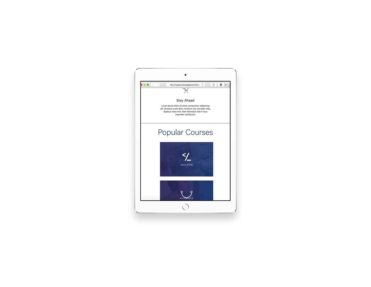
ProKno's website across in platforms. Designed by Brendan McCann, Michael Ponton and Michael Finneran.

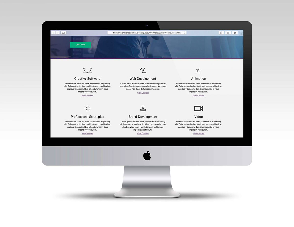
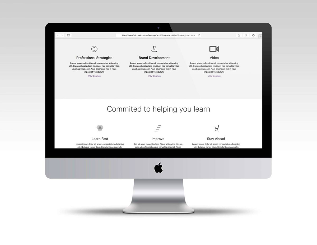
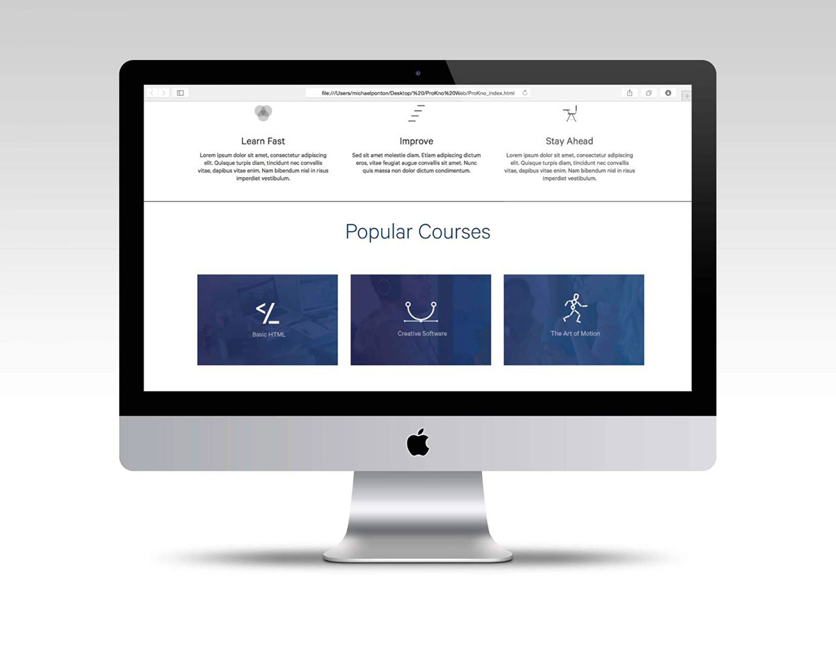
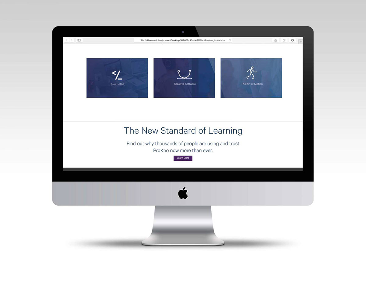
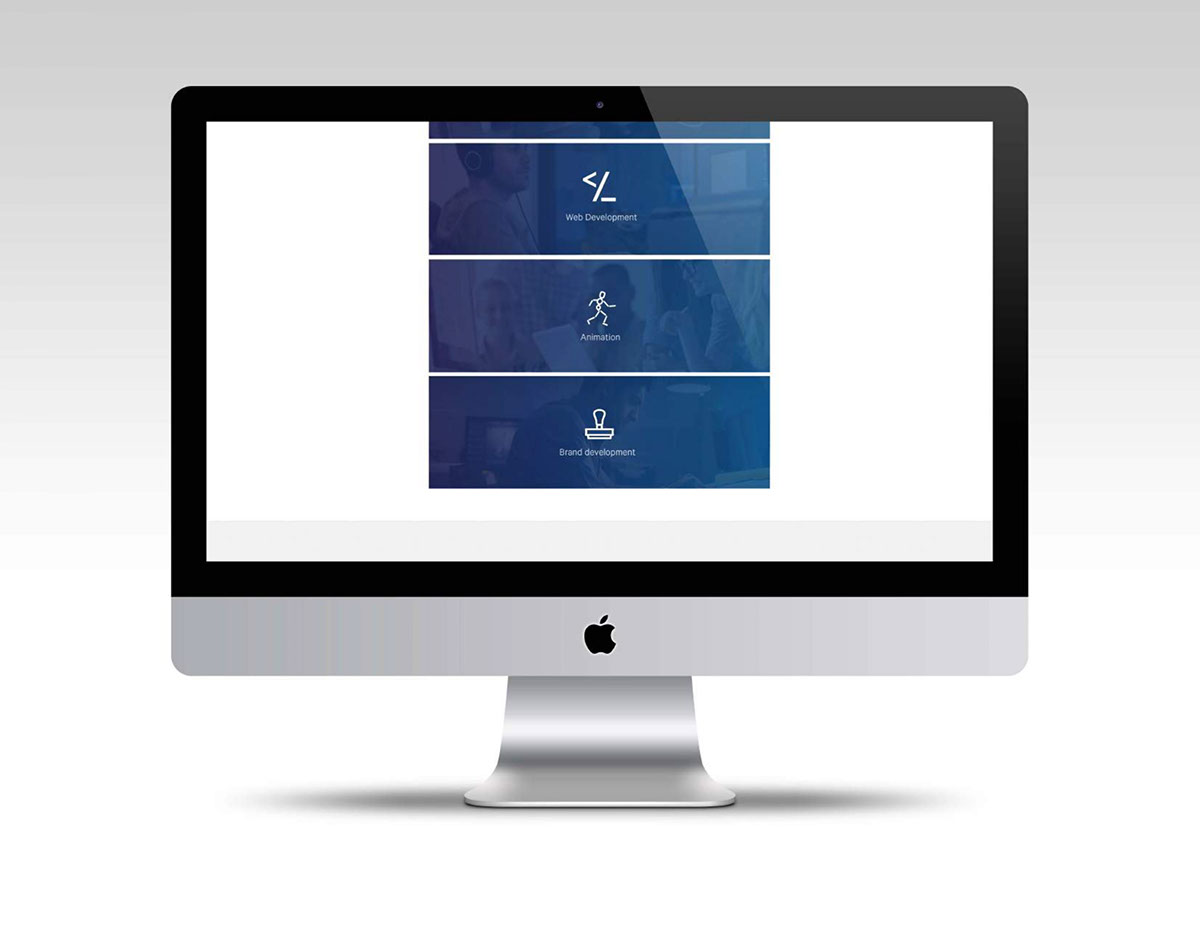
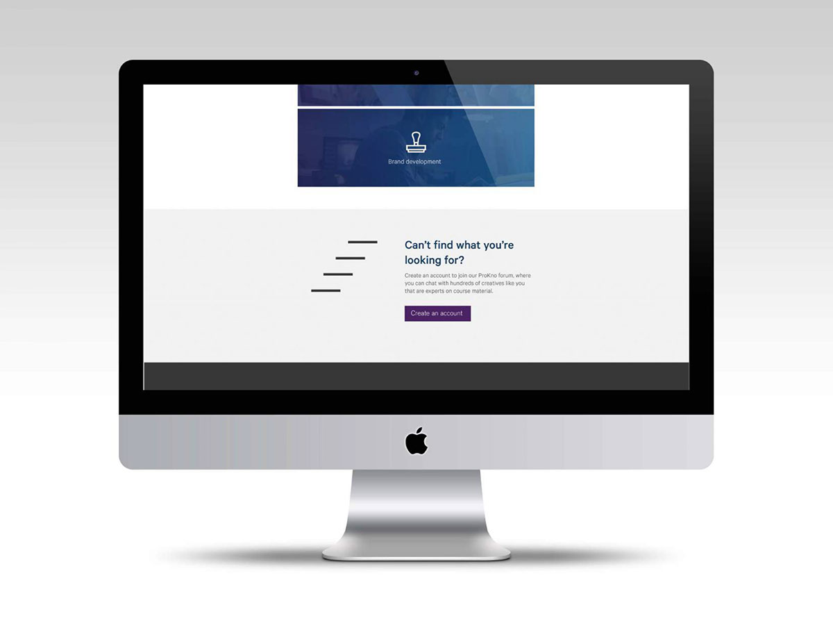
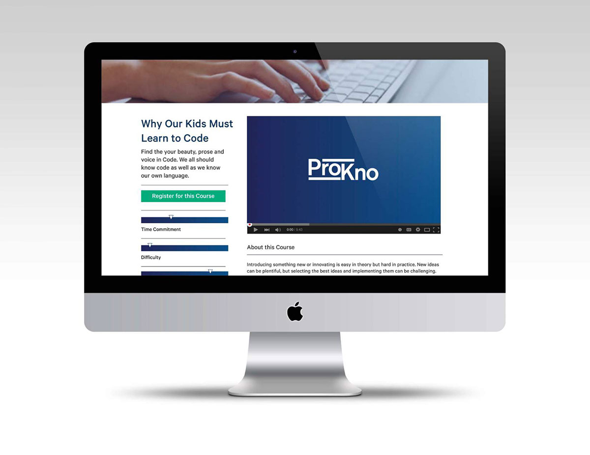
Here are pages of the ProKno website. Designed by Michael Finneran, Brendan McCann and Michael Ponton.


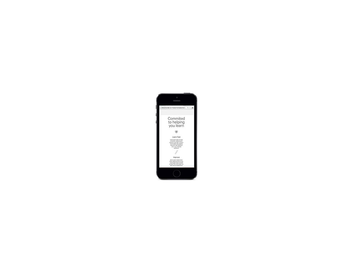
ProKno is on mobile devices such as the ipad, iphone and android devices.


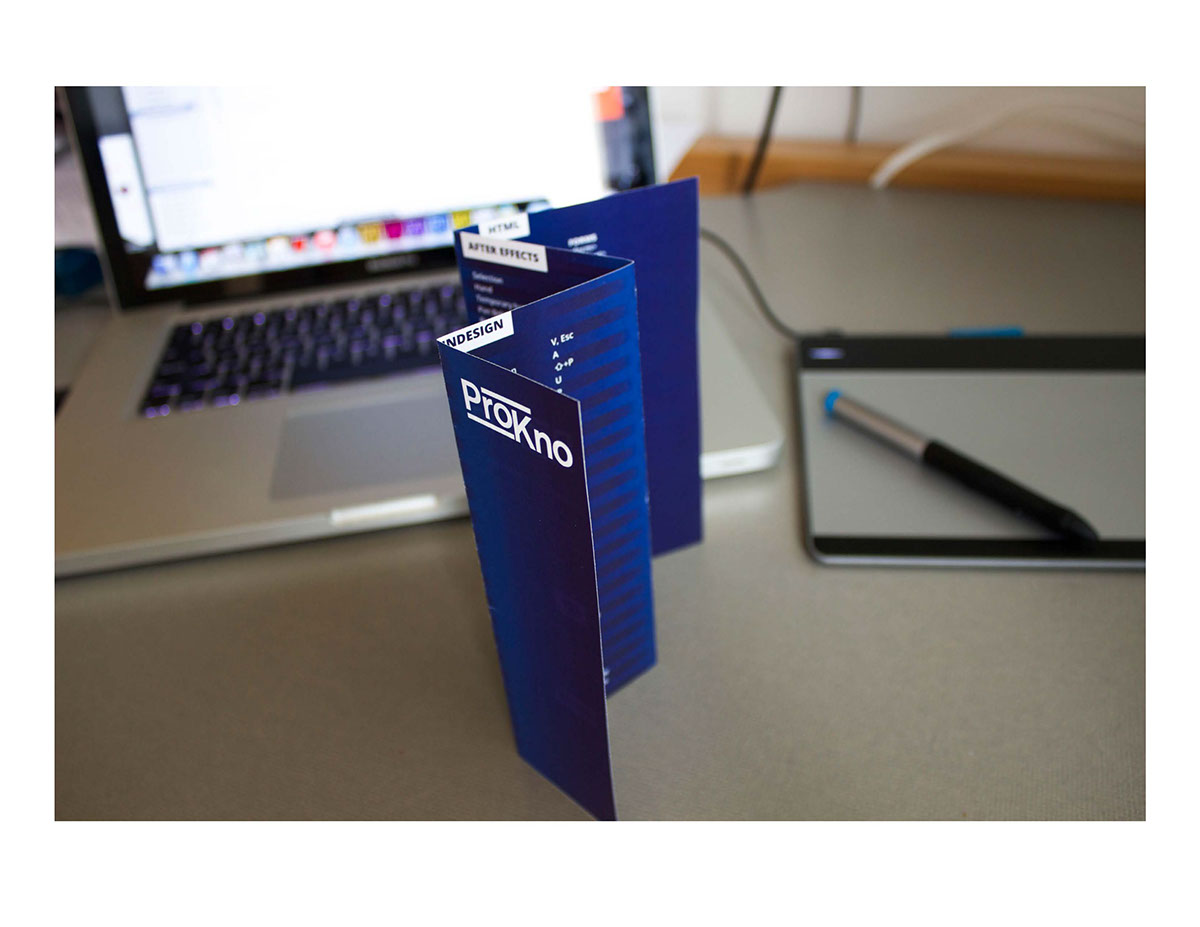
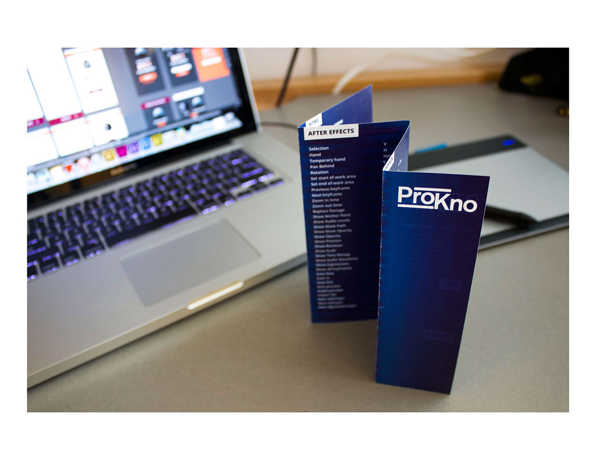
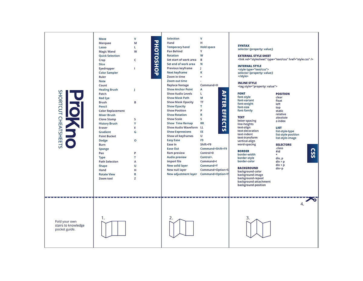
ProKno has cheat sheets that the user can always refer back to if they need to refresh their memory on what they learned. The sheets include shortcuts on programs and commands for coding. Designed by Lauren Burleigh.
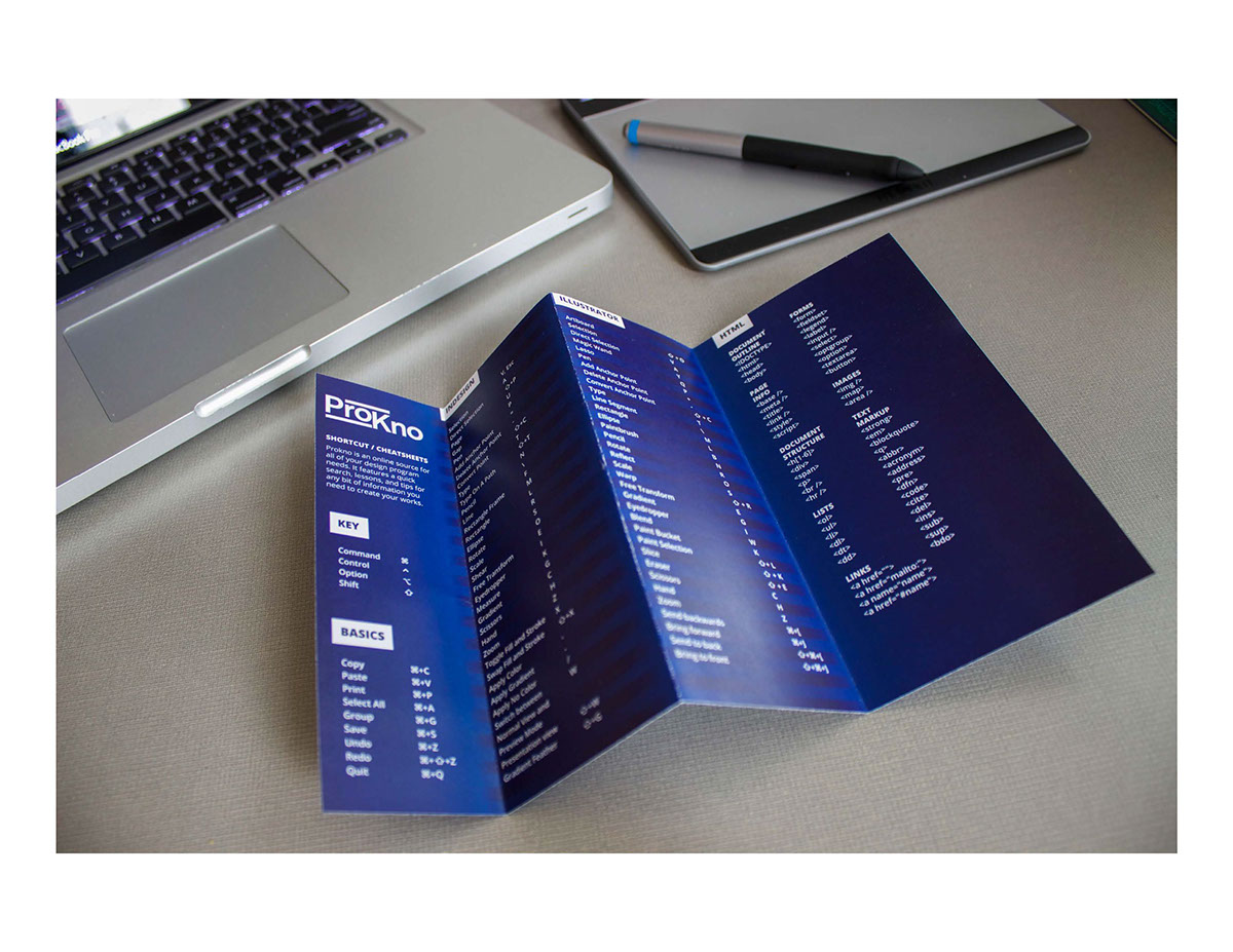

ProKno in an office settings. Designed by Lauren Burleigh.

ProKno fully assembled. Photo by Brendan McCann.