Client: Lykke Rewards
Brief:
Lykke Rewards is a unique customer oriented solution for businesses. It is a platform that rewards users for repeated visits. Lykke Rewards approached us while they were in the process of developing an app. However, the brand identity already in place didn’t represent any of the elements that comprise Lykke. We reworked the entire brand identity around the emotion that rewards incite: happiness.
The idea:
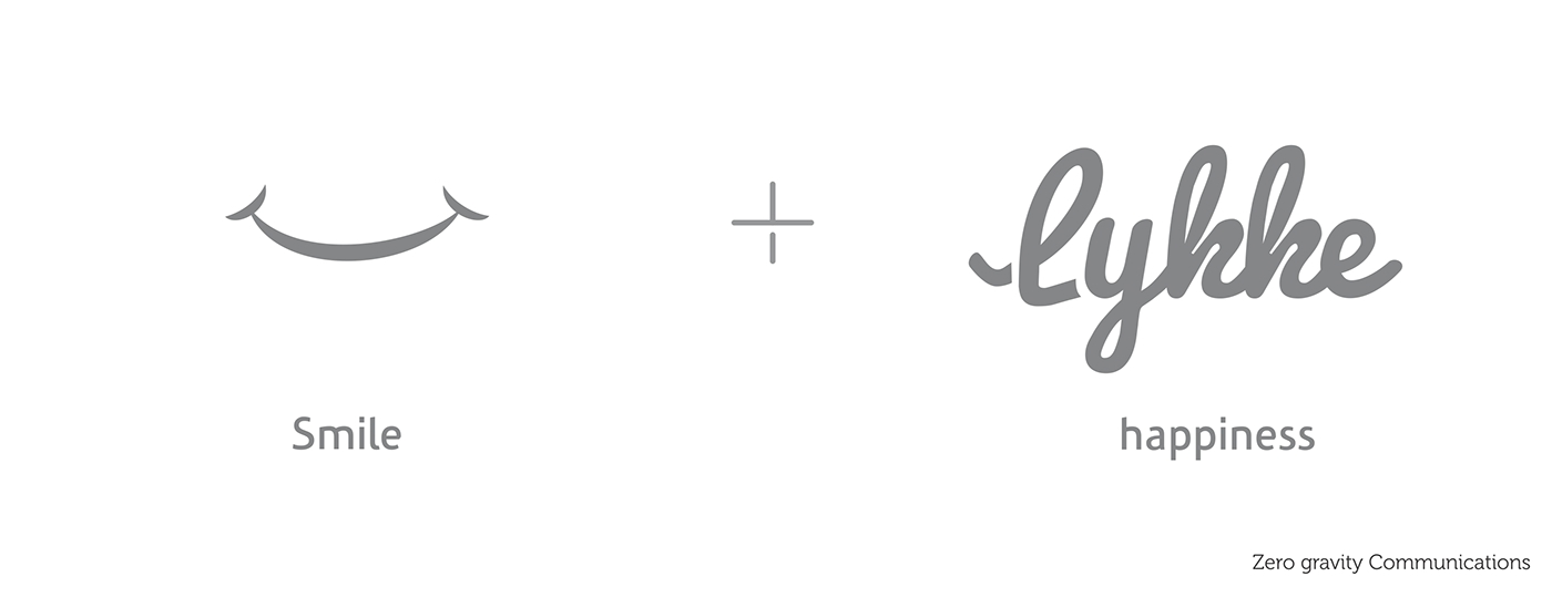
‘Lykke’, in Nordic, means happiness. Also, rewards, irrespective of their magnitude, always leave us with a smile. We tried incorporating happiness through various ways by replacing alphabets with joyful characters, playing around with fonts and colors. Eventually, we settled for a smile under a cheerful font.
Smile is the most basic form of expressing happiness. Not only does it represent the little moments of joy but it is also representative of how happy thoughts translate into an expression. We went ahead with blue and red since blue represents trust, sincerity and loyalty and red represents emotions of love, passion, joy and vibrance. Also, blueis the color of sky and oceans and connects with person in a calming and likeable way. The font used is also cheerful and easy on the eye and communicates something fun and likeable.