
After some deliberation, this was the final logo. It is an oragami bird, cut into sections in order to accentuate the folds and shadows. I then applied a paper texture in order to create something that looked rough and ready.

This is an example of the logo used on a poster.
Below is the original designs for the website. The website included a lot of user interaction - the main focus point is a section where the user could create their own digital origami piece by following the instructions onscreen and using either their fingers or mouse (depending on what platform they were using) could fold the piece of digial paper. This therefore brought the paper to life and would give the user the impression that they were actually touching paper.
I liked the idea of ripped paper, and had an image in my head of the intro page, where the user could rip the page away to reveal lots of shreds of paper that would eventually settle and reveal the logo, which was a cut out.
Original logo idea.

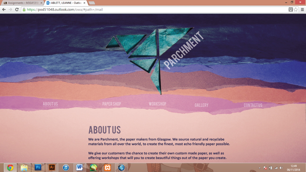
However, I decided that for a site thats main attraction was origami, it might be better to create website that is made out of folded paper. I still liked the shape of my logo and intended to keep it that way originally.

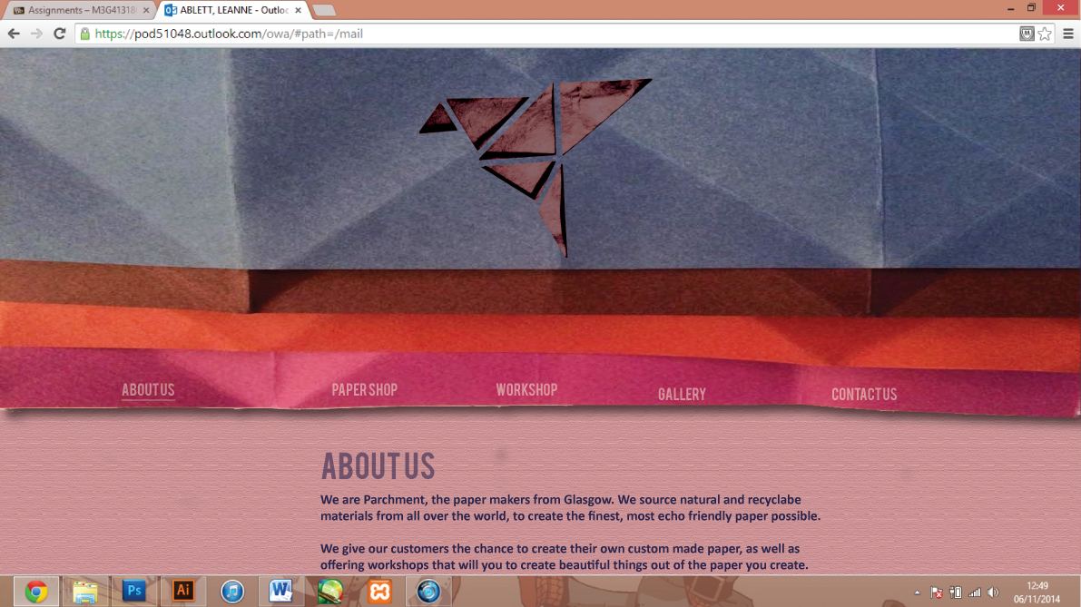

New logo design and website design below.


