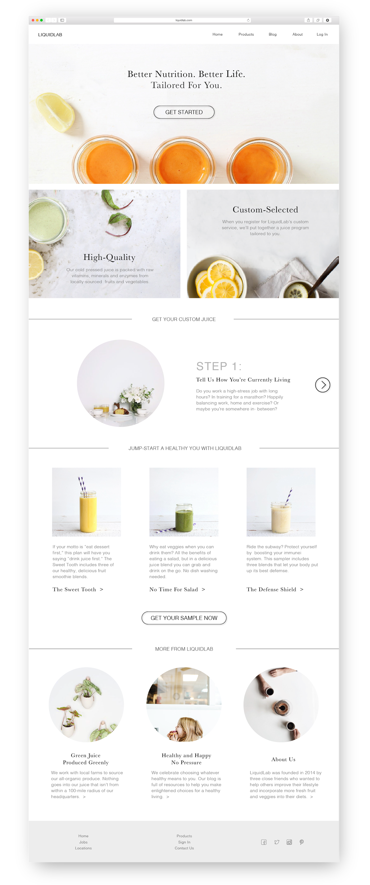
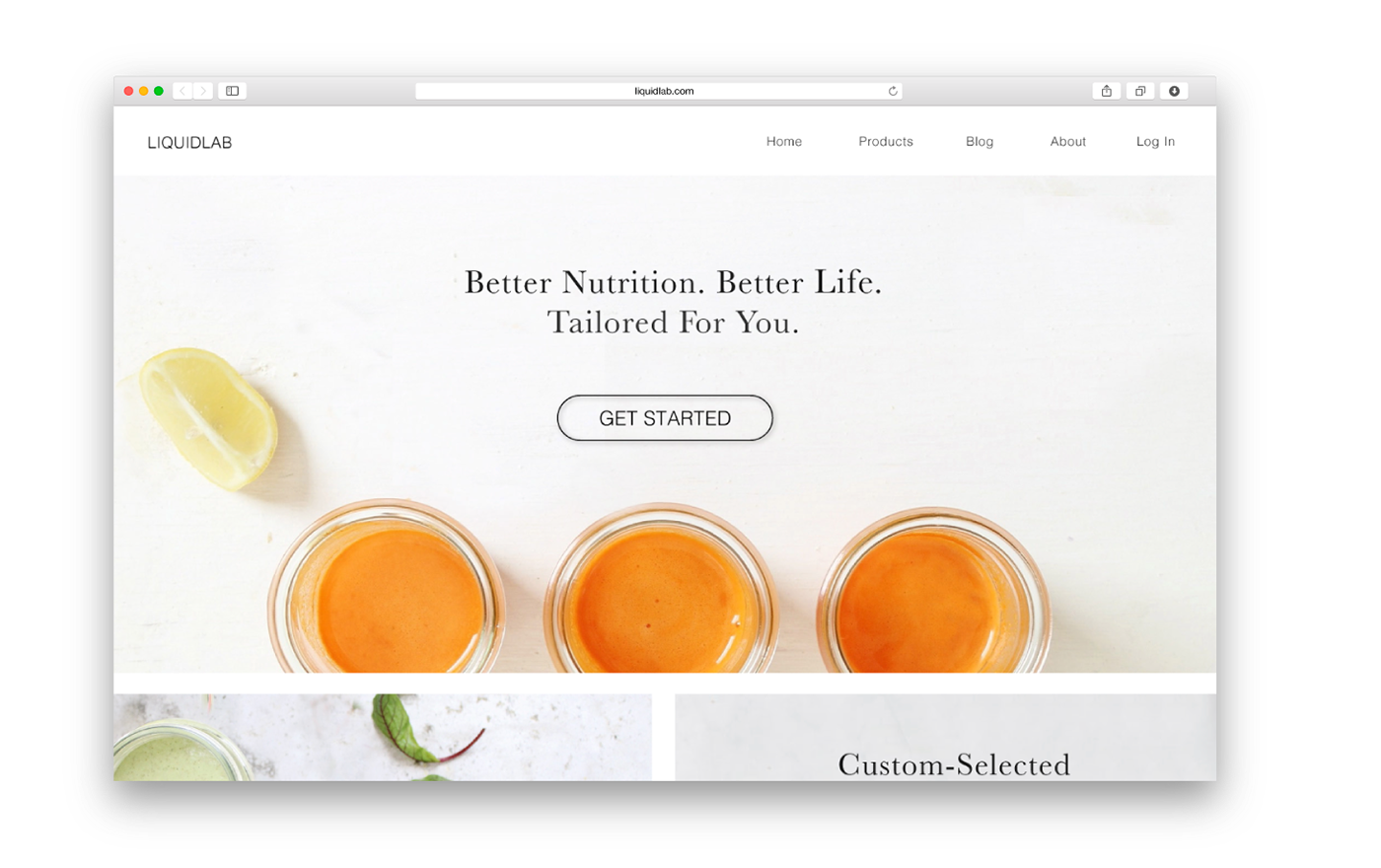
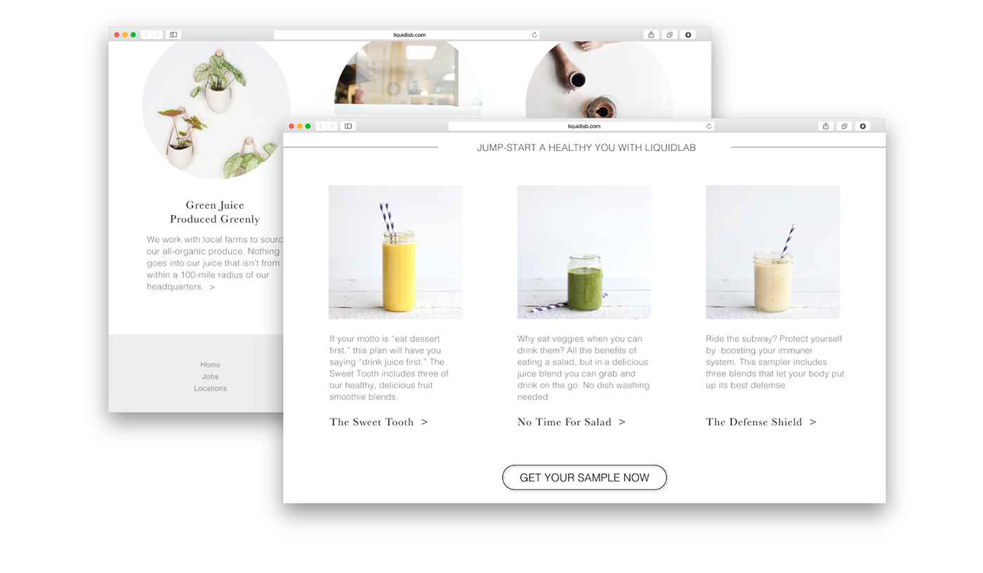
This is a landing page I created for LiquidLab,
a (virtual) boutique and privately owned cold press juice bar
offering their customers unique customized juices and smoothies.
This is a course project I worked on at General Assembly's Visual Design Course
LiquidLab is a high-end, high-touch service that caters to selective and demanding
audience with a high-level expectation as to the quality of products and
services. LiquidLab wants to ensure that custorers see them as trustworthy,
intelligent, sophisticated, modern and accessible.
Target Audience

A visual representation of LiquidLab's target audience
LiquidLab's target audience are 30-45 year-old professional women, single or married with 1 child, with 120k+ income. They are usually health-conscious urban-dwellers. They crave for an upscale juicing option. For a closer look, please see this Pinterest board I created.
Competitive Landscape
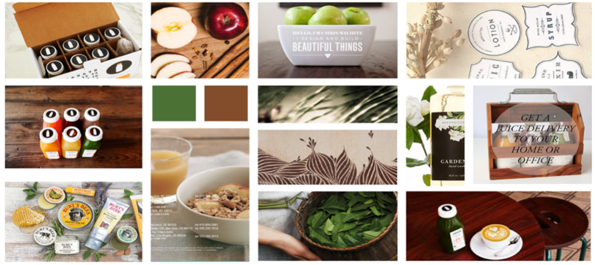
I researched LiquidLab's competitors in the juicing market. Below is a summary of its main competitors' branding strategies. For a more detailed look at the competitive landscape, please see this Pinterest board I created.

Some of LiquidLab's competitors
Keywords
While this project is an individual project, I also had the opportunity to participate in some brainstorming and critique sessions with my fellow General Assembly classments. Below is a picture from one of our brainstorming session, in which we wrote down any word that we can think of to describe LiquidLab on the whiteboard. I learned a lot from both listening to other people's ideas and sharing my own. As you can see, we had quite a collection.
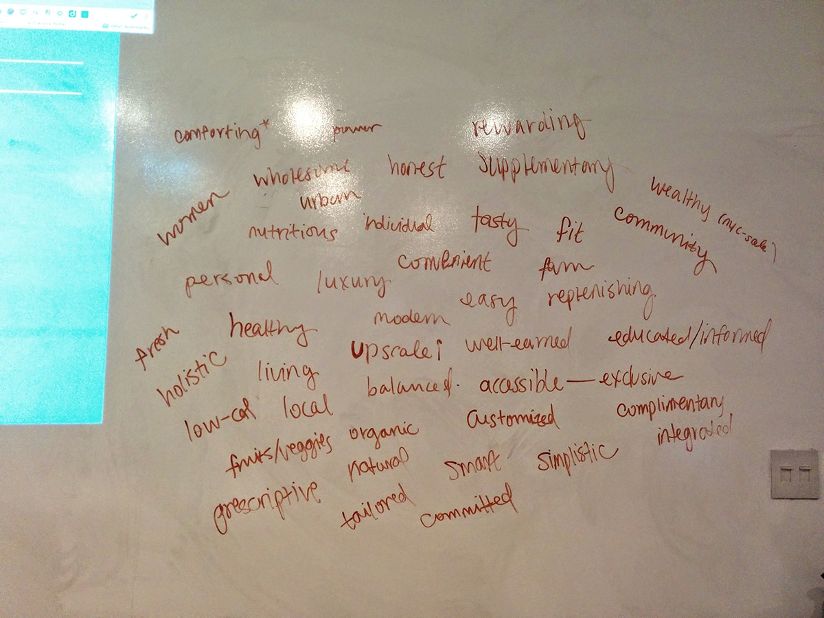
Whiteboard brainstorm session
Based on the group brainstorm session, my own research and analysis, I used the following words to depict LiquidLab's target audience, product, and brand identity.

Based on my research above, I decided on the following objective statement and design strategy. This serves as a roadmap for my design decision going forward.
Objective Statement
To establish LiquidLab as an upscale cold-press juice brand that represents a simplistic and modern way of life.
Design Strategy
Use fresh and simplistic visual elements, in addition to an effortless user experience, to create LiquidLab’s easy/modern lifestyle brand identity that appeals to high-income, professional, and health-conscious women.
Art Direction
To appeal to the urban and upscale target audience, I decided to go with a simplisitic look and feel. Also, since LiquidLab is natrual and health-conscious, the visual feel of the site also needs to be fresh.
Moodboards
With my objective statement and design strategy in mind, I explore a few moodboards. The first one, "Simplistic & Fresh", is the one that I finally decided to go with.
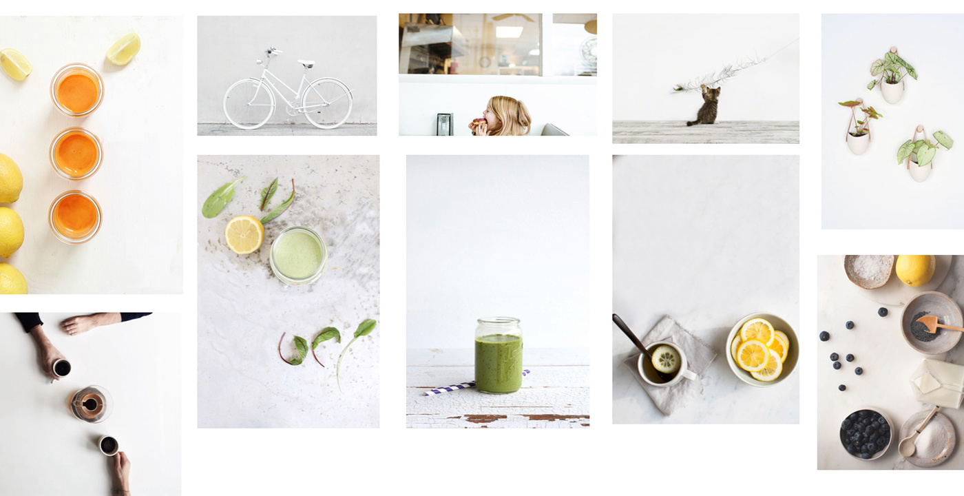
Moodboard: Simplistic & Fresh
I also explored a couple of other moodboard themes, but didn't decided to go with these.

Moodboard: Fresh & Pastel
Moodboard: Natural & Organic
Typography and Color Palette
For typography, I decided to use Baskerville for display and Heletica for body.
Baskerville is classic, elegant, and upscale. Helvetica is modern, clean, and clear.
The combination of the two creates dynamism and conveys the brand value of LiquidLab.

Final Design