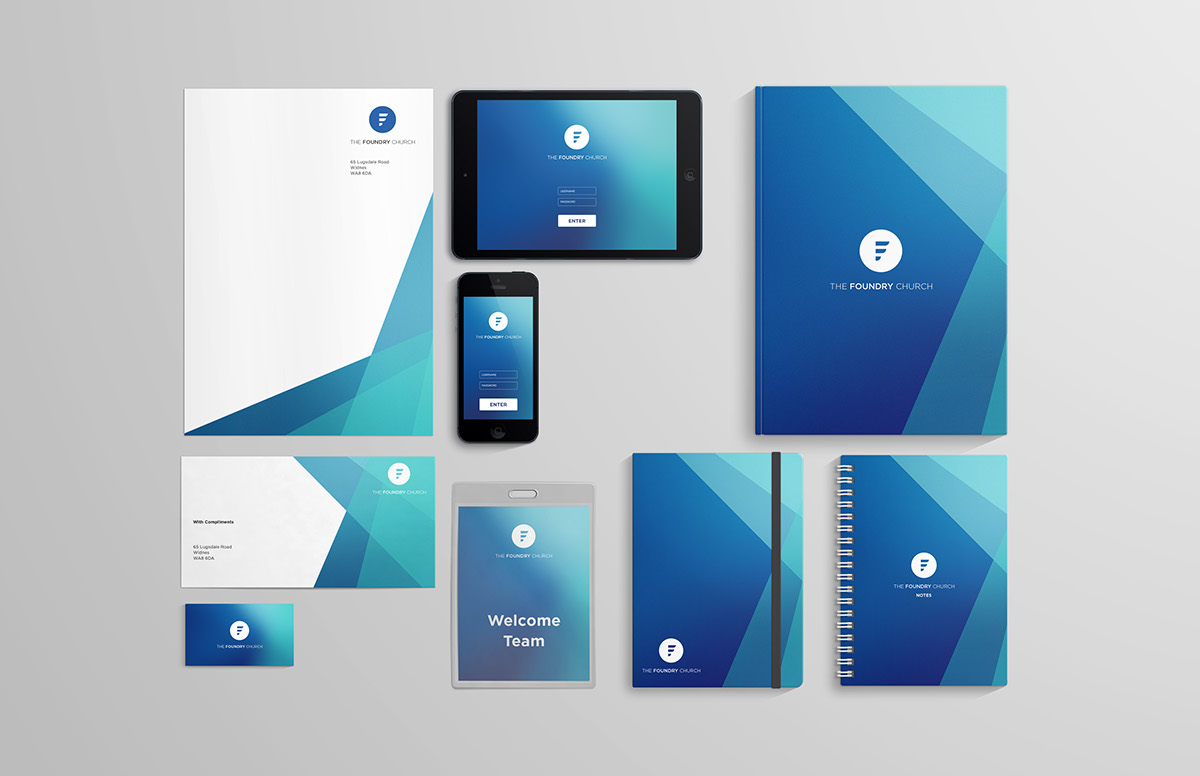
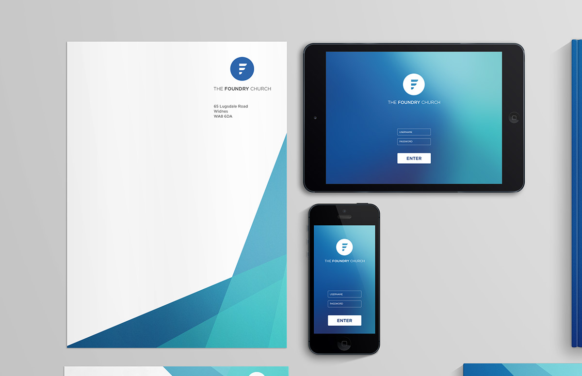
The Foundry Church is a well-established Pentecostal church in Widnes. During its life it has had a number of different logos and brandings but the church felt it was time for a refresh and a revitalisation of their branding.
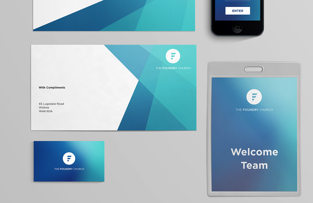
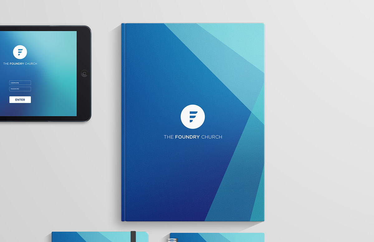
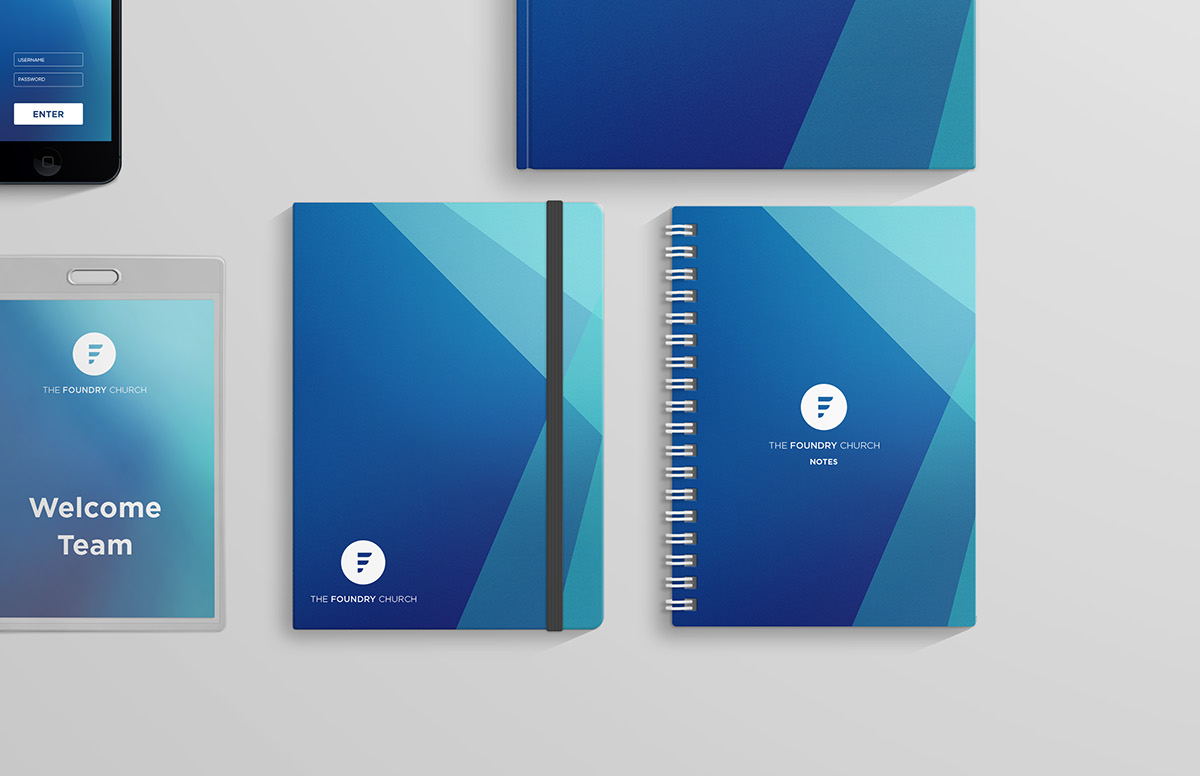
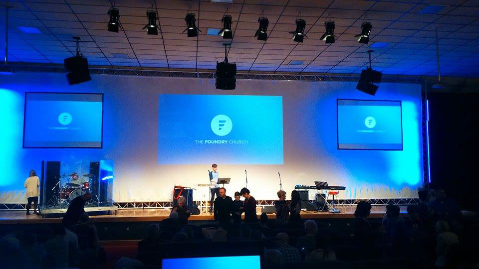
The church approached me and were quite flexible with their requirements, only really asking that it was contemporary and not cliché, so no crosses or steeples. They also wanted it to be something that they could easily use across a range of their media and so it has to be something that was symbolic and easily recognisable.
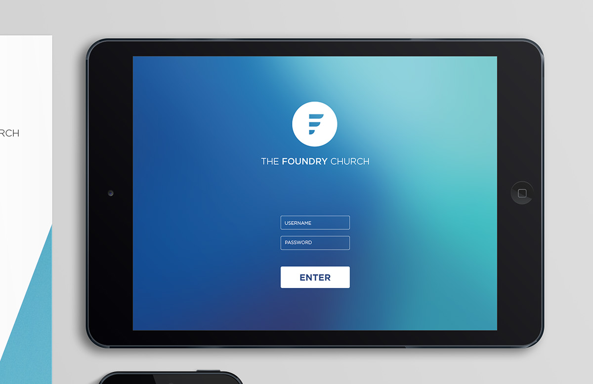
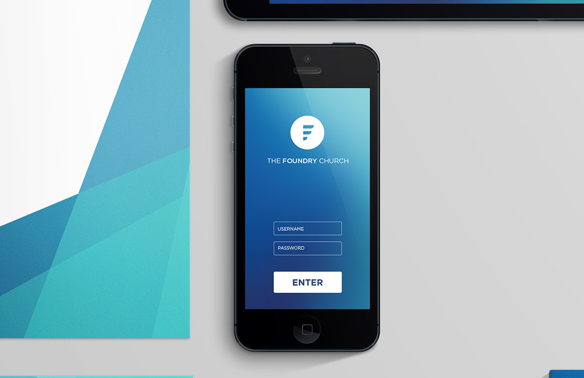
This is the design that I created, using the ‘F’ of the foundry as the basis of the logo. I decided to split the ‘F’ into sections because that way it is far more eye catching and interesting. Also splitting it into 3 sections is actually really symbolic too as the number 3 is an extremely important to the Christian faith and is representative of the Godhead; Father, Son, and Holy Spirit.
I placed the ‘F’ within a circle because it makes it really easy to work with, especially when it has to be flexible to work across multiple platforms. The circle also represents unity and community.