


Stick with a creative brand long enough and you will find yourself going through the rebrand process more than once. In this case not only was the old branding starting to show it's age, but the school was going to add new programs that would expand it's focus away from just it's music recording roots.
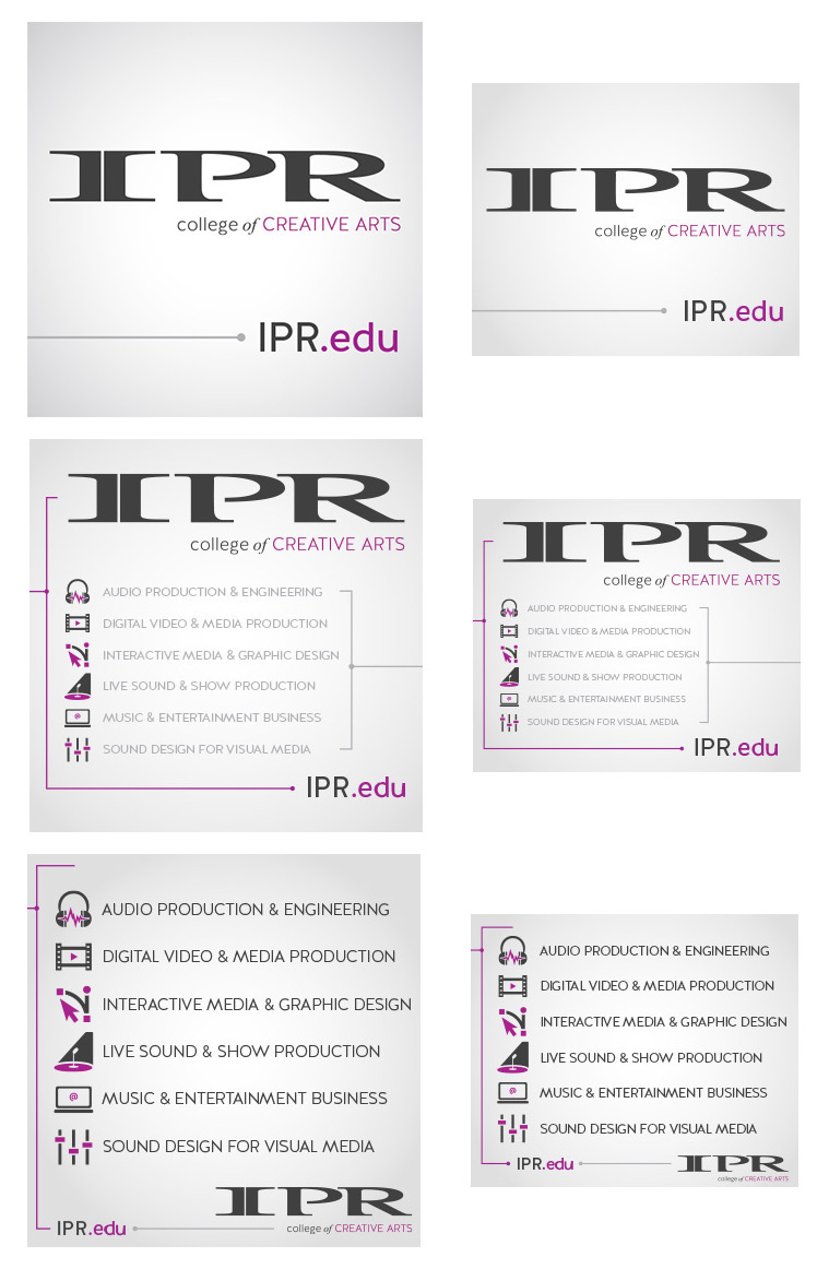
In recent years the IPR branding had been a riot of color and texture. The simplest, yet biggest, difference I could make is to strip away the texture and make a clean place for the new IPR Brand Message to stand forth. Hence a monochromatic color palette (white, charcoal and black) with an accent color (purple) that will allow both subtlety and punch as needed.
As for the logo, the decision was made to keep the historic IPR Logo. That logo stripped of the references to audio production allows both a connection with the past and gives the flexibility to expand toward the future. The loss of the words Institute of Production and Recording could cause confusion as to what the company is to those who were previously unaware of it. Adding the words college of creative arts below the logo succinctly answers the question of who they are.
Add a new modern typeface and the transformation is complete. Goodbye Institute of Production and Recording, hello IPR: College of Creative Arts.

In this rebrand an entirely new visual language was developed. We developed a series of icons to represent each program. In order they are: Applied Marketing & Management, Audio Production & Engineering, Digital Video & Media Production, Interactive Media & Graphic Design, Live Sound & Show Production, Music & Entertainment Business and Sound Design For Visual Media.

The IPR Stationery set. Letterhead, one of the many envelopes created for them and business cards. Each of the new pieces contain the new visual language to some extent. The cards have the icons, vignette and lines inspired by electrical diagrams. The letter head has no icons, but includes the others. The envelopes do not have anything but the new logo and typeface as only custom envelopes can have bleeds and to save money I designed these to be printed on stock envelopes.
Digital banner ads. These were created to be used on Pandora so there are only two sizes. We were testing three different concepts. One that was just the new name and look. One that included the programs, but still focused on the name and a third that focused on the program names.

Large brand-forward billboards in prominent locations around Minneapolis (including this above a restaurant in Uptown) helped to spread the word that IPR was new and dfferent.

Postcards sent to prospective students. Inviting them to campus open houses, events and scholarship tests.
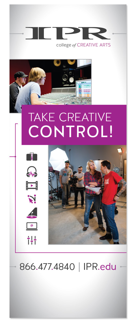
A new banner for college fairs and to place around campus when not in use.

The new branding had to extend to the interior of the campus as well. This is an example of a sign in the campus library advertising the fact that many of the materials are available online as well.

Eventually the need was felt to bring the new look to the admissions process. These characters were drawn to represent the fun and creative student that IPR attracts. These were created to liven up the online admissions site which could be a bit dry otherwise.


