Concept Statement| A conceptual re-design of the visual identity (logo and cover design aesthetic) for WIRED Magazine
Summary| The goal of this redesign for WIRED Magazine was to increase readership both in numbers and in scope. Research shows that their current readership consists of a mostly male audience between the ages of 30–50 with an average income of $75,000. The idea is that by moving their image towards more graphic, visually focused cover designs and a younger, organic logo mark that mimics the more fluid image and design of techology today, they can attract a wider demographic. This demographic would include those between the ages of 20–30 years with a lower average income of around $30,000 as well as drawing in more female readership. (the pixel-like feel of the original logo seems dated in this regard.)
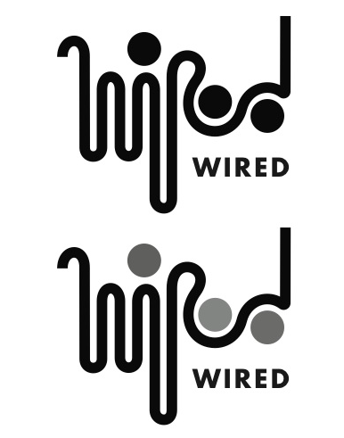
Final Logo Mark

The cover (re-)designs focused on the initially proposed concept of a graphic, visually focused approach. The illustrations reference the main articles in much the same way that current WIRED magazine covers use illustration or photography to either refer to products or parody articles. For the purpose of my re-design, I took two previously existed WIRED magazine covers and re-designed them through the lens of my new visual identity. I also based the colors of the logo on the colors of the graphics on the cover.
Original Covers:
http://goo.gl/C9mcAX
http://goo.gl/Lp5tFl
http://goo.gl/Lp5tFl


My first solution was a graphic that worked on the concept of modules: the shape that makes up the curves of the letterforms and the circle that forms the dot of the “i”. Furthermore the width of these modules allowed for the playful interchangeability of color within the logo. While this provided a dynamic youthful and bold solution, it was difficult to make the “e” and the “d” work well within this system thus, causing the two parts–the “wir” and the “ed” of WIRED– to act as two separate components rather than one unified logo mark.
I tried a number of different ways to make the “e” and the “d” work withing the moduler system of the first logo. However, by attempting do so, I started to face problems in legibility.

My second solution solved some of the previous problems regarding the issue of the entire logo working as one unit. However there were still issues in legibility. Furthermore, this solution lost some of the bolder more dynamic attributes of the previous logo solution.
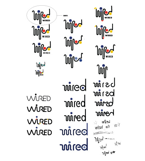
I attempted a number of different approaches towards merging the ideas of my first solution with my second one which finally led to my third and most successful soltuion. For this approach, I decided to transform my first, modular option into a logo mark accompanied by the name of the magazine at the bottom. Through this, I was able to retain the continuous organic form of the second option while still keeping parts of the modular form. I was also able to push the playfullness of the color-variability into the repetition of the circles, which in addition to forming the dot of the “i”, also form the curves of the “e” and the “d”. I also feel that this logo was the most successful with regards to providing a younger, organic and fluid identity as discussed in the reasoning behind my re-design.


