School of Visual Arts
Branding
May 2015
Assignment: "Create the branding for a place that you walk by every day and that you may or may not like".
I chose to “rebrand” a dry cleaning serive. I chose at random a dry cleaner called Pure Organic Dry Cleaning down in Alphabet City. I wasn’t working with the dry cleaner and I didn’t ask for the owner’s opinion about what I was doing – something I in hindsight see was one of the reasons I was all over the place.
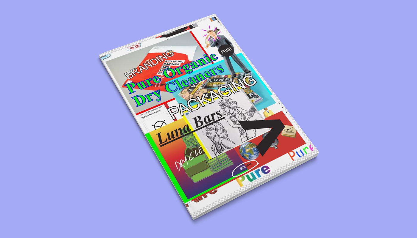
At the end of the semester I made a book that showcased both projects Kevin Brainard assigned us to do. Pure Organic Dry Cleaners as the branding project and redesigning the Luna bars as the packaging project. This is the cover for that book.
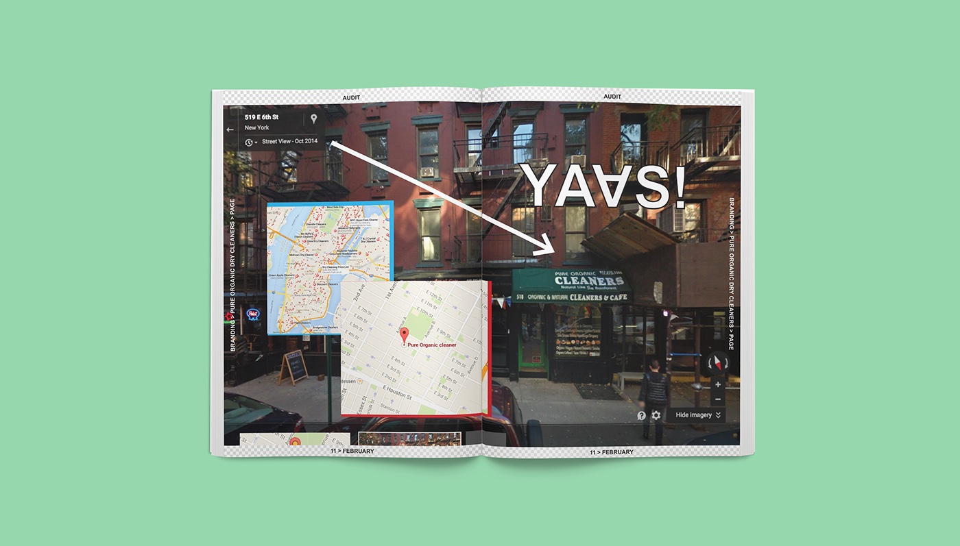
In New York you cannot turn your head without seeing at least three cleaners and I’ve always loved the Clip-Art simplicity and subdued colors and characteristic clothing hangers you get for free. It’s so basic it’s not basic. To me dry cleaning is luxury (I'm from Norway) and makes my life better in a weird and twisted way.
I had a lot of fun experimenting with different techniques (maybe too much) and I ended up getting lost in the process. That is what I want to show with this project; the process and the joy of doing and making things appear on your screen and evolving to something completely different.
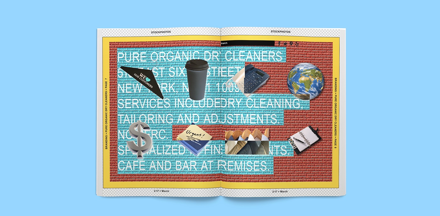
What I initially wanted to do was to create a “solid” and clean aesthetic. That didn't work out. Instead I started playing around with primary colors and using the traditional clip-art in illustrator, but that evolved into using pay-per-clip instead. This direction was especially intended for web.
The “modern” clip-art direction wasn’t quite right so I went out and took pictures of the clip art I saw in the windows of different dry cleaners. I supplemented the primary colors first with an earthy, but soapy palette, but that evolved into using gradients and the tracing I did went from basic to acid and to a “Wouldn’t it be cool if it looked like somewhere Peter Saville would have had his dry cleaning done way back when!?”
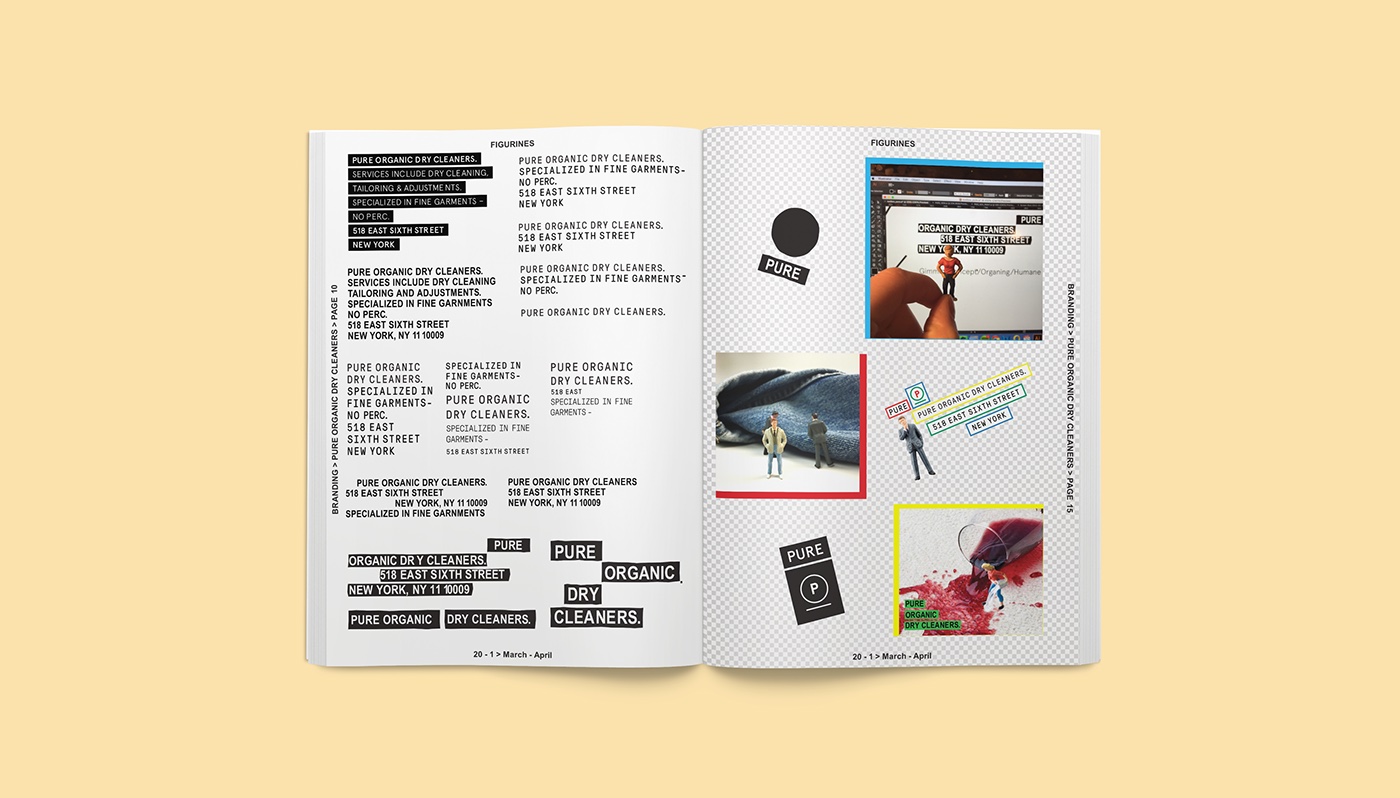
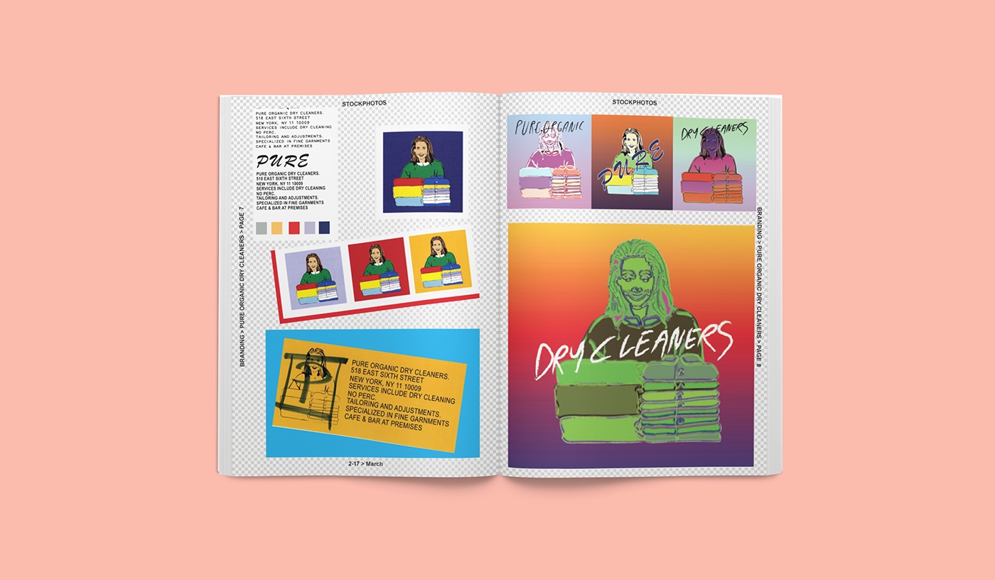
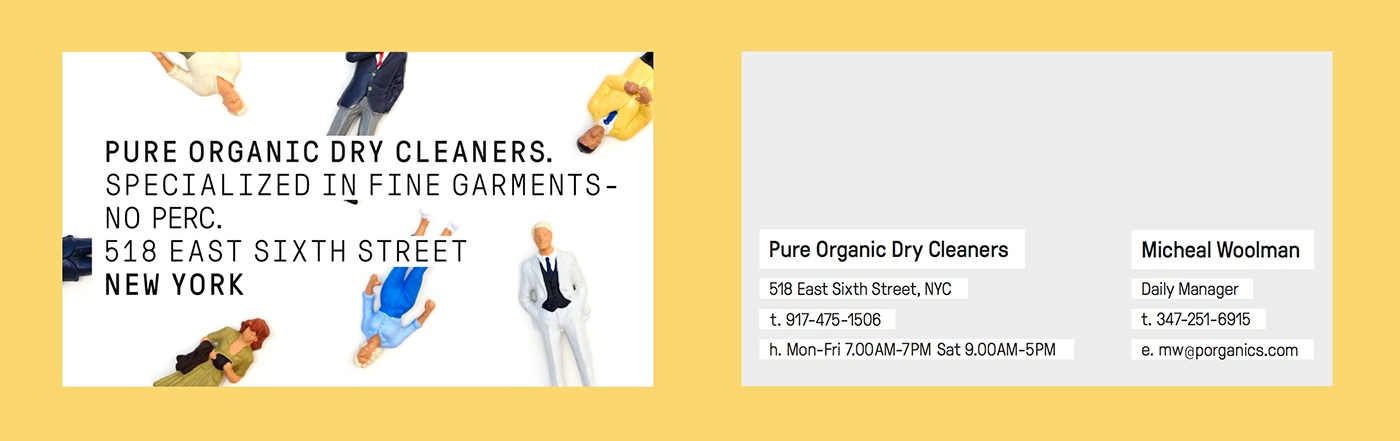
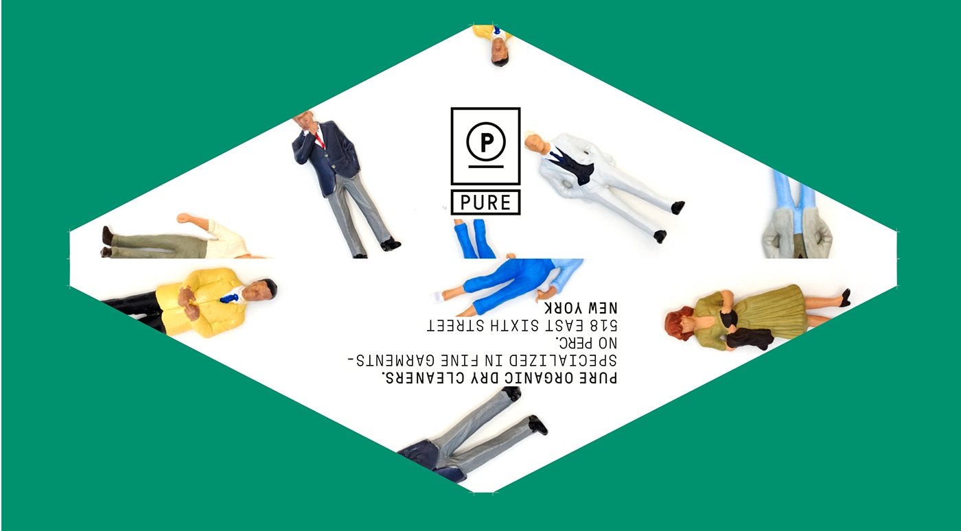
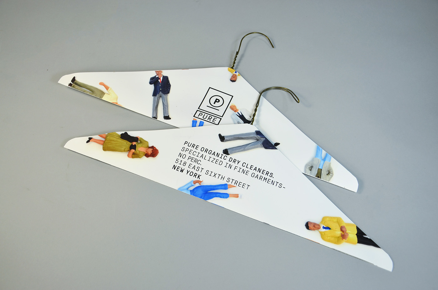
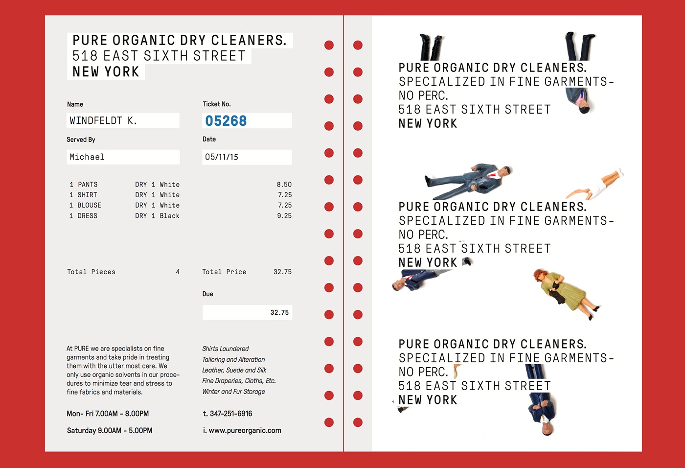
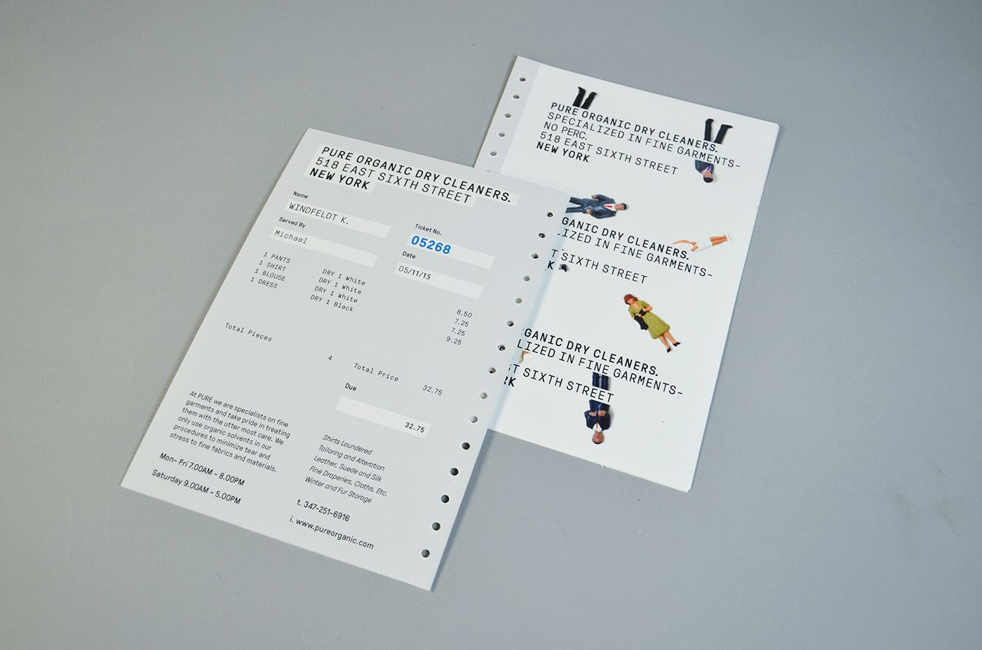
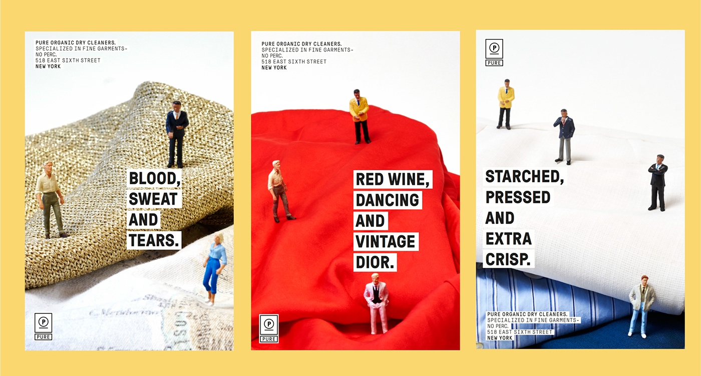
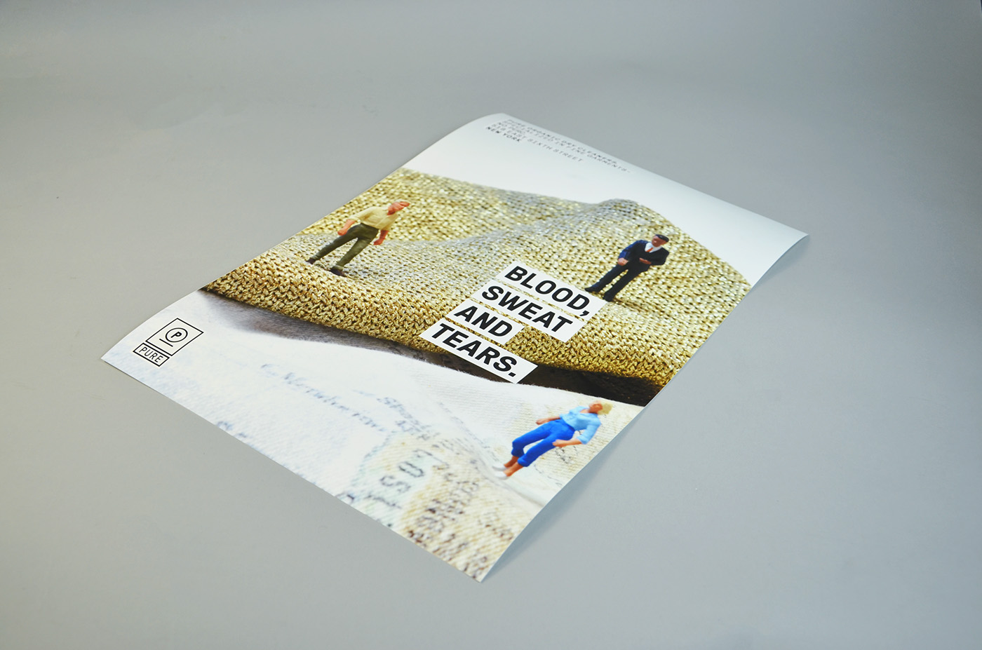
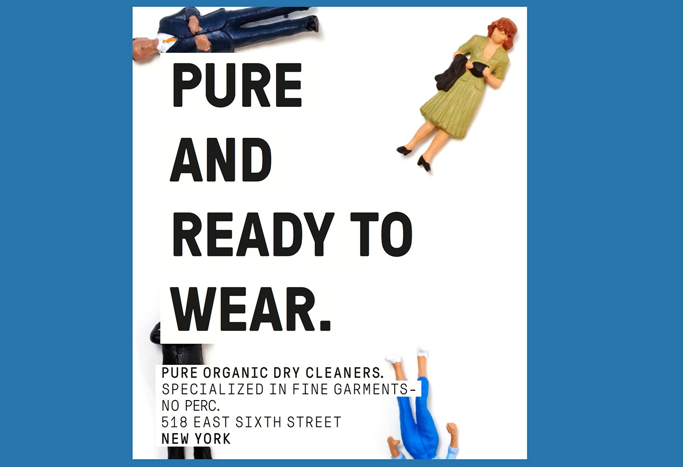
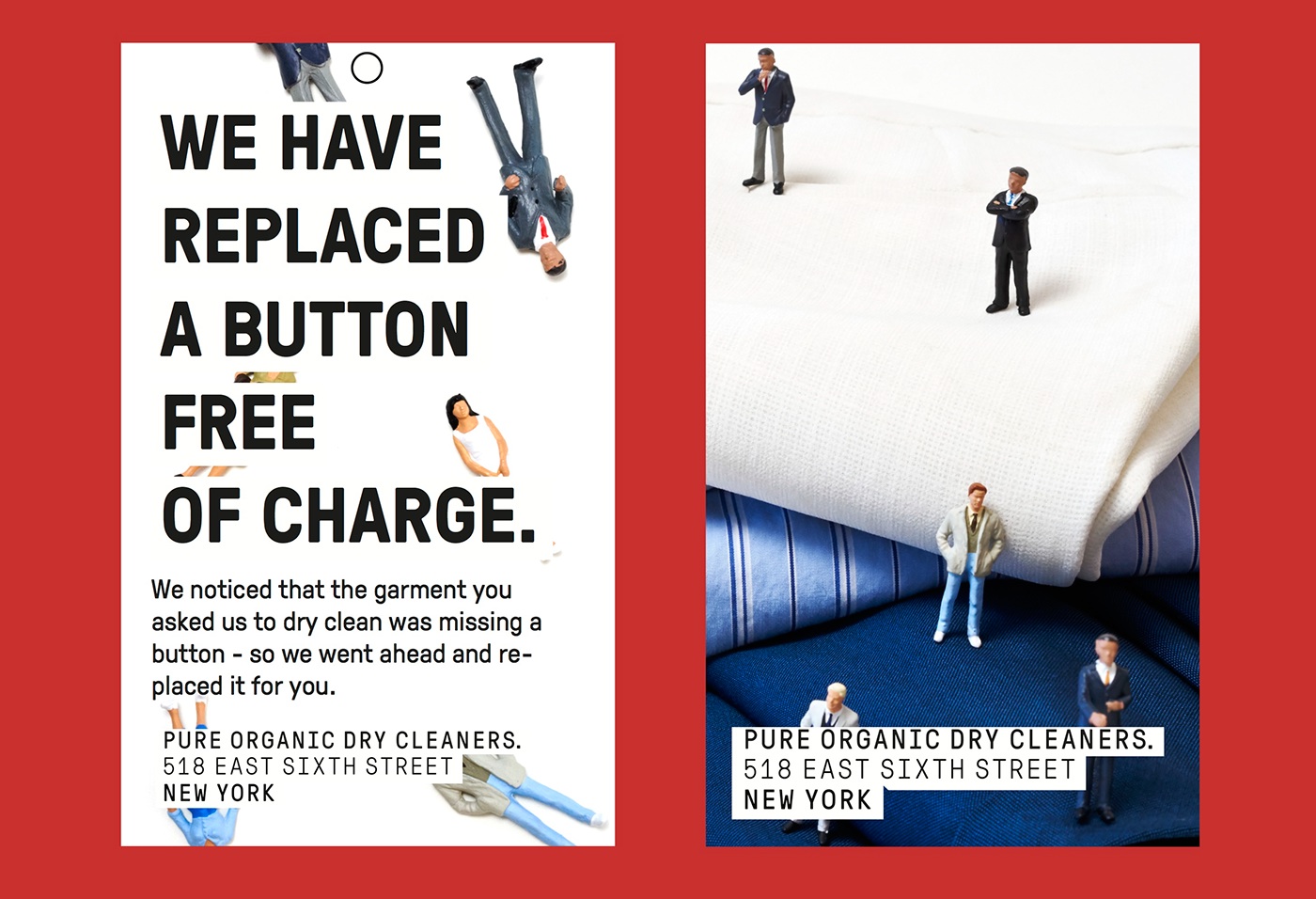
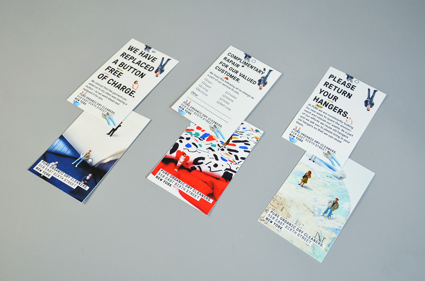
The acid theme didn’t stick for long and I had to go back to the start and do a new round of research. I started reimagining what story this specific dry cleaner was supposed to tell. Pure is a 100% organic, which means they use no PERC to clean the clothes and they specialize in laundering fine garments such as fur, suede, silk, cashmere etc. If Pure is Organic it has to look and feel organic. The solution to the last direction was right in front of me the whole time; While browsing 9gag I came across a person who made custom Barbies that looked like “real” people, and that was that. I already owned a small collection of miniature figurines and started experimenting on how they would use this dry cleaning service I was branding.
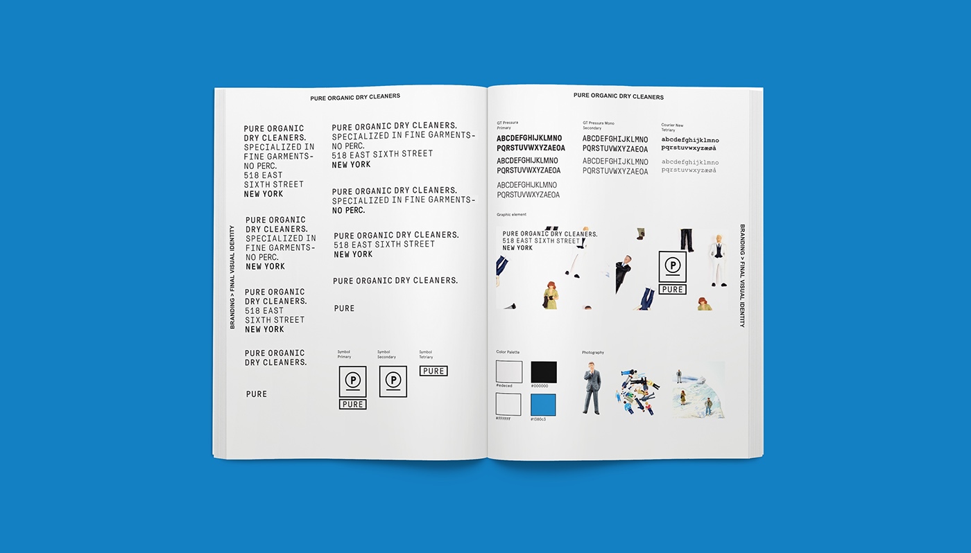
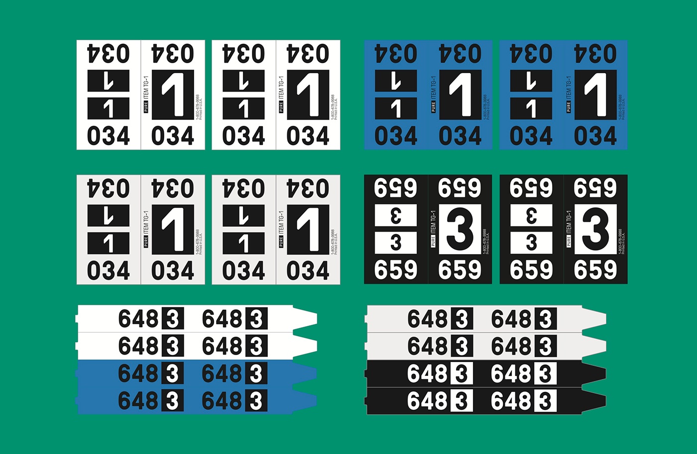
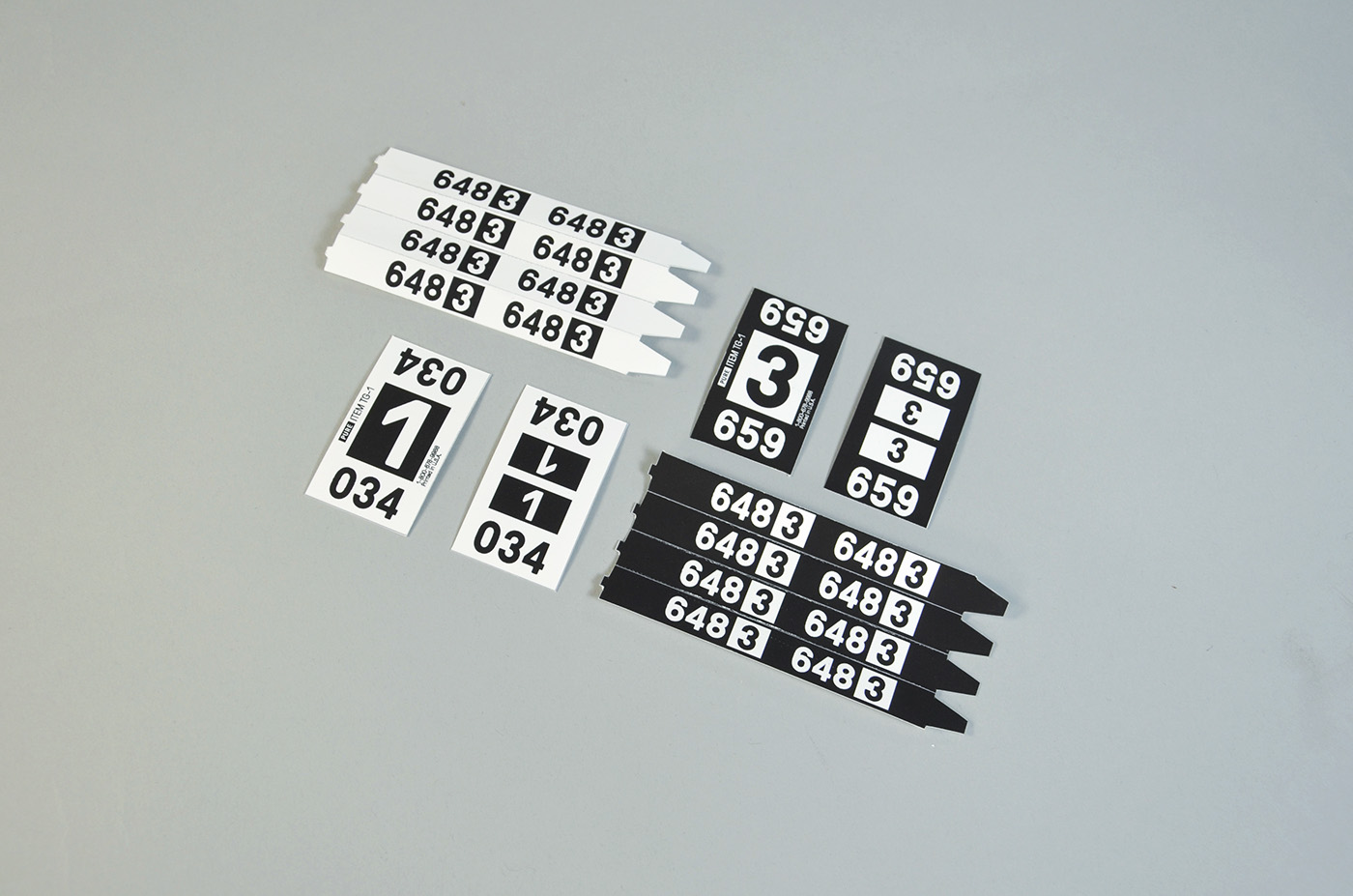
I combined the initial idea with having a logo consisting of all the information you need about Pure, and arranging it on solid color blocks to make it versatile if placed upon noisy backgrounds. Because the logo consists of a lot of information (all of it) it can be broken down into smaller variations, depending on intended application, and that is the basis for the system. It is organic and clean and visualizes together with the use of photography that Pure is friendly, customer oriented and professional.

The moral is, I need to distance myself and look at to whom I’m selling the product or service too and then I think about adding “something something” to make it my own.