In recent years, digital chromatic typefaces have gained popularity as designers have embraced the wood type aesthetic. In general these typefaces function the same way as they did when implemented in wood. Each letter has a variety of options that are built up within a letter to make effects.

The layers in typical chromatic fonts build up within a letter to create multi-color effects.
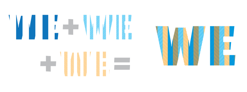
TextTile's layers create patterns that repeat seamlessly from letter to letter.
When I decided to develop TextTile in 2014, I knew I wanted to create a chromatic typeface, but I also wanted to achieve something slightly different. Rather than the patterns simply building up within each letter, the pattern propagates across the words.
Implementing a solution that allows a pattern to maintain integrity across a word and word boundaries requires a system to be aware of where the right edge of each letter intersects with the pattern so that the next letter can pick up in the right place at its left edge. Now, there is an easy way to do this and a hard way. The easy way is to make the pattern and the letters a fixed width. This way the pattern overlay starts and stops in the same place for every letter. The down side is that you are essentially designing a monospaced typeface.
For sufficient amounts of a pattern to be visible, the letters which contain it should be fairly heavy. But a monospaced heavy letter with dense strokes (say "M" or "W") would require optical corrections—like width variation and ink traps—that then interfere with the fidelity of the pattern.
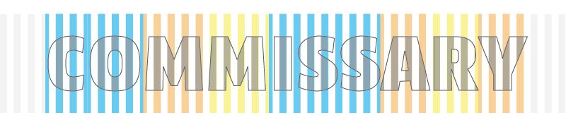
While there are some pleasant designs of this sort out there, more often than not, the results are a bit clumsy.

The monospaced letters on the left have equal widths but the awkward proportions and coloring are improved by the proportional letterforms on the right.
The hard way is to design a proportional face—one in which the letters vary in width. To pull this off, one needs a method to track start and stop positions in the pattern as well as alternate forms to keep things aligned from letter to letter as the letter widths vary. Luckily we have the OpenType contextual alternates feature to help manage this. But even with the help of programmatic substitutions, the design still needs to be bound to some grid; otherwise the sheer number of alternates would be unmanageable as you would have to account for every possible letter combination and how they affect the pattern downstream. This may be possible but it would not be very elegant.
The answer for TextTile was somewhere in between. Since every seamless pattern is made up of a basic unit which repeats, this unit can be used to define the minimum grid size. As long as every character was designed on an even multiple of the basic unit then everything remains naturally aligned while having some flexibility to adjust the proportions of the letters. Also, if this could be achieved, no alternates would be required to preserve pattern alignment. As a general rule, decreases in the unit size increase the flexibility in the letter proportions. While this implies that the best thing might be to use the smallest unit size possible, the ideal unit size is determined by the relative size of the pattern to the letter and how it appears in application. A good percentage of the pattern should be visible on most of the letters and be large enough to be seen at some target point size.

Alternating stripe pattern with basic unit (stripe and space) outlined in blue. The basic unit can be placed side by side to produce a larger pattern.
While I planned TextTile to have a variety of patterns down the road, alternating vertical stripes was to be the most fundamental pattern in the system. I roughly tested out various stripe sizes on a few letters to get a sense of what worked best. After a few iterations, I settled on a stripe size that met the above criteria. This, in turn, set the minimum grid size, which was defined as the width of the stripe and the space together.

Sequence of H's and O's that are designed to occupy the same multiple of basic units. Each character starts on a stripe and ends on a space.
The process of developing the letterforms was a juggling act of co-optimizing the stroke width, white space and proportions inside the bounds of the discrete character widths. During this optimization process it quickly became clear that the minimum grid size I chose was too coarse. This really should not have been a surprise. My minimum grid size was ~25% of the character height. But if a character was not fitting nicely in a certain block size, the next size up or down was simply too large a step. Since the stripe width was chosen for specific scale, shrinking it dramatically was not an option and a nominal reduction in size would not be sufficient.

Some characters do not nicely fit in an even multiple of the basic unit. The A on the left is 3 units wide and the A on the right is 4 units wide. Neither of these have the correct proportion compared to the H. The A in the center is 3.5 units wide (starts and ends on a stripe) and has the correct proportion.
The best solution was to limit character widths to even multiples of half of the minimum grid. This got the grid down to ~12% of the character height. The penalty for this decision was the necessity for alternate forms. Some letters would be ending on a stripe instead of a space, thus requiring the subsequent letter to start with a space. Is this scenario, I only needed one alternate form to keep things aligned. This seemed like a reasonable compromise. If I were to design on multiples of a quarter of the minimum grid the number of alternates would increase to three. Once the alternate forms were developed, a contextual alternate feature was implemented to determine whether a given glyph ends on a stripe or a space. The subsequent glyph is then substituted with its alternate, if needed.

The H and B on the right are the alternate forms of the of the H and B on the left. Notice that the stripes are completely flipped. These show the actual stripe placement from TextTile which are shifted half a stripe's width to the left. This was done to improve pattern placement within the letter. The boxes help show the bounds of the letters.
This shows the contextual alternate feature in action. Characters that end on half of a basic unit trigger an alternate substitution.
With the grid issue resolved, the final design challenge was optimizing letter spacing. Since pattern alignment relies on the consistency of the grid, character spacing needed to work in all letter combinations without using kerning offsets. More accurately, the only kerning offsets that could be allowed had to be a multiple of the stripe width. This allowed for the existing contextual alternate feature to manage the pattern alignment. A square-sided design would have simplified this challenge—but again, that would be the easy way out. The letterforms were ultimately designed to not use any kerning with the exception of several cases. All-in-all TextTile only has thirteen kerning pairs, all equal to the stripe width. Of these only five were needed to deal with letter pairs. The majority involve punctuation/letter and number pairs.

The LY pair on the left is not kerned and the pair on the right is. You can see that the Y moves in a stripe's width and then is replaced with its alternate form. TextTile only has 13 kerning offsets defined. Of those, only 5 are related to letter/letter pairs; the rest pertain to combinations with numbers and punctuation.
TextTile was originally released with just striped and hash options that could be combined into buffalo plaid and checked patterns. Since then I have added a herringbone pattern and double-wide stripes that increase the creative possibilities. More patterns are forthcoming.

This is an example of the double wide stripes. It requires 3 sets of alternates because the basic unit has doubled in size. If I were to have designed characters to multiples of one quarter of the minimum grid size, this would have also necessitated 3 sets of alternates.
One could legitimately argue that there is no real point to building pattern overlays into a font, since you can simply mask a vector pattern with your outlined type in Illustrator or Photoshop. While this is certainly true, there are a couple benefits of doing so. Unlike masking a pattern, TextTile enables one to dynamically set and edit text without having to adjust the pattern overlay. This opens up new creative possibilities by providing the core elements of the pattern to be combined and colored rather than a predefined pattern.
Moreover, the development of TextTile presented an interesting design challenge—a grid based design that does not scream that it is designed on a grid. By avoiding the design choices—like square-sided letters and distorted letterforms—that would have simplified the implementation of the seamless pattern overlay, TextTile has been given its own visual language that stands out from the typical wood-type aesthetic of most chromatic typefaces. Of course this is a matter of personal taste, but this aligns with my own feelings about the wood-type aesthetic. I generally feel that the eccentricities of wood-type tend to look the best with the subtle non-uniformities of the letterpress printing process and don't work nearly as well with digital reproduction techniques.
Specimen of TextTile letterforms without pattern overlay.

TextTile with layered patterns.
To see more, puchase or experiment with TextTile visit Greyletter.

