
Magazine Design Project
This is my documentation of my inspirations and parts of my creative process for a group university project, where each group member is required to design a minimum of 12 pages that are then all compiled into one, visually consistent magazine. I decided to design 18 pages for the magazine which are all document here, and are as follows:
2 page table of contents spread
1 page editorial letter
1 page publishing information
8 page interview spread with a feature designer
4 page interview spread with a feature studio
2 page reference list spread
I also wrote the editorial letter for our magazine, which states our groups vision and the concept of the magazine.
I also designed the grid layout for the magazine used by our team.
Please note, this is a layout project, and none of the images or articles used are my own, unless stated otherwise.
For image and article credits, please refer to the reference page towards the end.
Editorial Design Inspiration
I'm currently thinking about some layout options for the magazine.
I'm loving the bold types used here for large, statement headings.
Images from various sources - Pinterest

Type Pairings - Inspiration
I'm loving this project by Do-Hee Kim, showcasing some stunning Google Font pairings.
All photos from www.100daysoffonts.com


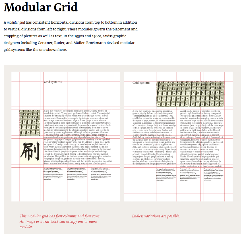
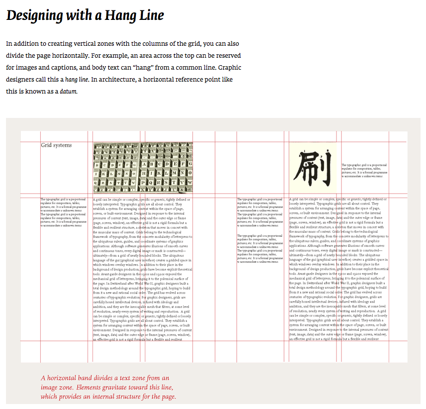
Grid Systems
I've been researching and playing around with some different grid layouts for our magazine.
I quite like the look of a hang line in the grid, and I like the neat, simpleness of the modular style too.
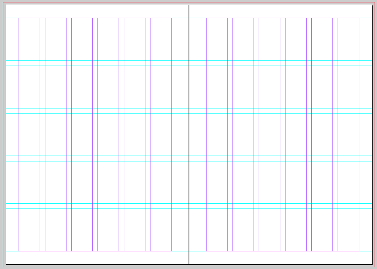
Below is the layout template that I've designed to use for the magazine.
I have allowed 3mm bleed around entire document, 20mm inside margins to allow for the spine, 15mm margins at top, bottom and outsides.
I have included 6 columns and 5 rows to create a modular grid layout. Between each column and row is 6mm gutter.
Inspiration - Layouts
I've been flicking through some of my favourite magazines, and I'm finding heaps of inspiration for minimalist layout designs. Fete Magazine, Smith Journal and Frankie Magazine all have really beautiful layouts and imagery.


Inspiration - Cover Design
I really like the simplisity of Fete magazine's cover design. They use the same layout for every issue, changing the photography to suit the season. Here is an example of their Spring cover last year.

Progress
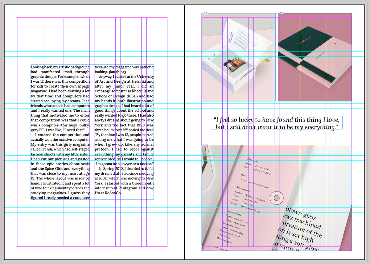
This is one of my 'Feature Designer Interview' layouts that I have designed using the grid I created (above).
Images from Lotta Nienminen's portfolio website
Interview content from The Great Discontent


Progress
This is another one of my layouts that I designed using my grid template. This layout is for my 'Feature Studio' article. I played around with multiple image layouts on the third page, and I quite like the way this layout is a little different to other layouts I have used for images. I have tried to create slight variances in all of my layouts, whilst still using the same grid, in order to remain constant with the minimalist feel of the magazine, yet still let each article and feature have it's own personality and appeal.
Images from Carpe Juvenis, Hum Creative, Coco + Kelley
Interview content from Coco + Kelley


Progress
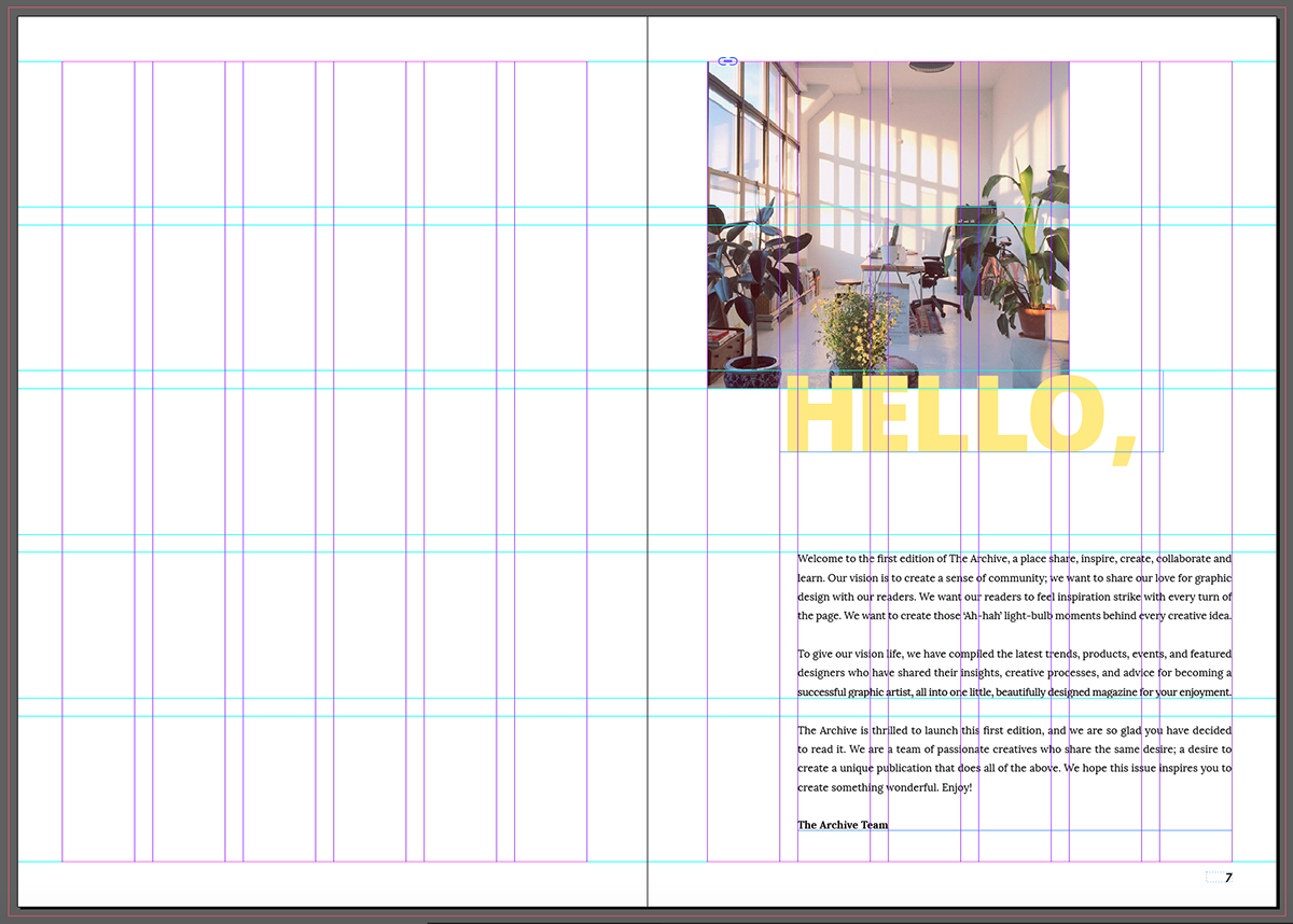
This is the layout I did for the editorial page. I used a simple image and a large heading at the top of the page, and left lots of room around the text for it to breathe.
This is the layout I did for the editorial page. I used a simple image and a large heading at the top of the page, and left lots of room around the text for it to breathe.
Image from Design Sponge
Progress
This is my finished publishing information page layout. I have used the large, overlayed heading style that I created for a number of my other pages to keep everything consistent and neat. I have also used a variety of font weights to differentiate the headings, names and email addresses.

Progress
This is the the layout for the contents page. I have used a large image that spreads across two pages, and small simple text for the table of contents. There is lots of space around the text to add to the overall minimalist, simplistic feel of the magazine.
Image from Hum Creative

Progress
This is the my reference list spread. I found this spread quite challenging to design, as our group had so many references that needed to be included. I have tried to keep it simple and consistent with the rest of my spreads. I have left some space at the top of the text on the first page, and used a large colourful heading and image.
Image from Hum Creative

Cover Design and Magazine Title
Our group decided on the name, The Archive, for our magazine. We did some brainstorming on some different design terminology, and we liked The Archive and it's reference to old files of design works. For the cover design, we decided to keep our clean and minimal style, with our magazine title and an image of a work by one of our feature designers, Lotta Nienimen.


