Design Rationale:
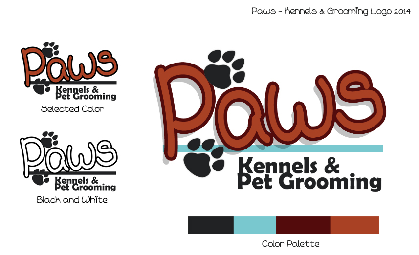
Font: Right off the bat I knew I wanted the ‘Paws’ font to be ‘cute’, almost as if it was written with a fat marker. The font used is named ‘Sweet Cheeks’. I wanted the ‘Kennels & Pet Grooming’ to directly contrast that with bold, professional font (Berlin Sans FB Demi).
Color: The colour palette chosen represents earthy red colours, almost like mud for a dirty puppy, and the authority of training. The blue is a nice, clean colour to combat the reds/browns. It would be a waste opportunity to not incorporate paw prints into the logo. Two paw prints are added in an upwards direction to add movement to the piece.