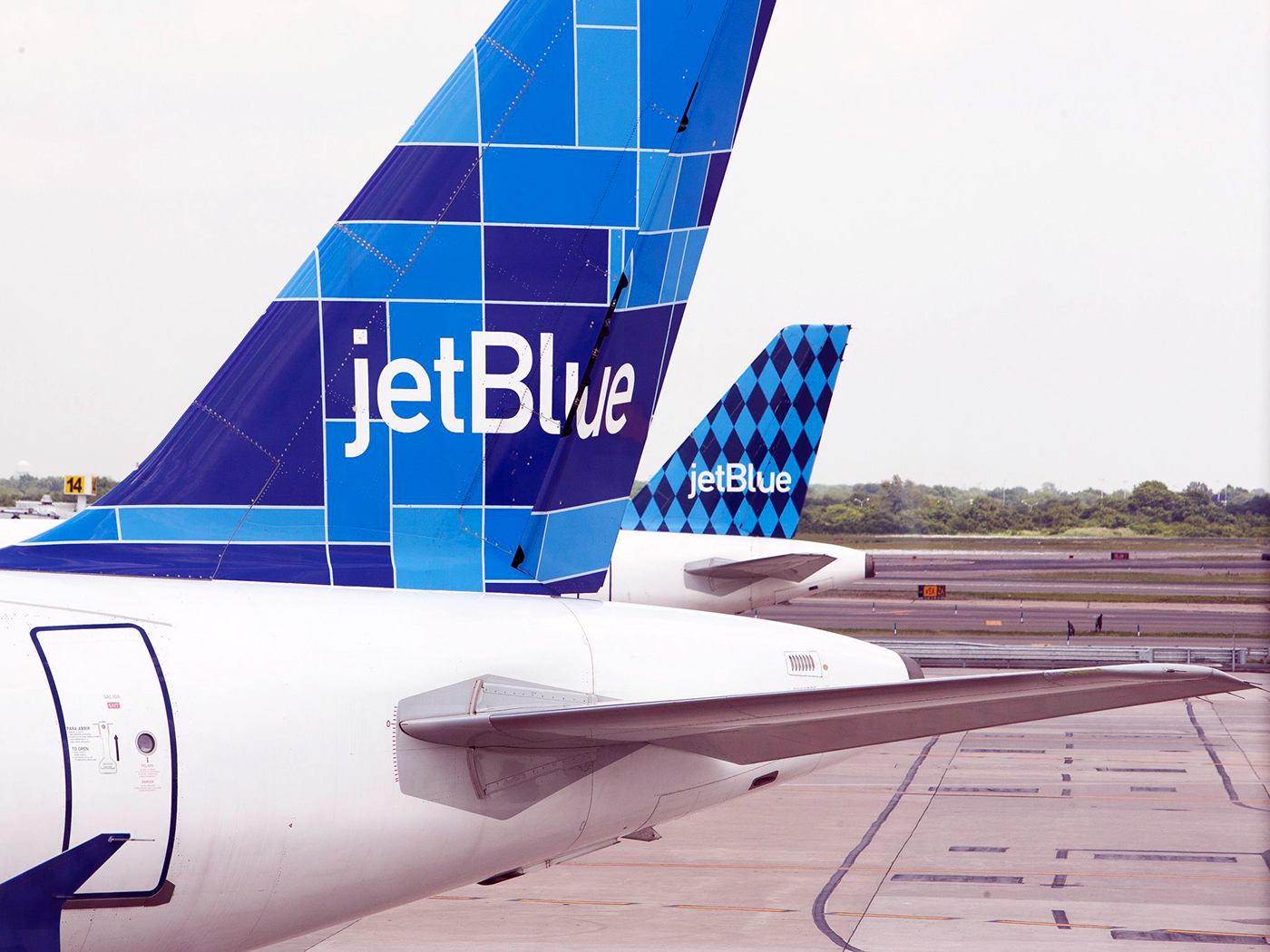
Rather than "own" a single Pantone blue, the creative director felt strongly about a range of blues, which lent itself well to creating a series of patterns for the 3 tail designs for the aircraft that would launch the airline. We settled on a palette of about 4 hues that worked together. As the brand matured we added orange. In subsequent years I've seen green enter the palette.

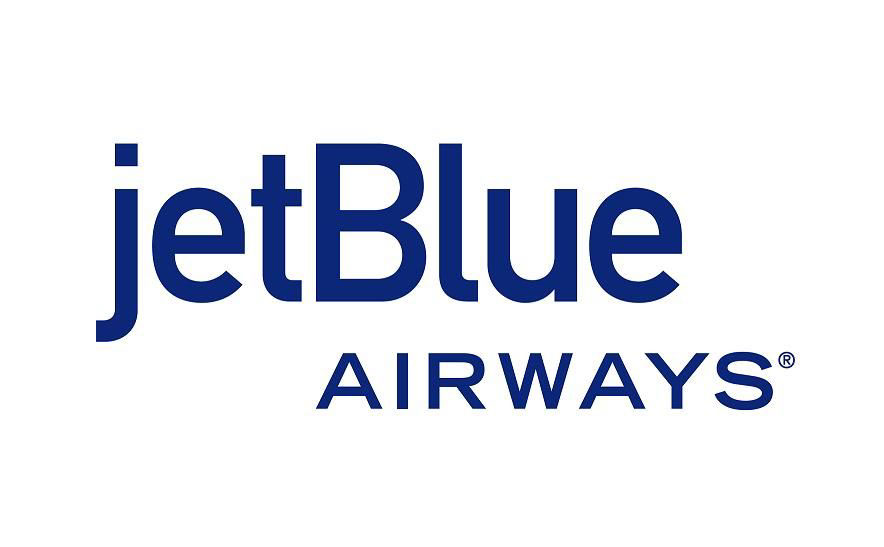
The single color JetBlue Airways logotype. JetBlue is a slightly modified DIN. We shortened the descender on the J so the non-standard lowercase would optically sit better. Rather than set AIRWAYS in DIN we paired it with the corporate typeface, Trade Gothic.


