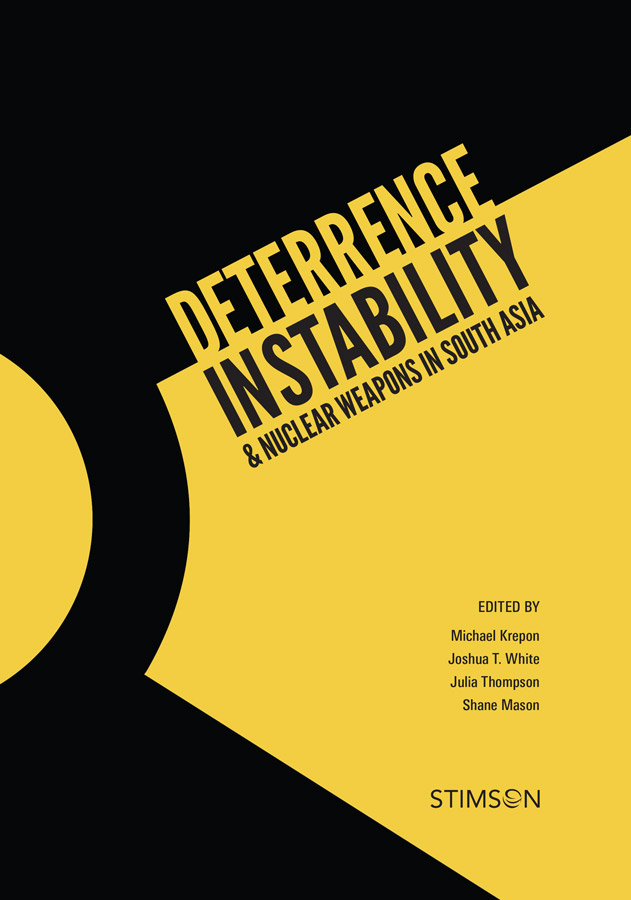
For this book on the effect of nuclear weapons as a war deterrence strategy, I chose to use a zoomed-in "radioactive" symbol. The close cropping creates a sense of tension and aggression. I used a condensed gothic typeface in all caps, adding to this feeling and lending further urgency. I tilted the type to evoke the feeling of instability, and to add dynamism to the overall composition.

