
Logo:
I chose to do a silhouette that resembled how Mandie looks. That way when this icon pops up people will relate it to her and her business. Since she is a hairstylist, I put more emphasis on just the hair. That was something I knew needed to stand out and make a statement. I chose not to do all of the facial features because I want the main focus to be on the hair. This icon is supposed to resemble Mandie, but it can also be a way for clients to get an idea of how they want their own hair to look. They could see just the hair and put their own face to it, not just Mandie's. Like I said, this is supposed to look like Mandie, so I chose the orange hair because she currently has this hair color and also short style. And the red lips were a good contrast to the hair color. I made the icon clean and shart because after getting a haircut, that is someting that is wanted. We want our hair to look clean and fresh after we get it done, so that is what this icon also depicts.
For the text I chose Jenna Sue because it is professonal, but still fairly playful and girly. Its letters flow together, but it is still easy to read. The text needed to POP next to the orange of the hair so I chose to make it a aqua blue color. Blue and orange are complementary colors so I knew it would be perfect. I chose to make the text curve along with the top of the hair because I didn't want it to be so centered or straight. The logo is meant to flow all together and be one.
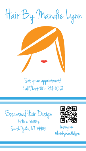
Business Card:
The business card is broken up into two sections. This way it is easier to follow and read the information on the card. It isn't all clustered or bunched up. The top section has the main information and of course Mandie's logo. It has her contact information so they know exactly how to go about setting up an appointment without confusion. The bottom section has the location of the salon Mandie styles at. The salon name is larger so it is easy to pick out and read. Below is the location of the salon. This way clients can easily type the same into Google or type the address into Google Maps. Beside that is a QR code that links to the Hair By Mandie Lynn Instagram page. The Instagram username is below the QR code to people know why it is there. I chose to split these sections up with two double lines that are different shades of blue to give it some depth and variaton. I didn't want it to look to solid and matchy. I didn't add stripes at the very top because it made the card feel to heavy and it was too much. The card is cute, yet simple and provides all of the necessary information for the person who has the card.
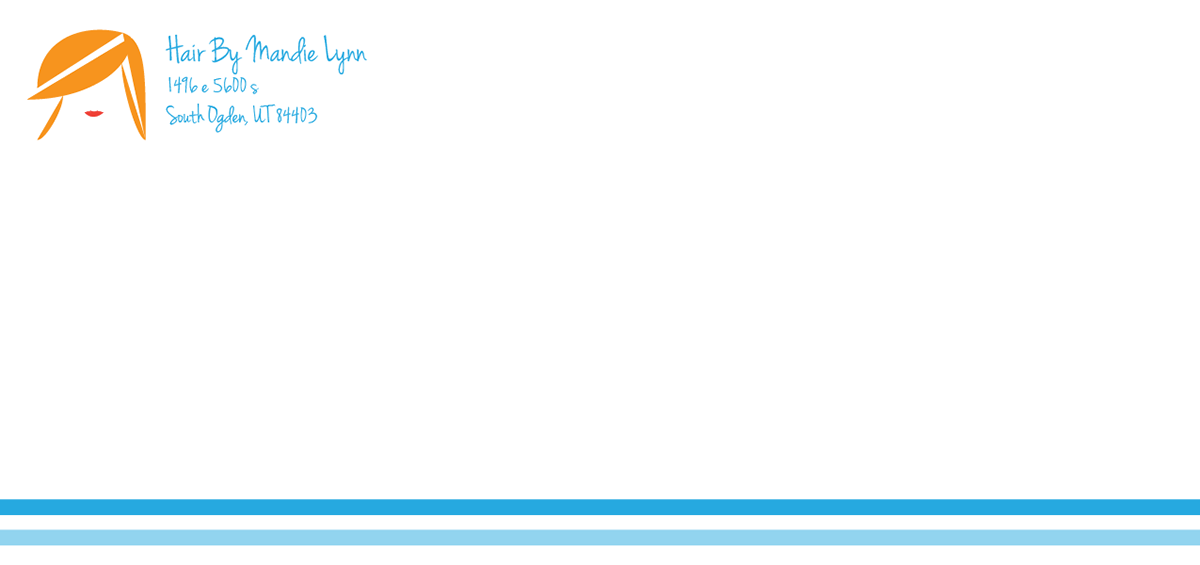
Envelope:
The front of the envelope (above) is simple because it is something that isn't always kept by the recipient. But it is still unique and represents Hair By Mandie Lynn. As you can see, the envelope also has the double lines and match the business card and that will also match the letterhead. I wanted to make these three things (Corporate Identity) flow together. The logo is at the top left and next to it is "Hair By Mandie Lynn" in the Jenna Sue font. Below is the addresss and the font is smaller so that the name stands out more.
The back of the envelope (below) has the two stripes as well because I felt that the stripes should connect from the front and wrap around the entiire envelope. It brings the entire look together, but it isn't too heavy and doesn't have too much happening. The flap has the logo in the center to act as a "seal" for the flap.


Leaderhead:
The leaderhead (above) has the same components as the envelope, but with the telephone number added to it as well. I had the logo at the left side and then the text to the right because that is the direction that text is read so it allows the reader's eyes to flow effortlessly. "Hair By Mandie Lynn" is larger then the rest of the information so that it stands out and the reader knows exactly who the letter is from. And of course the logo tells the reader who it is from too. I decided to have the line start from the right end of the logo because I didn't want it to run across the whole page. I feel like having the double lines run below the logo and across the whole page would just completly secton off the entire leaderhead and it wouldn't have the smoothness and flow that it currently does.
Below, I have added text so it can be seen how the letter will look when completed. It looks professional and eyecatching at the same time.


Magazine Ad:
To advertise for the business, I thought a spring sale would be a good idea. With the warmer season coming up people are wanting new hair colors and styles to look fresh for the summer. I had "Hair By Mandie Lynn" centered at the top so it would be easy to see what the ad was for. i put a picture of Mandie centered below because this image of her shows her passion for hair and the picture and fun. Right below I put the sale information and I chose to emphasize "free" because that will catch the reader's attention. The orange color of "free" contrasts with the rest of the blue text so it pops and the font makes it stand out as well. I broke up the ad into two parts. The top provides the sale information and the bottom has the location and contact information. I used bright tulips to break up the ad because this goes with the spring sales and it brings a fun spring vibe to the ad. I thought it would be odd to talk about spring and not show anything spring-y. I centered the location and contact information so it flowed well. I made "Essensual Hair Design" larger then the rest of the text to that it stood out and clients would know where to go. Instead of typing out Instagram I chose to put the logo so that it wasn't too wordy. The logo is more eyecatching and will draw the reader to check out the Instagram page.

Newspaper Ad:
The newspaper ad has the same information as the magazine ad, but it is black and white and the layout is more horizontal. I separated the ad into two sections so that it wasn't all clustered. The name and the business information is all at the top. "Hair By Mandie Lynn" is large and starts at the left side and as the person reads it their eyes then wander to the right side of the page with the locaton and contact information. I broke up the top and bottom with tulips, but this time I chose to use just the blossom part because I felt the entire tulip would be too much. I used the whole tulip to border the bottom of the ad because it brings the whole ad together and of course it ads that spring vibe to the ad.
