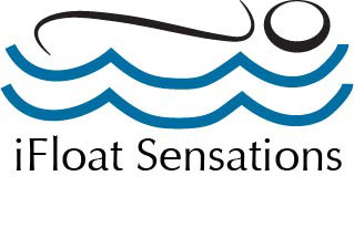
This is the logo I created for iFloat Sensations. This company provides pods of water that contain over 900 pounds of Epsom Salt. Because there is so much salt, the human body actually floats on top of the water. I wanted to incorporate the idea of floating within the new logo, which is why I placed a human-like figure on top of the water. I made the water blue, because the color blue symbolizes the “Throat Chakra, and this chakra symbolizing communication. iFloat Sensation’s “Why” is “Healing one mind at a time.” It is important that clients communication the need of healing to their bodies, and can do so at iFloat Sensations. I also wanted to try and create an Escherism, and made the human-like figure also look like the letter “i” so that there would be some type of repetitiveness within the logo.I wanted the color blue to stand out to create a visual hierarchy, and emphasize on the water aspect of the services provided. I tried to create a type of pattern and contrast within the logo as I placed black above and below the blue. I feel that the logo explains the services provided by iFloat Sensations.
This is the front of the business card. I wanted it to be simple, because I feel that the logo speaks for itself. I included the logo, and the “Why” statement. I feel that keeping the front of the business card simple and emphasizing on the color blue within the water, anyone who sees the business card would immediately turn it over to find out what the company is about and find out more information.

This is the back of the business card. I separated the logo and the contact information with a solid vertical black line. I wanted to keep the image and text separated but still wanted to keep a professional feel to the business card. Again, I wanted to keep it simple and to the point, and didn’t want to confuse any viewers with multiple colors and designs. I wanted to keep everything consistent. iFloat Sensations has a very calm and peaceful atmosphere and I wanted to show that through the business card.


This is the front and back of the iFloat Sensations business envelope. Like the logo and business cards, I wanted the blue in the water to be the first thing that people looked at. I felt that by staying consistent with the water standing out, potential clients would see the repetition and relate the color blue and water like designs to the idea of floating and relaxation. I kept the back simple and plain to emphasize on the color blue in the logo.
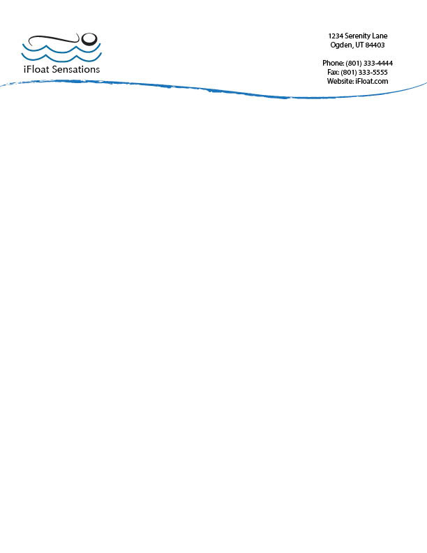

This is the letterhead for iFloat Sensations. I put the logo at the top left because is the direction in which people read, and normally the first place people look when looking at an actual piece of paper with writing on it. To the far right of the logo I placed the contact information, so that everything was visible and easy to access. I separated the logo and contact information from the writing area with a blue wave-like line. I tried to stay as repetitive as I could with the logo. I made the wave-like line the exact same color as the blue water in the logo, and I made the wave-like line curve the same way the human-like figure curved that is floating on top of the water in the logo. I wanted it to be easy to identify the information needed at the top, and the writing that was informative, and I feel that the blue like was successful in creating that. I also had the wave-like line go from somewhat separated to thick at the end to assist in guiding the attention from the logo to the contact information.

This is the magazine ad I put together for the company. One of the weaknesses assessed in the S.W.O.T analysis was the location of the actual company. They are hidden behind a gas station and near a dead end road. I wanted to figure out a way this company would be able to get more traffic to their business location and decided to do a “Grand Opening” event. The visual hierarchy in this image is the word “Grand Opening” and “50% Off.” These are the two most important messages I tried to portray in this add. By offering 50% off a client’s first float, more clients would be interested in finding out more. By offering that only the first 100 people would receive the deal, it would create more of an urgency to go to the location and check the business out. I stayed consistent with the color blue and outlined the key factors of the message to make them stand out.

Very similar to the magazine ad, is this, the newspaper add. I tried to continue to create that visual hierarchy with the word “Grand Opening” and “50% Off.” I did that by making those key factors bold, compared to the rest of the typeface. I feel that this would be the best way to create more awareness for the company and lessen the weaknesses iFloat Sensations has.

