I recently took Erik Marinovich's class on Skillshare. No matter what level you're at I highly recommend taking the time to learn from others. Below is the process post I shared with the Skillshare community.
Inspiration
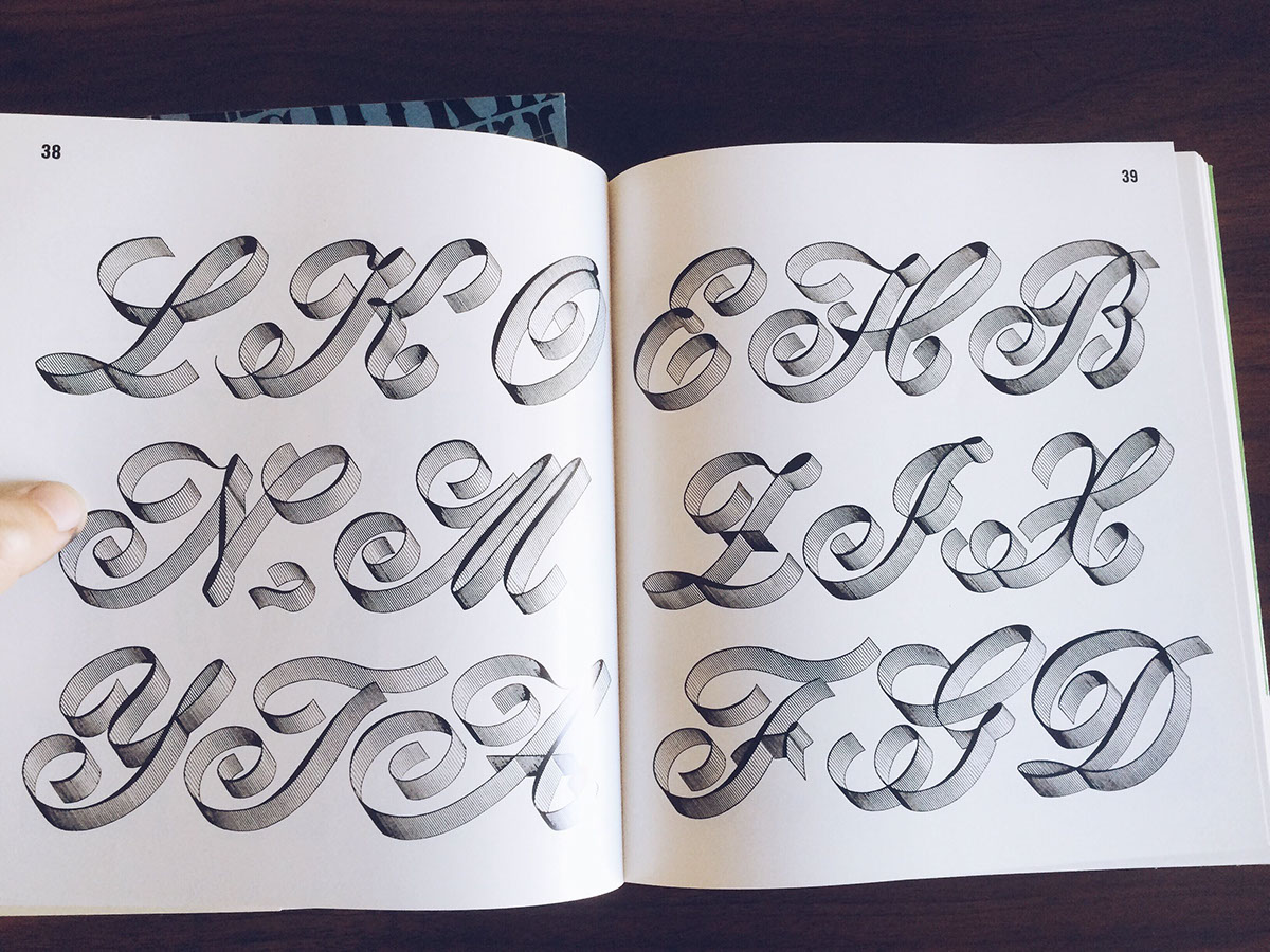
After watching the first videos about materials I immediately ordered my supplies. In the meantime I started going through my own library for inspiration. Some of my favorite books for inspiration are the Lettera series. I found these at a flea market and they always come in handy. Below are a few images of my favorite spreads. Another book I've used for years is Photo Lettering's One Line Manual of Styles. It's a rich resource to get you started on any style. I also ordered the Speedball Text Book that Erik recommended along with The Universal Penman. Both are excellent resources.
After watching the first videos about materials I immediately ordered my supplies. In the meantime I started going through my own library for inspiration. Some of my favorite books for inspiration are the Lettera series. I found these at a flea market and they always come in handy. Below are a few images of my favorite spreads. Another book I've used for years is Photo Lettering's One Line Manual of Styles. It's a rich resource to get you started on any style. I also ordered the Speedball Text Book that Erik recommended along with The Universal Penman. Both are excellent resources.


Materials & Practice
I am actually still waiting on the materials recommended by Erik in the video so I went out and hunted down the markers at local stores. It turns out that the jumbo white markers are incredibly hard to find locally so I'll definitely be ordering a few online to have in my kit. In the meantime I have large number of brushes and markers that I've been meaning to experiment with. The first is the Staedtler Mars Graphic 3000 Duo. Now that I've used the Tombow I would say the Staedtler feels very similar actually. Great flow. I love the feel of the rubber tip. It gives a very clean stroke and it's comfortable in the hand.
I am actually still waiting on the materials recommended by Erik in the video so I went out and hunted down the markers at local stores. It turns out that the jumbo white markers are incredibly hard to find locally so I'll definitely be ordering a few online to have in my kit. In the meantime I have large number of brushes and markers that I've been meaning to experiment with. The first is the Staedtler Mars Graphic 3000 Duo. Now that I've used the Tombow I would say the Staedtler feels very similar actually. Great flow. I love the feel of the rubber tip. It gives a very clean stroke and it's comfortable in the hand.
The other market that stood out is the Copic Sketch 110. Once you get used to the shape of the marker it's really easy to use and provides solid strokes. I would say it was a little tougher to get thicks and thins with the Copic.
I spent most of my time just working out an organice casual as demonstrated in the videos. I've been a huge fan of the House casuals for a long time but I felt the most comfortable just working the the natural movements of the brush to come up with organic shapes that felt comfortable to execute.


Endless Revisions
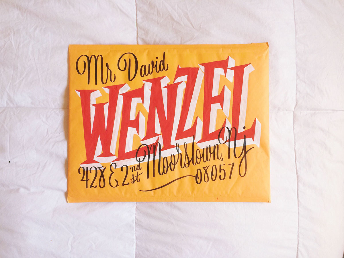
Before starting on my envelope I had to decide who to send mine to. I have a dear friend who's living in New Jersey for some medical treatment and I've been meaning to send a care package. I wanted the envelope to kind of match his personality. One of the most notable things about David is his style. He dresses bright, bold and colorful. He's a classy dude to the end. After getting his address I started exploring a variety of styles and techniques. I began with the basics because my markers had not yet arrived in the mail. I started with a bold western style slab. I thought I could make it look more contemporary. While I like the layout it just didn't feel like David.
Before starting on my envelope I had to decide who to send mine to. I have a dear friend who's living in New Jersey for some medical treatment and I've been meaning to send a care package. I wanted the envelope to kind of match his personality. One of the most notable things about David is his style. He dresses bright, bold and colorful. He's a classy dude to the end. After getting his address I started exploring a variety of styles and techniques. I began with the basics because my markers had not yet arrived in the mail. I started with a bold western style slab. I thought I could make it look more contemporary. While I like the layout it just didn't feel like David.

After looking through my inspiration again I landed on a direction that felt just right for Davids style. I probably drew this out 10 or 15 times trying to make it feel just right!

Envelope Application!
It was time to apply the design to the envelope. I didn't know about the lead transfer trick Erik taught – It was so easy to get my design on the envelope quickly and without losing any quality. I also loved the Pentel Chalk Markers. I tried some other brand and they were so watery that I threw them all away. Definitely going to use these on other projects in the future!
It was time to apply the design to the envelope. I didn't know about the lead transfer trick Erik taught – It was so easy to get my design on the envelope quickly and without losing any quality. I also loved the Pentel Chalk Markers. I tried some other brand and they were so watery that I threw them all away. Definitely going to use these on other projects in the future!


Final thoughts
It was a great experience and I can't wait to send more of these out in the future. It's great practice and an awesome way to use design to delight others. I loved it. Thanks for sharing your knowledge and your process Erik!
It was a great experience and I can't wait to send more of these out in the future. It's great practice and an awesome way to use design to delight others. I loved it. Thanks for sharing your knowledge and your process Erik!


